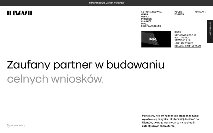
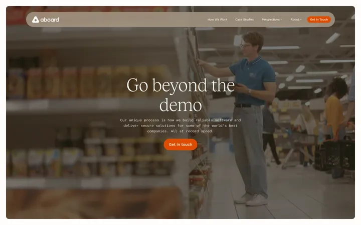
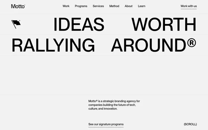
North star · Let a narrow column of clear, oversized copy do the work, using color and interface detail only as occasional punctuation.
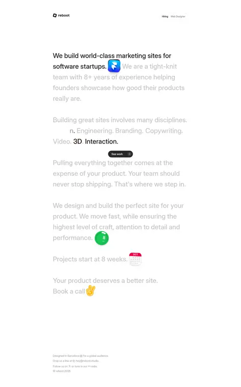
The page is built around a white canvas (#ffffff) and a focused column of large, left-aligned copy. Near-black text (#232323) carries the main message and selected emphases, while soft gray (#a7a7a7) recedes for supporting lines and secondary content. The type is Inter at a measured medium weight: the headline is generously sized and loosely led, giving the introduction an editorial, almost conversational pace. Subsequent statements continue as plain text rather than being divided into a conventional card grid. Ample measured section spacing lets each thought stand on its own. The header stays understated, pairing a compact wordmark with a fine outlined hiring pill. Hairlines (#e5e5e5) are used sparingly. Bright blue gradient hues and warm gradient hues appear as occasional media or illustrative accents, not as broad page backgrounds. Small product-like graphics and emoji punctuate the copy; the layout remains mostly flat and deliberately quiet.
All measured page typography, including headline, body copy, caption text, and interface labels.
角色
示例
字号
字重
行高
字距
一级标题
Opening studio statement, set as large, medium-weight text.
reboot
40px
500
1.6
0
正文
Main explanatory paragraphs and service or process statements.
The quick brown fox 敏捷的狐狸
16px
500
1.8
0
辅助文字
Small interface labels and compact supporting text.
The quick brown fox 敏捷的狐狸
14px
600
1.6
0
间距与布局
基准单位 8px · 密度:宽松
128px版块间距
—元素间距
—卡片内边距
808px内容最大宽度
1px
8px
16px
24px
32px
128px
Use a centered, narrow content column within the measured 808px page max width, with left-aligned copy and a restrained header row. Keep the page density spacious: the measured spacing scale is based on 8px, with a 128px section gap. The long single-page composition progresses through separated text statements rather than a dense grid. Maintain generous blank canvas around the copy and keep small header and footer details visually secondary.
圆角与层次
按钮 · 9999px
图片 · 16px
lg · other
lg · other
The overall page is flat, with no strong panel or card system. The hiring pill has a thin #e5e5e5 outline and a fully rounded silhouette. Measured layered shadows are subtle and should only support small media or interface elements when appropriate, never create heavy floating cards.
组件
下面的预览按实测的按钮、输入框、徽标、卡片样式重建(字体用替代字体)。
Header
A restrained top row pairs the reboot wordmark at the left with a compact hiring pill at the right.
Hiring pill
Outlined with #e5e5e5, fully rounded, and set in measured 14px medium Inter; keep it quiet rather than CTA-like.
Opening statement
Large, left-aligned 40px medium-weight copy; dark lead text is followed by lighter supporting lines.
Inline media accent
Small colorful product-like visual sits within the opening text flow; use as punctuation rather than a large hero image.
Text statements
Follow-up copy appears as separated, broad-leading text blocks with selected dark emphasis and muted surrounding lines.
Text link
Links such as “Book a call” use plain text treatment in #232323 rather than a filled button.
Footer details
Keep contact, location, and copyright-style information compact and low contrast at the end of the page.
Imagery · Media is limited and used as punctuation within the text-led composition: a small colorful product-like graphic sits beside the opening statement, while other page media includes compact graphics and a video. Treat these as isolated accents, not as full-bleed backgrounds. Keep framing neat and contained; measured media uses a 16px radius. Avoid inventing a photography-led art direction.
Set primary copy in #232323 and supporting copy in #a7a7a7.
Keep the main content in a narrow, left-aligned column.
Use large, medium-weight Inter for the opening statement.
Separate statements with generous whitespace.
Reserve gradients for small media or illustrative accents.
✕ 不该做
Do not add large colored background bands.
Do not turn every text block into a card.
Do not make the page feel dense or dashboard-like.
Do not use bright gradients as the primary CTA treatment.
Do not replace the text-led composition with a photo-heavy hero.
Do not overuse borders or shadows.
给 AI 的提示词
想快速出一个同风格的新页面,把这段话连同 DESIGN.md 一起发给 AI。
Build a new page in reboot’s restrained studio style. Use Gallery White (#ffffff) as the canvas, Soft Ink (#232323) for primary copy, and Misted Gray (#a7a7a7) for quieter supporting lines. Set all text in Inter or a close free equivalent, using measured medium weights and an editorial, generous leading. Center a narrow content area within the measured 808px max width, align statements to the left, and separate them with spacious vertical rhythm based on the measured 8px scale and 128px section gap. Keep the header minimal, with a compact wordmark and a rounded, hairline-outlined hiring-style pill. Use Quiet Line (#e5e5e5) sparingly. Cyan-to-blue and warm gradients are accents for small inline media only. Prefer plain text links, subtle elevation, and a clean footer; avoid card-heavy layouts or large color fields.