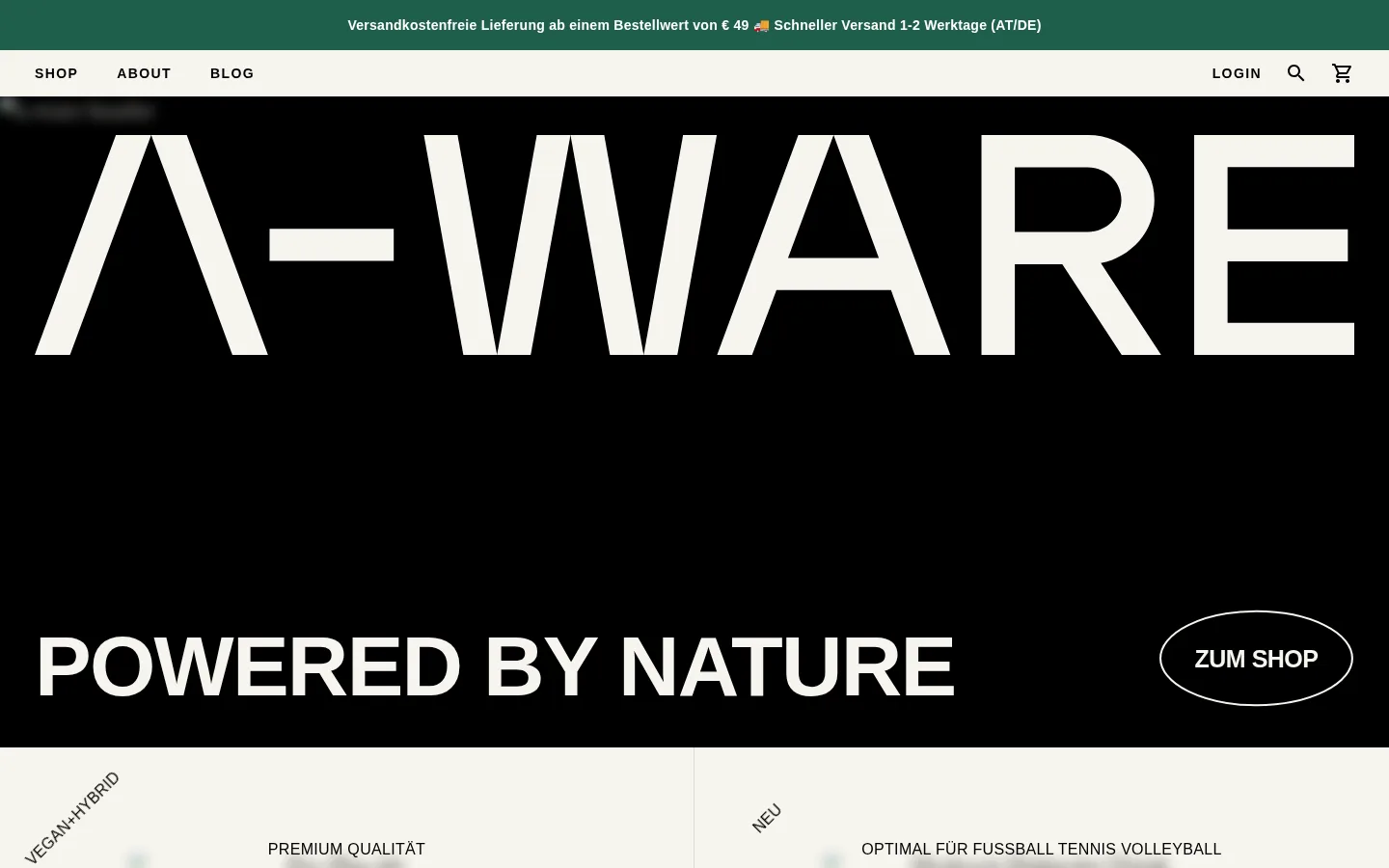
A-WARE以戏剧化的黑色首屏和超大字体建立鲜明识别,再切换到温暖浅色的产品内容区。页面将奥地利天然营养的品牌气质与直接清晰的电商体验结合起来。
North star · Use oversized, high-contrast typography on flat black and warm ivory fields, keeping accents and framing restrained.
The homepage is built around a stark alternation: a near-black hero establishes the brand, while warm ivory sections carry product and benefit content. White typography and the oversized A-WARE wordmark create the strongest contrast; green is reserved for the narrow delivery announcement and restrained accent moments. Typography pairs a bold uppercase sans for display, navigation, and short labels with a light serif for more editorial product and supporting text. A mono face appears in compact utility copy. The opening layout gives the wordmark an expansive field, then anchors a large slogan and outlined pill CTA near the lower edge. Below, pale sections use centered headings and split content with product imagery, lists, and short calls to action. Hairline dividers and minimal framing keep the page flat and let imagery and type provide hierarchy.
配色 点色块复制色值。用途说明来自对页面的实测位置(背景、文字、描边、按钮)与截图判读。
品牌色
Deep Canvas
#000000
Primary hero and category-band background; also the main dark text color on pale navigation and content surfaces.
强调色
Forest Signal
#205f4b
Green accent for the delivery announcement and restrained brand cues; keep it secondary to black and ivory.
表层色
Warm Parchment
#f7f5ee
Warm pale canvas for product benefits, editorial messaging, and product-focused sections.
中性色
Clean White
#ffffff
High-contrast text on black, product links, and the filled primary CTA background.
Quiet Gray
#808080
Muted supporting text and secondary headings where full white contrast is unnecessary.
Stone Text
#888783
Secondary text tone measured in headings and body copy; use sparingly against pale surfaces.
Soft Pewter
#b9b8b2
Subtle measured border color, especially for low-emphasis separators on light sections.
Ivory Rule
#d9d7d1
Light divider and link-related detail within the pale product and editorial sections.
Warm Charcoal
#403e3c
Deep neutral detail in measured borders and small interface elements, not a dominant surface.
功能色
Graphite Line
#595959
Measured border tone for subtle component outlines and separators.
文字 背景 对比度 WCAG #ffffff Clean White#000000 Deep Canvas21:1 AAA #ffffff Clean White#f7f5ee Warm Parchment1.09:1 不达标 #000000 Deep Canvas#f7f5ee Warm Parchment19.25:1 AAA #808080 Quiet Gray#000000 Deep Canvas5.32:1 AA #808080 Quiet Gray#f7f5ee Warm Parchment3.62:1 AA-large #205f4b Forest Signal#000000 Deep Canvas2.8:1 不达标
字体 字号阶梯:Augmented Fourth(比例约 1.406,正文 16px)。示例用免费替代字体渲染,数值为实测。
Aa 设计
plantin 网络字体 · 字重 300 · 占比 51%
免费替代:Cormorant Garamond
Light editorial headings and product or supporting copy.
Aa 设计
practice 系统字体 · 字重 600 / 400 · 占比 35%
免费替代:Montserrat
Display wordmark treatment, uppercase headings, navigation, labels, and CTAs.
Aa 设计
lab-mono 系统字体 · 字重 400 · 占比 15%
免费替代:IBM Plex Mono
Compact captions and utility information.
角色 示例 字号 字重 行高 字距 特大标题 Oversized uppercase brand and slogan display on the black hero.
A-WARE
88px 600 normal -0.02em 一级标题 Light serif introductory or editorial headline.
A-WARE
38px 300 1.05 -0.02em 二级标题 Bold uppercase section headlines on pale content areas.
A-WARE
36px 600 1.05 -0.02em 三级标题 Uppercase subheadings for benefits and product groupings.
The quick brown fox 敏捷的狐狸
25px 600 1.2 -0.02em 四级标题 Light serif supporting headlines within editorial content.
The quick brown fox 敏捷的狐狸
24px 300 1.33 0 正文 Compact, semibold sans copy for benefits and product information.
The quick brown fox 敏捷的狐狸
16px 600 1.19 0 辅助文字 Small mono utility and caption text.
The quick brown fox 敏捷的狐狸
12px 400 1.33 0 按钮 Large uppercase display treatment measured on category labels.
A-WARE
88px 600 normal -0.02em 链接 Compact uppercase navigation and action links.
The quick brown fox 敏捷的狐狸
14px 600 1 0.1em 眉题 Uppercase introductory labels above section content.
The quick brown fox 敏捷的狐狸
16px 600 1 0.04em 代码 Small mono utility text where technical-style notation is needed.
const style = 1;
12px 400 1.33 0
间距与布局 基准单位 4px · 密度:适中
48px 版块间距
5px 元素间距
— 卡片内边距
1368px 内容最大宽度
1px
2px
5px
8px
10px
12px
14px
16px
17px
20px
24px
32px
36px
38px
40px
48px
The measured content reaches a page max width of 1368px, with a comfortable rather than crowded density. The first viewport is dominated by a full-width black hero, followed by warm pale sections that use centered headings and split layouts. A narrow announcement strip and a separate light navigation row sit above the hero. Product and benefit content is organized into broad bands; category labels return to black full-width strips. Section rhythm is generous, with measured section gaps of 48px and a spacing system based on a 4px unit.
圆角与层次 没有测到阴影:页面是扁平的,层次靠底色和描边区分。
The page is predominantly flat: no measured shadows or gradients. Use contrast between black and warm ivory bands, plus fine gray or pale dividers, to create separation. Buttons and media are the main rounded elements, while category bands and text links remain unboxed. Keep overlays and card elevation minimal.
组件 下面的预览按实测的按钮、输入框、徽标、卡片样式重建(字体用替代字体)。
Announcement strip A slim forest-green band above navigation carries centered delivery and shipping information in compact light text.
Primary navigation A warm light row places uppercase SHOP, ABOUT, and BLOG links at left, with account, search, and cart utilities aligned right.
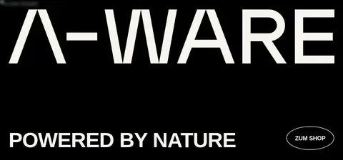
Hero wordmark A huge white A-WARE wordmark fills the black hero, followed by the uppercase POWERED BY NATURE slogan and an outlined pill-shaped shop CTA.
Benefit split Pale content panels pair uppercase benefit labels and short proof points with product or sport imagery; use a thin divider between columns.
Editorial CTA A centered uppercase headline and short supporting sentence introduce the range, followed by a compact uppercase text link.
Product links Product names and prices appear in a light serif on pale sections, with minimal framing and ample breathing room.
Category band Black full-width strips use large white uppercase category labels and item counts to introduce product groupings.
Imagery · Product and lifestyle imagery appears mainly in the pale sections, where it supports nutrition claims and product discovery rather than competing with the brand mark. The first viewport keeps the hero largely typographic and black, with no visible hero photography. Use clean, naturally lit product or sport imagery, broad crops, and restrained framing; measured image corners use a subtle radius. Avoid decorative illustration as the page’s main visual language.
页面版块 共 2 个版块,按页面从上到下排列,每个都标了类型、布局和交互套路。
该做与不该做 ✓ 该做 Keep the hero black and let the wordmark dominate. Use warm ivory as the main surface for product and benefit content. Reserve green for the announcement strip and small brand accents. Pair bold uppercase sans display with light serif editorial copy. Use broad section bands and clear contrast instead of elevated cards. Keep dividers subtle and product imagery naturally framed. ✕ 不该做 Do not add gradients or decorative shadows. Do not use multiple bright accent colors. Do not crowd the hero with supporting copy or imagery. Do not turn every product into a raised card. Do not replace the uppercase display style with soft, rounded typography. Do not use the green accent as a large-area background outside its restrained role. 给 AI 的提示词 想快速出一个同风格的新页面,把这段话连同 DESIGN.md 一起发给 AI。
复制 Build a new A-WARE page using the established contrast system: Deep Canvas (#000000) for the hero and category bands, Warm Parchment (#f7f5ee) for editorial and product surfaces, Clean White (#ffffff) for reversed text and primary controls, and Forest Signal (#205f4b) only for small brand accents. Use a bold uppercase sans display face with tightly tracked oversized headlines, balanced by a light editorial serif for product copy and a mono face for utility labels. Organize content in broad, full-width bands with generous spacing, centered section headings, and selective split layouts. Keep the navigation compact and the primary CTA clearly visible. Use clean, naturally lit product imagery with restrained framing. Avoid shadows, gradients, bright extra colors, or card-heavy layouts; rely on typography, flat color fields, and fine dividers for hierarchy.
DESIGN.md Tailwind v4 CSS 变量 Design Tokens
---
title: "A-WARE design system"
variant: extended
source: https://a-ware.at/
captured_at: 2026-10-12
theme: dark
industry: health
generator: Design DNA (https://four.wiralomi.com/style/a-ware-at)
ai_generated: true
ai_label: "本文件由 AI 辅助生成:数值取自公开网页的实测样式,命名、用途说明与建议为模型解读。商标归原所有者。 / AI-assisted content"
---
# A-WARE · Design System
> Natural nutrition, presented with bold restraint.
**Theme:** dark · **Industry:** health · **Source:** https://a-ware.at/ · **Captured:** 2026-10-12 (1440×900 desktop)
_AI-assisted content: values are measured from the public page at capture time; names, roles and guidance are model-written interpretations. Trademarks belong to their owners._
A-WARE pairs a dramatic black hero with oversized typography and warm, pale product sections. The homepage balances Austrian natural-nutrition cues with a direct, editorial online-store experience.
## North star
Use oversized, high-contrast typography on flat black and warm ivory fields, keeping accents and framing restrained.
## Overview
The homepage is built around a stark alternation: a near-black hero establishes the brand, while warm ivory sections carry product and benefit content. White typography and the oversized A-WARE wordmark create the strongest contrast; green is reserved for the narrow delivery announcement and restrained accent moments. Typography pairs a bold uppercase sans for display, navigation, and short labels with a light serif for more editorial product and supporting text. A mono face appears in compact utility copy. The opening layout gives the wordmark an expansive field, then anchors a large slogan and outlined pill CTA near the lower edge. Below, pale sections use centered headings and split content with product imagery, lists, and short calls to action. Hairline dividers and minimal framing keep the page flat and let imagery and type provide hierarchy.
## Colors
| Name | Hex | Token | Group | Role |
|---|---|---|---|---|
| Deep Canvas | ` | `--color-deep-canvas` | brand | Primary hero and category-band background; also the main dark text color on pale navigation and content surfaces. |
| Warm Parchment | ` | `--color-warm-parchment` | surface | Warm pale canvas for product benefits, editorial messaging, and product-focused sections. |
| Clean White | ` | `--color-clean-white` | neutral | High-contrast text on black, product links, and the filled primary CTA background. |
| Graphite Line | ` | `--color-graphite-line` | semantic | Measured border tone for subtle component outlines and separators. |
| Quiet Gray | ` | `--color-quiet-gray` | neutral | Muted supporting text and secondary headings where full white contrast is unnecessary. |
| Stone Text | ` | `--color-stone-text` | neutral | Secondary text tone measured in headings and body copy; use sparingly against pale surfaces. |
| Soft Pewter | ` | `--color-soft-pewter` | neutral | Subtle measured border color, especially for low-emphasis separators on light sections. |
| Ivory Rule | ` | `--color-ivory-rule` | neutral | Light divider and link-related detail within the pale product and editorial sections. |
| Warm Charcoal | ` | `--color-warm-charcoal` | neutral | Deep neutral detail in measured borders and small interface elements, not a dominant surface. |
| Forest Signal | ` | `--color-forest-signal` | accent | Green accent for the delivery announcement and restrained brand cues; keep it secondary to black and ivory. |
### Semantic aliases
`--color-canvas` → ` (Deep Canvas) · `--color-surface` → ` (Warm Parchment) · `--color-text` → ` (Clean White) · `--color-text-muted` → ` (Deep Canvas) · `--color-text-subtle` → ` (Quiet Gray) · `--color-border` → ` (Graphite Line) · `--color-accent` → ` (Forest Signal)
### Contrast (WCAG 2.x)
| Text | Background | Ratio | Level |
|---|---|---|---|
| ` | ` | 21:1 | AAA |
| ` | ` | 1.09:1 | fail |
| ` | ` | 19.25:1 | AAA |
| ` | ` | 5.32:1 | AA |
| ` | ` | 3.62:1 | AA-large |
| ` | ` | 2.8:1 | fail |
| ` | ` | 6.88:1 | AA |
## Typography
| Family | Token | Source | Weights | Role | Free substitute |
|---|---|---|---|---|---|
| plantin | `--font-display` | webfont | 300 | Light editorial headings and product or supporting copy. | Cormorant Garamond |
| practice | `--font-body` | system | 600, 400 | Display wordmark treatment, uppercase headings, navigation, labels, and CTAs. | Montserrat |
| lab-mono | `--font-mono` | system | 400 | Compact captions and utility information. | IBM Plex Mono |
- **plantin:** Use a light serif with natural contrast; sentence case is common, with restrained tracking.
- **practice:** Use confident sans weights, tight tracking on large uppercase display, and compact uppercase navigation.
- **lab-mono:** Keep mono text small and functional, with regular weight and uncomplicated casing.
### Type scale — Augmented Fourth (ratio ≈ 1.406, base 16px)
| Role | Size | Weight | Line height | Letter spacing | Case | Family | Used for |
|---|---|---|---|---|---|---|---|
| display | 88px | 600 | normal | -0.02em | uppercase | practice | Oversized uppercase brand and slogan display on the black hero. |
| h1 | 38px | 300 | 1.05 | -0.02em | — | plantin | Light serif introductory or editorial headline. |
| h2 | 36px | 600 | 1.05 | -0.02em | uppercase | practice | Bold uppercase section headlines on pale content areas. |
| h3 | 25px | 600 | 1.2 | -0.02em | uppercase | practice | Uppercase subheadings for benefits and product groupings. |
| h4 | 24px | 300 | 1.33 | 0 | — | plantin | Light serif supporting headlines within editorial content. |
| body | 16px | 600 | 1.19 | 0 | — | practice | Compact, semibold sans copy for benefits and product information. |
| caption | 12px | 400 | 1.33 | 0 | — | lab-mono | Small mono utility and caption text. |
| button | 88px | 600 | normal | -0.02em | uppercase | practice | Large uppercase display treatment measured on category labels. |
| link | 14px | 600 | 1 | 0.1em | uppercase | practice | Compact uppercase navigation and action links. |
| eyebrow | 16px | 600 | 1 | 0.04em | uppercase | practice | Uppercase introductory labels above section content. |
| code | 12px | 400 | 1.33 | 0 | — | lab-mono | Small mono utility text where technical-style notation is needed. |
## Spacing & layout
- Base unit **4px**, density **comfortable**.
- Scale (most used values): 1, 2, 5, 8, 10, 12, 14, 16, 17, 20, 24, 32, 36, 38, 40, 48 px.
- Section rhythm 48px · element gap 5px · card padding — · max content width 1368px.
The measured content reaches a page max width of 1368px, with a comfortable rather than crowded density. The first viewport is dominated by a full-width black hero, followed by warm pale sections that use centered headings and split layouts. A narrow announcement strip and a separate light navigation row sit above the hero. Product and benefit content is organized into broad bands; category labels return to black full-width strips. Section rhythm is generous, with measured section gaps of 48px and a spacing system based on a 4px unit.
## Shape & elevation
- Radius: button `9999px` · media `6px` · link `6px` · xs `6px` · pill `9999px`
- No box shadows measured: the page is flat.
- Motion: standard transition `0.15s linear` on interactive elements.
The page is predominantly flat: no measured shadows or gradients. Use contrast between black and warm ivory bands, plus fine gray or pale dividers, to create separation. Buttons and media are the main rounded elements, while category bands and text links remain unboxed. Keep overlays and card elevation minimal.
## Imagery
Product and lifestyle imagery appears mainly in the pale sections, where it supports nutrition claims and product discovery rather than competing with the brand mark. The first viewport keeps the hero largely typographic and black, with no visible hero photography. Use clean, naturally lit product or sport imagery, broad crops, and restrained framing; measured image corners use a subtle radius. Avoid decorative illustration as the page’s main visual language.
## Components
### Announcement strip
A slim forest-green band above navigation carries centered delivery and shipping information in compact light text.
### Primary navigation
A warm light row places uppercase SHOP, ABOUT, and BLOG links at left, with account, search, and cart utilities aligned right.
### Hero wordmark
A huge white A-WARE wordmark fills the black hero, followed by the uppercase POWERED BY NATURE slogan and an outlined pill-shaped shop CTA.
### Benefit split
Pale content panels pair uppercase benefit labels and short proof points with product or sport imagery; use a thin divider between columns.
### Editorial CTA
A centered uppercase headline and short supporting sentence introduce the range, followed by a compact uppercase text link.
### Product links
Product names and prices appear in a light serif on pale sections, with minimal framing and ample breathing room.
### Category band
Black full-width strips use large white uppercase category labels and item counts to introduce product groupings.
### Measured component styles
- **Primary button** (“MEHR PRODUKTE”): background ## Do
- Keep the hero black and let the wordmark dominate.
- Use warm ivory as the main surface for product and benefit content.
- Reserve green for the announcement strip and small brand accents.
- Pair bold uppercase sans display with light serif editorial copy.
- Use broad section bands and clear contrast instead of elevated cards.
- Keep dividers subtle and product imagery naturally framed.
## Don't
- Do not add gradients or decorative shadows.
- Do not use multiple bright accent colors.
- Do not crowd the hero with supporting copy or imagery.
- Do not turn every product into a raised card.
- Do not replace the uppercase display style with soft, rounded typography.
- Do not use the green accent as a large-area background outside its restrained role.
## Agent prompt
Build a new A-WARE page using the established contrast system: Deep Canvas (## Page sections (top to bottom)
| # | Type | Layout | UX patterns | UI patterns |
|---|---|---|---|---|
| 1 | hero | Full-width black hero with oversized wordmark, bottom-aligned slogan, and outlined CTA. | brand statement, shop CTA | black canvas, oversized uppercase type, outlined pill button |
| 2 | feature-grid | Warm ivory two-column area pairing benefit labels, claims, and product or sport imagery. | benefit scanning, product discovery | split columns, uppercase labels, fine divider |
| 3 | cta | Centered heading and supporting copy on a warm ivory field with a compact text link. | learn more, range exploration | centered typography, uppercase heading, text link |
| 4 | gallery | Single full-bleed image spanning a broad pale section. | visual storytelling | full-bleed media, minimal chrome |
| 5 | product-showcase | Pale product-focused band with supporting copy and a compact set of images or linked items. | product education, product browsing | serif product links, minimal framing, image-led content |
| 6 | category-nav | Black full-width band with a large uppercase category label and item count. | browse by goal | white display type, black band |
| 7 | category-nav | Black full-width band with a large uppercase category label and item count. | browse by goal | white display type, black band |
| 8 | category-nav | Black full-width band with a large uppercase category label and item count. | browse by goal | white display type, black band |
| 9 | category-nav | Black full-width band with a large uppercase category label and item count. | browse by goal | white display type, black band |
## Source CSS custom properties (selected)
```css
--cfw-heading-font-family: -apple-system,BlinkMacSystemFont,"Segoe UI",Roboto,Oxygen-Sans,Ubuntu,Cantarell,"Helvetica Neue",sans-serif;
--cfw-body-font-family: -apple-system,BlinkMacSystemFont,"Segoe UI",Roboto,Oxygen-Sans,Ubuntu,Cantarell,"Helvetica Neue",sans-serif;
--cfw-body-background-color: #fff;
--cfw-body-text-color: #666;
--cfw-body-link-color: