North star · Balance warm editorial restraint with vivid, human product imagery, using color sparingly to direct attention.
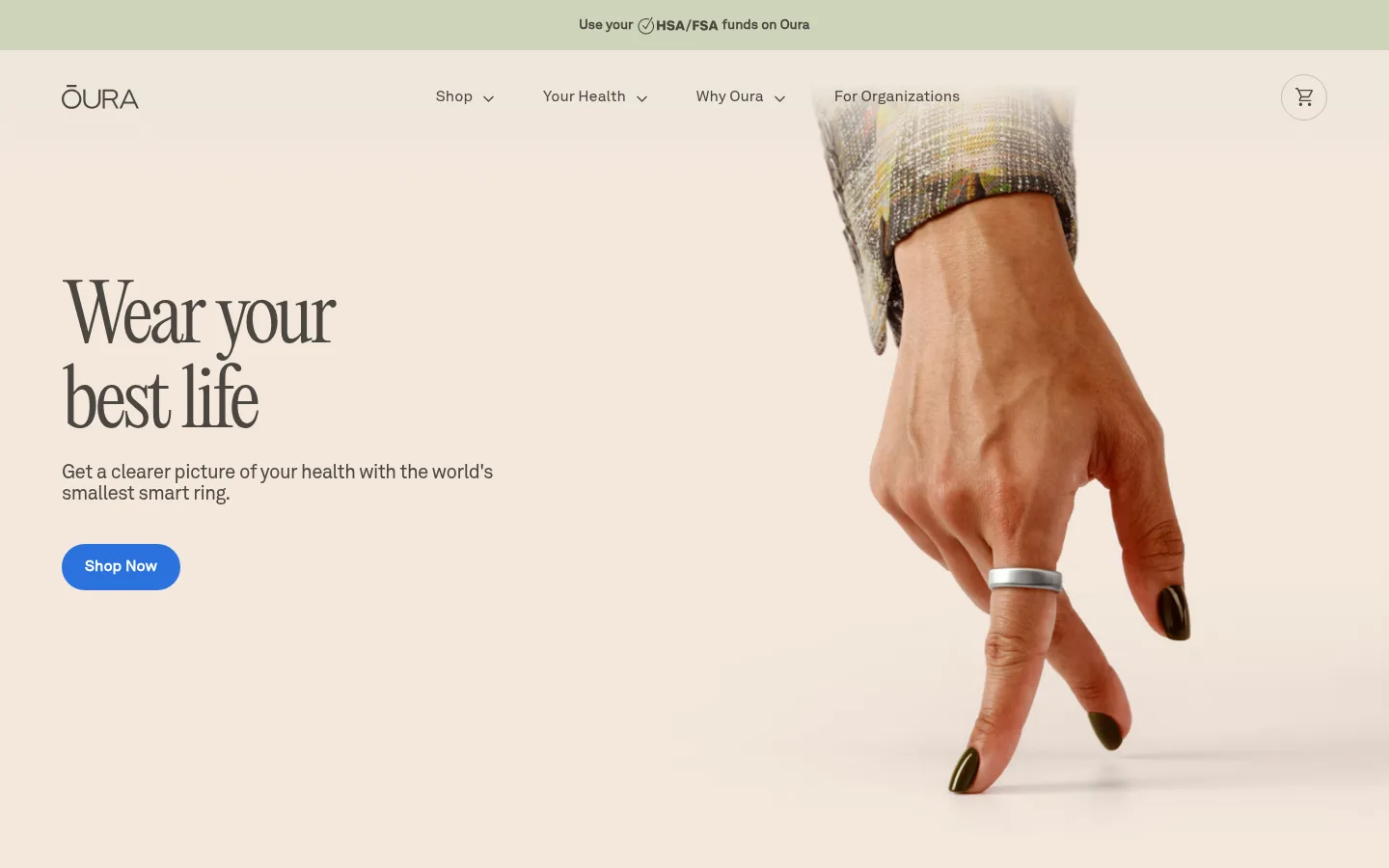
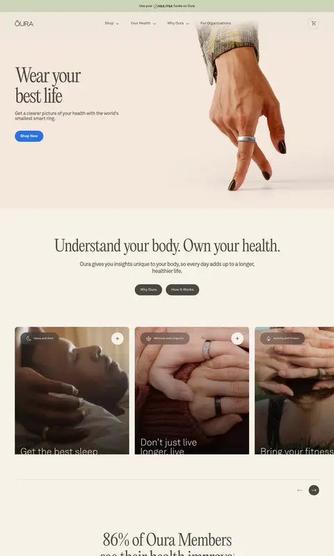
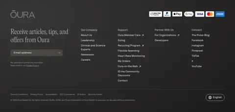
The visual identity is built around a warm ivory canvas (#f7f1e8) and expansive, pale photographic fields, with near-black and charcoal reserved for contrast and a single bright blue (#2a72de) marking the primary Shop Now action. Editorial New gives the hero and key statements a graceful, high-contrast serif voice; AkkuratLL handles navigation, body copy, and controls with restrained clarity. The opening composition sets concise copy on the left against a large human-and-ring photograph on the right. Further down, centered statements and image-led feature cards alternate with app-screen showcases, testimonials, and a dark news band. Sections feel generous rather than tightly packed, with rounded pill buttons and softly rounded cards. Photography is central to the storytelling; interface mockups introduce darker colors but do not redefine the brand palette. The footer becomes denser and darker, creating a clear visual endpoint.
Navigation, body copy, captions, buttons, and most interface text.
Aa 设计
Editorial New
网络字体 · 字重 100 / 400 / 300 · 占比 17%
免费替代:Cormorant Garamond
Display statements and large editorial headings, including the hero title.
角色
示例
字号
字重
行高
字距
特大标题
Large editorial statements and high-impact promotional copy.
Oura
80px
300
1.1
-0.05em
一级标题
Hero headline, set as a prominent serif statement.
Oura
68px
400
1.1
-0.03em
二级标题
Major section headlines, often centered.
Oura
56px
400
1.1
0
三级标题
Feature or content headings in the sans-serif family.
Oura
40px
300
1
0
四级标题
Supporting editorial subheadings.
The quick brown fox 敏捷的狐狸
24px
100
1.25
0
正文
Descriptions, narrative copy, and testimonial text.
The quick brown fox 敏捷的狐狸
16px
400
1.5
0
辅助文字
Small labels, metadata, and supporting notes.
The quick brown fox 敏捷的狐狸
14px
400
1.5
0
按钮
Primary and secondary pill-shaped action labels.
The quick brown fox 敏捷的狐狸
16px
400
1.5
0
导航
Header navigation and footer link groups.
The quick brown fox 敏捷的狐狸
16px
400
1.5
0
链接
Inline links and article or utility destinations.
The quick brown fox 敏捷的狐狸
16px
400
1.5
0
间距与布局
基准单位 8px · 密度:适中
80px版块间距
8px元素间距
40px卡片内边距
1312px内容最大宽度
4px
8px
10px
12px
16px
20px
24px
32px
40px
48px
64px
80px
A wide desktop canvas with a measured maximum content width of 1312px and comfortable section spacing. The hero uses left-aligned copy beside a large right-side photograph; later blocks alternate centered statements, horizontally arranged feature cards, broad product imagery, testimonials, and a split feature. The news section reverses to a dark band with a large lead story and a column of smaller stories. Maintain generous breathing room between major blocks while allowing card rows and footer navigation to become denser.
圆角与层次
按钮 · 50%
输入框 · 12px
卡片 · 8px
图片 · 50%
导航 · 50%
inset · input
The page is mostly flat, with large color fields and imagery establishing hierarchy rather than shadows. Cards have softly rounded corners and restrained separation from their backgrounds. Use fine measured hairlines sparingly for dividers; avoid strong elevation, heavy borders, or layered dashboard-like panels outside the app mockups.
组件
下面的预览按实测的按钮、输入框、徽标、卡片样式重建(字体用替代字体)。
Announcement strip
A narrow muted green-tinted banner above the navigation promotes HSA/FSA use, with compact centered text.
Primary action
The Shop Now control is a bright blue pill with white bold AkkuratLL text; it is the page’s most vivid interface accent.
Secondary pill button
Why Oura and related actions use warm graphite fills with pale text; Read More may invert to a pale fill with dark text.
Lifestyle feature cards
Rounded image cards combine darkened photography, compact category labels, and text overlaid near the lower edge.
Member quote cards
Pale neutral cards hold short health stories, small category labels, and member names or portraits.
News story layout
A dark editorial band pairs one large photographic lead story with a vertical stack of pale article cards.
Newsletter footer
The dark footer combines a serif invitation, email input, payment marks, and grouped company, support, and social links.
Imagery · Use warm, naturalistic photography as the primary storytelling device: close views of people wearing or handling the ring, framed with generous negative space for copy. The opening image is a large, human-centered crop rather than a floating product render. Feature cards use cinematic, darker lifestyle imagery; app screens and phone mockups appear as supporting product evidence. Keep interface imagery distinct from the site’s core palette.
Pair serif display headlines with clean sans-serif interface text.
Let lifestyle photography occupy substantial visual space.
Keep the primary blue accent limited to key actions.
Use rounded pills for prominent action controls.
Create a clear contrast shift for the dark news and footer areas.
✕ 不该做
Do not make blue the dominant page color.
Do not substitute generic gradients for the warm, photographic hero.
Do not crowd the hero with dense supporting copy.
Do not use heavy shadows to separate ordinary cards.
Do not style every section as a dashboard or app interface.
Do not introduce loud borders or overly sharp card geometry.
给 AI 的提示词
想快速出一个同风格的新页面,把这段话连同 DESIGN.md 一起发给 AI。
Build a new Oura-style health landing page with a warm, editorial feel. Use Oat Canvas (#f7f1e8) as the main surface, Gallery White (#ffffff) for clean areas, and True Ink (#000000) or Warm Graphite (#4a4741) for readable text. Reserve Signal Blue (#2a72de) for the primary action. Set large statements in a refined serif similar to Editorial New, and use a restrained sans-serif like AkkuratLL for navigation, body copy, and controls. Compose a spacious, left-copy/right-photography hero, then alternate centered health messaging, rounded lifestyle feature cards, app imagery, testimonials, and a dark news band in Midnight Cocoa (#1c1b1a). Keep borders and shadows minimal. End with a dense, dark footer containing newsletter signup and grouped links.