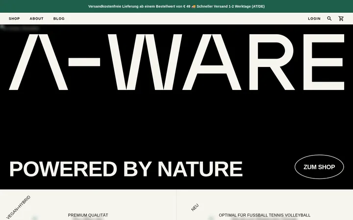
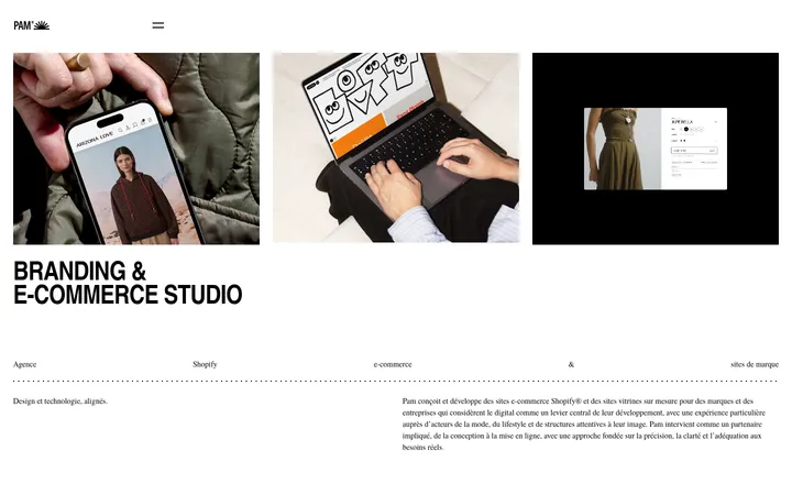
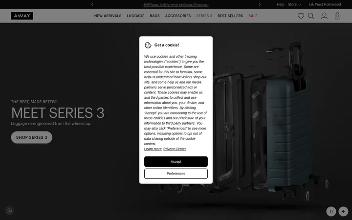
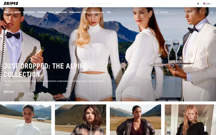
North star · Keep the interface quiet and product-focused so vivid, natural campaign photography supplies the personality.
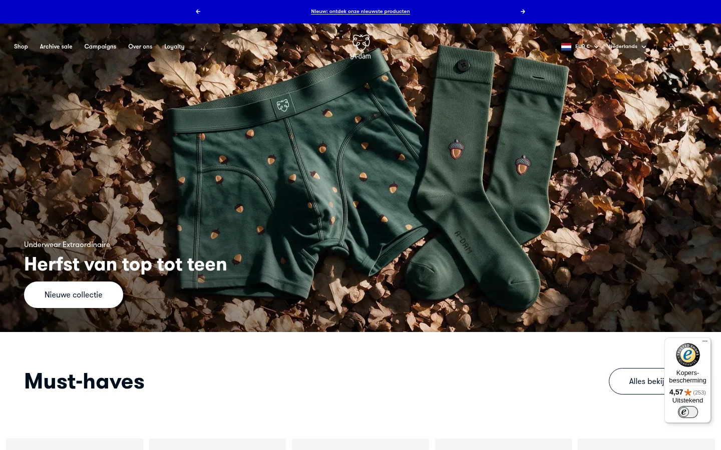
The page uses a predominantly white canvas and deep blue-black text to keep a long, image-rich storefront feeling clean and easy to scan. A saturated blue announcement strip at the top is the most visible interface accent; sale badges use a small, punchy red highlight, while muted gray supports secondary copy and pale gray grounds product cards. GT Walsheim Pro supplies a friendly, geometric sans-serif voice: large bold headings anchor sections, with compact, regular-weight product and supporting text. The layout alternates wide campaign imagery, centered product carousels, category tiles, and editorial image-text splits. Photography carries most of the color, moving from earthy autumn tones and dark forest greens to bright prints and lifestyle scenes. Broad white gaps separate these varied content blocks, while rounded pill CTAs provide a soft counterpoint to mostly square media and card surfaces.
Site-wide navigation, headings, product information, links, and promotional labels.
角色
示例
字号
字重
行高
字距
特大标题
Oversized campaign or editorial display headings.
A-dam
70.5px
700
1
0
一级标题
Primary hero headline.
A-dam
43.5px
700
1
0
二级标题
Major section headings and prominent editorial titles.
A-dam
37.5px
700
1.1
0
三级标题
Subsection and category headings.
A-dam
30px
700
1.4
0
四级标题
Smaller feature or content-block headings.
The quick brown fox 敏捷的狐狸
26px
700
1.1
0
正文
Product details, descriptions, and supporting copy.
The quick brown fox 敏捷的狐狸
13px
400
1.4
0
辅助文字
Compact labels, product metadata, and image captions.
The quick brown fox 敏捷的狐狸
12px
500
normal
0
导航
Header menu and utility navigation labels.
The quick brown fox 敏捷的狐狸
12px
500
normal
0
链接
Product names, editorial links, and supporting actions.
The quick brown fox 敏捷的狐狸
13px
400
1.4
0
间距与布局
基准单位 4px · 密度:适中
48px版块间距
2px元素间距
—卡片内边距
1344px内容最大宽度
2px
4px
6px
8px
10px
12px
14px
16px
24px
32px
40px
48px
72px
The page is a long, comfortable-density storefront, with a measured maximum content width of 1344px and full-bleed campaign media. Product collections use multi-column rows and carousels; category imagery appears in three-column grids, while brand stories use two-column image-and-copy splits. Most sections align to the left or center according to their content, with generous white intervals between them. The measured spacing system uses a 4px base and a 48px section gap; use these measured values as the rhythm rather than adding decorative layout complexity.
圆角与层次
按钮 · 9999px
图片 · 50%
链接 · 9999px
inset · button
The overall treatment is flat, with white space and pale card grounds doing most of the grouping. Borders are restrained and appear mainly as fine footer or control dividers. Buttons use rounded pill silhouettes; the measured button shadow is an inset layered treatment rather than a broad floating shadow. Keep overlays and badges compact, reserving stronger contrast for the cobalt announcement and red sale labels.
组件
下面的预览按实测的按钮、输入框、徽标、卡片样式重建(字体用替代字体)。
Announcement strip
A narrow, saturated #0000c5 band at the top, with centered white linked copy and small directional arrows.
Hero campaign
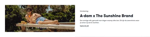
Full-bleed seasonal product photography with white navigation and a lower-left text block; pair a compact eyebrow and bold headline with a white pill CTA.
Product carousel
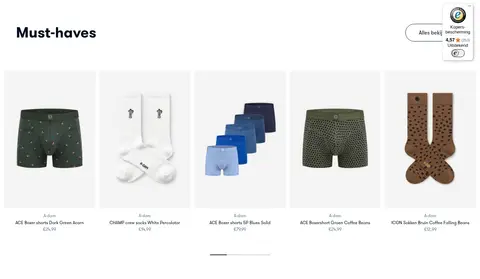
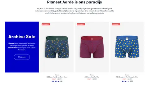
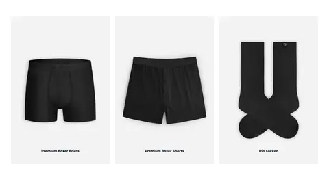
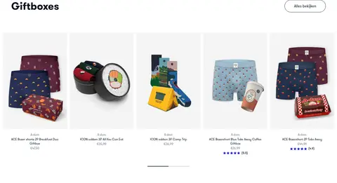
A row of product cutouts on #f4f4f4 grounds, with small product names, prices, ratings, and compact promotional badges.
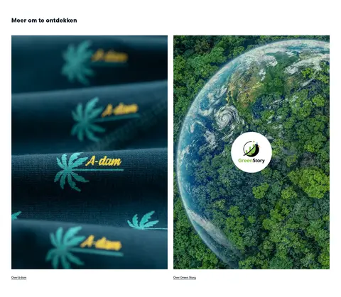
Category image tiles
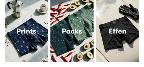
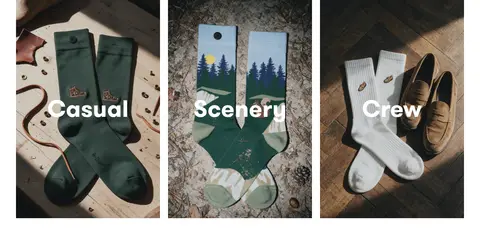
Three photographic tiles with large, bold white category labels over darkened imagery.
Editorial split
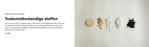
Two-column storytelling block combining lifestyle or material photography with a small eyebrow, bold title, concise copy, and understated link.
Pill control
Rounded, minimal CTA or collection link with a light surface and #000e1f text; keep its treatment clear without heavy outlines.
Footer
Multi-column company, contact, and policy links on a pale gray surface, separated from the payment and locale row by a fine hairline.
Imagery · Photography is the primary expressive layer: full-width seasonal product campaigns, close product images on pale card grounds, and lifestyle/editorial scenes. Images favor natural textures, dark greens, warm earth tones, and visible garment prints. Category tiles crop photography tightly and overlay bold white labels; product cutouts remain clean and centered. The interface itself is mostly flat, so avoid illustration or 3D embellishment that competes with the photography.
Use #0000c5 sparingly for a high-contrast announcement or promotion.
Reserve #fa3f3f for small sale highlights.
Keep headings bold and product copy compact.
Separate content with generous white space.
✕ 不该做
Do not turn every section into a colored band.
Do not use shadows to make cards appear to float.
Do not add gradients absent from the measured visual system.
Do not let promotional accents overpower product photography.
Do not use decorative display fonts or wide tracking.
Do not frame every card with a prominent border.
给 AI 的提示词
想快速出一个同风格的新页面,把这段话连同 DESIGN.md 一起发给 AI。
Build a fashion-commerce page in A-dam’s visual style. Use Gallery White (#ffffff) as the main canvas, Midnight Ink (#000e1f) for headings and links, and Soft Fog (#f4f4f4) for quiet product-card grounds. Reserve Signal Cobalt (#0000c5) for a narrow announcement or one promotional feature, and Sale Coral (#fa3f3f) for small sale badges. Use a GT Walsheim Pro-like geometric sans: bold, natural-case headlines and compact, readable product details. Create a full-width photographic campaign hero, scannable product rows, image-led category tiles, and editorial image-text splits. Keep the overall layout open, with generous white intervals and minimal borders or elevation. Make photography feel tactile and natural; keep controls simple, pill-shaped, and secondary to the merchandise.