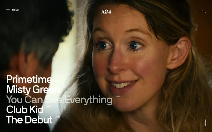
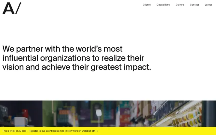
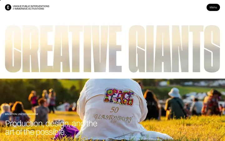
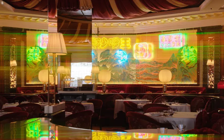
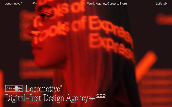
North star · Let one cinematic full-bleed image carry the page, with oversized white editorial type and only essential navigation layered over it.
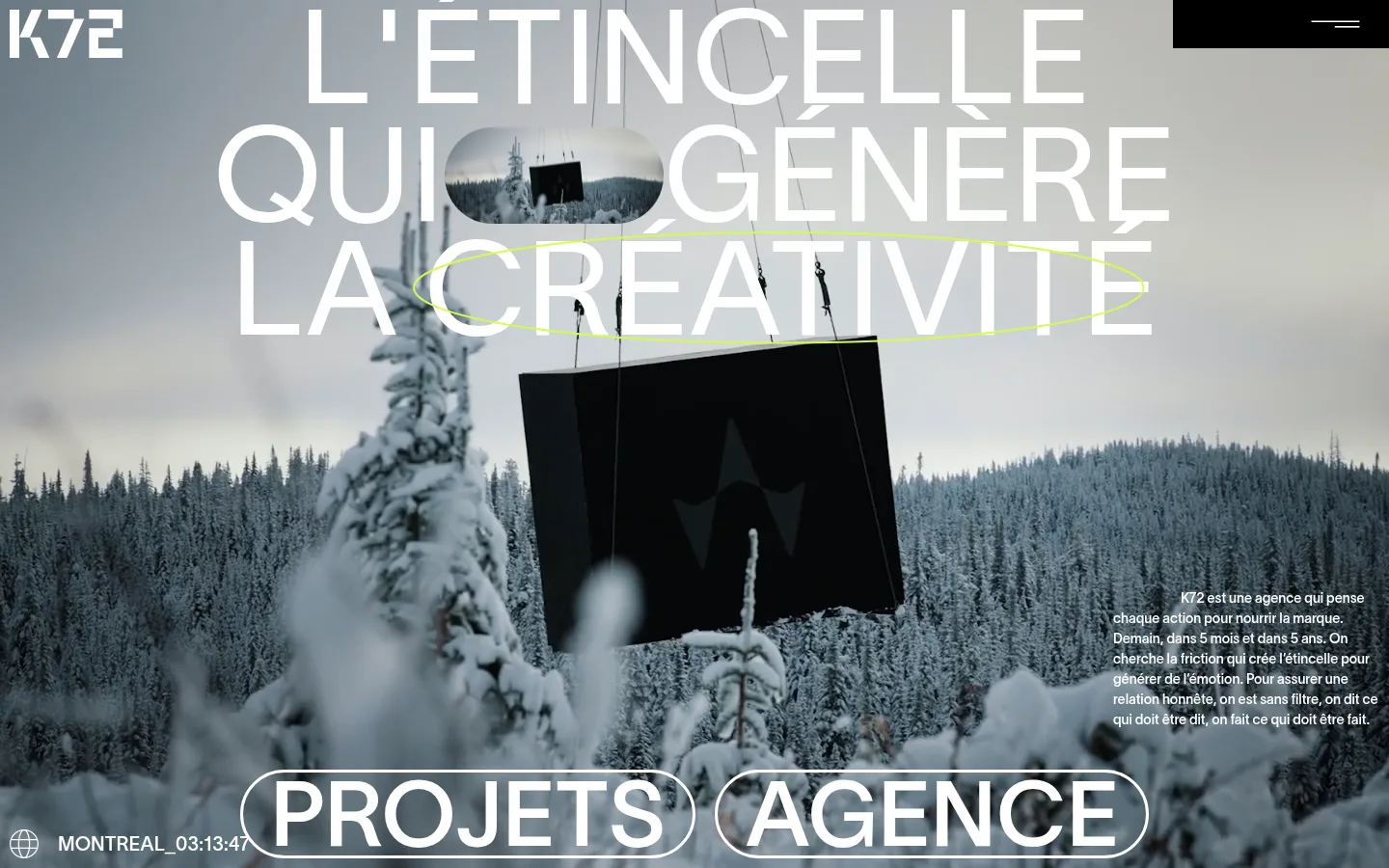
The homepage uses a deliberately spare black-and-white interface over cinematic, full-bleed photography. Pure black (#000000) anchors the navigation block and serves as the measured canvas; white (#ffffff) carries the logo, navigation, headline, body copy, and outlined links. The snowy forest footage introduces cool gray tones, but these belong to the imagery rather than the measured brand palette. A very large, light-weight Lausanne headline dominates the upper portion, set in uppercase and broken into short, emphatic lines. The composition floats this type directly over the image instead of placing it in a card or panel. Small explanatory copy sits low and to the right, while pill-shaped outlined project and agency links span the lower edge. The layout favors a single immersive focal point, generous open image area, and widely separated content rather than conventional columns or stacked cards. A restrained lime ellipse appears in the screenshot as an image or motion detail, not a measured interface color.
配色
点色块复制色值。用途说明来自对页面的实测位置(背景、文字、描边、按钮)与截图判读。
品牌色
中性色
页面底色 · Pure Black主文字 · Gallery White描边 · Gallery White
文字
背景
对比度
WCAG
#ffffff Gallery White
#000000 Pure Black
21:1
AAA
字体
字号阶梯:Custom(比例约 2.139,正文 14px)。示例用免费替代字体渲染,数值为实测。
Aa 设计
Lausanne
网络字体 · 字重 400 / 300 · 占比 100%
免费替代:Inter
Display headlines, navigation, body copy, and oversized project links
角色
示例
字号
字重
行高
字距
特大标题
Oversized uppercase hero statement layered over the full-screen image.
Agence K72
137px
300
0.87
0
一级标题
Primary hero headline, set in large uppercase lines.
Agence K72
93.5px
400
0.7
0
二级标题
Supporting introductory copy and secondary text.
The quick brown fox 敏捷的狐狸
20px
400
1.5
0
正文
Compact agency description over the lower-right image area.
The quick brown fox 敏捷的狐狸
14px
400
1.5
0
导航
Menu label and small project or agency navigation.
The quick brown fox 敏捷的狐狸
16px
400
1.5
0
链接
Large uppercase outlined project and agency entry links.
Agence K72
93.5px
400
0.7
0
间距与布局
基准单位 1px · 密度:宽松
144px版块间距
—元素间距
—卡片内边距
1132px内容最大宽度
5px
10px
21px
25px
27px
28px
40px
144px
A single full-bleed hero fills the initial viewport, with interface elements layered directly over the image. The measured page maximum width is 1132px, though the visual composition extends edge to edge. Position the logo at the top left and a compact black menu panel at the top right. Center the giant headline across the upper area, place short supporting copy at the lower right, and anchor the outlined links along the bottom. Spacious image areas do the work of section rhythm; measured density is spacious.
圆角与层次
链接 · 9999px
没有测到阴影:页面是扁平的,层次靠底色和描边区分。
The interface is largely flat, with no measured shadows or gradients. Separation comes from contrast against the photography, a solid black menu panel, and crisp white outlines around large pill links. Keep layering direct and editorial rather than introducing cards, soft shadows, or decorative surface effects.
组件
下面的预览按实测的按钮、输入框、徽标、卡片样式重建(字体用替代字体)。
Wordmark
Compact white K72 mark at the upper-left edge, placed directly over the hero image.
Menu control
White MENU label with a minimal line icon, housed in a black top-right block.
Hero headline
Very large uppercase Lausanne text, light in weight and arranged in short lines over the image.
Intro copy
Small white agency description aligned near the lower-right edge of the hero.
Outlined navigation links
Oversized uppercase PROJETS and AGENCE links, white text inside white outlined pill shapes.
Location and time
Small globe icon followed by a city and local-time label along the bottom-left edge.
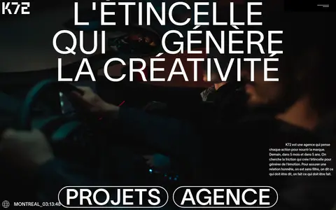
Imagery · Use cinematic, full-bleed photographic or video scenes as the dominant page surface. The screenshot shows a snowy conifer landscape and suspended dark signage, while the scaled page image shows a different dark, atmospheric scene; treat these as changeable project footage, not fixed brand assets. Preserve natural cool tones and contrast, and layer white typography over legible portions of the frame.
Use cinematic photography as the hero’s dominant surface.
Set the main statement in oversized uppercase Lausanne-style sans serif.
Keep interface text and borders pure white.
Reserve black for the measured canvas and menu panel.
Overlay content directly on imagery where contrast allows.
Use outlined pill links for major project navigation.
✕ 不该做
Do not add unmeasured brand colors to interface elements.
Do not place the hero headline inside a card.
Do not dilute the composition with many small panels.
Do not use heavy shadows or gradient treatments.
Do not make supporting copy compete with the headline.
Do not mistake image colors for the brand palette.
给 AI 的提示词
想快速出一个同风格的新页面,把这段话连同 DESIGN.md 一起发给 AI。
Build a new agency page in K72’s cinematic editorial style. Use a full-bleed photographic or video hero and keep the interface palette to Pure Black (#000000) and Gallery White (#ffffff); let other colors come only from the image. Layer a very large, light-weight uppercase sans-serif headline directly over the scene, with compact regular-weight navigation and supporting copy. Place the logo at the upper left, a black-backed menu control at the upper right, concise copy low on one side, and prominent white outlined pill links near the bottom. Preserve generous open image space and strong contrast. Keep surfaces flat: no card grid, soft shadow, or invented accent color. Treat any scene-specific color or graphic detail as part of the media, not the interface system.