North star · Keep the page nearly black and spacious, letting a single bold white statement and compact floating navigation carry the identity.
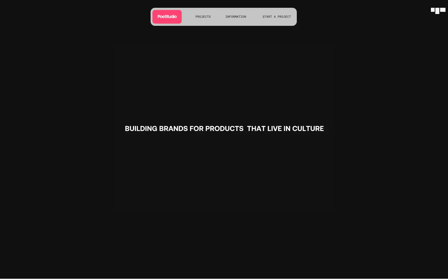
The visual strategy relies on restraint: a nearly black full-page canvas establishes a quiet, immersive setting, with white reserved for the central statement, navigation marks, and small utility icon. The measured palette is minimal; the vivid pink visible in the studio wordmark is a localized navigation detail, not a basis for expanding the site palette. Typography carries the message. The hero statement is bold, uppercase, tightly tracked, and centered as a single line, while navigation labels use a much smaller, utilitarian treatment. A pale rounded navigation capsule floats near the top center and contrasts sharply with the dark field; its pink brand tab supplies the only vivid accent in view. The composition leaves extensive open space around both navigation and headline. No prominent photography or decorative illustration appears in the supplied viewport, so the page reads as an intentionally sparse typographic portfolio rather than a media-heavy landing page.
配色
点色块复制色值。用途说明来自对页面的实测位置(背景、文字、描边、按钮)与截图判读。
品牌色
表层色
中性色
页面底色 · Studio Black表层 · Gallery White主文字 · Gallery White次要文字 · Studio Black
Bold hero statement, prominent navigation link, and small bold labels.
Aa 设计
custom_152369
网络字体 · 字重 400 · 占比 37%
免费替代:Inter
Regular-weight supporting text and compact navigation labels.
角色
示例
字号
字重
行高
字距
正文
Central uppercase brand statement in the hero.
Aaron Poe & Co.
42px
700
1.02
-0.029em
辅助文字
Small utility labels and compact navigation copy.
The quick brown fox 敏捷的狐狸
10px
700
3.2
-0.05em
链接
Prominent navigation link styling.
Aaron Poe & Co.
42px
700
1.02
-0.029em
间距与布局
基准单位 1px · 密度:适中
—版块间距
—元素间距
—卡片内边距
—内容最大宽度
1px
Use a single expansive dark canvas with sparse content and no visible column grid. Keep the navigation compact, centered near the top, and visually detached from the hero. Place the hero statement on the horizontal centerline, with generous empty space above, below, and on both sides. The screenshot suggests a comfortable rather than dense composition; avoid adding unsupported card groups or section bands. Keep the top-right utility mark separate from the main navigation.
圆角与层次
没有测到阴影:页面是扁平的,层次靠底色和描边区分。
The page is predominantly flat, with no measured shadows or decorative borders. The navigation capsule is the main layered element, defined by its pale surface and rounded silhouette against the dark canvas. Keep separation tonal and simple; avoid adding cards, gradients, or simulated depth.
组件
下面的预览按实测的按钮、输入框、徽标、卡片样式重建(字体用替代字体)。
Floating navigation capsule
A compact pale rounded bar near the top center, with a vivid pink studio tab and small dark navigation labels.
Hero statement
A single centered line of bold uppercase white copy, using the measured 700-weight display family and tight tracking.
Studio wordmark
The PoeStudio mark appears as white lettering on a vivid pink tab within the navigation; treat the pink as screenshot-specific rather than a measured palette token.
Utility mark
A small white geometric mark sits independently near the upper-right edge of the dark canvas.
Imagery · No prominent photography, illustration, 3D, or video is visible in the supplied viewport. The visual identity comes from typography, the studio wordmark, and a small geometric utility mark. Preserve the dark uninterrupted field rather than introducing decorative imagery; if later content includes portfolio work, let that work remain distinct from this sparse opening composition.
Set the main statement in bold white uppercase type.
Keep the hero copy centered and visually isolated.
Place navigation in a compact pale capsule near the top.
Use pink only as a localized wordmark detail.
Preserve broad areas of uninterrupted negative space.
✕ 不该做
Do not fill the canvas with extra content.
Do not add gradients or shadows.
Do not turn the hero into a multi-line editorial block without evidence.
Do not introduce a large bright accent palette.
Do not add card grids to the opening viewport.
Do not make navigation compete with the hero statement.
给 AI 的提示词
想快速出一个同风格的新页面,把这段话连同 DESIGN.md 一起发给 AI。
Build a new page in the Aaron Poe & Co. visual style. Use Studio Black (#101010) for a nearly uninterrupted full-page canvas and Gallery White (#ffffff) for the primary statement and utility marks. Keep the layout sparse: a compact, pale rounded navigation capsule near the top, a separate small mark at upper right, and one bold uppercase statement centered in the open field. Use a heavy, tightly tracked sans-serif display face, with small restrained labels in regular sans-serif. The screenshot’s pink studio tab is a localized identity detail, not a measured palette color; do not spread it across the page. Avoid gradients, shadows, decorative borders, dense grids, and unnecessary imagery. Prioritize strong contrast, generous negative space, and clear separation between navigation and headline.