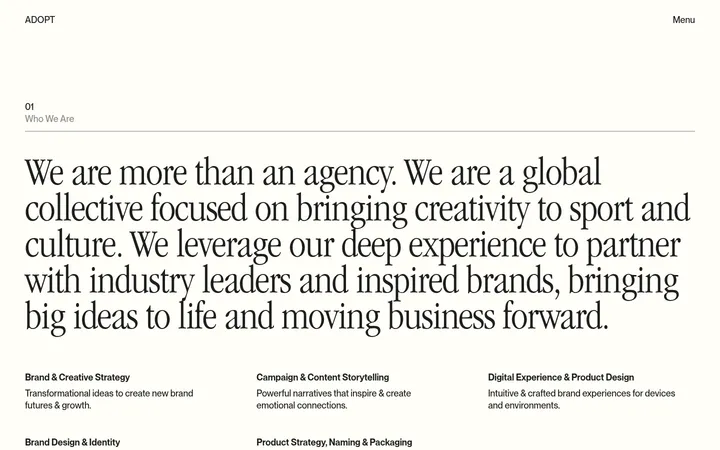
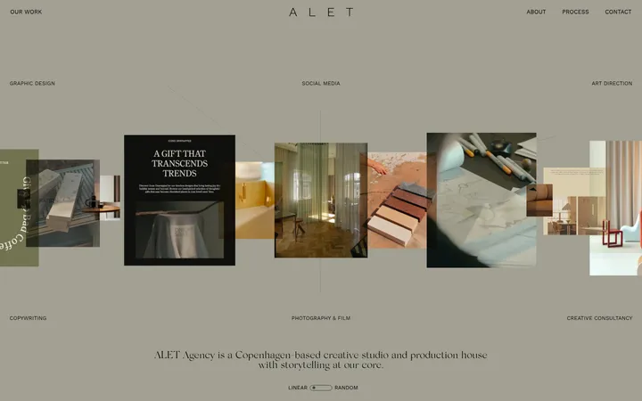
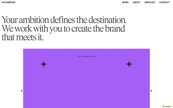
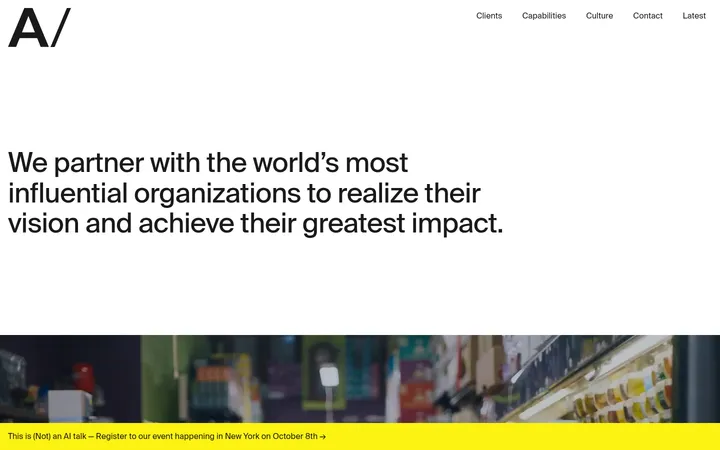
North star · Keep the interface quiet and editorial so that each project’s imagery, not decoration, supplies the page’s visual drama.
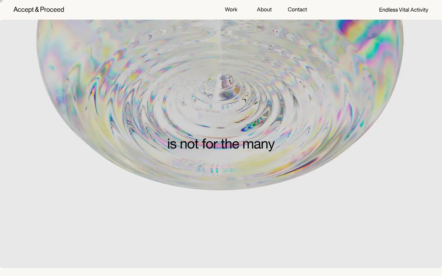
The visual strategy balances a quiet, warm-neutral interface with highly expressive portfolio media. The canvas is #f9f7f3, with white and pale gray-beige section surfaces establishing subtle changes between the project feed, collaboration catalogue, and footer. Black typography carries nearly all interface contrast; muted gray is reserved for secondary details and fine separators. Messina Sans is used throughout the navigation, body copy, labels, and controls, while a distinctive display face appears in the hero. Type is regular-weight and largely unembellished, allowing scale and placement to create hierarchy. The opening viewport is dominated by a wide, pale video composition with a short centered statement. Below, projects use an intentionally varied, asymmetrical image rhythm rather than uniform cards. A white catalogue section switches to aligned rows and pill-shaped Listen controls; the closing contact area returns to a warm neutral band. Rounded media and small capsule controls soften an otherwise flat, spacious layout.
Navigation, body copy, section headings, captions, links, and controls
角色
示例
字号
字重
行高
字距
一级标题
Opening hero statement over the full-width media.
Accept & Proceed
33.5px
400
1
0
二级标题
Major catalogue or section headings.
The quick brown fox 敏捷的狐狸
24px
400
1.33
-0.01em
三级标题
Project and collaboration titles.
The quick brown fox 敏捷的狐狸
20px
400
1.4
-0.01em
正文
Project descriptions, editorial copy, and footer text.
The quick brown fox 敏捷的狐狸
14px
400
1.71
-0.01em
辅助文字
Small metadata, labels, and secondary details.
The quick brown fox 敏捷的狐狸
10px
400
1.6
-0.01em
按钮
Read Story, Listen, and form submission controls.
The quick brown fox 敏捷的狐狸
17px
400
1
0
导航
Primary header navigation links.
The quick brown fox 敏捷的狐狸
17px
400
1
-0.01em
链接
Inline project, social, and contact links.
The quick brown fox 敏捷的狐狸
14px
400
1.71
-0.01em
间距与布局
基准单位 4px · 密度:适中
40px版块间距
24px元素间距
—卡片内边距
1352px内容最大宽度
3px
4px
8px
10px
12px
14px
15px
16px
18px
20px
21px
24px
30px
32px
33px
40px
A spacious editorial canvas uses a measured maximum page width of 1352px. The header aligns the wordmark left, primary links across the center, and the collaboration destination toward the right. Project content shifts between paired thumbnails, full-width media, and a centered feature image, creating asymmetry without losing clear alignment. The catalogue uses a three-column row structure, while the closing contact band divides social, contact, and brand narrative into columns. Section changes are calm and legible rather than card-heavy.
圆角与层次
按钮 · 9999px
输入框 · 9999px
图片 · 8px
导航 · 9999px
链接 · 8px
没有测到阴影:页面是扁平的,层次靠底色和描边区分。
The page is predominantly flat, with no measured shadow system. Sections are differentiated through warm canvas, white, and pale gray-beige backgrounds rather than raised cards. Fine gray separators define catalogue rows, while rounded media and capsule controls provide the limited dimensional cues. Avoid adding ornamental borders or layered UI chrome.
组件
下面的预览按实测的按钮、输入框、徽标、卡片样式重建(字体用替代字体)。
Header navigation
A quiet horizontal header with a left-aligned wordmark and widely distributed Work, About, Contact, and Endless Vital Activity links in black.
Project feature
Portfolio entries combine prominent rounded imagery with concise title and supporting description; vary image scale and alignment instead of enclosing every project in a card.
Story control
Read Story uses black text on a pale #ecebe7 capsule with regular Messina Sans lettering.
Collaboration catalogue row
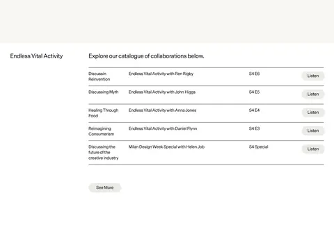
White-section rows align topic, episode title, season marker, and a right-side Listen capsule, with subtle gray separators.
Listen control
A compact pill-shaped #ecebe7 control labeled Listen, set in regular black sans-serif text.
Contact and newsletter footer
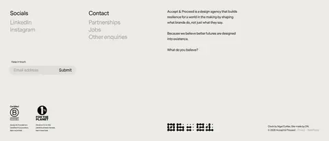
A pale footer band groups social links, contact links, brand copy, and an email field with a Submit control.
Imagery · Large project imagery and video are the page’s main expressive layer, ranging from an abstract iridescent hero to documentary-style installations, brand work, and technology exhibits. Media appears in both broad, nearly full-width placements and smaller paired or centered frames. The muted interface palette does not constrain image color; vivid hues belong to the work itself and should not be mistaken for interface accents. Media corners are softly rounded.
Keep interface text black and typography regular-weight.
Let project media carry the strongest colors and contrast.
Vary project image scale and placement for an editorial rhythm.
Use white as a distinct, clean catalogue-section surface.
Keep controls simple, pale, and capsule-shaped.
Separate catalogue rows with restrained gray hairlines.
✕ 不该做
Do not add saturated interface accent colors.
Do not turn every project into a uniform boxed card.
Do not add prominent shadows or heavy borders.
Do not force navigation or headings into uppercase.
Do not mistake colors inside portfolio media for brand UI colors.
Do not crowd the page with dense decorative elements.
给 AI 的提示词
想快速出一个同风格的新页面,把这段话连同 DESIGN.md 一起发给 AI。
Build a new creative-agency page in an understated editorial style. Use Warm Canvas (#f9f7f3) for the main background, Studio Ink (#000000) for navigation and copy, Gallery White (#ffffff) for a clean content band, and Soft Pebble (#ecebe7) for quiet capsule controls. Use a clean regular-weight sans-serif comparable to Messina Sans, with restrained hierarchy and concise copy. Place a simple horizontal navigation above a strong, immersive hero image or video. Follow it with an asymmetrical portfolio feed that mixes paired, wide, and centered media placements. Reserve white space and use Quiet Gray (#a2a1a1) only for muted details and subtle separators. Keep surfaces flat, media softly rounded, and interface decoration minimal. Finish with a warm neutral contact area organized into clear columns.