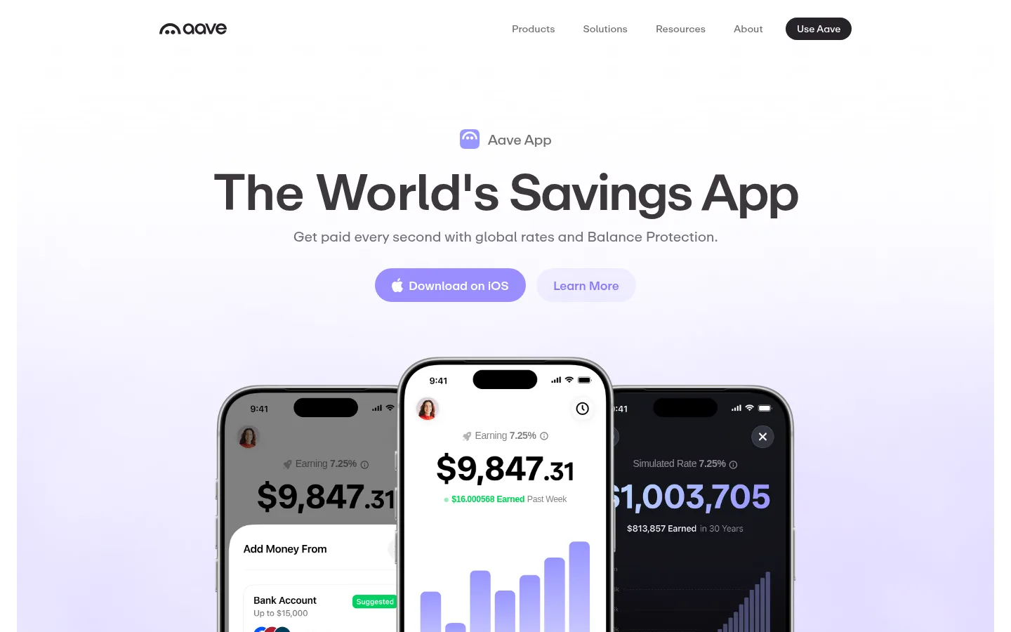
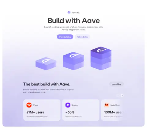
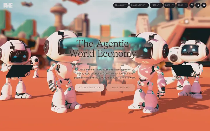
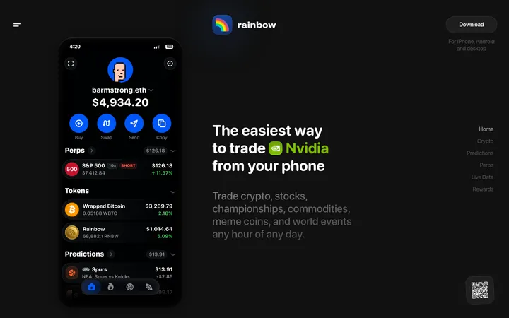
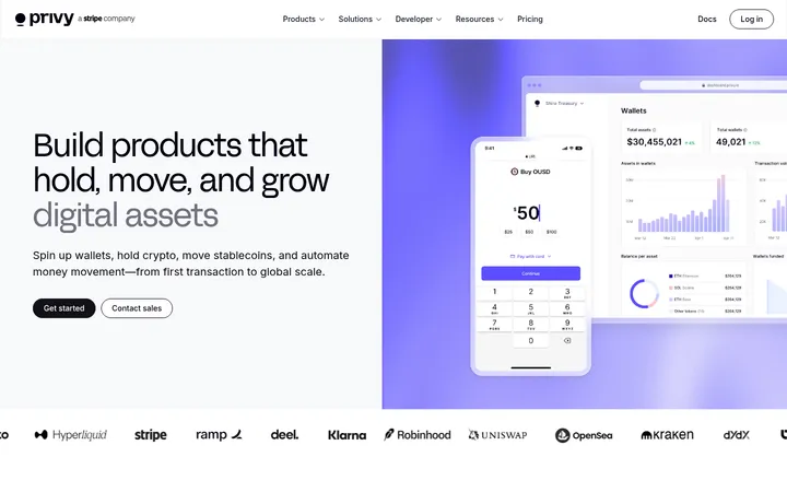
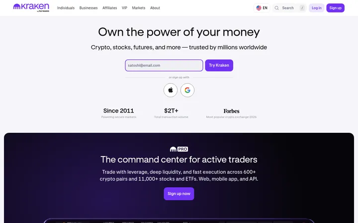
Aave以明亮宽松的首页展示链上储蓄与借贷,并用深色产品展示区形成鲜明对比。克制的字体、薰衣草色渐变与应用界面,让复杂的金融工具显得亲切而精致。
North star · Pair calm, spacious white layouts with precise lavender accents and one purposeful dark product-showcase band.
The page uses white as its main canvas, with pale lavender gradients softening large media sections and a near-black band giving the Aave Pro showcase a clear visual pause. Lavender marks primary actions, selected figures, and highlighted words; gray text keeps supporting copy quiet, while green appears sparingly in financial interface details. Aave Repro is the defining typeface: large, tightly tracked headlines sit above understated body copy and compact navigation. The composition favors centered introductions, broad breathing room, and rounded CTA pills, then shifts into denser layouts for product interfaces, cards, and footer links. Realistic app screens and product-led graphics provide the visual focus rather than decorative photography. Fine borders and subtle shadows distinguish cards without making the mostly flat page feel heavy.
配色 点色块复制色值。用途说明来自对页面的实测位置(背景、文字、描边、按钮)与截图判读。
品牌色
Lavender Signal
#998eff
Primary download CTA, highlighted headline accents, badges, and recurring lavender gradient.
强调色
Lavender Mist
#e5e5ff
Pale end of the measured lavender gradient used to soften hero and feature media backgrounds.
Violet Link
#8777ff
Learn More link treatment and secondary lavender emphasis.
表层色
Obsidian
#0f0f10
Full-width dark Aave Pro showcase band, creating the page’s strongest contrast.
Night Panel
#1b1a1d
Dark inset product cards and interface surfaces within the Aave Pro section.
Ink Plum
#262228
Dark rounded buttons and occasional dark interface details.
中性色
Gallery White
#ffffff
Primary page canvas and bright section background; also the contrast color on dark surfaces and CTAs.
Warm Graphite
#636161
Default paragraph and supporting text on the light canvas.
Porcelain Line
#f4f4f4
Thin card and component outlines on white sections.
Muted Slate
#736f73
Navigation and secondary interface text where a softer gray is needed.
Silver Hush
#bebcbe
Muted descriptions, footer copy, and low-emphasis supporting text.
Deep Umber
#221d1d
Measured dark text on cards, navigation, and form elements.
Stone Gray
#8f8e8e
Secondary measured text for lower-emphasis interface copy.
Charcoal Edge
#2e2e2f
Outline on dark token-market cards inside the product showcase.
Smoky Plum
#3d383d
Low-emphasis text and headings in dark interface contexts.
功能色
Yield Green
#00d452
Positive earnings and green financial indicators inside app mockups; not a dominant page color.
文字 背景 对比度 WCAG #636161 Warm Graphite#ffffff Gallery White6.15:1 AA #636161 Warm Graphite#0f0f10 Obsidian3.11:1 AA-large #636161 Warm Graphite#1b1a1d Night Panel2.82:1 不达标 #bebcbe Silver Hush#ffffff Gallery White1.89:1 不达标 #bebcbe Silver Hush#0f0f10 Obsidian10.15:1 AAA #bebcbe Silver Hush#1b1a1d Night Panel9.18:1 AAA
字体 字号阶梯:Perfect Fourth(比例约 1.351,正文 16px)。示例用免费替代字体渲染,数值为实测。
Aa 设计
Aave Repro 网络字体 · 字重 400 / 450 / 500 / 550 · 占比 96%
免费替代:Inter
Primary site typeface for headings, navigation, body copy, buttons, and links.
Aa 设计
-apple-system 系统字体 · 字重 600 / 500 · 占比 3%
免费替代:Inter
Small system-font fallback for heavier interface text.
Aa 设计
Inter Variable 网络字体 · 字重 450 · 占比 2%
免费替代:Inter
Minor app-interface or fallback text usage.
角色 示例 字号 字重 行高 字距 特大标题 Largest hero headline and major campaign statements.
Aave
72px 550 1.1 -0.02em 一级标题 Primary section heading, including the build and trust sections.
Aave
40px 500 1.2 -0.03em 二级标题 Secondary feature and subsection headings.
Aave
32px 500 1.35 -0.02em 三级标题 Tertiary feature headings and prominent card titles.
The quick brown fox 敏捷的狐狸
24px 450 1.35 -0.03em 四级标题 Compact card titles and smaller section labels.
The quick brown fox 敏捷的狐狸
20px 400 1.36 -0.01em 正文 Explanatory paragraphs, descriptions, and FAQ answers.
The quick brown fox 敏捷的狐狸
16px 400 1.5 -0.011em 辅助文字 Small labels, metric notes, and understated helper text.
The quick brown fox 敏捷的狐狸
13px 400 1.36 -0.01em 按钮 Compact CTA labels such as Use Aave and Notify Me.
The quick brown fox 敏捷的狐狸
14px 450 normal 0 导航 Header and footer navigation labels.
The quick brown fox 敏捷的狐狸
14px 450 1.25 0 链接 Standalone Learn More and other emphasized text links.
The quick brown fox 敏捷的狐狸
17px 500 normal -0.01em
间距与布局 基准单位 8px · 密度:适中
48px 版块间距
8px 元素间距
32px 卡片内边距
986px 内容最大宽度
4px
5px
8px
10px
12px
16px
20px
24px
32px
48px
72px
Use a centered, comfortable-width content frame, measured at a 986px page maximum, with generous vertical separation between sections. The hero aligns its label, headline, copy, and paired CTAs centrally above full-bleed phone imagery. The metrics and signup content remain restrained and centered; the dark showcase expands into a broad, rounded band with dense product content. Later sections alternate centered feature introductions with multi-column cards, FAQs, and a multi-column footer. The overall density is relaxed, with smaller gaps reserved for related controls.
圆角与层次 hairline · link, card
hairline · button, section, card
The page is mostly flat: white space, color bands, and fine outlines do most of the work. Cards use measured light borders and subtle hairline shadows rather than pronounced depth. Rounded cards and pill controls separate interaction surfaces; the dark showcase relies on contrast and embedded interface layers, not heavy shadows.
组件 下面的预览按实测的按钮、输入框、徽标、卡片样式重建(字体用替代字体)。
Primary CTA Lavender pill with white Aave Repro text; used for the hero download action and visually prominent calls to action.
Secondary link pill Pale lavender background with violet text, rounded into a pill for Learn More actions.
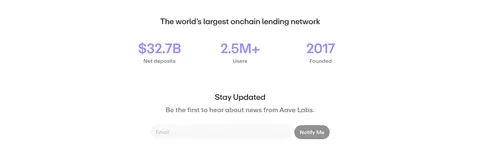
Notify form Email input and dark Notify Me pill grouped in a light, centered newsletter area.
Metric card White card with a fine #f4f4f4 border and rounded corners; pairs a prominent figure with a short caption.
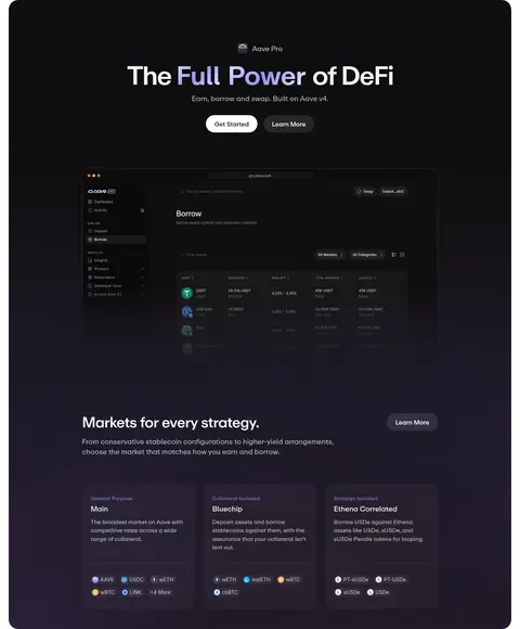
Dark showcase Large #0f0f10 section containing a product UI preview, light text, and darker token-market cards.
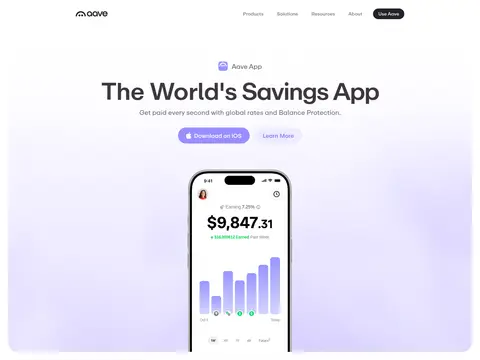
Hero app mockup Layered phone-screen imagery centered beneath the hero copy, set against a subtle lavender gradient.
FAQ row Plain, spacious question rows with a compact expand control and minimal visual framing.
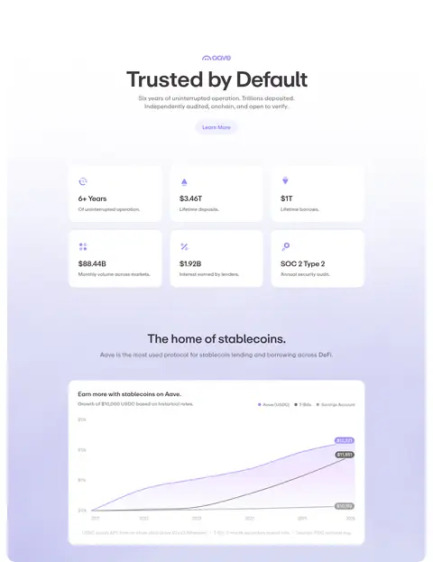
Imagery · Lead with large, realistic mobile app mockups against a pale lavender-tinted field, centered and overlapping in the hero. The dark showcase uses an embedded product-interface view and compact market cards. Later product imagery becomes dimensional and softly lit, while trust and savings sections use metric cards and a clean chart. The screenshots show no dominant photography or video; keep imagery product-focused and contained within broad section bands.
页面版块 共 8 个版块,按页面从上到下排列,每个都标了类型、布局和交互套路。
该做与不该做 ✓ 该做 Keep the primary canvas white and the page visually calm. Use lavender for primary actions and focused highlights. Center hero introductions above product imagery. Reserve near-black for the dedicated product showcase. Use Aave Repro-style rounded sans lettering and tight headlines. Separate cards with subtle borders rather than heavy shadows. ✕ 不该做 Do not make the whole page dark. Do not use saturated colors as large background fields. Do not crowd the hero with extra navigation or copy. Do not replace product imagery with generic lifestyle photography. Do not make every section a card grid. Do not overuse green outside financial status details. 给 AI 的提示词 想快速出一个同风格的新页面,把这段话连同 DESIGN.md 一起发给 AI。
复制 Build a new Aave-style page with a bright white canvas (#ffffff), spacious centered introductions, and product-first imagery. Use Gallery White for the main surface, Warm Graphite (#636161) for supporting copy, and Lavender Signal (#998eff) for primary CTAs and selected emphasis; pair secondary actions with Violet Link (#8777ff). Set headings in an Aave Repro-like sans with compact, tightly tracked display type and restrained body copy. Use broad pale lavender gradients behind app imagery, rounded pill buttons, and fine Porcelain Line (#f4f4f4) card borders. Create one deliberate dark product band in Obsidian (#0f0f10), using Night Panel (#1b1a1d) for inset interface surfaces. Keep layouts relaxed and legible, with product screens, metrics, and clear CTA hierarchy.
DESIGN.md Tailwind v4 CSS 变量 Design Tokens
---
title: "Aave design system"
variant: extended
source: https://aave.com/
captured_at: 2026-10-12
theme: light
industry: crypto
generator: Design DNA (https://four.wiralomi.com/style/aave-com)
ai_generated: true
ai_label: "本文件由 AI 辅助生成:数值取自公开网页的实测样式,命名、用途说明与建议为模型解读。商标归原所有者。 / AI-assisted content"
---
# Aave · Design System
> Quiet finance, illuminated by lavender.
**Theme:** light · **Industry:** crypto · **Source:** https://aave.com/ · **Captured:** 2026-10-12 (1440×900 desktop)
_AI-assisted content: values are measured from the public page at capture time; names, roles and guidance are model-written interpretations. Trademarks belong to their owners._
Aave presents onchain saving and lending through a bright, spacious homepage balanced by a dramatic dark product showcase. Restrained typography, lavender gradients, and app imagery make complex financial tools feel approachable and polished.
## North star
Pair calm, spacious white layouts with precise lavender accents and one purposeful dark product-showcase band.
## Overview
The page uses white as its main canvas, with pale lavender gradients softening large media sections and a near-black band giving the Aave Pro showcase a clear visual pause. Lavender marks primary actions, selected figures, and highlighted words; gray text keeps supporting copy quiet, while green appears sparingly in financial interface details. Aave Repro is the defining typeface: large, tightly tracked headlines sit above understated body copy and compact navigation. The composition favors centered introductions, broad breathing room, and rounded CTA pills, then shifts into denser layouts for product interfaces, cards, and footer links. Realistic app screens and product-led graphics provide the visual focus rather than decorative photography. Fine borders and subtle shadows distinguish cards without making the mostly flat page feel heavy.
## Colors
| Name | Hex | Token | Group | Role |
|---|---|---|---|---|
| Gallery White | ` | `--color-gallery-white` | neutral | Primary page canvas and bright section background; also the contrast color on dark surfaces and CTAs. |
| Obsidian | ` | `--color-obsidian` | surface | Full-width dark Aave Pro showcase band, creating the page’s strongest contrast. |
| Warm Graphite | ` | `--color-warm-graphite` | neutral | Default paragraph and supporting text on the light canvas. |
| Lavender Signal | ` | `--color-lavender-signal` | brand | Primary download CTA, highlighted headline accents, badges, and recurring lavender gradient. |
| Porcelain Line | ` | `--color-porcelain-line` | neutral | Thin card and component outlines on white sections. |
| Muted Slate | ` | `--color-muted-slate` | neutral | Navigation and secondary interface text where a softer gray is needed. |
| Silver Hush | ` | `--color-silver-hush` | neutral | Muted descriptions, footer copy, and low-emphasis supporting text. |
| Lavender Mist | ` | `--color-lavender-mist` | accent | Pale end of the measured lavender gradient used to soften hero and feature media backgrounds. |
| Violet Link | ` | `--color-violet-link` | accent | Learn More link treatment and secondary lavender emphasis. |
| Night Panel | ` | `--color-night-panel` | surface | Dark inset product cards and interface surfaces within the Aave Pro section. |
| Ink Plum | ` | `--color-ink-plum` | surface | Dark rounded buttons and occasional dark interface details. |
| Deep Umber | ` | `--color-deep-umber` | neutral | Measured dark text on cards, navigation, and form elements. |
| Stone Gray | ` | `--color-stone-gray` | neutral | Secondary measured text for lower-emphasis interface copy. |
| Charcoal Edge | ` | `--color-charcoal-edge` | neutral | Outline on dark token-market cards inside the product showcase. |
| Smoky Plum | ` | `--color-smoky-plum` | neutral | Low-emphasis text and headings in dark interface contexts. |
| Yield Green | ` | `--color-yield-green` | semantic | Positive earnings and green financial indicators inside app mockups; not a dominant page color. |
### Semantic aliases
`--color-canvas` → ` (Gallery White) · `--color-surface` → ` (Obsidian) · `--color-surface-2` → ` (Night Panel) · `--color-text` → ` (Warm Graphite) · `--color-text-muted` → ` (Silver Hush) · `--color-text-subtle` → ` (Gallery White) · `--color-border` → ` (Porcelain Line) · `--color-accent` → ` (Lavender Signal) · `--color-accent-2` → ` (Violet Link) · `--color-accent-3` → ` (Yield Green) · `--color-on-accent` → ` (Gallery White)
### Contrast (WCAG 2.x)
| Text | Background | Ratio | Level |
|---|---|---|---|
| ` | ` | 6.15:1 | AA |
| ` | ` | 3.11:1 | AA-large |
| ` | ` | 2.82:1 | fail |
| ` | ` | 1.89:1 | fail |
| ` | ` | 10.15:1 | AAA |
| ` | ` | 9.18:1 | AAA |
| ` | ` | 19.16:1 | AAA |
| ` | ` | 17.33:1 | AAA |
| ` | ` | 2.74:1 | fail |
| ` | ` | 7:1 | AAA |
### Gradients
- `linear-gradient(134deg, color(display-p3 0.898039 0.898039 1) 0px, rgb(147, 145, 254) 49.47%, color(display-p3 0.898039 0.898039 1) 91.25%)`
- `linear-gradient(0deg, rgba(239, 237, 255, 0.31) 9.2%, rgba(202, 140, 255, 0.31) 55.91%, rgba(153, 141, 255, 0.31)), none`
## Typography
| Family | Token | Source | Weights | Role | Free substitute |
|---|---|---|---|---|---|
| Aave Repro | `--font-body` | webfont | 400, 450, 500, 550 | Primary site typeface for headings, navigation, body copy, buttons, and links. | Inter |
| -apple-system | `--font-apple-system` | system | 600, 500 | Small system-font fallback for heavier interface text. | Inter |
| Inter Variable | `--font-inter-variable` | webfont | 450 | Minor app-interface or fallback text usage. | Inter |
- **Aave Repro:** Use measured regular-to-medium weights; headlines have tight negative tracking, while navigation and buttons stay compact and untransformed.
- **-apple-system:** Measured at 500–600 weight; keep this usage limited to compact emphasis rather than the main typographic voice.
- **Inter Variable:** Appears at a small share; use sparingly and preserve the overall Aave Repro-led typographic character.
### Type scale — Perfect Fourth (ratio ≈ 1.351, base 16px)
| Role | Size | Weight | Line height | Letter spacing | Case | Family | Used for |
|---|---|---|---|---|---|---|---|
| display | 72px | 550 | 1.1 | -0.02em | — | Aave Repro | Largest hero headline and major campaign statements. |
| h1 | 40px | 500 | 1.2 | -0.03em | — | Aave Repro | Primary section heading, including the build and trust sections. |
| h2 | 32px | 500 | 1.35 | -0.02em | — | Aave Repro | Secondary feature and subsection headings. |
| h3 | 24px | 450 | 1.35 | -0.03em | — | Aave Repro | Tertiary feature headings and prominent card titles. |
| h4 | 20px | 400 | 1.36 | -0.01em | — | Aave Repro | Compact card titles and smaller section labels. |
| body | 16px | 400 | 1.5 | -0.011em | — | Aave Repro | Explanatory paragraphs, descriptions, and FAQ answers. |
| caption | 13px | 400 | 1.36 | -0.01em | — | Aave Repro | Small labels, metric notes, and understated helper text. |
| button | 14px | 450 | normal | 0 | — | Aave Repro | Compact CTA labels such as Use Aave and Notify Me. |
| nav | 14px | 450 | 1.25 | 0 | — | Aave Repro | Header and footer navigation labels. |
| link | 17px | 500 | normal | -0.01em | — | Aave Repro | Standalone Learn More and other emphasized text links. |
OpenType features in use: `"cv11"` , `"ss07"` .
## Spacing & layout
- Base unit **8px**, density **comfortable**.
- Scale (most used values): 4, 5, 8, 10, 12, 16, 20, 24, 32, 48, 72 px.
- Section rhythm 48px · element gap 8px · card padding 32px · max content width 986px.
Use a centered, comfortable-width content frame, measured at a 986px page maximum, with generous vertical separation between sections. The hero aligns its label, headline, copy, and paired CTAs centrally above full-bleed phone imagery. The metrics and signup content remain restrained and centered; the dark showcase expands into a broad, rounded band with dense product content. Later sections alternate centered feature introductions with multi-column cards, FAQs, and a multi-column footer. The overall density is relaxed, with smaller gaps reserved for related controls.
## Shape & elevation
- Radius: button `9999px` · input `9999px` · card `24px` · media `50%` · badge `9999px` · link `9999px` · xs `20px` · sm `24px` · md `32px` · pill `9999px`
- Shadow `hairline` (link, card): `rgba(37, 34, 40, 0.05) 0px 0px 0px 1px, rgba(0, 0, 0, 0.03) 0px 1px 2px 0px`
- Shadow `hairline-2` (button, section, card): `rgba(37, 34, 40, 0.05) 0px 0px 0px 1px`
- Motion: standard transition `0.15s ease` on interactive elements.
The page is mostly flat: white space, color bands, and fine outlines do most of the work. Cards use measured light borders and subtle hairline shadows rather than pronounced depth. Rounded cards and pill controls separate interaction surfaces; the dark showcase relies on contrast and embedded interface layers, not heavy shadows.
## Imagery
Lead with large, realistic mobile app mockups against a pale lavender-tinted field, centered and overlapping in the hero. The dark showcase uses an embedded product-interface view and compact market cards. Later product imagery becomes dimensional and softly lit, while trust and savings sections use metric cards and a clean chart. The screenshots show no dominant photography or video; keep imagery product-focused and contained within broad section bands.
## Components
### Primary CTA
Lavender pill with white Aave Repro text; used for the hero download action and visually prominent calls to action.
### Secondary link pill
Pale lavender background with violet text, rounded into a pill for Learn More actions.
### Notify form
Email input and dark Notify Me pill grouped in a light, centered newsletter area.
### Metric card
White card with a fine ### Dark showcase
Large ### Hero app mockup
Layered phone-screen imagery centered beneath the hero copy, set against a subtle lavender gradient.
### FAQ row
Plain, spacious question rows with a compact expand control and minimal visual framing.
### Measured component styles
- **Primary button** (“Download on iOS”): background ## Do
- Keep the primary canvas white and the page visually calm.
- Use lavender for primary actions and focused highlights.
- Center hero introductions above product imagery.
- Reserve near-black for the dedicated product showcase.
- Use Aave Repro-style rounded sans lettering and tight headlines.
- Separate cards with subtle borders rather than heavy shadows.
## Don't
- Do not make the whole page dark.
- Do not use saturated colors as large background fields.
- Do not crowd the hero with extra navigation or copy.
- Do not replace product imagery with generic lifestyle photography.
- Do not make every section a card grid.
- Do not overuse green outside financial status details.
## Agent prompt
Build a new Aave-style page with a bright white canvas (## Page sections (top to bottom)
| # | Type | Layout | UX patterns | UI patterns |
|---|---|---|---|---|
| 1 | hero | Centered headline and copy above paired pill CTAs; full-width lavender-tinted field frames overlapping phone imagery. | primary download CTA, secondary learn-more link | large centered headline, lavender gradient media field, layered app mockups |
| 2 | stats | Centered lending-network heading, three metrics in a row, followed by a compact centered newsletter form. | scanable key metrics, email signup | lavender metric values, minimal form, rounded notification button |
| 3 | product-showcase | Large dark full-width band; centered title and actions above product UI, with market content below. | get-started CTA, learn-more CTA, market strategy browsing | near-black section, dark product interface, outlined market cards |
| 4 | feature-grid | Centered introduction and paired actions above dimensional graphics and a multi-column proof-point area. | start-building CTA, sales contact CTA, browse use cases | centered feature heading, soft lavender backdrop, illustrated product blocks |
| 5 | feature-grid | Broad light section with centered trust heading, a compact grid of proof cards, then a stablecoin chart panel. | trust proof scanning, learn-more link, historical chart viewing | white metric cards, lavender-tinted background, contained chart |
| 6 | faq | Simple question list in a two-column section, with generous white space and a small learn-more link. | expandable questions, related information link | minimal accordion rows, compact plus icons, unframed white background |
| 7 | newsletter | Centered heading, supporting sentence, and email form in a restrained light section. | email capture, notify action | minimal input, dark pill button, soft section backdrop |
| 8 | footer | Multi-column link groups above a brand and social row, followed by small muted legal copy. | grouped navigation, social links, legal information | column-based link lists, brand mark, muted fine print |
## Source CSS custom properties (selected)
```css
--font-app: "Inter Variable", "Inter", sans-serif;
--font-mono: "Aave Repro Mono", ui-monospace, SFMono-Regular, Menlo, Monaco, Consolas, "Liberation Mono", "Courier New", monospace;
--font-serif: "Aave Aguzzo", ui-serif, Georgia, Cambria, "Times New Roman", Times, serif;
--font-regola: "FT Regola Neue", "Inter Variable", "Inter", sans-serif;
--bg-1: color(display-p3 1 1 1/1);
--bg-2: color(display-p3 1 1 1/1);
--bg-3: color(display-p3 0.9803921569 0.9803921569 0.9764705882/1);
--bg-4: color(display-p3 0.968627451 0.9647058824 0.9647058824/1);
--bg-panel: color(display-p3 0.9843137255 0.9843137255 0.9843137255/1);
--border-1: color(display-p3 0.9450980392 0.9450980392 0.9411764706/1);
--border-2: color(display-p3 0.8823529412 0.8823529412 0.8784313725/1);
--border-p-1: color(display-p3 0.1490196078 0.1333333333 0.1568627451/0.1);
--border-p-2: color(display-p3 0.1490196078 0.1333333333 0.1568627451/0.05);
--border-p-3: color(display-p3 0.1490196078 0.1333333333 0.1568627451/0.03);
--fg-1: color(display-p3 0.1294117647 0.1137254902 0.1137254902/1);
--fg-2: color(display-p3 0.3882352941 0.3803921569 0.3803921569/1);
--fg-3: color(display-p3 0.5607843137 0.5568627451 0.5568627451/1);
--fg-4: color(display-p3 0.737254902 0.7333333333 0.7333333333/1);
--push-color: color(display-p3 0 0 1/1);
--primary: color(display-p3 0.5921568627 0.5568627451 1/1);
--primary-text: #fff;
--error-color: color(display-p3 0.9490196078 0.2862745098 0/1);
--menu-icon-surface: color(display-p3 1 1 1/1);
--duration-snappy: 750ms;
--ease-snappy: cubic-bezier(0.175,0.885,0.32,1.1);
--duration-swift: 1800ms;
--ease-swift: cubic-bezier(0.19,1,0.22,1);
```
---
本文件由 AI 辅助生成:数值取自公开网页的实测样式,命名、用途说明与建议为模型解读。商标归原所有者。
Generated by Design DNA · https://four.wiralomi.com/style/aave-com