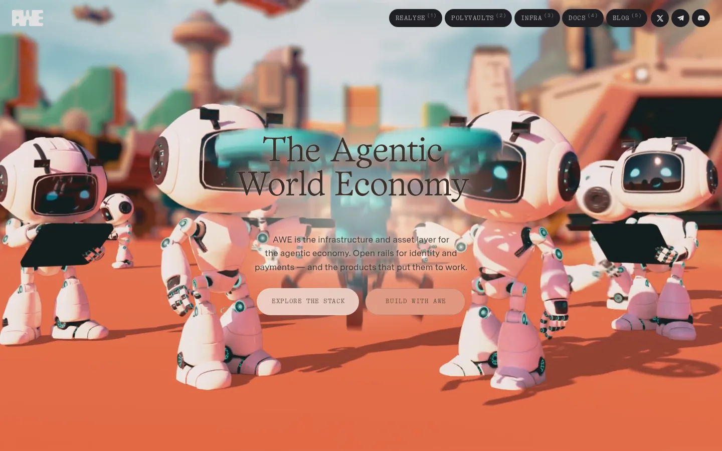
AWE以沉浸式彩色视频开场,再转入以黑色为主、信息密集的AI与加密基础设施界面。编辑感衬线标题、等宽标签和细分隔线,让技术内容呈现克制而有节奏的阅读体验。
North star · Keep the page’s black editorial canvas quiet and structured, then let full-bleed media and selective blue accents provide the visual energy.
The page is anchored by near-black #010101, which gives the long scroll a continuous canvas and lets the hero video carry the strongest color. Most later sections remain black, while #05060a and #040405 distinguish cards and inset content without breaking the dark field. Warm white text and restrained gray levels establish hierarchy; blue accents such as #4d94ff and #9cc2ff are reserved for links, labels, and selected technical details. Large, tightly set Office Times Round headlines contrast with Messina Sans body copy and ABC Laica Mono navigation and eyebrows. The opening is a full-bleed video with centered overlay copy and pill CTAs; subsequent content uses centered section introductions, multi-column cards, dense statistics, and a tabbed infrastructure module. Hairline borders organize cards and ecosystem listings. Spacing is compact within components but generous between major sections, maintaining a cinematic, technical editorial feel.
配色 点色块复制色值。用途说明来自对页面的实测位置(背景、文字、描边、按钮)与截图判读。
品牌色
Absolute Black
#010101
Primary page canvas, long section backgrounds, and footer foundation.
强调色
Midnight Cobalt
#182e4e
Muted blue border on technical badges and selected controls; keep it secondary to brighter blue accents.
Glacier Blue
#9cc2ff
Pale blue text on dark technical badges and occasional highlighted data labels.
Signal Blue
#4d94ff
Primary blue accent for selected headings, technical details, and restrained glow effects.
表层色
Night Card
#05060a
Primary dark card and content-panel fill within black sections.
Graphite Rule
#1f1f23
Frequent hairline border and subdued dark control or section detail.
Charcoal Seam
#19191b
Subtle link, footer, card, and section boundaries on the black canvas.
Blue-Black
#0d1622
Deep blue-tinted fill in technical cards, buttons, or gradient details.
Carbon Panel
#111214
Dark link and button surfaces set just above the page canvas.
Obsidian Panel
#040405
Near-black inset card background, distinct from the main canvas by a subtle tonal shift.
中性色
Gallery White
#f3f3f3
Measured light section and inverse text or media surface; not the dominant page canvas.
Ash Gray
#8d8d8f
Muted supporting copy against dark backgrounds.
Soft Silver
#e0e0e0
Common light text for navigation, cards, and section content.
Quiet Silver
#9a9a9b
Secondary muted copy where supporting information needs less emphasis.
Slate Text
#6d6d6e
Low-emphasis navigation and supporting text.
Warm Chalk
#e8e8e4
Warm light text on buttons and selected interface elements.
功能色
Umber Ink
#2a211c
Minor warm-toned text detail; not a defining page-wide brand color.
文字 背景 对比度 WCAG #f3f3f3 Gallery White#010101 Absolute Black18.81:1 AAA #f3f3f3 Gallery White#05060a Night Card18.25:1 AAA #f3f3f3 Gallery White#111214 Carbon Panel16.89:1 AAA #8d8d8f Ash Gray#010101 Absolute Black6.3:1 AA #8d8d8f Ash Gray#f3f3f3 Gallery White2.99:1 不达标 #8d8d8f Ash Gray#05060a Night Card6.11:1 AA
字体 字号阶梯:Augmented Fourth(比例约 1.384,正文 14.5px)。示例用免费替代字体渲染,数值为实测。
Aa 设计
Messina Sans 网络字体 · 字重 400 / 500 / 700 / 600 · 占比 62%
免费替代:Inter
Body copy, card text, and general interface content
Aa 设计
ABC Laica Mono 网络字体 · 字重 300 / 400 · 占比 32%
免费替代:IBM Plex Mono
Navigation, buttons, captions, eyebrows, and technical labels
Aa 设计
Office Times Round 网络字体 · 字重 400 / 600 · 占比 6%
免费替代:DM Serif Display
Display headlines and major section titles
角色 示例 字号 字重 行高 字距 特大标题 Hero and prominent display headlines.
AWE
73.5px 600 0.88 -0.03em 一级标题 Primary hero headline.
AWE
66.5px 400 1.02 -0.02em 二级标题 Major section titles such as stack and ecosystem.
AWE
49px 400 0.95 -0.03em 三级标题 Module and feature headings.
AWE
37.5px 600 0.92 -0.04em 四级标题 Card and subsection titles.
The quick brown fox 敏捷的狐狸
21.5px 700 1.2 0 正文 Descriptions, explanatory copy, and supporting prose.
The quick brown fox 敏捷的狐狸
14.5px 400 1.4 0.01em 辅助文字 Uppercase metadata and compact annotations.
The quick brown fox 敏捷的狐狸
13px 300 1.4 0.08em 按钮 Uppercase CTA and control labels.
The quick brown fox 敏捷的狐狸
11.5px 400 1.4 0.12em 导航 Uppercase global navigation items.
The quick brown fox 敏捷的狐狸
13px 300 1.3 0.08em 链接 Text links in ecosystem and infrastructure content.
The quick brown fox 敏捷的狐狸
11.5px 400 1.45 0.02em 眉题 Small uppercase labels above section headings.
The quick brown fox 敏捷的狐狸
13px 300 1.4 0.08em 代码 Compact uppercase technical or system labels.
const style = 1;
13px 300 1.4 0.08em
间距与布局 基准单位 1px · 密度:紧凑
40px 版块间距
11px 元素间距
17px 卡片内边距
1360px 内容最大宽度
1px
2px
4px
5px
6px
7px
8px
10px
11px
12px
14px
15px
16px
17px
18px
22px
Use a centered content frame capped at the measured 1360px maximum, with full-bleed media at the opening. The hero overlays centered copy and actions on video; interior sections alternate centered introductions with three-column feature cards, four-column metrics, a five-part infrastructure navigation, and a dense ecosystem directory. Keep section transitions spacious against the black canvas, but make cards and listings compact. Thin horizontal rules and aligned columns provide structure without heavy containers.
圆角与层次 md · other
md · other
inset · other
md · other
Favor flat, dark surfaces and fine borders over conventional raised cards. Card outlines and section rules are more important than shadows; reserve subtle blue glows for select technical details or interactive emphasis. Keep layered content legible through tonal differences among the black canvas, charcoal panels, and blue-black inset areas.
组件 下面的预览按实测的按钮、输入框、徽标、卡片样式重建(字体用替代字体)。
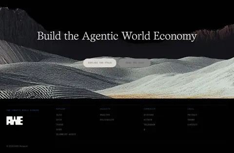
Video hero Full-bleed video backdrop with centered serif headline, concise supporting copy, and pill-shaped uppercase CTA controls.
Top navigation Compact uppercase monospaced links and rounded dark controls sit over the hero media.
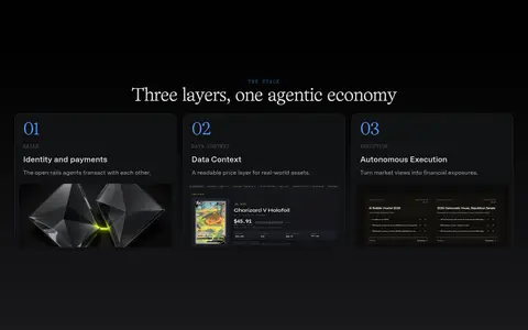
Stack cards Three-column dark feature cards combine numbered blue labels, compact copy, and product imagery within fine borders.
Network metrics A centered section introduction leads into a four-column set of large values and supporting labels.
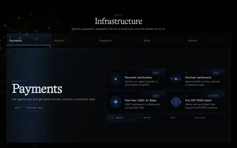
Infrastructure module Five-part category navigation controls a dark feature panel with a large serif title and compact capability cards.
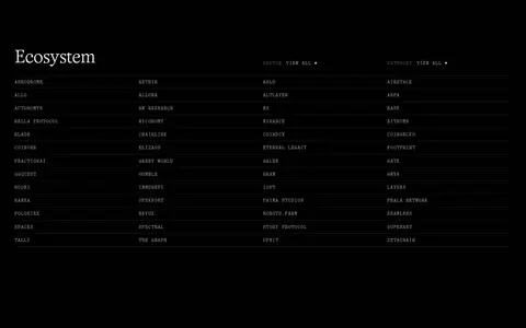
Ecosystem directory A dense, multi-column list of linked names uses low-contrast rules and compact typography for scanning.
Pill CTA Rounded action buttons use uppercase ABC Laica Mono labels; use light fills for primary hero actions and dark treatments for navigation.
Imagery · The hero’s full-bleed video is the most vivid element, featuring colorful, playful agent-world imagery that can shift between scenes. Treat it as environmental media rather than a palette specification: sampled warm orange and muted colors belong to the screenshot imagery, not the core interface. Lower sections use product and interface visuals inside dark cards, with restrained framing and ample black space around them.
页面版块 共 6 个版块,按页面从上到下排列,每个都标了类型、布局和交互套路。
该做与不该做 ✓ 该做 Keep the main canvas near-black and uninterrupted. Use editorial serif faces for large section headlines. Set navigation and utility labels in tracked uppercase mono. Reserve bright blue for selective technical emphasis. Use fine borders to organize dark cards and lists. Let full-bleed media supply the hero’s strongest color. ✕ 不该做 Do not turn the whole page into a light interface. Do not reuse hero-image colors as global brand accents. Do not round every card or content panel. Do not replace editorial headlines with generic geometric sans. Do not make every label bright blue or high contrast. Do not crowd major section transitions with extra decoration. 给 AI 的提示词 想快速出一个同风格的新页面,把这段话连同 DESIGN.md 一起发给 AI。
复制 Build a new AWE-style page on an Absolute Black (#010101) canvas, using Gallery White (#f3f3f3) only where an inverse surface is appropriate. Let full-bleed media create the hero’s color; do not promote imagery colors to interface tokens. Use Office Times Round or a close editorial serif for large, tightly set headlines, Messina Sans or Inter for prose, and ABC Laica Mono or IBM Plex Mono for tracked uppercase navigation, labels, and CTAs. Structure content with centered section intros, compact dark cards, fine Graphite Rule (#1f1f23) borders, and selective Signal Blue (#4d94ff) or Glacier Blue (#9cc2ff) accents. Keep the layout aligned within the measured 1360px frame, with spacious section breaks and denser interior data. Favor flat surfaces and restrained effects over heavy shadows.
DESIGN.md Tailwind v4 CSS 变量 Design Tokens
---
title: "AWE design system"
variant: extended
source: https://awenetwork.ai/
captured_at: 2026-10-12
theme: dark
industry: ai
generator: Design DNA (https://four.wiralomi.com/style/awenetwork-ai)
ai_generated: true
ai_label: "本文件由 AI 辅助生成:数值取自公开网页的实测样式,命名、用途说明与建议为模型解读。商标归原所有者。 / AI-assisted content"
---
# AWE · Design System
> An editorial interface for the agentic economy
**Theme:** dark · **Industry:** ai · **Source:** https://awenetwork.ai/ · **Captured:** 2026-10-12 (1440×900 desktop)
_AI-assisted content: values are measured from the public page at capture time; names, roles and guidance are model-written interpretations. Trademarks belong to their owners._
AWE pairs an immersive, colorful hero with a predominantly black, information-dense interface for its AI and crypto infrastructure. Editorial serif headlines, monospaced labels, and fine rules give the technical content a deliberate, publication-like rhythm.
## North star
Keep the page’s black editorial canvas quiet and structured, then let full-bleed media and selective blue accents provide the visual energy.
## Overview
The page is anchored by near-black ## Colors
| Name | Hex | Token | Group | Role |
|---|---|---|---|---|
| Midnight Cobalt | ` | `--color-midnight-cobalt` | accent | Muted blue border on technical badges and selected controls; keep it secondary to brighter blue accents. |
| Glacier Blue | ` | `--color-glacier-blue` | accent | Pale blue text on dark technical badges and occasional highlighted data labels. |
| Absolute Black | ` | `--color-absolute-black` | brand | Primary page canvas, long section backgrounds, and footer foundation. |
| Gallery White | ` | `--color-gallery-white` | neutral | Measured light section and inverse text or media surface; not the dominant page canvas. |
| Night Card | ` | `--color-night-card` | surface | Primary dark card and content-panel fill within black sections. |
| Ash Gray | ` | `--color-ash-gray` | neutral | Muted supporting copy against dark backgrounds. |
| Soft Silver | ` | `--color-soft-silver` | neutral | Common light text for navigation, cards, and section content. |
| Graphite Rule | ` | `--color-graphite-rule` | surface | Frequent hairline border and subdued dark control or section detail. |
| Quiet Silver | ` | `--color-quiet-silver` | neutral | Secondary muted copy where supporting information needs less emphasis. |
| Charcoal Seam | ` | `--color-charcoal-seam` | surface | Subtle link, footer, card, and section boundaries on the black canvas. |
| Slate Text | ` | `--color-slate-text` | neutral | Low-emphasis navigation and supporting text. |
| Blue-Black | ` | `--color-blue-black` | surface | Deep blue-tinted fill in technical cards, buttons, or gradient details. |
| Carbon Panel | ` | `--color-carbon-panel` | surface | Dark link and button surfaces set just above the page canvas. |
| Signal Blue | ` | `--color-signal-blue` | accent | Primary blue accent for selected headings, technical details, and restrained glow effects. |
| Warm Chalk | ` | `--color-warm-chalk` | neutral | Warm light text on buttons and selected interface elements. |
| Umber Ink | ` | `--color-umber-ink` | semantic | Minor warm-toned text detail; not a defining page-wide brand color. |
| Obsidian Panel | ` | `--color-obsidian-panel` | surface | Near-black inset card background, distinct from the main canvas by a subtle tonal shift. |
### Semantic aliases
`--color-canvas` → ` (Absolute Black) · `--color-surface` → ` (Gallery White) · `--color-surface-2` → ` (Night Card) · `--color-surface-3` → ` (Carbon Panel) · `--color-surface-4` → ` (Obsidian Panel) · `--color-text` → ` (Gallery White) · `--color-text-muted` → ` (Ash Gray) · `--color-text-subtle` → ` (Quiet Silver) · `--color-border` → ` (Graphite Rule) · `--color-accent` → ` (Glacier Blue) · `--color-accent-2` → ` (Signal Blue)
### Contrast (WCAG 2.x)
| Text | Background | Ratio | Level |
|---|---|---|---|
| ` | ` | 18.81:1 | AAA |
| ` | ` | 18.25:1 | AAA |
| ` | ` | 16.89:1 | AAA |
| ` | ` | 6.3:1 | AA |
| ` | ` | 2.99:1 | fail |
| ` | ` | 6.11:1 | AA |
| ` | ` | 5.66:1 | AA |
| ` | ` | 7.42:1 | AAA |
| ` | ` | 2.53:1 | fail |
| ` | ` | 7.2:1 | AAA |
### Gradients
- `linear-gradient(rgb(1, 1, 1) 15%, rgba(31, 31, 34, 0.8))`
- `radial-gradient(120% 80% at 100% 0px, rgba(77, 148, 255, 0.1), rgba(0, 0, 0, 0) 46%), none`
- `linear-gradient(115deg, rgba(77, 148, 255, 0.08), rgba(0, 0, 0, 0) 46%), none`
- `linear-gradient(rgba(0, 0, 0, 0), rgba(1, 1, 1, 0.72) 18%, rgb(1, 1, 1) 42%)`
## Typography
| Family | Token | Source | Weights | Role | Free substitute |
|---|---|---|---|---|---|
| Messina Sans | `--font-body` | webfont | 400, 500, 700, 600 | Body copy, card text, and general interface content | Inter |
| ABC Laica Mono | `--font-mono` | webfont | 300, 400 | Navigation, buttons, captions, eyebrows, and technical labels | IBM Plex Mono |
| Office Times Round | `--font-display` | webfont | 400, 600 | Display headlines and major section titles | DM Serif Display |
- **Messina Sans:** Use regular body weights and heavier subsection labels; keep sentence-case prose and compact line lengths.
- **ABC Laica Mono:** Light-to-regular weights, uppercase, and generous tracking give small labels their instrument-panel character.
- **Office Times Round:** Use regular or semibold editorial serif forms, tight leading, and negative tracking for large headings.
### Type scale — Augmented Fourth (ratio ≈ 1.384, base 14.5px)
| Role | Size | Weight | Line height | Letter spacing | Case | Family | Used for |
|---|---|---|---|---|---|---|---|
| display | 73.5px | 600 | 0.88 | -0.03em | — | Office Times Round | Hero and prominent display headlines. |
| h1 | 66.5px | 400 | 1.02 | -0.02em | — | Office Times Round | Primary hero headline. |
| h2 | 49px | 400 | 0.95 | -0.03em | — | Office Times Round | Major section titles such as stack and ecosystem. |
| h3 | 37.5px | 600 | 0.92 | -0.04em | — | Office Times Round | Module and feature headings. |
| h4 | 21.5px | 700 | 1.2 | 0 | — | Messina Sans | Card and subsection titles. |
| body | 14.5px | 400 | 1.4 | 0.01em | — | Messina Sans | Descriptions, explanatory copy, and supporting prose. |
| caption | 13px | 300 | 1.4 | 0.08em | uppercase | ABC Laica Mono | Uppercase metadata and compact annotations. |
| button | 11.5px | 400 | 1.4 | 0.12em | uppercase | ABC Laica Mono | Uppercase CTA and control labels. |
| nav | 13px | 300 | 1.3 | 0.08em | uppercase | ABC Laica Mono | Uppercase global navigation items. |
| link | 11.5px | 400 | 1.45 | 0.02em | — | Messina Sans | Text links in ecosystem and infrastructure content. |
| eyebrow | 13px | 300 | 1.4 | 0.08em | uppercase | ABC Laica Mono | Small uppercase labels above section headings. |
| code | 13px | 300 | 1.4 | 0.08em | uppercase | ABC Laica Mono | Compact uppercase technical or system labels. |
## Spacing & layout
- Base unit **1px**, density **compact**.
- Scale (most used values): 1, 2, 4, 5, 6, 7, 8, 10, 11, 12, 14, 15, 16, 17, 18, 22 px.
- Section rhythm 40px · element gap 11px · card padding 17px · max content width 1360px.
Use a centered content frame capped at the measured 1360px maximum, with full-bleed media at the opening. The hero overlays centered copy and actions on video; interior sections alternate centered introductions with three-column feature cards, four-column metrics, a five-part infrastructure navigation, and a dense ecosystem directory. Keep section transitions spacious against the black canvas, but make cards and listings compact. Thin horizontal rules and aligned columns provide structure without heavy containers.
## Shape & elevation
- Radius: button `9999px` · media `11px` · link `16px` · xs `1px` · sm `11px` · md `16px` · pill `9999px`
- Shadow `md` (other): `rgba(77, 148, 255, 0.35) 0px 0px 12px 0px`
- Shadow `md-2` (other): `rgba(77, 148, 255, 0.75) 0px 0px 16px 0px`
- Shadow `inset` (other): `rgba(77, 148, 255, 0.16) 0px 0px 22px 0px inset`
- Shadow `md-3` (other): `rgba(77, 148, 255, 0.55) 0px 0px 14px 0px`
- Shadow `lg` (button): `rgba(70, 36, 16, 0.08) 0px 10px 28px 0px`
- Shadow `inset-2` (link): `rgba(58, 48, 42, 0.28) 0px 0px 0px 1px inset`
- Motion: standard transition `0.2s ease` on interactive elements.
Favor flat, dark surfaces and fine borders over conventional raised cards. Card outlines and section rules are more important than shadows; reserve subtle blue glows for select technical details or interactive emphasis. Keep layered content legible through tonal differences among the black canvas, charcoal panels, and blue-black inset areas.
## Imagery
The hero’s full-bleed video is the most vivid element, featuring colorful, playful agent-world imagery that can shift between scenes. Treat it as environmental media rather than a palette specification: sampled warm orange and muted colors belong to the screenshot imagery, not the core interface. Lower sections use product and interface visuals inside dark cards, with restrained framing and ample black space around them.
## Components
### Video hero
Full-bleed video backdrop with centered serif headline, concise supporting copy, and pill-shaped uppercase CTA controls.
### Top navigation
Compact uppercase monospaced links and rounded dark controls sit over the hero media.
### Stack cards
Three-column dark feature cards combine numbered blue labels, compact copy, and product imagery within fine borders.
### Network metrics
A centered section introduction leads into a four-column set of large values and supporting labels.
### Infrastructure module
Five-part category navigation controls a dark feature panel with a large serif title and compact capability cards.
### Ecosystem directory
A dense, multi-column list of linked names uses low-contrast rules and compact typography for scanning.
### Pill CTA
Rounded action buttons use uppercase ABC Laica Mono labels; use light fills for primary hero actions and dark treatments for navigation.
### Measured component styles
- **Primary button** (“REALYSE (1)”): background ## Do
- Keep the main canvas near-black and uninterrupted.
- Use editorial serif faces for large section headlines.
- Set navigation and utility labels in tracked uppercase mono.
- Reserve bright blue for selective technical emphasis.
- Use fine borders to organize dark cards and lists.
- Let full-bleed media supply the hero’s strongest color.
## Don't
- Do not turn the whole page into a light interface.
- Do not reuse hero-image colors as global brand accents.
- Do not round every card or content panel.
- Do not replace editorial headlines with generic geometric sans.
- Do not make every label bright blue or high contrast.
- Do not crowd major section transitions with extra decoration.
## Agent prompt
Build a new AWE-style page on an Absolute Black (## Page sections (top to bottom)
| # | Type | Layout | UX patterns | UI patterns |
|---|---|---|---|---|
| 1 | hero | Full-bleed video with centered headline, short supporting copy, and paired actions. | overlay navigation, primary and secondary CTA | full-bleed video, centered serif headline, pill buttons |
| 2 | feature-grid | Centered section heading above three dark, side-by-side feature cards. | numbered features, card-to-detail links | dark panels, blue numbering, product imagery |
| 3 | stats | Centered title and context above a four-column metrics layout. | scannable metrics, snapshot context | large numeric values, compact labels, subtle rules |
| 4 | product-showcase | Centered introduction, five-part category navigation, and a wide selected-module panel. | tabbed category selection, capability discovery | dark feature panel, compact bordered cards, selective blue emphasis |
| 5 | integrations | Left-aligned section title above dense multi-column linked directories and filtering controls. | browse by sector, category filtering | compact link lists, fine horizontal rules, minimal controls |
| 6 | footer | Closing CTA band followed by a dark, multi-column footer. | repeat primary action, grouped footer navigation | media-backed CTA, logo lockup, muted link columns |
## Source CSS custom properties (selected)
```css
--colors--black: