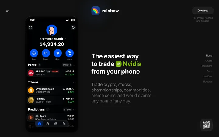
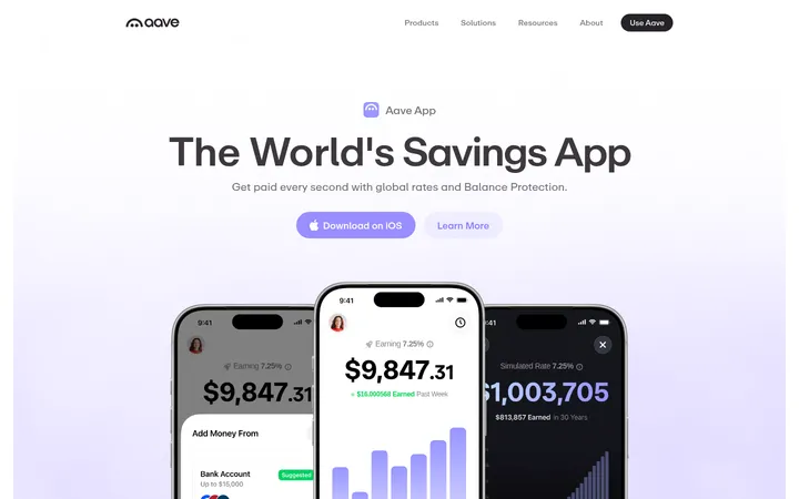
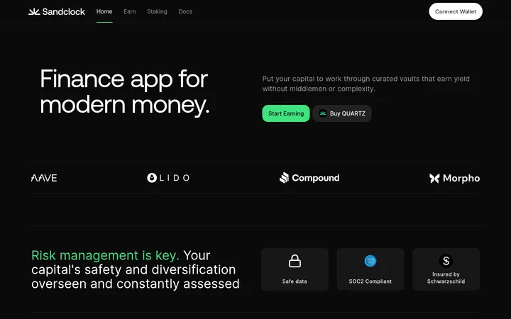
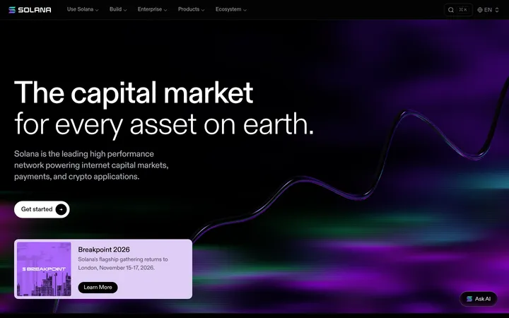
North star · Keep the pale, spacious page calm and let purple actions and dark product showcases provide the contrast.
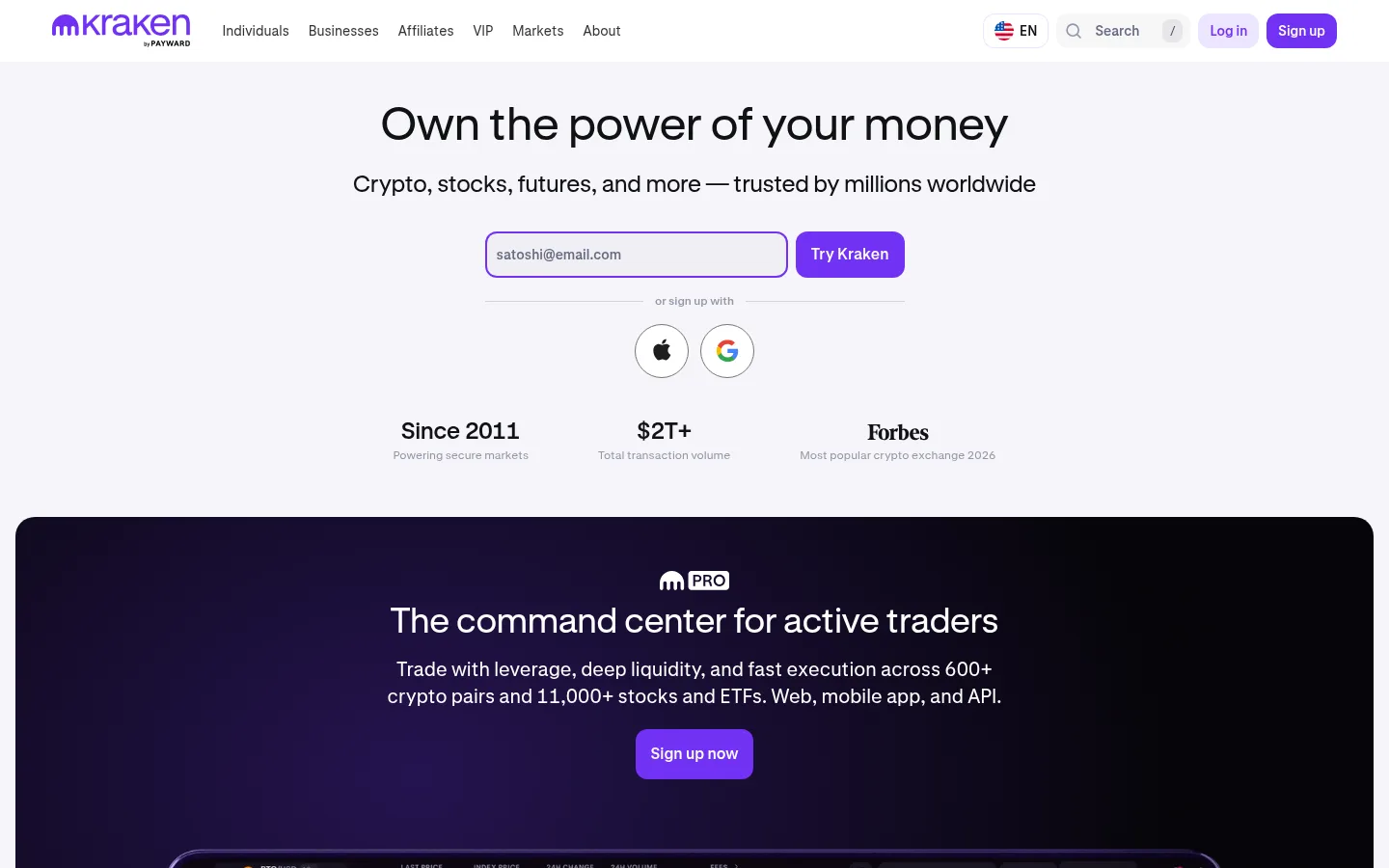
The page uses #f6f5f9 as a soft, cool canvas across the hero and market content, with #101114 for primary text and #686b82 or #9497a9 for supporting copy. The saturated #7132f5 is reserved for high-intent controls, links, and brand marks, so actions stand out without overwhelming the open layout. A centered hero pairs a large, light-weight Kraken-Brand headline with a short supporting line, email entry, and compact trust metrics. Below, broad dark trading showcases with rounded corners and subtle purple gradients introduce a high-contrast product mode; their interface imagery is treated as product proof rather than decoration. Content returns to the pale canvas for market tabs, a compact asset table, and a final signup prompt. Kraken-Brand carries display headings, while Kraken-Product handles navigation, body text, and buttons. Generous whitespace separates the major blocks; understated hairlines and restrained shadows keep cards crisp.
Navigation, body copy, buttons, captions, and links
Aa 设计
Kraken-Brand
网络字体 · 字重 400 / 500 · 占比 6%
免费替代:Manrope
Display headings and major hero titles
Aa 设计
Kraken-Mono
网络字体 · 字重 500 · 占比 2%
免费替代:Roboto Mono
Code-like or technical interface snippets
角色
示例
字号
字重
行高
字距
特大标题
Large, brand-led headline treatment, especially the home hero.
Kraken
58px
400
1.14
0
一级标题
Primary page heading and prominent section titles.
Kraken
48px
400
1.17
0
二级标题
Major section headings such as market exploration.
Kraken
36px
400
1.22
0
三级标题
Subsection headings inside feature and product content.
The quick brown fox 敏捷的狐狸
24px
400
1.33
0
四级标题
Smaller card and content headings.
The quick brown fox 敏捷的狐狸
20px
400
1.4
0
正文
General explanatory copy and product descriptions.
The quick brown fox 敏捷的狐狸
14px
400
1.43
0
辅助文字
Trust metric notes, legal details, and low-priority labels.
The quick brown fox 敏捷的狐狸
12px
400
1.33
0
按钮
Signup and other prominent conversion controls.
The quick brown fox 敏捷的狐狸
20px
500
1.4
0
导航
Header navigation and footer column labels.
The quick brown fox 敏捷的狐狸
14px
400
1.43
0
链接
Compact inline links and footer destinations.
The quick brown fox 敏捷的狐狸
12px
400
1.33
0
代码
Technical or command-line content where present.
const style = 1;
14px
500
1.43
0
间距与布局
基准单位 4px · 密度:适中
56px版块间距
12px元素间距
26px卡片内边距
1332px内容最大宽度
4px
6px
8px
10px
12px
15px
16px
20px
24px
40px
48px
54px
56px
72px
The page centers its hero content within a broad desktop canvas, then uses wide, rounded showcase panels and a narrower market table to vary the rhythm. Measured page max width is 1332px; the layout feels comfortable rather than dense. Major content blocks are separated by a measured 56px section rhythm, with tighter 12px element spacing. The header is a single horizontal navigation row. Footer content shifts to a multi-column directory layout with fine-print and secondary legal navigation below.
圆角与层次
按钮 · 12px
卡片 · 20px
图片 · 50%
导航 · 12px
hairline · button
inset · button
xl · card
sm · button
Most light content remains flat, with thin muted borders separating cards and table surfaces. Rounded dark showcases create the main depth shift; use shadows sparingly rather than adding elevation to every block. Measured card corners are 20px and buttons 12px. Any inset button treatment should remain subtle.
组件
下面的预览按实测的按钮、输入框、徽标、卡片样式重建(字体用替代字体)。
Header navigation
Single-row light header with Kraken mark, compact Kraken-Product navigation, language and search controls, then login and violet signup actions.
Hero signup
Centered headline and supporting sentence above a bordered email entry paired with a #7132f5 action; social signup and trust metrics sit below.
Primary CTA
Violet #7132f5 fill, white text, 12px measured radius, and medium-weight Kraken-Product typography.
Trading showcase
Large rounded dark panel with pale text, centered heading and CTA, and a trading-interface visual extending below the copy.
Market table
Light, compact asset listing with category tabs, columns for price and movement, and subtle separation between rows.
Footer directory
Dense multi-column link directory with muted text, social icons, account actions, and a separate legal-information band.
Imagery · The visible product imagery is primarily trading-interface capture: dark charts, order books, and market data framed within large rounded showcase panels. Treat these as product proof, with the interface itself carrying most detail. Supporting dark gradients and subtle purple glow can enrich the showcase, but the page is not led by lifestyle photography or illustration. Keep market data and logos crisp against light surfaces.
Reserve #7132f5 for primary actions and selective brand emphasis.
Set major headings in Kraken-Brand with a calm, light-weight appearance.
Use dark rounded panels to frame trading product imagery.
Keep market data compact, aligned, and easy to scan.
Separate major sections with generous whitespace and restrained rules.
✕ 不该做
Do not flood the light canvas with saturated purple.
Do not make every card dark or heavily shadowed.
Do not crowd the hero with extra competing calls to action.
Do not use gradient-only decoration as a substitute for product UI.
Do not style headings in uppercase or add artificial tracking.
Do not mistake illustration colors for recurring interface colors.
给 AI 的提示词
想快速出一个同风格的新页面,把这段话连同 DESIGN.md 一起发给 AI。
Build a crypto-exchange page in Kraken's calm, product-led style. Use Lavender Mist (#f6f5f9) for the main canvas, Near Black (#101114) for primary text, and Slate Lavender (#686b82) for secondary copy. Make Kraken Violet (#7132f5) the selective action color for signup buttons and important links, with white button text. Use Kraken-Brand-like light sans-serif headings and a neutral sans-serif for navigation, body, and controls. Center the hero around a concise promise and a clear signup path. Follow it with broad, rounded Night Plum (#16121f) or Abyss Violet (#0b041a) product panels containing crisp trading-interface imagery. Return to light surfaces for market data and supporting content. Keep borders subtle, spacing open, and shadows limited; ensure dense footer links remain orderly and readable.