North star · Let warm, rounded surfaces and real-life product imagery carry the story, with yellow used as a precise brand signal rather than a wash.
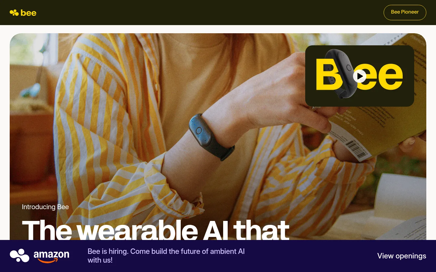
The page balances a quiet, warm canvas (#fbf9f8) with deep olive-black (#21200b) navigation, headings, and footer surfaces. Signal yellow (#ffd900) supplies the strongest brand cue in the logo, controls, and select feature panels; lavender (#d2c4ff) alternates with pale gray cards to organize product capabilities. Oversized lifestyle photography leads the hero, using rounded framing and a dark overlay to keep white headline text legible. Acidgrotesk sets the display voice: bold, compact headlines with confident scale. Inter Variable handles supporting copy and detailed product information. The layout moves from a broad photographic introduction into an asymmetrical feature mosaic, a dedicated search panel, and a centered product presentation. Generous separation between large rounded blocks contrasts with compact text groupings inside them. The footer returns to the dark brand surface and uses oversized yellow lettering as a graphic anchor.
配色
点色块复制色值。用途说明来自对页面的实测位置(背景、文字、描边、按钮)与截图判读。
品牌色
强调色
表层色
中性色
功能色
页面底色 · Warm Canvas表层 · Stone Card表层 2 · Soft Lavender表层 3 · Olive Ink表层 4 · Pale Blush主文字 · Olive Ink次要文字 · Clean White描边 · Signal Yellow强调 · Signal Yellow强调 2 · Soft Lavender
Display headlines, navigation, captions, and buttons.
角色
示例
字号
字重
行高
字距
特大标题
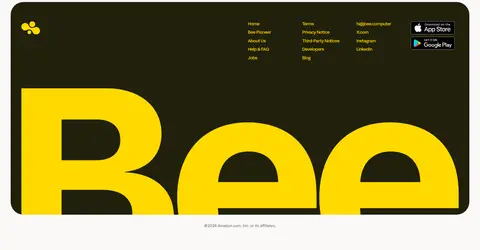
Oversized hero and footer brand wordmark-style display.
Bee
96px
700
1
-0.033em
一级标题
Primary hero headline.
Bee
59px
700
1.2
0
二级标题
Major feature and product section headings.
Bee
48px
700
1.2
0
三级标题
Feature titles and prominent supporting headings.
Bee
32px
600
1.5
0
四级标题
Product and card subheadings.
The quick brown fox 敏捷的狐狸
24px
500
1.2
-0.016em
正文
Explanatory copy and product descriptions.
The quick brown fox 敏捷的狐狸
16px
400
1.8
-0.03em
辅助文字
Eyebrows, short labels, and compact card notes.
The quick brown fox 敏捷的狐狸
13px
500
1.5
-0.03em
按钮
Primary rounded calls to action.
The quick brown fox 敏捷的狐狸
20px
500
1
0
导航
Header navigation and compact site links.
The quick brown fox 敏捷的狐狸
16px
500
1.5
0
链接
Prominent footer or announcement links.
The quick brown fox 敏捷的狐狸
24px
500
1
0
间距与布局
基准单位 2px · 密度:紧凑
40px版块间距
8px元素间距
—卡片内边距
1376px内容最大宽度
5px
6px
8px
13px
16px
19px
24px
26px
32px
40px
48px
50px
57px
60px
80px
The measured content max width is 1376px, with the screenshot showing broad, inset blocks and full-bleed media within rounded containers. The opening is a two-column hero, followed by a feature split and an irregular two-column card mosaic; a single-column lavender search panel breaks that rhythm. Product and press sections are centered and card-led. Use compact internal groupings, clear section separation, and alignment that shifts between left-led feature content and centered product headings.
圆角与层次
按钮 · 9999px
卡片 · 38px
导航 · 9999px
链接 · 38px
没有测到阴影:页面是扁平的,层次靠底色和描边区分。
The design is mostly flat: color blocks and generous rounded corners define cards instead of drop shadows. Large cards use a measured radius around 38px, while pill-shaped navigation and buttons use fully rounded ends. Preserve contrast through surface changes and selective borders; avoid adding prominent elevation or decorative outlines.
组件
下面的预览按实测的按钮、输入框、徽标、卡片样式重建(字体用替代字体)。
Top navigation
A dark Olive Ink bar with the yellow Bee mark at left and an outlined pill-shaped Bee Pioneer link at right.
Photographic hero
Large rounded lifestyle image with an overlaid video thumbnail, small introduction label, and oversized white headline near the bottom.
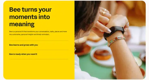
Feature split
A bright yellow text panel sits beside a lifestyle photo; concise benefit rows use fine dividers.
Capability cards
An asymmetric mosaic alternates Stone Card, Soft Lavender, and dark surfaces, framing app screenshots and short feature labels.
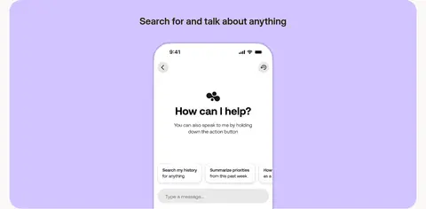
Search panel
A full-width lavender block centers a heading above a phone interface image.
Product details
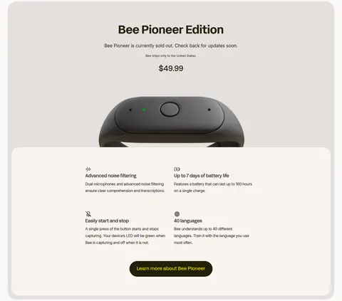
Centered Bee Pioneer presentation with device imagery, compact feature details, and a yellow-on-dark rounded CTA.
Press and footer
A rounded neutral logo cloud leads into a dark footer with yellow links and oversized yellow brand lettering.
Imagery · Use natural lifestyle photography prominently in the hero and feature split, with warm light and a visible wearable in context. Product and capability sections use device and app imagery inside rounded, pastel or neutral panels. Keep image compositions large and immersive; the hero has a darkened photographic treatment behind white text. The page includes a product video thumbnail, but the visual system is primarily photography and interface imagery rather than illustration.
Keep Olive Ink for strong text and dark brand surfaces.
Reserve Signal Yellow for recognizable highlights and actions.
Alternate lavender and stone cards to group capabilities.
Use rounded framing for major images and card surfaces.
Pair oversized Acidgrotesk headlines with restrained Inter copy.
✕ 不该做
Do not make every section yellow or lavender.
Do not replace lifestyle photography with generic abstract gradients.
Do not add heavy shadows to flat card layouts.
Do not make body copy compete with the display headlines.
Do not force all sections into identical centered grids.
Do not treat screenshot-only colors as core brand colors.
给 AI 的提示词
想快速出一个同风格的新页面,把这段话连同 DESIGN.md 一起发给 AI。
Build a new Bee-style page with a warm, human product feel. Use Warm Canvas (#fbf9f8) as the main background and Olive Ink (#21200b) for primary text and dark surfaces. Apply Signal Yellow (#ffd900) sparingly to brand marks and key actions; use Soft Lavender (#d2c4ff) and Stone Card (#e5e0dd) to distinguish feature panels. Set display headlines in a bold Acidgrotesk-like face and supporting copy in Inter. Create a strong photographic lead image with rounded framing, then vary the content rhythm with split layouts, asymmetric capability cards, and a centered product feature. Keep cards flat, with broad rounded corners and compact internal copy. Favor clear hierarchy and generous separation over ornamental effects.