North star · Keep the interface quiet and white so bold type, useful blue links, and expressive music imagery carry the story.
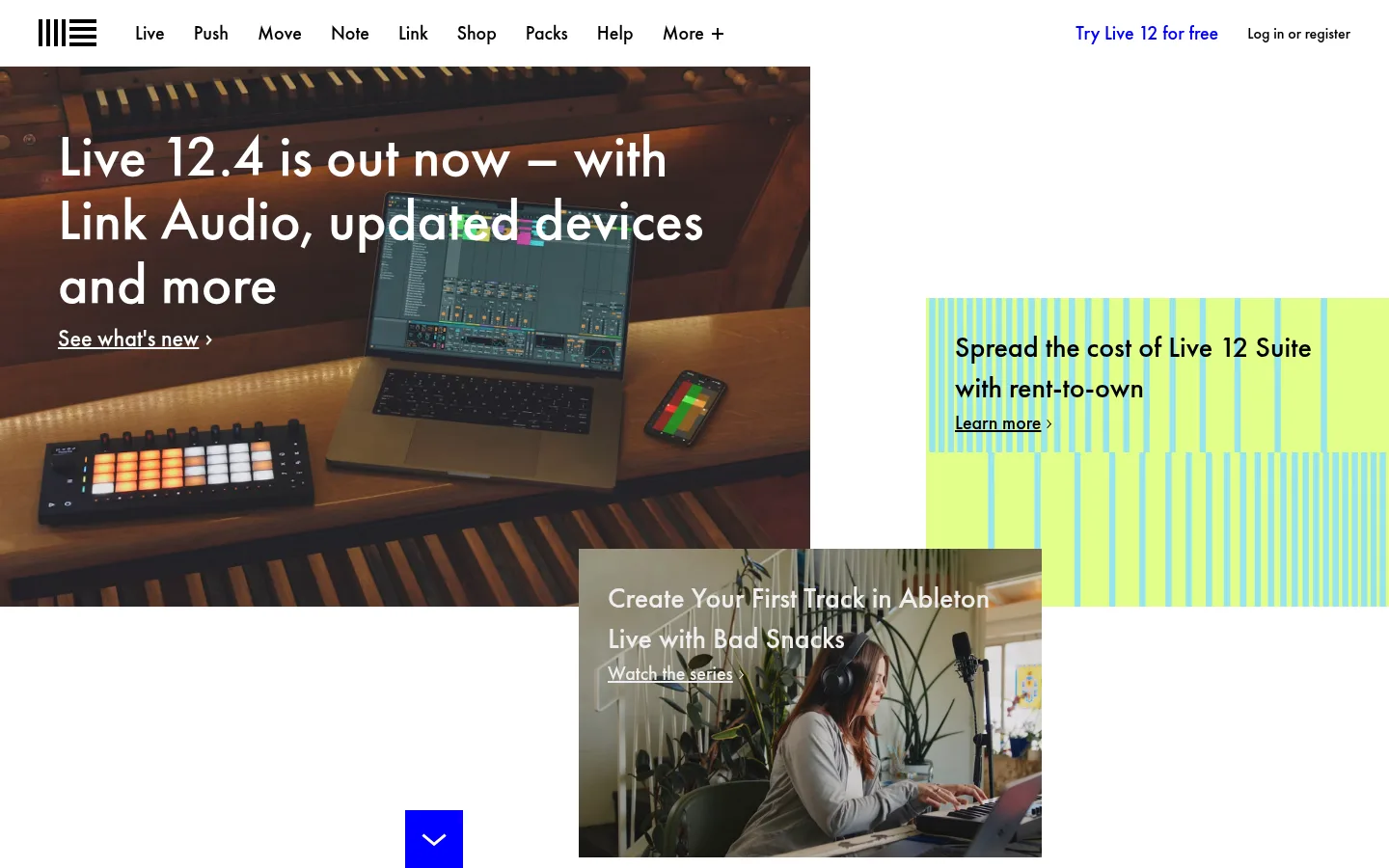
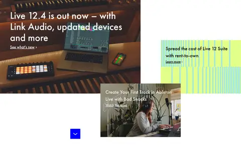
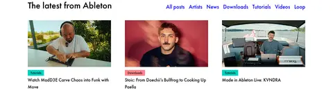
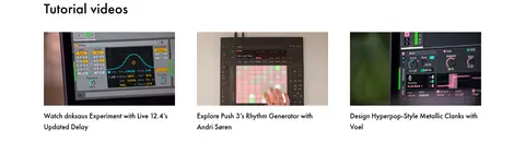
The page uses white as its primary canvas, with black text and blue links providing the clearest interface contrast. Pale gray bands distinguish the lower footer navigation from the white content areas, while turquoise and coral appear as small category markers rather than broad brand fills. Futura PT gives headings and navigation a rounded, confident character; heavier weights establish hierarchy without relying on uppercase styling. The opening area is deliberately asymmetric: a large music-making photograph anchors the left, while smaller campaign tiles sit to the right and overlap below. Further down, compact three-column image feeds are organized by strong section headings and generous white gaps. Product and creator photography supplies most of the page’s color, so interface colors stay restrained. Flat cards, minimal borders, and overlapping hero tiles preserve a light editorial feel.
All measured roles, from large headings and navigation to body copy, captions, links, and buttons.
角色
示例
字号
字重
行高
字距
特大标题
Oversized promotional headline in the opening campaign area.
Ableton
60px
700
1.1
0
一级标题
Primary page or major editorial section headings.
Ableton
40px
700
1.2
0
二级标题
Section titles introducing news, tutorials, and video feeds.
Ableton
30px
700
1.4
0
三级标题
Individual story titles and nested content headings.
The quick brown fox 敏捷的狐狸
24px
700
1.5
0
正文
Promotional and explanatory copy, including footer descriptions.
The quick brown fox 敏捷的狐狸
20px
700
1.5
0
辅助文字
Compact category labels and supporting metadata.
The quick brown fox 敏捷的狐狸
14px
700
1.5
0
按钮
Calls to action, including scroll and sign-up controls.
The quick brown fox 敏捷的狐狸
16px
400
1.5
0
导航
Main header navigation and other prominent navigation items.
The quick brown fox 敏捷的狐狸
20px
700
1.5
0
链接
Large editorial links such as view-all actions.
The quick brown fox 敏捷的狐狸
24px
700
1.5
0
间距与布局
基准单位 2px · 密度:宽松
120px版块间距
—元素间距
51px卡片内边距
1200px内容最大宽度
2px
3px
5px
7px
8px
10px
11px
12px
13px
15px
16px
20px
30px
40px
50px
60px
The header spans the page, followed by an asymmetric hero with a large left image and smaller, offset campaign tiles on the right. The measured content max width is 1200px. Subsequent editorial feeds use three columns with left-aligned headings and image cards. Section spacing is spacious, with a measured 120px section gap; content density stays low and navigation remains visually compact. A pale gray category strip separates the content from a multi-column footer.
圆角与层次
没有测到阴影:页面是扁平的,层次靠底色和描边区分。
The interface reads as flat: measured components have no shadows, and the palette reports no shadow or gradient system. Cards and inputs use simple fills without measured borders or rounded corners. Visual depth comes from image content and the overlapping hero tiles, not from raised UI surfaces.
组件
下面的预览按实测的按钮、输入框、徽标、卡片样式重建(字体用替代字体)。
Header navigation
A white horizontal header with the Ableton mark, bold black product links, and a blue free-trial link aligned toward the right.
Campaign hero
Large photo-led feature on the left, paired with smaller offset promotional tiles and text links on the right and below.
Editorial feed cards
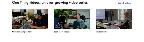
Three-column image-led stories with compact category markers, black titles, and generous white separation between feeds.
Category markers
Small turquoise tutorial and coral downloads labels with black text; keep these as localized accents.
Category navigation strip
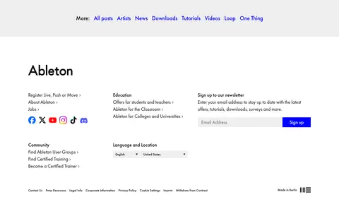
A full-width pale gray band containing a centered row of blue links for browsing content categories.
Footer signup and language controls
Multi-column footer with black section headings, blue links, a gray email input, a blue sign-up control, and language/location selectors.
Imagery · Photography leads throughout: music hardware and software in use, artists at work, tutorial interface captures, and creator video stills. Hero imagery is large and rectangular, with promotional copy placed directly over darker photographs. Feed thumbnails are consistent and compact, with little visible framing. The bright striped campaign graphic is a distinct promotional illustration; its colors should not be mistaken for the overall site palette.
Set interface text in black Futura-like geometric sans.
Use blue for navigation and editorial links.
Let campaign imagery form the main color fields.
Keep turquoise and coral confined to small category markers.
Use offset hero tiles and orderly three-column feeds.
Separate content groups with generous white space.
✕ 不该做
Do not turn the page into a dark interface.
Do not use gradients or shadows for depth.
Do not make turquoise or coral full-page backgrounds.
Do not replace the asymmetric hero with a uniform banner.
Do not crowd cards with heavy borders or decoration.
Do not mistake photograph colors for interface palette colors.
给 AI 的提示词
想快速出一个同风格的新页面,把这段话连同 DESIGN.md 一起发给 AI。
Build a new Ableton-style page as a bright editorial canvas. Use Gallery White (#ffffff) for the main background and Studio Ink (#000000) for headings and copy; reserve Signal Blue (#0000ff) for links and key navigation. Use Futura PT or a close geometric sans substitute, with bold sentence-case headings and a compact, clear header. Create an asymmetric, image-led feature area with offset campaign tiles, then organize related stories into spacious three-column feeds. Keep photography vivid and rectangular, with minimal card chrome. Use Mist Gray (#eeeeee) for a restrained category strip or form surfaces. Pulse Turquoise (#00d2be) and Coral Note (#ff8389) belong only on small category labels. Keep the interface flat, avoid decorative shadows, and let spacing and image composition create hierarchy.