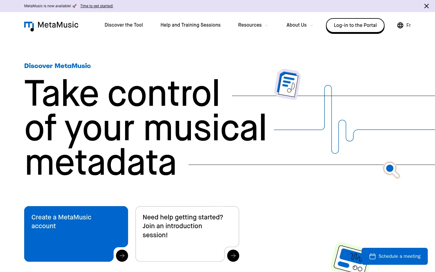
MetaMusic以醒目的大字号首页主视觉,介绍面向音乐行业的元数据服务。暖色与冷色区块交替呈现,搭配蓝色点缀和实用的信息卡片,引导访客了解产品、学习资源与最新公告。
North star · Let oversized black typography and spacious editorial layouts lead, using blue accents and section color bands to make each next step clear.
The homepage balances an airy white opening with a sequence of clearly differentiated section bands: warm off-white for audience information, deep charcoal for services, saturated navy for benefits, and pale green for a learning prompt. Black typography anchors the page; vivid blue marks links, calls to action, and small illustrative details. Maison Neue supplies a consistent voice, from the oversized, tightly tracked hero headline to compact labels and readable body copy. Layouts alternate between broad two-column feature sections and centered title bands, then settle into three-column editorial card rows and a four-column member strip. Generous separation between sections gives the long page room to breathe, while cards remain information-dense and practical. Photography shows music-making and studio contexts; thin waveform-like line art and small music-related illustrations connect the product story to the imagery without turning the page into a decorative showcase.
配色 点色块复制色值。用途说明来自对页面的实测位置(背景、文字、描边、按钮)与截图判读。
品牌色
Signal Blue
#0066cc
Primary account CTA, text links, and small emphasis details.
Deep Set Blue
#0e2575
Full-width benefits section background.
强调色
Illustration Indigo
#213680
Secondary blue found in cards and graphic details; use as an accent, not a dominant page color.
表层色
Canvas White
#ffffff
Main hero and editorial canvas, card surfaces, and text on dark sections.
Studio Charcoal
#101820
Services and closing CTA section backgrounds.
Warm Paper
#f4f1ea
Audience-introduction section background.
Fresh Lime
#ebfedd
Learning-more feature section background.
Soft Ivory
#f9f7f3
Minor warm neutral surface detail; not a primary section color.
中性色
Stage Black
#000000
Primary text, inverse footer background, navigation text, and outlined portal-login button.
Quiet Rule
#ebebeb
Subtle borders and hairlines separating cards and content.
功能色
Muted Slate
#828aa8
Secondary text and subdued supporting copy.
文字 背景 对比度 WCAG #000000 Stage Black#ffffff Canvas White21:1 AAA #000000 Stage Black#101820 Studio Charcoal1.17:1 不达标 #000000 Stage Black#f4f1ea Warm Paper18.62:1 AAA #ffffff Canvas White#000000 Stage Black21:1 AAA #ffffff Canvas White#101820 Studio Charcoal17.89:1 AAA #ffffff Canvas White#f4f1ea Warm Paper1.13:1 不达标
字体 字号阶梯:Perfect Fifth(比例约 1.496,正文 16px)。示例用免费替代字体渲染,数值为实测。
Aa 设计
Maison Neue 网络字体 · 字重 400 / 500 / 600 · 占比 99%
免费替代:Inter
Site-wide typeface for display headlines, section headings, navigation, body text, links, and buttons.
角色 示例 字号 字重 行高 字距 特大标题 Oversized hero headline and prominent display messaging.
MetaMusic
120px 500 0.95 -0.02em 一级标题 Primary page or major section headline.
MetaMusic
80px 500 1.05 -0.03em 二级标题 Large section headings such as service and benefits titles.
MetaMusic
56px 500 1.1 -0.03em 三级标题 Subsection headings and prominent card titles.
MetaMusic
40px 500 1.2 -0.02em 四级标题 Compact card and feature headings.
The quick brown fox 敏捷的狐狸
26px 600 1.4 -0.02em 正文 Paragraphs describing services, audiences, and resources.
The quick brown fox 敏捷的狐狸
16px 500 1.5 0 辅助文字 Dates, categories, and small supporting labels.
The quick brown fox 敏捷的狐狸
14px 500 1.4 0 按钮 Account creation, scheduling, and other action labels.
The quick brown fox 敏捷的狐狸
16px 500 1.5 0 导航 Main navigation and portal access links.
The quick brown fox 敏捷的狐狸
16px 500 1.5 0 链接 Prominent in-content links to tools and resources.
The quick brown fox 敏捷的狐狸
22px 500 1.35 -0.01em
间距与布局 基准单位 8px · 密度:适中
80px 版块间距
8px 元素间距
24px 卡片内边距
1280px 内容最大宽度
8px
12px
16px
24px
40px
80px
160px
The page uses a centered, wide content frame with measured maximum width of 1280px. Its hero is left-aligned and spacious, pairing oversized copy with line-art imagery and two action cards. Two-column feature sections alternate text and media; centered title bands introduce full-width dark sections. Later content uses three-column editorial cards, a two-column announcements feed, and a four-column founding-member strip. An 80px section rhythm and comfortable density separate the long sequence, while tighter card interiors keep information scannable.
圆角与层次 hairline · button
sm · button
Most sections are flat color bands, with separation created by background changes and whitespace rather than deep shadows. Cards use white surfaces and rounded corners; selected content has subtle hairlines. Portal-login buttons use a crisp black offset shadow, while other CTAs stay visually simple. Keep layering restrained and prioritize clear edges over soft, floating panels.
组件 下面的预览按实测的按钮、输入框、徽标、卡片样式重建(字体用替代字体)。
Hero action cards Pair a solid Signal Blue account-creation card with a white outlined introduction-session card; each ends with a small circular arrow affordance.
Portal login Use a black outlined pill with black text and a crisp offset black shadow, matching the measured login-button treatment.
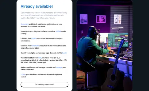
Service showcase Combine a rounded white information card and studio photography in a two-column layout against Studio Charcoal.
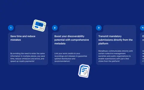
Benefits cards Present numbered benefit cards over the Deep Set Blue section, keeping supporting text compact and easy to scan.
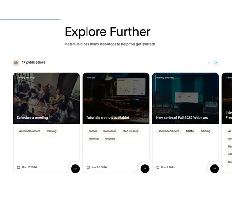
Editorial resource cards Use image-led cards with category and date details, rounded corners, fine separators, and circular next-arrow controls.
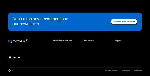
Newsletter banner Set a wide Signal Blue subscription panel within the black footer, with the message on one side and a compact contrasting action.
Imagery · Photography focuses on studios, recording, and music professionals, often placed beside explanatory copy or inside editorial cards. Images retain a natural photographic look, with rounded card framing and occasional dark overlays for readable text. Simple waveform lines and small music-related illustrations recur as lightweight visual motifs; treat their colors as supporting artwork rather than core brand surfaces.
页面版块 共 13 个版块,按页面从上到下排列,每个都标了类型、布局和交互套路。
首页
首屏 首页主视觉
White, spacious hero with top announcement and navigation, left-aligned headline, line art, and paired action cards.
图文交替 适用人群
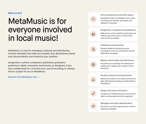
Warm Paper two-column section: explanatory copy at left and stacked audience cards at right.
其他 服务标题
Centered title band on Studio Charcoal, with a small lead-in and account link.
产品展示 产品服务展示
Two columns on Studio Charcoal: white service details beside a large studio image.
其他 优势标题
Short Deep Set Blue title band with left-aligned heading and supporting link.
功能网格 使用优势
Deep Set Blue field with a horizontal sequence of numbered benefit cards.
图文交替 了解更多
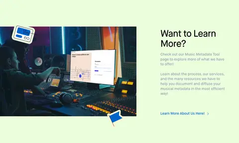
Fresh Lime split section with wide studio image on the left and text with link on the right.
内容列表 精选资源
White editorial section with heading and three-column image-led resource cards.
内容列表 元数据文章
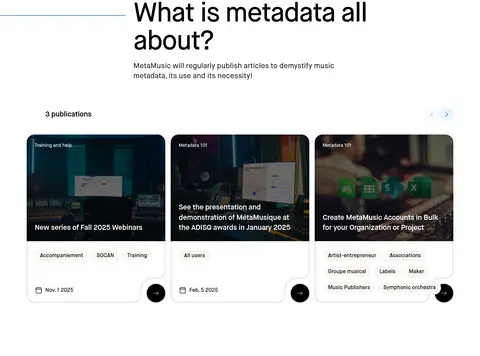
White section with explanatory heading followed by a three-column article-card row.
内容列表 最新公告
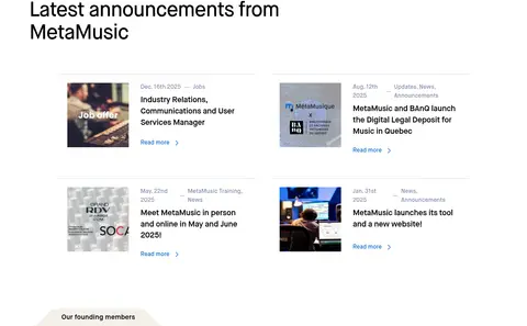
White two-column announcements feed with thumbnail, date, category, title, and read-more link.
品牌墙 创始成员
Shallow full-width member strip with four-column logo arrangement on a light background.
行动号召 立即开始
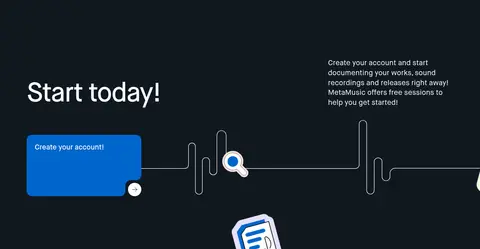
Studio Charcoal two-column CTA with large heading, supporting copy, blue action, and waveform line art.
页脚 订阅与页脚
Black footer with blue newsletter banner, link columns, social icons, language choice, and policy links.
该做与不该做 ✓ 该做 Use Maison Neue or a close sans-serif substitute throughout. Make the hero headline the strongest typographic element. Alternate the measured section colors to distinguish content chapters. Reserve Signal Blue for clear actions, links, and restrained highlights. Use photography that connects to music creation and the platform’s audience. Give major sections generous breathing room and cards clear internal structure. ✕ 不该做 Do not introduce unmeasured brand colors as large surfaces. Do not crowd the hero or reduce its headline to ordinary body scale. Do not apply gradients; the measured page uses flat color bands. Do not rely on heavy shadows to separate cards from their backgrounds. Do not make every section the same layout or background color. Do not treat illustrative colors as additional core brand colors. 给 AI 的提示词 想快速出一个同风格的新页面,把这段话连同 DESIGN.md 一起发给 AI。
复制 Build a new MetaMusic page using an editorial, music-industry visual language. Use Canvas White (#ffffff) and Stage Black (#000000) as the foundation, with Signal Blue (#0066cc) for key actions and links. Set dark sections in Studio Charcoal (#101820) or Deep Set Blue (#0e2575); reserve Warm Paper (#f4f1ea) and Fresh Lime (#ebfedd) for contrasting feature bands. Use Maison Neue, or Inter as a free substitute, with a bold-scale, tightly tracked headline and readable compact copy. Organize content in a wide centered frame, alternating two-column feature layouts with editorial card grids. Include authentic music-studio photography and restrained waveform-style illustration. Keep cards rounded, borders quiet, and shadows minimal. Maintain clear section rhythm and make every CTA easy to identify.
DESIGN.md Tailwind v4 CSS 变量 Design Tokens
---
title: "MetaMusic design system"
variant: extended
source: https://metamusic.ca/
captured_at: 2026-10-12
theme: light
industry: media
generator: Design DNA (https://four.wiralomi.com/style/metamusic-ca)
ai_generated: true
ai_label: "本文件由 AI 辅助生成:数值取自公开网页的实测样式,命名、用途说明与建议为模型解读。商标归原所有者。 / AI-assisted content"
---
# MetaMusic · Design System
> Clear metadata, confident music careers.
**Theme:** light · **Industry:** media · **Source:** https://metamusic.ca/ · **Captured:** 2026-10-12 (1440×900 desktop)
_AI-assisted content: values are measured from the public page at capture time; names, roles and guidance are model-written interpretations. Trademarks belong to their owners._
MetaMusic pairs an oversized, high-contrast typographic hero with approachable content about music metadata services. Warm and cool section bands, small blue accents, and practical editorial cards carry the page from product introduction to learning resources and announcements.
## North star
Let oversized black typography and spacious editorial layouts lead, using blue accents and section color bands to make each next step clear.
## Overview
The homepage balances an airy white opening with a sequence of clearly differentiated section bands: warm off-white for audience information, deep charcoal for services, saturated navy for benefits, and pale green for a learning prompt. Black typography anchors the page; vivid blue marks links, calls to action, and small illustrative details. Maison Neue supplies a consistent voice, from the oversized, tightly tracked hero headline to compact labels and readable body copy. Layouts alternate between broad two-column feature sections and centered title bands, then settle into three-column editorial card rows and a four-column member strip. Generous separation between sections gives the long page room to breathe, while cards remain information-dense and practical. Photography shows music-making and studio contexts; thin waveform-like line art and small music-related illustrations connect the product story to the imagery without turning the page into a decorative showcase.
## Colors
| Name | Hex | Token | Group | Role |
|---|---|---|---|---|
| Stage Black | ` | `--color-stage-black` | neutral | Primary text, inverse footer background, navigation text, and outlined portal-login button. |
| Canvas White | ` | `--color-canvas-white` | surface | Main hero and editorial canvas, card surfaces, and text on dark sections. |
| Signal Blue | ` | `--color-signal-blue` | brand | Primary account CTA, text links, and small emphasis details. |
| Deep Set Blue | ` | `--color-deep-set-blue` | brand | Full-width benefits section background. |
| Studio Charcoal | ` | `--color-studio-charcoal` | surface | Services and closing CTA section backgrounds. |
| Quiet Rule | ` | `--color-quiet-rule` | neutral | Subtle borders and hairlines separating cards and content. |
| Warm Paper | ` | `--color-warm-paper` | surface | Audience-introduction section background. |
| Muted Slate | ` | `--color-muted-slate` | semantic | Secondary text and subdued supporting copy. |
| Fresh Lime | ` | `--color-fresh-lime` | surface | Learning-more feature section background. |
| Illustration Indigo | ` | `--color-illustration-indigo` | accent | Secondary blue found in cards and graphic details; use as an accent, not a dominant page color. |
| Soft Ivory | ` | `--color-soft-ivory` | surface | Minor warm neutral surface detail; not a primary section color. |
### Semantic aliases
`--color-canvas` → ` (Canvas White) · `--color-surface` → ` (Stage Black) · `--color-surface-2` → ` (Studio Charcoal) · `--color-surface-3` → ` (Warm Paper) · `--color-surface-4` → ` (Fresh Lime) · `--color-text` → ` (Stage Black) · `--color-text-muted` → ` (Canvas White) · `--color-text-subtle` → ` (Muted Slate) · `--color-border` → ` (Quiet Rule) · `--color-accent` → ` (Signal Blue) · `--color-accent-2` → ` (Deep Set Blue) · `--color-accent-3` → ` (Illustration Indigo) · `--color-on-accent` → ` (Canvas White)
### Contrast (WCAG 2.x)
| Text | Background | Ratio | Level |
|---|---|---|---|
| ` | ` | 21:1 | AAA |
| ` | ` | 1.17:1 | fail |
| ` | ` | 18.62:1 | AAA |
| ` | ` | 21:1 | AAA |
| ` | ` | 17.89:1 | AAA |
| ` | ` | 1.13:1 | fail |
| ` | ` | 3.41:1 | AA-large |
| ` | ` | 6.15:1 | AA |
| ` | ` | 5.24:1 | AA |
| ` | ` | 3.03:1 | AA-large |
## Typography
| Family | Token | Source | Weights | Role | Free substitute |
|---|---|---|---|---|---|
| Maison Neue | `--font-body` | webfont | 400, 500, 600 | Site-wide typeface for display headlines, section headings, navigation, body text, links, and buttons. | Inter |
- **Maison Neue:** Use measured medium weights for most text and semibold for smaller headings; display headlines are large, tightly tracked, and mixed case.
### Type scale — Perfect Fifth (ratio ≈ 1.496, base 16px)
| Role | Size | Weight | Line height | Letter spacing | Case | Family | Used for |
|---|---|---|---|---|---|---|---|
| display | 120px | 500 | 0.95 | -0.02em | — | Maison Neue | Oversized hero headline and prominent display messaging. |
| h1 | 80px | 500 | 1.05 | -0.03em | — | Maison Neue | Primary page or major section headline. |
| h2 | 56px | 500 | 1.1 | -0.03em | — | Maison Neue | Large section headings such as service and benefits titles. |
| h3 | 40px | 500 | 1.2 | -0.02em | — | Maison Neue | Subsection headings and prominent card titles. |
| h4 | 26px | 600 | 1.4 | -0.02em | — | Maison Neue | Compact card and feature headings. |
| body | 16px | 500 | 1.5 | 0 | — | Maison Neue | Paragraphs describing services, audiences, and resources. |
| caption | 14px | 500 | 1.4 | 0 | — | Maison Neue | Dates, categories, and small supporting labels. |
| button | 16px | 500 | 1.5 | 0 | — | Maison Neue | Account creation, scheduling, and other action labels. |
| nav | 16px | 500 | 1.5 | 0 | — | Maison Neue | Main navigation and portal access links. |
| link | 22px | 500 | 1.35 | -0.01em | — | Maison Neue | Prominent in-content links to tools and resources. |
## Spacing & layout
- Base unit **8px**, density **comfortable**.
- Scale (most used values): 8, 12, 16, 24, 40, 80, 160 px.
- Section rhythm 80px · element gap 8px · card padding 24px · max content width 1280px.
The page uses a centered, wide content frame with measured maximum width of 1280px. Its hero is left-aligned and spacious, pairing oversized copy with line-art imagery and two action cards. Two-column feature sections alternate text and media; centered title bands introduce full-width dark sections. Later content uses three-column editorial cards, a two-column announcements feed, and a four-column founding-member strip. An 80px section rhythm and comfortable density separate the long sequence, while tighter card interiors keep information scannable.
## Shape & elevation
- Radius: button `9999px` · card `24px` · nav `8px` · link `24px` · xs `8px` · sm `14px` · md `16px` · lg `24px` · pill `9999px`
- Shadow `hairline` (button): `rgb(0, 0, 0) 0px 4px 0px 0px`
- Shadow `sm` (button): `rgba(0, 0, 0, 0) 0px 0px 0px 0px, rgba(0, 0, 0, 0) 0px 0px 0px 0px, rgba(0, 0, 0, 0) 0px 0px 0px 0px, rgba(0, 0, 0, 0) 0px 0px 0px 0px, rgba(0, 0, 0, 0.1) 0px 1px 3px 0px, rgba(0, 0, 0, 0.1) 0px 1px 2`
- Motion: standard transition `0.1s linear` on interactive elements.
Most sections are flat color bands, with separation created by background changes and whitespace rather than deep shadows. Cards use white surfaces and rounded corners; selected content has subtle hairlines. Portal-login buttons use a crisp black offset shadow, while other CTAs stay visually simple. Keep layering restrained and prioritize clear edges over soft, floating panels.
## Imagery
Photography focuses on studios, recording, and music professionals, often placed beside explanatory copy or inside editorial cards. Images retain a natural photographic look, with rounded card framing and occasional dark overlays for readable text. Simple waveform lines and small music-related illustrations recur as lightweight visual motifs; treat their colors as supporting artwork rather than core brand surfaces.
## Components
### Hero action cards
Pair a solid Signal Blue account-creation card with a white outlined introduction-session card; each ends with a small circular arrow affordance.
### Portal login
Use a black outlined pill with black text and a crisp offset black shadow, matching the measured login-button treatment.
### Service showcase
Combine a rounded white information card and studio photography in a two-column layout against Studio Charcoal.
### Benefits cards
Present numbered benefit cards over the Deep Set Blue section, keeping supporting text compact and easy to scan.
### Editorial resource cards
Use image-led cards with category and date details, rounded corners, fine separators, and circular next-arrow controls.
### Newsletter banner
Set a wide Signal Blue subscription panel within the black footer, with the message on one side and a compact contrasting action.
### Measured component styles
- **Primary button** (“Schedule a meeting”): background ## Do
- Use Maison Neue or a close sans-serif substitute throughout.
- Make the hero headline the strongest typographic element.
- Alternate the measured section colors to distinguish content chapters.
- Reserve Signal Blue for clear actions, links, and restrained highlights.
- Use photography that connects to music creation and the platform’s audience.
- Give major sections generous breathing room and cards clear internal structure.
## Don't
- Do not introduce unmeasured brand colors as large surfaces.
- Do not crowd the hero or reduce its headline to ordinary body scale.
- Do not apply gradients; the measured page uses flat color bands.
- Do not rely on heavy shadows to separate cards from their backgrounds.
- Do not make every section the same layout or background color.
- Do not treat illustrative colors as additional core brand colors.
## Agent prompt
Build a new MetaMusic page using an editorial, music-industry visual language. Use Canvas White (## Page sections (top to bottom)
| # | Type | Layout | UX patterns | UI patterns |
|---|---|---|---|---|
| 1 | hero | White, spacious hero with top announcement and navigation, left-aligned headline, line art, and paired action cards. | announcement link, primary account CTA, introduction-session CTA, portal login | oversized black headline, blue accent, waveform illustration, outlined pill |
| 2 | feature-split | Warm Paper two-column section: explanatory copy at left and stacked audience cards at right. | audience segmentation, tool discovery link | warm neutral band, stacked white cards, small audience icons |
| 3 | other | Centered title band on Studio Charcoal, with a small lead-in and account link. | section introduction, account creation link | dark background, centered white heading, blue supporting text |
| 4 | product-showcase | Two columns on Studio Charcoal: white service details beside a large studio image. | feature explanation, account creation prompt | rounded white card, music studio photography, dark section band |
| 5 | other | Short Deep Set Blue title band with left-aligned heading and supporting link. | benefits introduction, learn-more link | navy background, white heading, blue rule detail |
| 6 | feature-grid | Deep Set Blue field with a horizontal sequence of numbered benefit cards. | numbered benefits, scan-and-compare | dark blue cards, number markers, small illustrative stickers |
| 7 | feature-split | Fresh Lime split section with wide studio image on the left and text with link on the right. | learn-more explanation, related-page link | pale green band, studio image, simple text column |
| 8 | content-feed | White editorial section with heading and three-column image-led resource cards. | browse resources, card-level navigation | editorial cards, category labels, date and arrow controls |
| 9 | content-feed | White section with explanatory heading followed by a three-column article-card row. | educational content discovery, browse publications | image-led cards, compact metadata, rounded card frames |
| 10 | content-feed | White two-column announcements feed with thumbnail, date, category, title, and read-more link. | latest updates, read-more links | thumbnail-led rows, fine separators, compact text hierarchy |
| 11 | logo-cloud | Shallow full-width member strip with four-column logo arrangement on a light background. | member recognition, partner navigation | organization logos, quiet neutral strip |
| 12 | cta | Studio Charcoal two-column CTA with large heading, supporting copy, blue action, and waveform line art. | account creation, free-session reassurance | dark section, blue action card, decorative waveform |
| 13 | footer | Black footer with blue newsletter banner, link columns, social icons, language choice, and policy links. | newsletter subscription, footer navigation, language selection | black background, blue banner, compact link columns |
## Source CSS custom properties (selected)
```css
--wp--preset--color--black: