North star · Keep the canvas nearly black and let bold white type, artist imagery, and music content create the contrast.
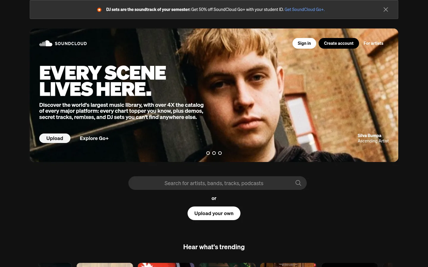
The visual system is anchored by a near-black #121212 canvas, with white typography carrying most of the contrast and muted gray supporting navigation, metadata, and secondary copy. Darker gray surfaces distinguish search and utility controls without introducing bright section bands. The hero is the main interruption: large artist photography fills a rounded, wide panel, while compact white copy and pill-shaped actions sit over the image. Söhne provides a consistent sans-serif voice, from heavy uppercase display headlines to smaller semibold navigation and track labels. The page alternates between discovery-focused content and spacious promotional feature blocks, keeping the overall dark field continuous. Album artwork and artist photos supply warm, varied color; these image colors are content, not core brand tokens. Thin dividers, restrained borders, and minimal shadows keep the interface flat, while persistent playback controls reinforce the feeling of an active listening environment.
配色
点色块复制色值。用途说明来自对页面的实测位置(背景、文字、描边、按钮)与截图判读。
品牌色
强调色
表层色
中性色
功能色
页面底色 · Midnight Canvas表层 · Panel Gray表层 2 · Control Charcoal主文字 · Stage White次要文字 · Quiet Gray弱文字 · Midnight Canvas描边 · Divider Charcoal强调 · Link Blue强调 2 · Coral Signal
文字
背景
对比度
WCAG
#ffffff Stage White
#121212 Midnight Canvas
18.73:1
AAA
#ffffff Stage White
#666666 Panel Gray
5.74:1
AA
#ffffff Stage White
#303030 Control Charcoal
13.2:1
AAA
#999999 Quiet Gray
#121212 Midnight Canvas
6.58:1
AA
#999999 Quiet Gray
#666666 Panel Gray
2.02:1
不达标
#999999 Quiet Gray
#303030 Control Charcoal
4.63:1
AA
字体
字号阶梯:Custom(比例约 1.85,正文 19px)。示例用免费替代字体渲染,数值为实测。
Aa 设计
Söhne
网络字体 · 字重 600 / 400 / 800 / 700 · 占比 98%
免费替代:Inter
Site-wide interface and editorial typography, including display headings, body text, buttons, navigation, and links.
Aa 设计
a
系统字体 · 字重 400 · 占比 3%
免费替代:Arial
Minor system-font fallback detected in a small portion of the interface.
角色
示例
字号
字重
行高
字距
特大标题
Oversized uppercase hero and promotional headlines.
SoundCloud
65px
800
0.85
-0.02em
一级标题
Section-level headline and prominent page messaging.
SoundCloud
28px
600
1.29
0
正文
Hero description and primary supporting copy.
The quick brown fox 敏捷的狐狸
19px
600
1.1
-0.01em
辅助文字
Track labels, metadata, and compact supporting details.
The quick brown fox 敏捷的狐狸
14px
600
1.43
0
按钮
Primary and secondary action labels.
The quick brown fox 敏捷的狐狸
17px
600
1.41
0.012em
导航
Header and product navigation labels.
The quick brown fox 敏捷的狐狸
14px
600
1.43
0
链接
Text links across content and footer.
The quick brown fox 敏捷的狐狸
14px
600
1.43
0
间距与布局
基准单位 8px · 密度:适中
48px版块间距
16px元素间距
—卡片内边距
1240px内容最大宽度
4px
6px
8px
10px
12px
13px
16px
18px
20px
23px
24px
32px
48px
64px
70px
120px
The main content sits within a centered, measured maximum width of 1240px. A broad hero panel leads into a centered search and upload area, then a multi-column music feed; lower sections use two-column feature splits before a compact footer. Keep the dark canvas continuous between sections, with a measured 48px section gap and 16px element gap. The overall density is comfortable: feed content is compact, while promotional blocks retain generous breathing room.
圆角与层次
按钮 · 9999px
输入框 · 9999px
链接 · 9999px
inset · other
The page is predominantly flat, with dark surfaces distinguished by subtle tonal shifts and restrained hairlines. Avoid prominent card shadows or layered panels. The hero image and artwork provide depth through photography and color, while controls remain legible through contrast and simple filled shapes.
组件
下面的预览按实测的按钮、输入框、徽标、卡片样式重建(字体用替代字体)。
Announcement bar
A centered charcoal notice above the hero, with compact copy, a small icon, a highlighted link, and a dismiss control.
Hero panel
Wide artist-photo feature with uppercase white headline, concise copy, compact actions, attribution, and carousel indicators.
Search input
Dark #303030 search field with muted prompt and search icon; measured variants use a pill radius.
Pill actions
High-contrast rounded actions use white or near-white fills with dark text; the measured primary button uses a 9999px radius.
Music discovery feed
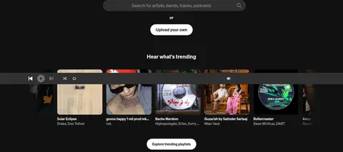
A dense row of album artwork and track metadata, supported by compact links and persistent playback controls.
Feature split
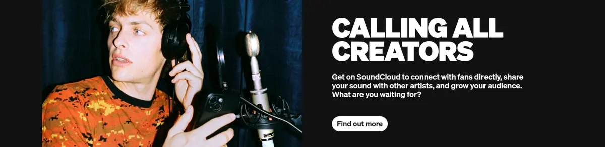
Promotional sections pair bold uppercase messaging and supporting copy with photography, QR code, or colorful illustration.
Footer
Compact utility links, social icons, language selector, and brand mark arranged on the continuing dark canvas.
Imagery · Large artist photography anchors the hero and creator feature, cropped wide and placed within rounded panels or split layouts. Album covers form a dense horizontal discovery feed, with artwork providing the strongest color variation. A small illustrated music-device composition appears in the listening feature; treat its vivid colors as editorial imagery, not as interface palette.
Let artist photography and album art carry vivid color.
Make primary actions high-contrast and pill-shaped.
Keep content centered within the measured 1240px maximum width.
✕ 不该做
Do not turn image-artwork colors into broad UI surfaces.
Do not introduce bright section backgrounds between content blocks.
Do not use oversized shadows or layered card treatments.
Do not make secondary navigation as bright as primary headlines.
Do not crowd feature sections with dense interface controls.
Do not replace the music feed with generic marketing cards.
给 AI 的提示词
想快速出一个同风格的新页面,把这段话连同 DESIGN.md 一起发给 AI。
Build a new SoundCloud-style page with a continuous #121212 Midnight Canvas and a centered content area capped at the measured 1240px width. Use Söhne or Inter, with bold uppercase display headlines, white primary copy, and #999999 Quiet Gray for secondary labels. Keep controls restrained: #303030 Control Charcoal inputs, subtle #353535 Divider Charcoal hairlines, and high-contrast pill actions. Organize the page into a bold artist-led hero, discovery content, and spacious feature sections. Use photography, album artwork, and occasional illustration as the source of vivid color; do not promote artwork hues into large interface backgrounds. Preserve comfortable spacing, flat surfaces, compact metadata, and a clear listening-product feel.