North star · Keep the interface quiet and dark so album artwork and listening choices provide the color, character, and focus.
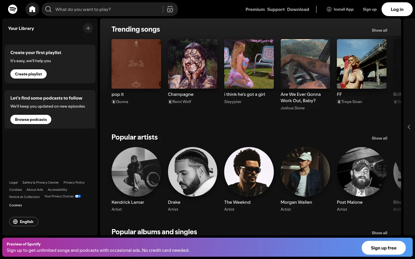
The page uses a #121212 canvas with a near-black navigation rail and content regions, keeping the interface quiet while album art supplies most of the color. White headings and primary labels stand out against muted #b3b3b3 supporting text; thin outlined controls use #7c7c7c, and Spotify Green is reserved for a small search-related accent. A persistent top bar combines the logo, home control, pill-shaped search field, and account actions. Below it, a narrow library sidebar sits beside a broad, scrollable discovery area. Music collections form horizontal rows of square cover tiles and circular artist portraits, with labels aligned consistently beneath each image. SpotifyMixUI provides a compact, familiar sans-serif voice, while the title font sharpens section headings. The fixed bottom signup preview uses a magenta-to-blue gradient as the page’s strongest color moment and a white pill CTA.
Prominent page or section heading, including discovery section titles.
The quick brown fox 敏捷的狐狸
24px
700
normal
0
正文
Main interface copy, playlist prompts, and standard supporting text.
The quick brown fox 敏捷的狐狸
16px
400
normal
0
辅助文字
Compact metadata and artist or track details.
The quick brown fox 敏捷的狐狸
14px
400
normal
0
按钮
Bold labels on primary and secondary action controls.
The quick brown fox 敏捷的狐狸
16px
700
normal
0
导航
Small utility and legal links in navigation areas.
The quick brown fox 敏捷的狐狸
12px
400
normal
0
链接
Interactive artist, track, and destination labels.
The quick brown fox 敏捷的狐狸
14px
400
normal
0
间距与布局
基准单位 4px · 密度:宽松
172px版块间距
8px元素间距
—卡片内边距
1424px内容最大宽度
2px
4px
8px
12px
16px
20px
24px
32px
172px
A 12-column measured grid sits within a 1424px maximum page width, with content aligned to the start. The viewport is organized into a top navigation bar, a narrow library sidebar, and a wide discovery feed. The feed stacks music sections vertically, while each section presents a horizontal carousel of cover or artist cards. The measured section rhythm is spacious, but card rows remain information-dense. A persistent signup preview anchors the bottom edge.
圆角与层次
按钮 · 50%
输入框 · 9999px
卡片 · 6px
图片 · 6px
徽标 · 9999px
导航 · 9999px
链接 · 9999px
md · card
inset · text
The page is primarily flat, using tonal shifts between black, #121212, and charcoal panels instead of strong borders. Cards rely on artwork and spacing for definition. The measured card shadow is soft and deep, while a subtle inset outline appears on some controls. Rounded pill controls and restrained outlines establish interaction affordances without adding a heavy layered-card aesthetic.
组件
下面的预览按实测的按钮、输入框、徽标、卡片样式重建(字体用替代字体)。
Top navigation
Black horizontal bar combines the Spotify mark, home control, #1f1f1f search input, utility links, and account actions.
Library sidebar
Dark left rail groups Your Library, playlist and podcast prompts, pill CTAs, legal links, and an outlined language selector.
Discovery section
White section heading and muted Show all link introduce a horizontal row of music or artist cards.
Album tile
Square cover artwork sits above track and artist labels, with muted supporting metadata and minimal framing.
Artist tile
Circular portrait crop paired with a white artist name and muted category label.
Signup preview bar
Fixed bottom banner uses a #af2896-to-#509bf5 gradient, compact white copy, and a white pill signup CTA.
Pill controls
Rounded buttons distinguish actions through white fills, muted text, or thin #7c7c7c outlines.
Imagery · Real music and artist photography carries most of the page’s expressive color. Album covers appear as square thumbnails, while artist portraits use circular crops; both sit directly within horizontal discovery rows. The images keep their original artwork treatment rather than sharing a single overlay or filter. Album art may introduce warm or cool tones, but those sampled colors belong to media content, not the interface palette.
Keep navigation compact and separate from the discovery feed.
Let album and artist imagery provide most of the visual variation.
Use white for primary labels and #b3b3b3 for supporting text.
Reserve the magenta-to-blue gradient for a prominent signup preview.
Use pill silhouettes for buttons and search controls.
✕ 不该做
Do not turn sampled artwork colors into general UI accents.
Do not replace the dark canvas with bright section backgrounds.
Do not crowd album images with decorative borders or labels.
Do not make supporting metadata compete with section headings.
Do not spread the gradient across every card or control.
Do not add heavy shadows to the overall page structure.
给 AI 的提示词
想快速出一个同风格的新页面,把这段话连同 DESIGN.md 一起发给 AI。
Build a new music-discovery page in Spotify’s dark, media-first visual language. Use Listening Black (#121212) for the main canvas, Deep Black (#000000) for the top bar, and Panel Charcoal (#1f1f1f) for search or input surfaces. Set headings and primary labels in Pure White (#ffffff), with Soft Silver (#b3b3b3) for metadata and secondary links. Keep the header compact, the library rail distinct from the broad content feed, and discovery sections arranged as horizontal rows of square covers or circular portraits. Use pill-shaped controls and restrained outlines in Quiet Graphite (#7c7c7c). Apply Spotify Green (#1ed760) only as a small accent. If a signup banner is needed, use Vivid Magenta (#af2896) blending to Sky Blue (#509bf5). Preserve generous section separation and let supplied artwork supply the page’s visual richness.