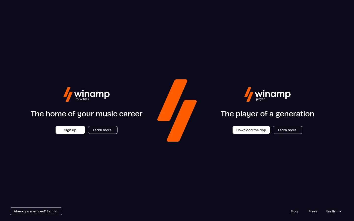
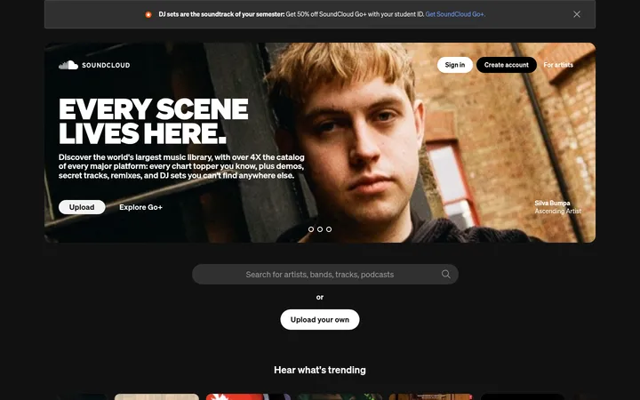
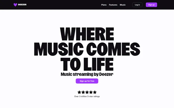
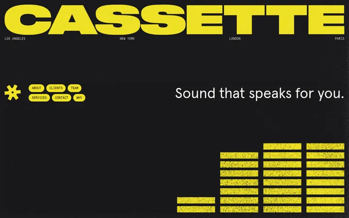
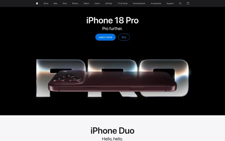
North star · Keep the canvas quiet and dark so a centered, balanced choice and the orange Winamp mark carry the entire first impression.
The page is built on a nearly uniform midnight-violet canvas (#0b0a1a), leaving generous negative space around a single centered choice between two Winamp experiences. White (#ffffff) carries the key headlines and filled CTA surfaces, while the orange brand mark is the most vivid visual signal, contained in the logo artwork rather than part of the measured interface palette. The two offers mirror one another: artist tools on the left, the player on the right, with the large central mark acting as their divider. Bricolage Grotesque gives headlines a compact, distinctive shape; Poppins supports the accompanying product identity and body copy. Small, restrained controls sit directly beneath each headline. Outlined secondary actions and the bottom-edge utility links remain quiet against the dark field. The page avoids decorative panels, shadows, and busy section bands; its visual impact comes from symmetry, contrast, and the scale of the central logo.
配色
点色块复制色值。用途说明来自对页面的实测位置(背景、文字、描边、按钮)与截图判读。
品牌色
中性色
页面底色 · Midnight Violet主文字 · Studio White次要文字 · Charcoal Ink弱文字 · Deep Black
文字
背景
对比度
WCAG
#ffffff Studio White
#0b0a1a Midnight Violet
19.58:1
AAA
#09090b Charcoal Ink
#0b0a1a Midnight Violet
1.02:1
不达标
#000000 Deep Black
#0b0a1a Midnight Violet
1.07:1
不达标
字体
字号阶梯:Custom(比例约 2.462,正文 13px)。示例用免费替代字体渲染,数值为实测。
Aa 设计
Poppins
网络字体 · 字重 500 / 400 · 占比 55%
免费替代:Nunito Sans
Body copy and supporting text accompanying the product identities.
Aa 设计
Bricolage Grotesque
网络字体 · 字重 500 · 占比 36%
免费替代:Space Grotesk
Primary product headlines, including the two mirrored hero statements.
Aa 设计
sans-serif
系统字体 · 字重 400 · 占比 10%
免费替代:Inter
Small utility labels and measured CTA text.
角色
示例
字号
字重
行高
字距
一级标题
The prominent statement for each of the two hero destinations.
Winamp
32px
500
1.06
-0.02em
正文
Supporting product labels and explanatory copy.
The quick brown fox 敏捷的狐狸
13px
500
1.62
0
辅助文字
Compact CTA labels and bottom-edge utility navigation.
The quick brown fox 敏捷的狐狸
12px
400
normal
0
间距与布局
基准单位 2px · 密度:适中
—版块间距
8px元素间距
—卡片内边距
—内容最大宽度
5px
6px
8px
10px
12px
16px
24px
32px
40px
A single viewport-scale canvas holds a horizontally balanced, two-column hero, with a large orange Winamp symbol centered between the offers. Each column aligns its logo, headline, and paired actions as a compact stack. The page leaves broad areas of uninterrupted background above and below the central content. A member sign-in control anchors the lower left, while blog, press, and language links sit along the lower right. No card grid, visible section bands, or measured maximum width is present.
圆角与层次
按钮 · 8px
导航 · 8px
没有测到阴影:页面是扁平的,层次靠底色和描边区分。
The design is essentially flat: the dark canvas runs continuously behind all content, with no measured shadows or layered cards. A thin light outline distinguishes secondary actions from filled white CTAs. Preserve clear contrast through color and borders rather than simulated depth.
组件
下面的预览按实测的按钮、输入框、徽标、卡片样式重建(字体用替代字体)。
Artist-platform hero
Left-side offer with the artist Winamp wordmark, a concise headline, a filled sign-up CTA, and an outlined Learn more action.
Player hero
Mirrors the left offer on the right, using the player wordmark, generation-focused headline, filled Download the app CTA, and outlined Learn more action.
Central brand mark
Large orange Winamp symbol centered between the two product destinations; it is the page’s strongest visual accent.
Member sign-in
Small outlined sign-in control positioned near the lower-left edge of the canvas.
Utility navigation
Quiet bottom-right links for Blog, Press, and language selection, kept visually subordinate to the hero.
Imagery · The first viewport contains brand artwork rather than photography or product screenshots: two small white-and-orange Winamp wordmarks and a much larger orange symbol between the hero columns. The marks sit directly on the dark canvas, with no visible frame or image container. Keep the artwork crisp, simple, and prominent; do not introduce photographic textures or extra illustration colors.
Keep the two primary destinations visually balanced.
Reserve orange emphasis for Winamp brand artwork.
Use white for clear headlines and filled CTA surfaces.
Keep secondary actions outlined and understated.
Leave generous negative space around the hero.
✕ 不该做
Do not add bright section backgrounds or gradients.
Do not place the hero content inside raised cards.
Do not let utility links compete with the two main offers.
Do not introduce decorative photography or textures.
Do not use the measured muted text colors as brand accents.
Do not break the centered, mirrored composition.
给 AI 的提示词
想快速出一个同风格的新页面,把这段话连同 DESIGN.md 一起发给 AI。
Build a new Winamp-style page around a continuous Midnight Violet (#0b0a1a) canvas. Establish one clear focal area with balanced, side-by-side content groups and generous negative space. Use Studio White (#ffffff) for prominent text and filled primary actions; keep secondary actions as fine outlined controls. Treat the orange Winamp artwork as a brand asset, not a reason to add extra interface accent colors. Use Bricolage Grotesque or a close geometric substitute for headlines, Poppins-like sans-serif for supporting copy, and small neutral sans-serif utility labels. Keep surfaces flat, avoid shadows and card-heavy layouts, and place low-priority navigation near the bottom edge. Make the composition feel calm, symmetrical, and unmistakably music-led.