North star · Keep the interface black on white and editorially restrained, letting oversized typography and project media carry the personality.
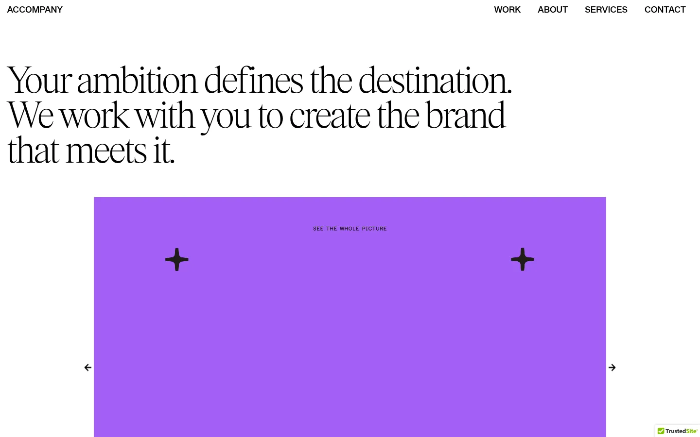
The page is built on a near-pure white canvas (#ffffff) with black typography (#000000), keeping the studio identity quiet and allowing its portfolio media to supply the colour. The vivid purple hero slide and colourful project tiles are artwork within the carousel and portfolio, not evidence of a broader interface palette. Display copy uses a delicate, high-contrast serif at a very large scale; compact navigation and supporting copy use a clean, medium-weight sans serif. The opening statement is left-aligned and spans several lines, followed by a centered, wide media panel with simple arrow controls. A single-column introductory statement transitions into a three-column project row. Broad stretches of white space separate content groups, while the footer returns to a simple two-column arrangement. The overall strategy is editorial rather than decorative: typography establishes hierarchy, media provides variety, and the interface stays flat, spare, and monochrome.
配色
点色块复制色值。用途说明来自对页面的实测位置(背景、文字、描边、按钮)与截图判读。
表层色
中性色
页面底色 · Gallery White主文字 · Studio Ink
文字
背景
对比度
WCAG
#000000 Studio Ink
#ffffff Gallery White
21:1
AAA
字体
字号阶梯:Custom(比例约 2.108,正文 18px)。示例用免费替代字体渲染,数值为实测。
Aa 设计
SyndicatGroteskMedium
网络字体 · 字重 400 · 占比 89%
免费替代:Inter
Navigation, body copy, and links
Aa 设计
Items-Light
网络字体 · 字重 400 · 占比 11%
免费替代:Bodoni Moda
Oversized display headline
角色
示例
字号
字重
行高
字距
特大标题
Oversized serif opening statement.
ACCOMPANY
80px
400
0.9
-0.02em
一级标题
Section-level studio introduction or prominent heading.
ACCOMPANY
44px
400
1
-0.03em
正文
Supporting studio and project descriptions.
The quick brown fox 敏捷的狐狸
18px
400
1.2
0
导航
Header navigation links.
The quick brown fox 敏捷的狐狸
18px
400
1
0
链接
Contact and inline text links.
The quick brown fox 敏捷的狐狸
18px
400
1.2
0
间距与布局
基准单位 2px · 密度:宽松
40px版块间距
35px元素间距
—卡片内边距
1055px内容最大宽度
5px
10px
14px
22px
35px
36px
40px
43px
72px
101px
115px
165px
173px
A spacious, mostly left-aligned editorial layout with a measured page maximum width of 1055px. The header places the wordmark at the left and navigation at the right. The hero statement sits above a wide centered carousel; below it, a single-column studio introduction leads into three project columns. Sections retain generous vertical separation, with low overall density and broad white margins. The lower contact statement is followed by a two-column footer.
圆角与层次
按钮 · 2px
sm · button
The page is predominantly flat: white canvas, black text, and no recurring card shadows or visible section bands. Keep separations structural through whitespace rather than borders. The measured button radius is 2px, but the visible interface uses restrained, nearly unadorned controls; avoid adding layered panels or decorative elevation.
组件
下面的预览按实测的按钮、输入框、徽标、卡片样式重建(字体用替代字体)。
Header navigation
Place the ACCOMPANY wordmark at the left and WORK, ABOUT, SERVICES, and CONTACT links at the right, in black sans-serif text on white.
Display statement
Set the opening message in a large, light serif with tight tracking, left aligned and broken across multiple lines.
Hero carousel
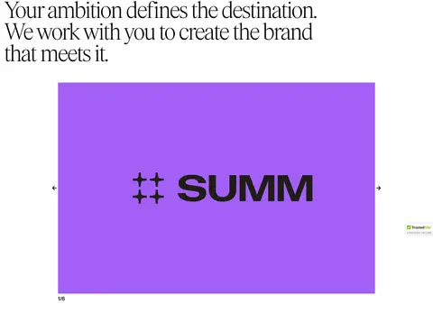
Show a centered, wide project-media frame with simple previous/next arrow controls and a small slide counter.
Studio introduction
Use a strong, left-aligned sans-serif paragraph in a single-column content block beneath the hero media.
Project cards
Arrange three image-led project stories in columns, with compact titles and short supporting descriptions.
Contact prompt
Use a prominent, left-aligned invitation and a direct get-in-touch link on the white canvas.
Footer
Organize studio address, social links, acknowledgement copy, and back-to-top navigation into a simple two-column layout.
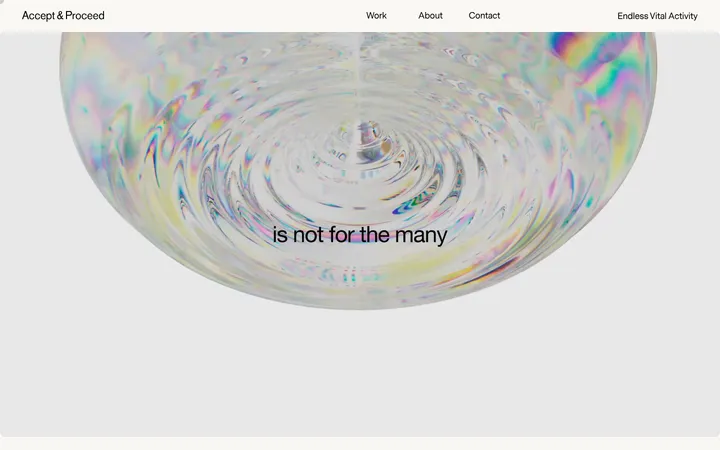
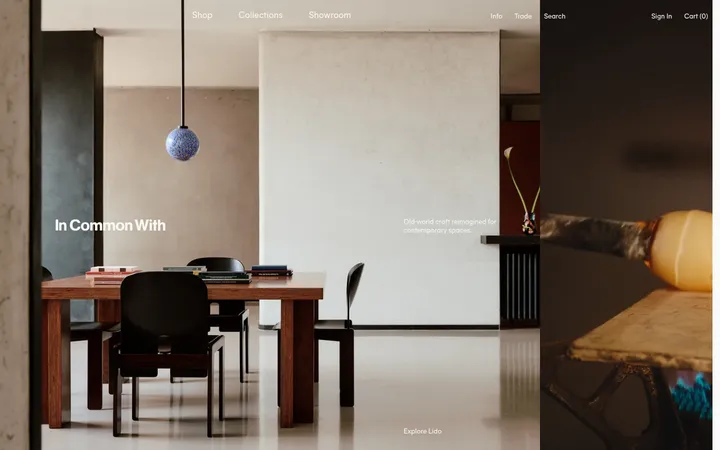
Imagery · Project media is presented as video or image-led portfolio work rather than as decorative interface art. The hero carousel uses a wide, centered frame with minimal directional controls; its bright purple slide belongs to the showcased project visual. Below, three compact project cards display varied creative work, including graphic-led award and branding imagery. Keep media crisp and let each project retain its own palette.
Use Gallery White (#ffffff) as the continuous page canvas.
Use Studio Ink (#000000) for core text, navigation, and links.
Give the display headline a light, editorial serif character.
Keep header navigation compact and aligned to the upper right.
Let project imagery introduce colour without recolouring the interface.
Use whitespace to distinguish sections and preserve a spacious rhythm.
✕ 不该做
Do not treat the purple carousel artwork as a global accent colour.
Do not add coloured section backgrounds absent from the measured page.
Do not add heavy borders, shadows, or elevated card treatments.
Do not center every heading; preserve the page’s left-aligned editorial composition.
Do not crowd the hero headline or compress the whitespace between sections.
Do not replace project-specific imagery with generic decorative illustrations.
给 AI 的提示词
想快速出一个同风格的新页面,把这段话连同 DESIGN.md 一起发给 AI。
Build a new page in the ACCOMPANY visual style: use Gallery White (#ffffff) as the uninterrupted canvas and Studio Ink (#000000) for navigation, headings, body copy, and links. Set a quiet header with the wordmark on the left and compact navigation on the right. Lead with a prominent, left-aligned, light editorial serif statement; use a medium sans serif for supporting copy and controls. Place wide, centered project media beneath the headline, with simple arrow controls, then introduce a single-column studio statement and a three-column project showcase. Preserve generous whitespace and a flat visual treatment. Let each project’s own artwork provide colour; do not turn its purple or other image colours into interface accents. Finish with a direct contact invitation and a practical two-column footer.