North star · Keep the interface quiet and grayscale, reserving visual intensity for full-bleed media and tightly set editorial statements.
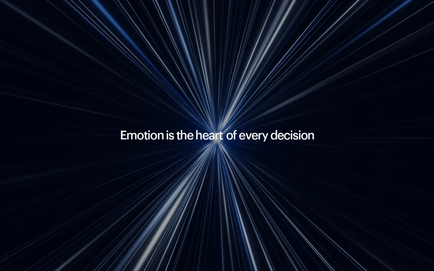
The page opens on a full-viewport, near-black cinematic image with a single centered white statement; this dark blue-black atmosphere belongs to the hero media, not the measured interface palette. The main canvas is #ededed, carrying almost-black #1c1c1c text and #7a7a7a secondary copy. A muted #b8b8b8 section surface and a #000000 inverse band provide restrained tonal changes; project imagery supplies most of the brighter colour. Graphik Medium shapes the page from compact captions to large display statements, with notably tight negative tracking and medium weight. The layout is editorial rather than card-driven: an agency introduction and jump links lead into a centered work heading, then a vertical sequence of broad, rounded project images. Substantial empty space separates the cinematic opening, introduction, portfolio, and closing contact prompt. Keep interface decoration minimal so media and typography carry the visual emphasis.
配色
点色块复制色值。用途说明来自对页面的实测位置(背景、文字、描边、按钮)与截图判读。
品牌色
表层色
中性色
功能色
页面底色 · Gallery White表层 · Soft Concrete表层 2 · Deep Black主文字 · Warm Ink次要文字 · Quiet Graphite弱文字 · Gallery White
文字
背景
对比度
WCAG
#1c1c1c Warm Ink
#ededed Gallery White
14.56:1
AAA
#1c1c1c Warm Ink
#b8b8b8 Soft Concrete
8.59:1
AAA
#1c1c1c Warm Ink
#000000 Deep Black
1.23:1
不达标
#7a7a7a Quiet Graphite
#ededed Gallery White
3.67:1
AA-large
#7a7a7a Quiet Graphite
#b8b8b8 Soft Concrete
2.16:1
不达标
#7a7a7a Quiet Graphite
#000000 Deep Black
4.89:1
AA
字体
字号阶梯:Custom(比例约 1.826,正文 18px)。示例用免费替代字体渲染,数值为实测。
Aa 设计
Graphik Medium
网络字体 · 字重 500 / 400 · 占比 100%
免费替代:Inter
Shared typeface for display statements, headings, body copy, and captions.
角色
示例
字号
字重
行高
字距
特大标题
Oversized editorial statements and prominent linked phrases.
Analogue
60px
500
1
-0.05em
一级标题
Primary page and section headings, including the agency introduction.
Analogue
40px
500
1.05
-0.05em
正文
Introductory and supporting copy, set compactly.
The quick brown fox 敏捷的狐狸
18px
500
1.1
-0.04em
辅助文字
Small labels and supporting metadata around navigation or projects.
The quick brown fox 敏捷的狐狸
11px
400
1.25
-0.027em
间距与布局
基准单位 2px · 密度:宽松
100px版块间距
10px元素间距
—卡片内边距
—内容最大宽度
10px
11px
13px
20px
30px
40px
50px
60px
70px
100px
Use a spacious, vertically sequenced editorial layout. The opening is full-bleed media with centered copy; below it, a large gap precedes the left-aligned agency introduction and compact jump links. Center the work heading above a single-column run of broad project images, then leave generous room before the closing contact prompt. Measurements indicate a two-column structure in the overall section, but the visible work sequence reads as a vertical portfolio. Preserve natural alignment shifts rather than forcing every block into a rigid centered grid; no measured page maximum width is available.
圆角与层次
图片 · 10px
链接 · 13px
没有测到阴影:页面是扁平的,层次靠底色和描边区分。
The interface reads mostly flat: no measured shadows or gradients define its components. Separate content through whitespace, changes in light and dark section surfaces, and large media blocks rather than stacked cards. Project images have softly rounded corners; avoid prominent borders, floating panels, or ornamental depth effects.
组件
下面的预览按实测的按钮、输入框、徽标、卡片样式重建(字体用替代字体)。
Cinematic opening
Full-bleed dark video or image with one centered white statement; keep interface chrome out of the focal area.
Agency introduction
Large left-aligned Graphik statement on #ededed, with selected secondary phrases in #7a7a7a.
Jump links
Small caption-scale navigation with restrained text styling and a fine vertical hairline as a visual guide.
Work heading
Centered section title with a quieter secondary link beneath it, set against the pale canvas.
Project gallery
Vertical sequence of broad, rounded project images; let client work supply the colour and texture.
Closing contact prompt
Minimal brand sign-off with a prominent invitation and subdued booking link, surrounded by open space.
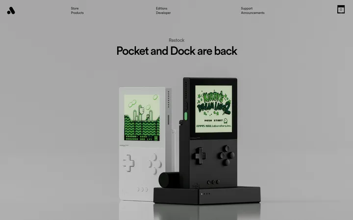
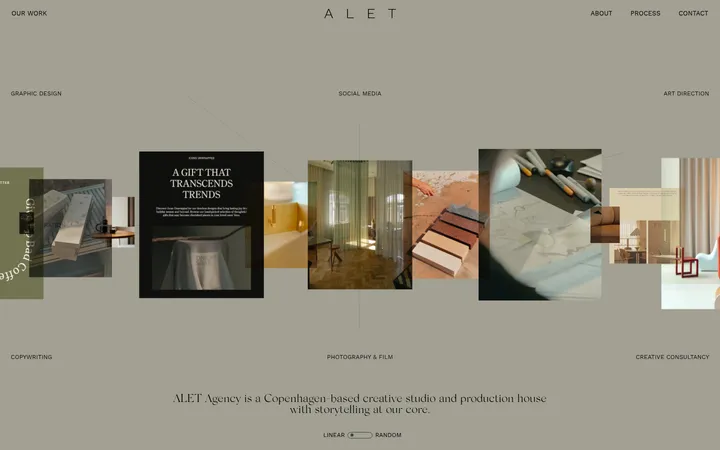
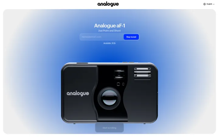
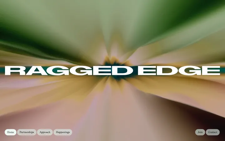
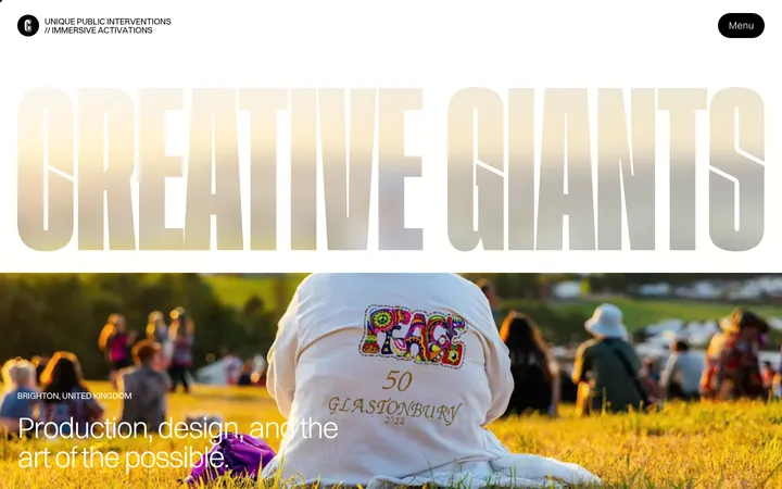
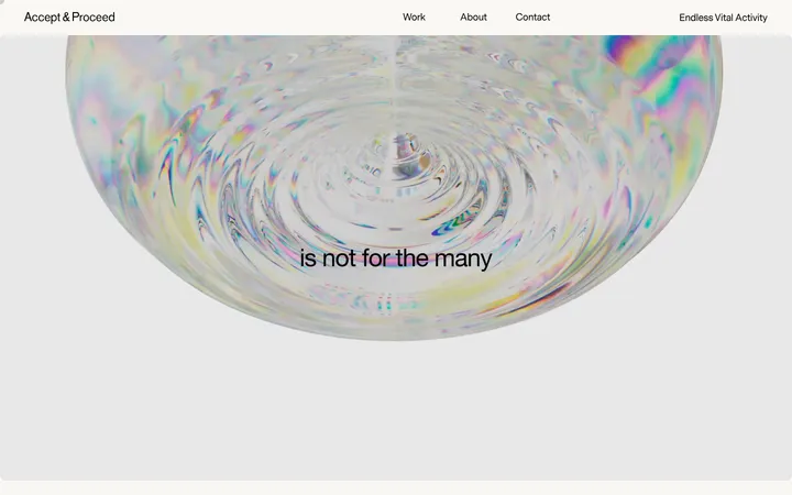
Imagery · Lead with cinematic full-bleed motion imagery, dark and radiating toward a bright center, with a short white statement overlaid. Follow with large client project visuals: product screens, devices, brand collateral, and presentation scenes. Keep images visually dominant and close to their natural colour; the supplied work imagery, not interface accents, carries vivid colour. Media corners appear softly rounded.
Set primary copy in #1c1c1c and secondary copy in #7a7a7a.
Give the opening media a cinematic, full-bleed treatment.
Use tight tracking for prominent Graphik-style statements.
Keep project imagery large and vertically sequenced.
Use whitespace to distinguish major page moments.
✕ 不该做
Do not add bright interface accent colours.
Do not treat video pixels as the brand palette.
Do not pack content into dense card grids.
Do not add heavy shadows or decorative borders.
Do not center every text block; preserve editorial alignment.
Do not let interface decoration compete with project imagery.
给 AI 的提示词
想快速出一个同风格的新页面,把这段话连同 DESIGN.md 一起发给 AI。
Build a new agency page in Analogue’s restrained editorial style. Use Gallery White (#ededed) as the main canvas, Warm Ink (#1c1c1c) for primary copy, Quiet Graphite (#7a7a7a) for secondary text, and Soft Concrete (#b8b8b8) or Deep Black (#000000) only for restrained section-surface contrast. Set a single clean sans-serif close to Graphik Medium, with tight tracking on large statements and compact captions. Open with immersive, dark full-bleed media and a centered short line. Follow with a spacious left-aligned introduction, understated navigation, a centered work label, and a vertical gallery of broad project visuals. Finish with a minimal contact invitation. Favor whitespace and flat surfaces; use media, not interface accents, for colour and drama.