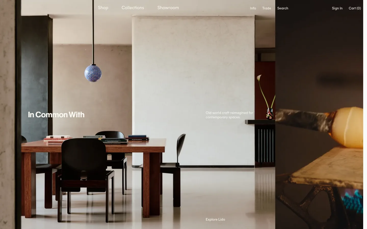
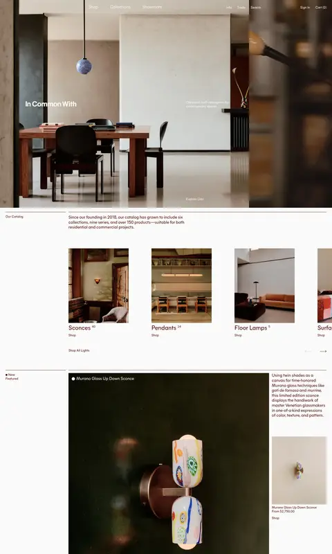
In Common With 以沉浸式室内影像、克制的排版和温暖的材质色调呈现灯具设计工作室。首页从沉浸式主视觉延伸至产品分类、单品故事、系列陈列、展厅信息与编辑内容。
North star · Let atmospheric interior photography lead, while keeping the interface quiet, flat, and anchored by Brick Ink on Gallery White.
The page balances a quiet Gallery White canvas (#fafaf9) with deep Brick Ink (#4a0a05) for headings, body copy, links, and fine rules. A muted blue-gray band (#b3bec5) marks the trade section, while Clay Stone (#bcb6a6) appears as a measured card surface; the warm interior photography supplies most of the visible color and should not be mistaken for UI palette. Mier A is the workhorse sans, used for navigation, body text, labels, and most headings in regular weight. Caslon Ionic adds a restrained editorial contrast in the measured secondary-heading role. Layout shifts between a full-bleed opening photograph and compact, asymmetrical editorial grids, with generous white intervals and thin separators. Product and room photography carries the storytelling: tactile materials, crafted fixtures, and lived-in architectural settings remain the visual focus. Controls stay understated, with square corners and outlined forms rather than elevated, rounded UI.
Primary sans for navigation, body copy, links, buttons, labels, and most headings.
角色
示例
字号
字重
行高
字距
一级标题
Homepage identity and primary hero title.
The quick brown fox 敏捷的狐狸
26px
400
1.2
0
二级标题
Editorial secondary headings and section titles.
The quick brown fox 敏捷的狐狸
24px
400
1.2
0
三级标题
Catalog, product, collection, and content-card headings.
The quick brown fox 敏捷的狐狸
18px
400
1.2
0
正文
Product descriptions, studio copy, and explanatory text.
The quick brown fox 敏捷的狐狸
14px
400
1.2
0
辅助文字
Small labels, dates, product details, and supporting notes.
The quick brown fox 敏捷的狐狸
13px
400
1.2
0
按钮
Quietly styled actions such as sign-up and form controls.
The quick brown fox 敏捷的狐狸
14px
400
1.2
0
导航
Header navigation and account or utility links.
The quick brown fox 敏捷的狐狸
14px
400
1.2
0
链接
Inline and standalone navigation actions.
The quick brown fox 敏捷的狐狸
14px
400
1.2
0
间距与布局
基准单位 4px · 密度:适中
48px版块间距
12px元素间距
3px卡片内边距
1392px内容最大宽度
4px
6px
8px
10px
12px
14px
16px
18px
20px
24px
28px
32px
40px
48px
56px
60px
The homepage opens with full-bleed interior photography, then moves into a long, single-page editorial sequence on a light canvas. Measured content uses a maximum width of 1392px and a comfortable density, with a recurring 8-column structure. Align section labels to the left and let content occupy offset columns, alternating large image-led blocks with smaller supporting text and cards. Preserve generous section intervals, thin horizontal rules, and uneven image widths rather than forcing uniform centered panels.
圆角与层次
没有测到阴影:页面是扁平的,层次靠底色和描边区分。
The interface is predominantly flat: no measured shadows, raised cards, or rounded container treatment. Separate content with fine Brick Ink rules and changes in image scale or background tone. The hero overlays text and navigation directly on photography; maintain legibility through placement and image contrast, not heavy UI panels.
组件
下面的预览按实测的按钮、输入框、徽标、卡片样式重建(字体用替代字体)。
Overlay navigation
Place compact Mier A navigation over the hero image; measured navigation appears in light text on imagery and Brick Ink on light backgrounds.
Hero image
Use a full-bleed architectural interior photograph with a restrained title and supporting copy positioned directly over the scene.
Category cards
Show product-category photography with short Brick Ink labels and simple shop links; keep cards visually open and unrounded.
Editorial product feature
Pair a large product or room image with a small description and secondary product image, using asymmetrical columns and fine dividers.
Trade band
Set trade-program copy and a small product image within a distinct Mist Blue (#b3bec5) section band.
Newsletter form
Use a minimal email input and outlined sign-up button with Brick Ink (#4a0a05) borders and regular sans-serif text.
Footer
Organize studio contacts, showroom details, newsletter signup, and link groups into compact columns separated by thin rules.
Imagery · Use large, naturalistic photographs of lighting in architectural interiors, with the fixture shown in context and materials left visibly tactile. The opening image fills the viewport and supports subtle overlaid navigation and text. Later sections mix portrait product images, wide room scenes, and small product cards. Keep color grading warm and atmospheric; avoid decorative illustration or artificial product renders that compete with the photography.
Let contextual lighting photography dominate the page.
Use Brick Ink (#4a0a05) for core text and fine rules.
Keep the Gallery White (#fafaf9) canvas visually calm.
Use asymmetrical image-and-copy compositions.
Reserve Mist Blue (#b3bec5) for the trade section band.
Keep typography regular-weight and understated.
✕ 不该做
Do not turn the interface into a bright, saturated storefront.
Do not add shadows or elevated card effects.
Do not round cards or controls.
Do not make every section a uniform grid of equal tiles.
Do not treat warm photographic tones as interface colors.
Do not crowd images with heavy text panels.
给 AI 的提示词
想快速出一个同风格的新页面,把这段话连同 DESIGN.md 一起发给 AI。
Build a new In Common With page as a quiet, image-led design-studio experience. Use Gallery White (#fafaf9) for the main canvas and Brick Ink (#4a0a05) for headings, body text, links, and hairline rules. Let large, warm architectural photographs carry the mood; keep navigation and copy small, light, and directly over imagery where appropriate. Use Mier A or a close sans substitute for most text, with a restrained Caslon-style serif accent for editorial headings. Compose asymmetrical columns, varied image widths, and generous intervals instead of repeated uniform cards. A Mist Blue (#b3bec5) band may distinguish a partner or trade section. Keep controls square, outlined, and flat; avoid shadows, gradients beyond subtle image treatment, and decorative UI chrome.