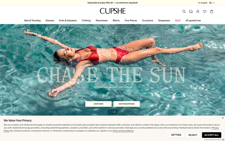
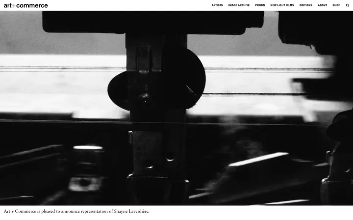
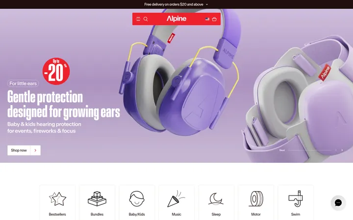
North star · Keep the interface quiet and sharply structured so the ceramics and their real-world use carry the colour and emotional weight.
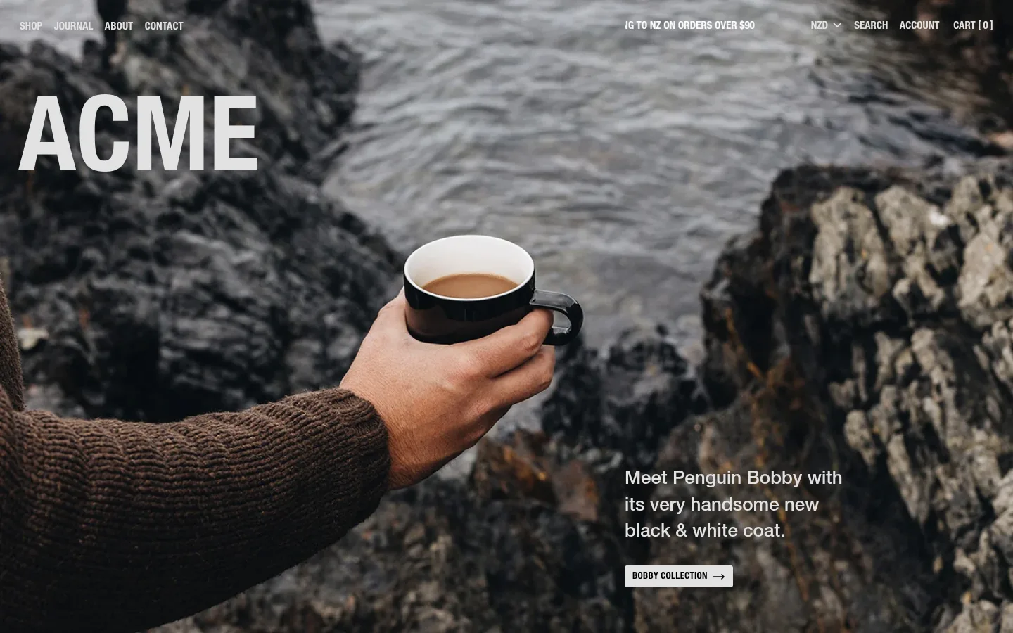
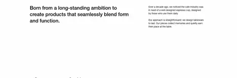
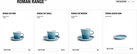
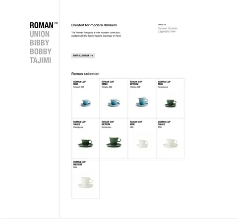
Acme Cups balances an almost entirely white canvas with strong black typography, thin grey rules, and occasional pale-grey controls. The measured clay accent appears as a single sustainability callout rather than a dominant brand colour; most of the page’s colour comes from product and lifestyle photography. Helvetica Neue creates a crisp, utilitarian voice: oversized uppercase display lettering marks the hero, while compact uppercase headings and labels organize collections and commerce. The layout alternates full-bleed photographic stories with restrained white editorial and product sections. Product cards sit in ruled grids, and ample vertical pauses separate them from feature bands. Images are treated as the emotional focus, with unembellished product cutouts and workshop footage alongside them. Borders, not shadows, define most interactive and card edges. Buttons are small, uppercase, and lightly filled or outlined, keeping the page functional without competing with the photography.
Site-wide display, headings, body copy, navigation, labels, links, and buttons.
角色
示例
字号
字重
行高
字距
特大标题
Oversized uppercase ACME wordmark over the full-bleed hero image.
Acme Cups
148px
700
1
0
一级标题
Large uppercase collection and major section headings.
Acme Cups
48px
700
1
0
二级标题
Editorial lead statements and prominent feature headings.
Acme Cups
30px
500
1.3
0
三级标题
Product-family and secondary feature headings.
The quick brown fox 敏捷的狐狸
26px
500
1.04
0
四级标题
Compact product or journal subheadings.
The quick brown fox 敏捷的狐狸
21px
500
1.3
0
正文
Descriptions, product details, and supporting editorial copy.
The quick brown fox 敏捷的狐狸
14px
400
1.43
0
辅助文字
Small metadata, product-category badges, and date labels.
The quick brown fox 敏捷的狐狸
12px
400
1
0
按钮
Bold uppercase labels on collection and purchase controls.
The quick brown fox 敏捷的狐狸
13px
700
1
0.02em
链接
Navigation, product links, and editorial calls to action.
The quick brown fox 敏捷的狐狸
14px
400
1.3
0
间距与布局
基准单位 4px · 密度:宽松
142px版块间距
4px元素间距
—卡片内边距
1080px内容最大宽度
1px
2px
3px
4px
5px
6px
7px
8px
9px
11px
12px
13px
14px
20px
28px
29px
The homepage alternates full-bleed media with broad white sections, combining split editorial layouts and multi-column product grids. Measured content max width is 1080px, with section spacing that feels notably spacious and vertical pauses between major stories. Collection headings align to the start edge, while products sit in ruled cells with compact information above or below imagery. The page shifts between single-column image bands, two-column editorial areas, and denser product or colour grids. Keep alignment crisp, section transitions simple, and product information subordinate to the imagery.
圆角与层次
按钮 · 2px
输入框 · 3px
图片 · 3px
徽标 · 3px
没有测到阴影:页面是扁平的,层次靠底色和描边区分。
The interface is predominantly flat: no measured shadows or gradients. Thin grey borders establish product cells, badges, and controls, with white space doing most of the separation work. Keep the clay sustainability panel as a flat colour block; avoid floating cards and layered effects.
组件
下面的预览按实测的按钮、输入框、徽标、卡片样式重建(字体用替代字体)。
Hero story
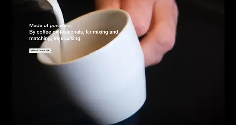
Full-bleed lifestyle photograph with an oversized uppercase wordmark, short product story, and a small pale-grey collection button.
Collection heading
Bold uppercase range title aligned to the section start, paired with a pale-grey collection CTA and understated browsing controls.
Product card
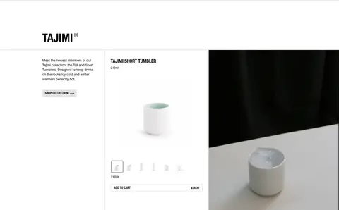
White product cell with a thin #c3c3c3 outline, product image, compact item name and details, and an outlined uppercase add-to-cart control.
Product badge
Small rounded-outline label with muted #666666 text for product style or category metadata.
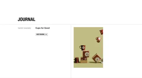
Editorial feature
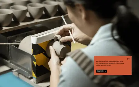
A spacious text-and-image story; sustainability uses a single flat #ce5936 panel with compact dark copy and a read-more action.
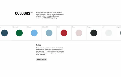
Colour selector
A ruled row of named colour swatches followed by concise colour-specific editorial text and a small shop-colour action.
Newsletter and footer
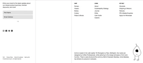
Compact email signup and currency controls sit beside grouped shop, learn, and help links, separated by fine rules.
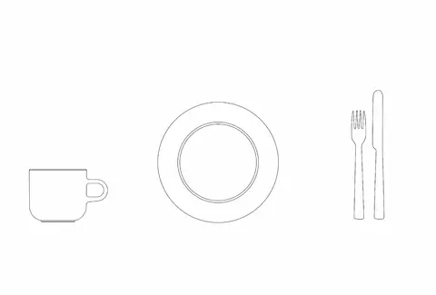
Imagery · Photography leads the experience: the hero pairs a person using a cup with a rugged outdoor setting, while later bands show ceramic production and close-up product use. Product listings use isolated porcelain imagery against white. A few video frames and simple line drawings add variety; colour swatches are presented as a dedicated product-colour feature. Use natural, tactile imagery without decorative filters or heavy graphic overlays.
Let large, natural product photography lead feature bands.
Use thin grey rules to define product and editorial grids.
Keep purchase controls compact and uppercase.
Reserve clay orange for an isolated editorial accent.
✕ 不该做
Do not introduce gradients or drop shadows.
Do not use saturated colours as broad interface backgrounds.
Do not crowd product images with decorative elements.
Do not make buttons visually louder than the products.
Do not replace fine rules with heavy card treatments.
Do not treat photography-derived colours as interface palette.
给 AI 的提示词
想快速出一个同风格的新页面,把这段话连同 DESIGN.md 一起发给 AI。
Build a new Acme Cups page as a calm, editorial storefront. Use Gallery White (#ffffff) for the canvas, Studio Ink (#000000) for typography, and Rule Grey (#c3c3c3) for fine card and control outlines. Use Soft Pebble (#e3e2e2) for restrained secondary button fills; reserve Kiln Clay (#ce5936) for a rare, story-led accent, not the global CTA. Set the page in Helvetica Neue or Inter, with uppercase bold section labels and compact, readable body copy. Alternate immersive, natural lifestyle photography with spacious white product and editorial sections. Organize products in crisp ruled grids with concise names, details, and small outlined purchase controls. Keep navigation quiet, layouts aligned, and transitions flat. Avoid shadows, gradients, oversized coloured panels, and decorative interface chrome.