Art + Commerce 以克制、近似画廊的首页呈现全球影像创作者阵容。黑白文字与充足留白将视觉焦点交给时尚摄影和视频作品。
North star · Treat the interface as a quiet white gallery: keep typography and controls restrained so each image has room to command attention.
The page uses a white canvas as a quiet gallery ground, with black typography providing the only consistent graphic contrast and a pale gray hairline separating the compact navigation from the work. The measured palette is deliberately narrow; vivid reds, blues, and other hues belong to campaign imagery rather than the site’s interface. Adobe Garamond gives headlines, captions, and editorial copy a refined print sensibility, while Akzidenz Grotesk appears in compact uppercase navigation and metadata. The layout alternates full-bleed moving image, centered or inset campaign visuals, a two-column editorial feature, and tightly aligned multi-column indexes. Large vertical gaps create a slow viewing rhythm without adding decorative framing. Captions sit close to imagery and remain visually subordinate. The overall system is flat and unembellished: no shadows, rounded cards, or persistent accent-color buttons compete with the portfolio.
Uppercase navigation, eyebrows, and compact metadata
角色
示例
字号
字重
行高
字距
特大标题
Large editorial display typography where featured content calls for emphasis.
Art + Commerce
56px
400
1.1
-0.018em
一级标题
Editorial feature title, such as the photographer exhibition headline.
The quick brown fox 敏捷的狐狸
20px
400
1.1
0
正文
News announcements, editorial descriptions, and linked text.
The quick brown fox 敏捷的狐狸
16px
400
1.3
0
辅助文字
Compact uppercase campaign and image metadata.
The quick brown fox 敏捷的狐狸
10px
700
1.25
0.03em
导航
Top-level navigation labels in the header.
The quick brown fox 敏捷的狐狸
10px
700
1
0.027em
眉题
Small uppercase section labels and editorial identifiers.
The quick brown fox 敏捷的狐狸
10px
700
1.25
0.03em
间距与布局
基准单位 4px · 密度:宽松
160px版块间距
8px元素间距
—卡片内边距
1417px内容最大宽度
8px
12px
13px
16px
23px
29px
32px
36px
80px
160px
A compact horizontal header sits above a long, spacious portfolio feed on a white canvas. The measured maximum page width is 1417px; sections alternate full-bleed media, inset single-image compositions, split editorial blocks, paired images, and a four-column campaign row. The final roster is organized in aligned columns. Keep text and imagery carefully aligned, but allow selected media to span broadly. The measured section gap is 160px, with a spacious overall density and short gaps within related content.
圆角与层次
没有测到阴影:页面是扁平的,层次靠底色和描边区分。
The system is flat: measured data reports no shadows, gradients, or radius scale. Keep campaign images flush against the white canvas without card shells or floating panels. Use the measured #e7e7e7 hairline sparingly at the navigation boundary; rely on whitespace and alignment, not borders, to separate sections.
组件
下面的预览按实测的按钮、输入框、徽标、卡片样式重建(字体用替代字体)。
Header navigation
Compact horizontal white bar with the wordmark at left and small bold uppercase destinations at right; use a fine #e7e7e7 divider.
Featured media
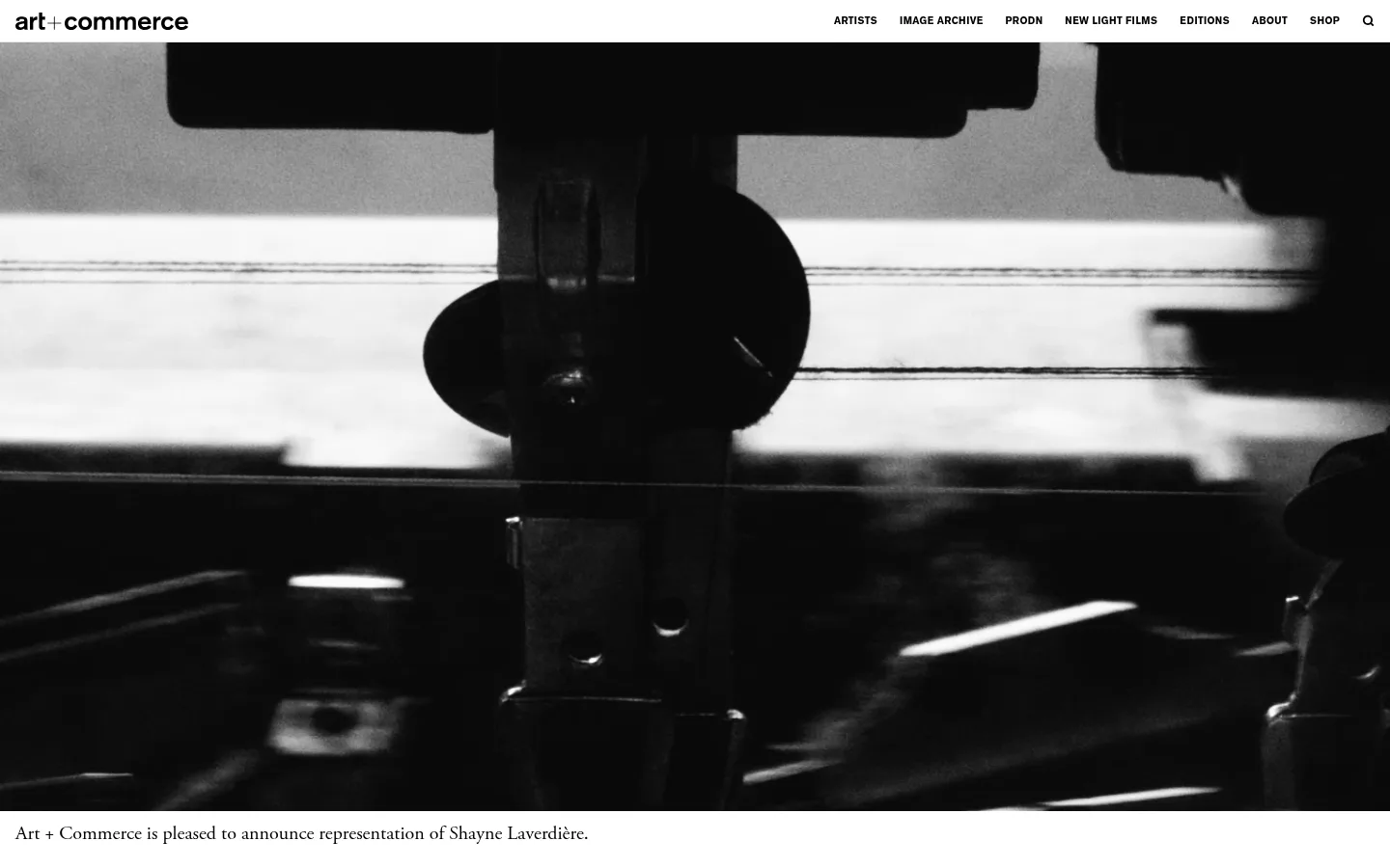
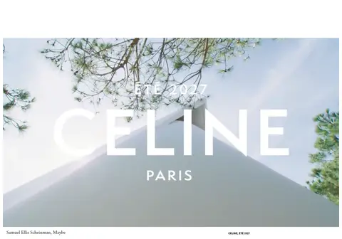
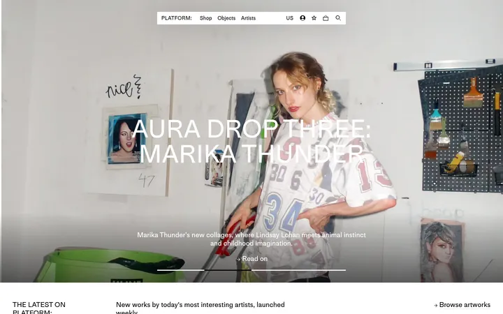
Large campaign video or image, sometimes full bleed, followed by a concise serif announcement or credit.
Editorial feature
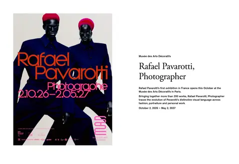
Two-column feature pairing a campaign image with a small eyebrow, serif title, and concise editorial description.
Campaign image and caption
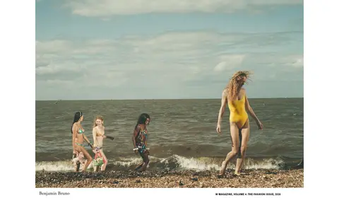
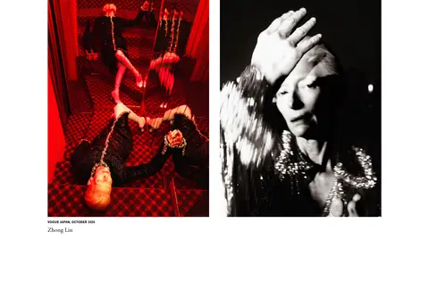
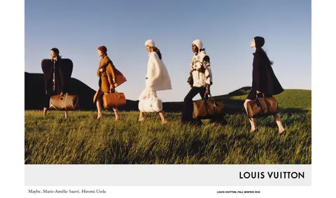
Single or paired photography with understated serif creator credit and compact uppercase project metadata.
Campaign row
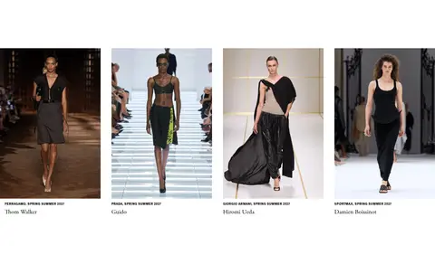
Four evenly organized campaign entries with image, small project label, and creator credit.
Artist index
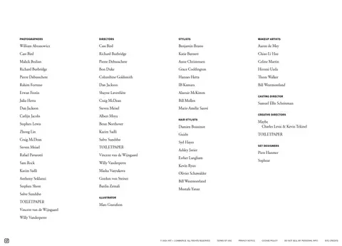
Dense, multi-column roster of creative disciplines and linked names, set in small type on the open white canvas.
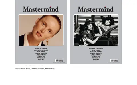
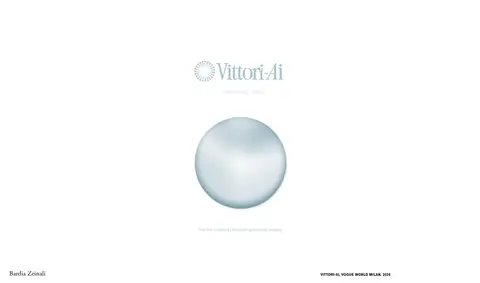
Imagery · Photography and video are the main event: fashion campaigns, portraits, editorial covers, runway imagery, and creative work appear in varied aspect ratios. Some media runs edge to edge; other images sit centered or in paired columns with restrained credits close by. Preserve original image color and tonal treatment rather than applying a site-wide filter. The grayscale hero demonstrates campaign content, not a mandatory monochrome treatment for all imagery.
Keep the canvas white and the interface palette restrained.
Let campaign imagery dominate the visual hierarchy.
Use Garamond-style serif for editorial text and credits.
Set navigation and metadata in compact uppercase grotesk.
Alternate image-led layouts with generous vertical breathing room.
Keep captions close to the work they identify.
✕ 不该做
Do not turn campaign colors into interface accents.
Do not add shadows, gradients, or rounded card containers.
Do not crowd the page with promotional UI or decorative chrome.
Do not make captions compete with the featured imagery.
Do not force every portfolio image into the same aspect ratio.
Do not replace the spacious rhythm with dense dashboard-like grids.
给 AI 的提示词
想快速出一个同风格的新页面,把这段话连同 DESIGN.md 一起发给 AI。
Build a new Art + Commerce page as a restrained editorial gallery, not a conventional agency landing page. Use Gallery White (#ffffff) for the canvas, Print Ink (#000000) for all core text and navigation, and Quiet Rule (#e7e7e7) only for subtle dividers. Set editorial headlines, descriptions, and credits in a Garamond-style serif; reserve a compact, uppercase grotesk for navigation, eyebrows, and project metadata. Create a short horizontal header, then give campaign photography or video broad, varied placements: full-bleed feature, inset image, paired work, and carefully aligned multi-column entries. Use ample whitespace to separate stories and keep captions close to their images. Avoid card shells, shadows, gradients, rounded corners, and interface accent colors. Preserve the distinct colors and framing of the supplied campaign assets.