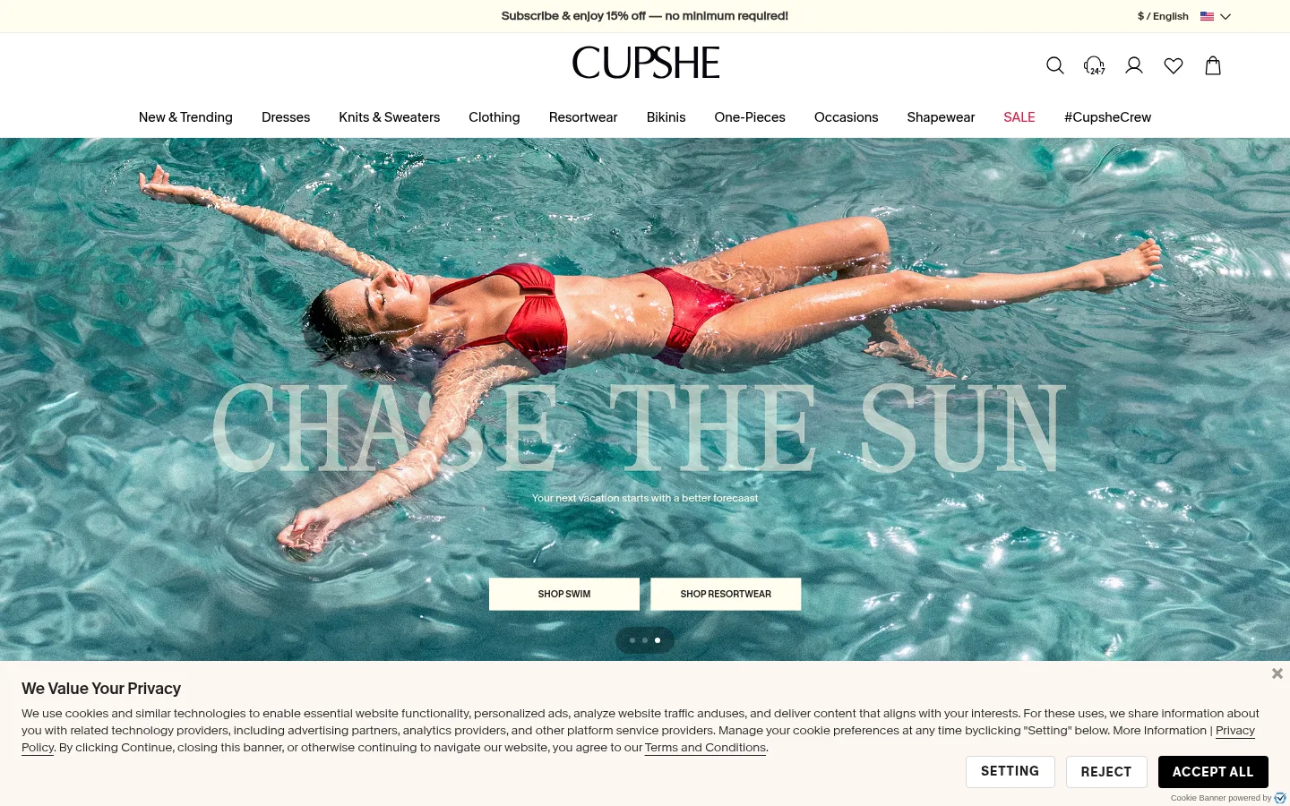
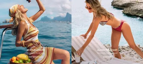
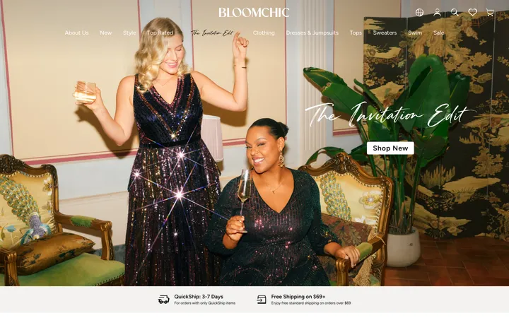
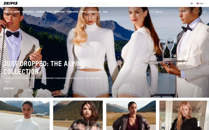
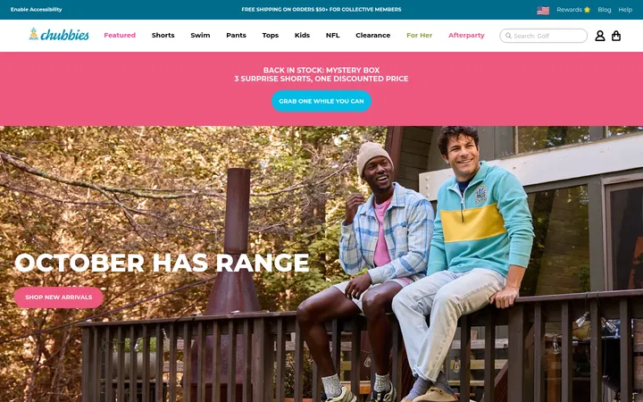
North star · Keep the interface quiet and legible so full-width vacation photography and shoppable fashion categories carry the page.
The page uses white as its main canvas, letting saturated teal water, warm natural settings, and clothing photography carry most of the visual character. Near-black text and occasional deep charcoal panels provide contrast, while a pale cream tint appears in the announcement strip, promotional cards, and footer areas. KMR Melange Grotesk forms the site’s typographic voice: uppercase display and section headings sit above small, practical navigation and product details. The homepage alternates full-bleed campaign imagery with centered category headings, tiled fashion grids, and more editorial split layouts. Product cards and community imagery keep shopping discovery close to the visual storytelling. Sections feel open and straightforward rather than heavily framed; hairlines and subtle neutral dividers appear mainly in utility and footer regions. The result is a clean retail shell that gives seasonal imagery room to lead without sacrificing clear browsing paths.
Primary body copy, navigation, links, and product information.
Aa 设计
KMRMelangeGrotesk-SemiBold
网络字体 · 字重 400 / 500 / 600 · 占比 33%
免费替代:Montserrat
Display and section headings, plus emphasized interface labels.
Aa 设计
Muli-Light
网络字体 · 字重 400 / 700 · 占比 8%
免费替代:Nunito Sans
Limited light-weight supporting text.
Aa 设计
KMRMelangeGrotesk-Light
网络字体 · 字重 400 · 占比 7%
免费替代:DM Sans
Occasional light heading treatment.
Aa 设计
-apple-system
系统字体 · 字重 400 · 占比 4%
免费替代:Inter
System-font fallbacks and select compact button or card labels.
Aa 设计
KMRMelangeGrotesk-ExtraBold
网络字体 · 字重 400 · 占比 1%
免费替代:Montserrat
Strong h1 emphasis.
角色
示例
字号
字重
行高
字距
特大标题
Large uppercase campaign or hero display headlines.
Cupshe
60px
400
1.4
0
一级标题
Strong uppercase primary page or campaign heading.
Cupshe
50px
400
1.4
0
二级标题
Uppercase section headings above category and product content.
Cupshe
44px
400
3.3
0
三级标题
Light-weight editorial heading within brand storytelling.
Cupshe
40px
400
1.4
0
四级标题
Semibold subheadings and supporting feature titles.
Cupshe
36px
400
normal
0
正文
Default copy, descriptions, and brand-story text.
The quick brown fox 敏捷的狐狸
16px
400
normal
0
辅助文字
Compact product details and secondary labels.
The quick brown fox 敏捷的狐狸
14px
400
1.57
0
导航
Header navigation and utility links.
The quick brown fox 敏捷的狐狸
14px
400
1.57
0
间距与布局
基准单位 4px · 密度:紧凑
40px版块间距
6px元素间距
133px卡片内边距
1360px内容最大宽度
4px
6px
8px
10px
12px
14px
16px
18px
20px
24px
32px
40px
56px
72px
The header combines a slim announcement strip, centered wordmark, utility icons, and a horizontal category navigation row. A broad 1360px measured page max width supports the desktop composition, while campaign sections break into full-bleed media. Category and product areas use tiled grids, often separated by centered headings; editorial blocks shift to split layouts. The measured spacing system is compact, with a 40px section gap and smaller element gaps, balanced by generous photographic areas. Footer information resolves into dense, aligned columns.
圆角与层次
没有测到阴影:页面是扁平的,层次靠底色和描边区分。
The interface is largely flat, with white canvases and photographic surfaces doing the visual work. The measured shadow list is empty, and component corners are square in the sampled controls and cards. Use thin neutral borders and dividers sparingly for forms, navigation, and footer organization; cookie and promotional panels read as layered blocks through placement and contrasting fills rather than pronounced shadows.
组件
下面的预览按实测的按钮、输入框、徽标、卡片样式重建(字体用替代字体)。
Announcement strip
A narrow pale cream band carries centered promotional copy above the brand header; keep the message compact and high contrast.
Store header
Center the Cupshe wordmark, place utility icons alongside it, and use a separate horizontal row for category navigation.
Campaign hero
Use full-bleed vacation photography with oversized headline treatment, supporting copy, paired shopping links, and restrained carousel indicators.
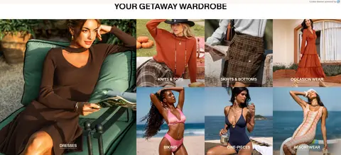
Category tiles
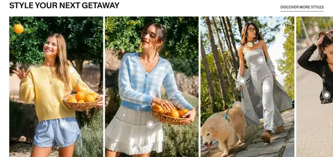
Arrange fashion categories as image-led grids with small, legible labels positioned over each photograph.
Product cards
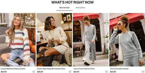
Keep product photography prominent; pair it with compact names, prices, and simple shopping controls on light surfaces.
Subscribe form
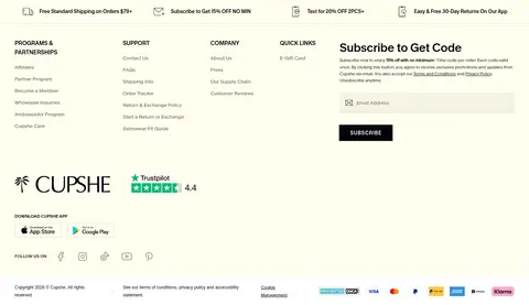
Use a pale input surface, understated border treatment, and a dark square-cornered SUBSCRIBE button.
Footer
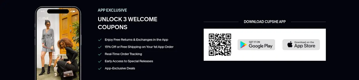
Combine service benefits, link columns, newsletter signup, app references, and payment details across light and dark zones.
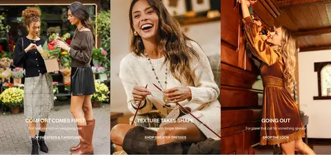
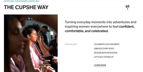
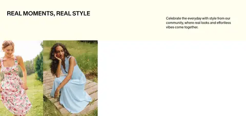
Imagery · Photography is the primary visual language: models wear seasonal swim, resort, and everyday clothing in pools, gardens, homes, and outdoor settings. Hero and campaign imagery spans the available width; category tiles use varied crops with small overlay labels. Product grids prioritize clear garment visibility, while community imagery adds a candid lifestyle feel. A few video placements support the campaign storytelling; there is no illustration-led or 3D visual system.
Let fashion and destination photography lead each major section.
Use Gallery White (#ffffff) as the primary interface canvas.
Reserve Midnight Ink (#04040c) for inverse panels and strong actions.
Use uppercase display headings to establish clear retail hierarchy.
Keep category labels and product details compact and easy to scan.
Alternate full-width campaigns with structured shopping grids.
✕ 不该做
Do not add a bright interface accent absent from the measured palette.
Do not put heavy borders around every card or section.
Do not obscure product photography with oversized controls.
Do not make navigation compete with the campaign imagery.
Do not use rounded-card styling; measured sampled corners are square.
Do not treat colors inside campaign photography as interface tokens.
给 AI 的提示词
想快速出一个同风格的新页面,把这段话连同 DESIGN.md 一起发给 AI。
Build a fashion-retail page in Cupshe’s clean, vacation-led style. Use Gallery White (#ffffff) for the canvas, True Black (#000000) for most navigation and copy, and Midnight Ink (#04040c) for dark promotional panels and primary subscribe actions. Soft Butter (#fffeee) can warm announcement and footer surfaces; keep borders subtle with Linen Edge (#eae9cf). Set headings in an uppercase, semibold geometric sans and body text in a clean regular sans, with compact product captions. Structure the page with a quiet header, large photographic campaign, image-led category tiles, shoppable product cards, and editorial brand content. Use broad imagery, square corners, restrained dividers, and open white space between content groups. Keep controls clear but visually secondary to the clothing photography.