North star · Let an editorial serif headline and generous pale space frame the product, using warm orange only as a focused cue.
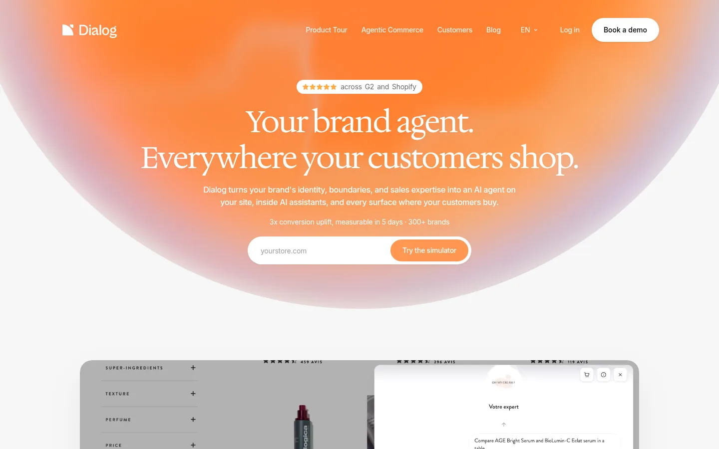
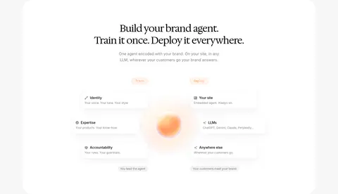
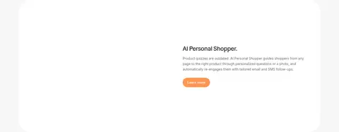
The page balances a near-white #f7f7f7 canvas with a dramatic opening gradient that moves through orange, peach, and muted rose. Orange is reserved for primary actions and small highlights, while black anchors typography and a later analytics section. Large Hedvig serif display headlines bring editorial character; Inter keeps navigation, body copy, and interface labels crisp and compact. The hero centers its message and simulator input over a broad, soft-edged color field, then transitions into product imagery, brand tiles, and spacious white feature panels. Content alternates between centered introductions and two-column demonstrations, with rounded media and cards softening the technical subject matter. The dark insights band creates a deliberate contrast before the light FAQ and footer. Borders are faint, shadows restrained, and whitespace does most of the grouping work.
Navigation, body copy, buttons, labels, and compact interface text.
Aa 设计
Hedvig Letters Serif
网络字体 · 字重 400 · 占比 9%
免费替代:Cormorant Garamond
Display, H1, and H2 editorial headlines.
Aa 设计
Hedvig Letters Sans
网络字体 · 字重 400 · 占比 1%
免费替代:Inter
H3 headings and occasional secondary display text.
角色
示例
字号
字重
行高
字距
特大标题
Large centered hero headline.
Dialog
60px
400
1.2
-0.03em
一级标题
Primary page and feature-section headlines.
Dialog
48px
400
1.2
-0.025em
二级标题
Major section titles, including FAQ and insights.
Dialog
42px
400
1.2
-0.03em
三级标题
Feature headings within product explanations.
The quick brown fox 敏捷的狐狸
26px
400
1.2
-0.02em
四级标题
Compact emphasized headings and card titles.
The quick brown fox 敏捷的狐狸
20px
600
1.4
-0.025em
正文
Supporting descriptions and explanatory copy.
The quick brown fox 敏捷的狐狸
14px
400
1.63
0
辅助文字
Small metadata and product-interface notes.
The quick brown fox 敏捷的狐狸
13px
400
1.38
0
按钮
Primary and secondary action labels.
The quick brown fox 敏捷的狐狸
14px
500
1.43
0
导航
Header navigation and language control.
The quick brown fox 敏捷的狐狸
14px
500
1.43
-0.02em
链接
Inline and footer links.
The quick brown fox 敏捷的狐狸
14px
400
1.4
-0.02em
代码
Small monospace labels and training badges.
const style = 1;
12px
400
1.33
0
间距与布局
基准单位 8px · 密度:宽松
112px版块间距
20px元素间距
—卡片内边距
736px内容最大宽度
4px
6px
8px
10px
12px
16px
20px
24px
32px
40px
48px
56px
64px
The page uses a spacious single-page flow within a measured 736px content max width for core copy, while hero media and color fields extend broadly. Centered hero and section introductions alternate with two-column product explanations and a multi-column integrations area. Sections have generous vertical separation, with a measured 112px section rhythm and 20px element gap. The overall density is low: concise copy, broad margins, and large visual panels carry the story.
圆角与层次
按钮 · 9999px
输入框 · 9999px
卡片 · 16px
图片 · 8px
徽标 · 9999px
导航 · 12px
lg · other
sm · button, other
xl · section
md · other
The interface favors flat surfaces, faint #f0f0f0 rules, and contrast between light panels and dark bands over heavy card shadows. Rounded cards and media establish grouping; subtle shadows appear on selected controls and demonstration panels. Keep layering restrained so the gradient and product previews remain prominent.
组件
下面的预览按实测的按钮、输入框、徽标、卡片样式重建(字体用替代字体)。
Hero simulator
Centered store URL input and orange simulator action sit beneath the headline; use a white pill-shaped field and concise supporting proof text.
Primary action
Orange #ff9752 pill button with white Inter medium text; used for simulator, demo, and learn-more actions.
Product preview panel
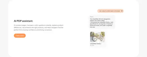
Large rounded white or dark container for shopping assistant previews, with screenshots and interface content kept visually contained.
Customer strip
Horizontal run of rounded photographic brand tiles separating the hero demonstration from the agent-building section.
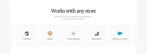
Integration tiles
Light, evenly spaced logo tiles for commerce platforms beneath a centered section heading.
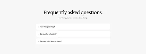
FAQ accordion
Centered light section with stacked white question rows, compact text, and simple plus controls.
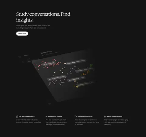
Insights band
Full-width #141414 section pairing a serif title and light copy with a dark analytics visualization.
Imagery · Product screenshots and simulated shopping conversations are the main visuals, set inside rounded, uncluttered panels. A horizontal strip of customer imagery and brand marks adds photographic color between product sections. The hero relies on an oversized orange-peach-rose gradient field rather than a literal illustration; the analytics section uses a dark, dimensional interface graphic.
Reserve orange for focused actions and gradient highlights.
Use a refined serif for large editorial headlines.
Keep body and interface copy in crisp Inter.
Alternate centered storytelling with product-led split layouts.
Use rounded panels and generous whitespace to group content.
✕ 不该做
Do not fill every section with saturated color.
Do not use heavy borders or pronounced card shadows.
Do not crowd product previews with decorative elements.
Do not replace the editorial headlines with generic bold sans-serif.
Do not use orange as a large flat section background.
Do not compress the vertical rhythm into a dense dashboard.
给 AI 的提示词
想快速出一个同风格的新页面,把这段话连同 DESIGN.md 一起发给 AI。
Build a new page in Dialog’s style: start with a spacious #f7f7f7 canvas, a restrained header, and a centered editorial hero. Set large headlines in Hedvig Letters Serif (or Cormorant Garamond), with Inter for navigation, body copy, and controls. Use #ff9752 for pill-shaped primary actions and small emphasis only. A broad orange-to-peach-to-rose gradient may frame the hero, but keep later sections mostly pale and uncluttered. Alternate centered introductions with two-column product demonstrations and rounded preview panels. Use customer imagery or platform marks as concise visual proof. Add a contrasting #141414 feature band when useful, then return to a quiet FAQ and footer. Favor faint rules, modest shadows, generous section spacing, and a clear hierarchy over decorative density.