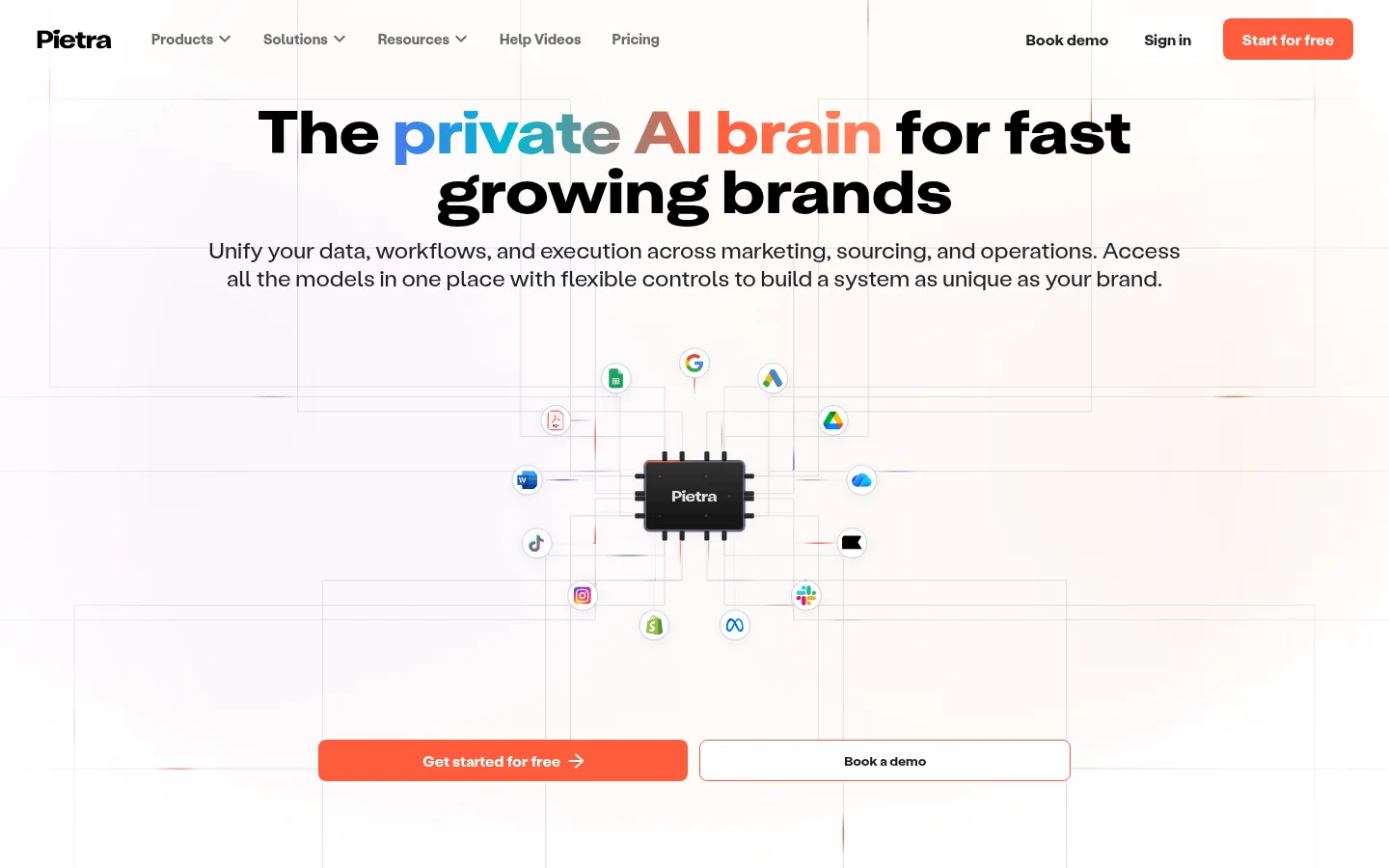
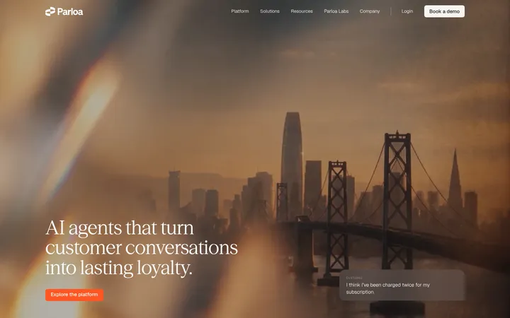
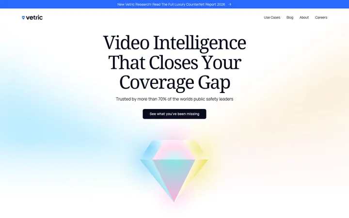
Pietra 以通透的编辑式布局、醒目的大标题和温暖珊瑚橙,展示面向品牌团队的 AI 平台。首页从网络连接式主视觉展开,依次呈现产品功能、客户品牌、浅色能力面板、醒目 CTA 和深色页脚。
North star · Keep the page airy and editorial, reserving saturated coral for high-intent actions and conversion moments.
The page pairs a white canvas with warm blush panels, using coral orange for the primary CTA, selected emphasis, and a full-width conversion band. Near-black typography carries the main message; muted grays handle supporting copy, while thin pale borders create the faint connected-grid effect visible behind the hero. The headline is large, heavy, and tightly tracked, with a blue-to-coral gradient emphasis that appears as expressive display styling rather than a general UI colour system. Labil’s rounded grotesk forms keep navigation, body copy, and controls approachable. A centered hero transitions into left-aligned product explanation, a centered customer showcase, and a broad pale feature card. Generous white space separates sections, keeping the page comfortable rather than dense. Product diagrams and customer imagery add colour and texture within otherwise restrained blocks. Coral CTA and near-black footer create strong bookends.
配色
点色块复制色值。用途说明来自对页面的实测位置(背景、文字、描边、按钮)与截图判读。
品牌色
强调色
表层色
中性色
功能色
页面底色 · Gallery White表层 · Blush Mist表层 2 · Footer Ink表层 3 · Deep Black主文字 · Body Charcoal次要文字 · Quiet Gray弱文字 · Gallery White描边 · Soft Rule强调 · Signal Coral强调 2 · Peach Coral强调 3 · Violet Signal
Body copy, links, captions, and regular-weight feature headings.
Aa 设计
Labil Grotesk
网络字体 · 字重 500 / 400 / 700 · 占比 34%
免费替代:Manrope
Navigation, buttons, secondary headings, and card text.
Aa 设计
Labil-Bold
网络字体 · 字重 400 · 占比 12%
免费替代:Manrope
Bold brand and display text where this custom face is applied.
Aa 设计
Attila-Bold
网络字体 · 字重 400 · 占比 6%
免费替代:Manrope
Display and headline typography.
Aa 设计
Attila Sans Uniform
网络字体 · 字重 700 · 占比 4%
免费替代:Plus Jakarta Sans
Hero display headline and primary H1.
角色
示例
字号
字重
行高
字距
特大标题
Oversized hero or standout display statements.
Pietra
62px
700
1
0
一级标题
Primary hero headline.
Pietra
48px
700
normal
-0.02em
二级标题
Section titles and feature headings.
The quick brown fox 敏捷的狐狸
24px
500
normal
-0.01em
三级标题
Smaller feature and card headings.
The quick brown fox 敏捷的狐狸
20px
400
normal
0
正文
Paragraphs and explanatory product copy.
The quick brown fox 敏捷的狐狸
16px
400
1
0
辅助文字
Compact captions and fine-print labels.
The quick brown fox 敏捷的狐狸
12px
400
1
0
按钮
Primary and secondary CTA labels.
The quick brown fox 敏捷的狐狸
16px
700
normal
0
链接
Navigation and inline links.
The quick brown fox 敏捷的狐狸
16px
400
1.13
0
眉题
Uppercase category labels above feature content.
The quick brown fox 敏捷的狐狸
14px
400
1
0.143em
间距与布局
基准单位 4px · 密度:适中
64px版块间距
8px元素间距
28px卡片内边距
1248px内容最大宽度
2px
4px
5px
6px
8px
10px
12px
16px
20px
24px
32px
46px
48px
64px
80px
110px
The page uses a centered, wide content frame with a measured maximum width of 1248px. The hero is centrally aligned, followed by a left-aligned feature explanation, a centered customer grid, and a broad pale capability panel. Sections have generous separation, with a comfortable density and clear shifts between white canvas, blush surfaces, coral CTA, and dark footer. Feature content alternates text and visual emphasis rather than relying on a dense uniform grid.
圆角与层次
按钮 · 8px
卡片 · 12px
图片 · 12px
hairline · button
The page is mostly flat, with whitespace and background bands doing the structural work. Thin pale borders define controls and faint hero connections. Cards use blush fills and rounded corners rather than pronounced shadows; the measured button shadow is only a subtle hairline. Preserve clear layering between the white canvas, feature panels, coral CTA, and dark footer.
组件
下面的预览按实测的按钮、输入框、徽标、卡片样式重建(字体用替代字体)。
Header navigation
A compact horizontal brand and link row on white, with sign-in and a coral filled primary action aligned to the right.
Hero headline
Centered bold display copy with selective blue-to-coral gradient emphasis, short explanatory text, and a connected-platform diagram below.
Hero CTA pair
Two side-by-side actions: a coral filled primary button and a white secondary button with a thin coral outline; use 8px corners.
Feature panel
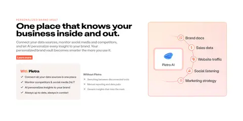
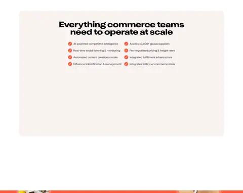
Pale blush card with 12px corners, black text, and a diagram or illustration paired with concise product explanation.
Customer brand grid
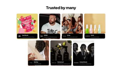
Centered customer heading above a multi-column set of image cards with dark caption bars.
Conversion band
Full-width coral section with centered white headline and support copy, plus two conversion actions and cropped imagery.
Footer
Near-black footer with grouped navigation columns, muted text, partner marks, and a fine divider above legal links.
Imagery · The hero uses a compact network diagram: a central Pietra chip connects to recognizable commerce and marketing platform marks across faint lines. Product diagrams appear in warm blush panels, while the customer section uses a grid of brand and founder imagery with dark caption strips. The CTA band includes cropped product or lifestyle photos at its edges. Keep imagery contained, softly framed, and secondary to the headline.
Reserve coral for primary actions and the conversion band.
Keep hero headlines centered and visually dominant.
Use blush panels to group product explanations.
Separate sections with generous whitespace.
Keep borders faint and shadows nearly invisible.
✕ 不该做
Do not make the page uniformly dark.
Do not use coral as a background for every component.
Do not compress the page into dense, tightly packed cards.
Do not use heavy drop shadows to imply elevation.
Do not turn gradient accents into a general-purpose palette.
Do not let supporting imagery overpower the message.
给 AI 的提示词
想快速出一个同风格的新页面,把这段话连同 DESIGN.md 一起发给 AI。
Build a new Pietra-style AI commerce page with a white Gallery White (#ffffff) canvas, crisp near-black headlines, and a restrained Signal Coral (#ff5c3c) action colour. Use Blush Mist (#f9f2f1) for selected feature surfaces and Footer Ink (#141414) for the closing footer. Make the hero centered and editorial, with a strong display headline, concise supporting copy, a connected-platform diagram, and a paired CTA. Continue into spacious feature explanations, customer imagery, and a broad capability panel. Use rounded grotesk typography, bold display type, subtle borders in Soft Rule (#e7e7e7), and minimal elevation. Keep colour gradients limited to headline or illustration accents; prioritize clear hierarchy, generous breathing room, and concrete product imagery over decorative effects.