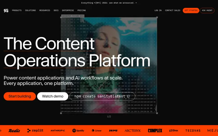
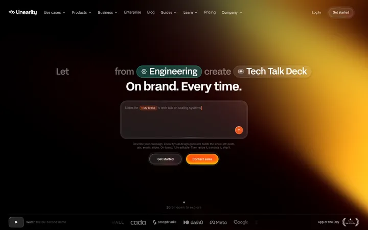
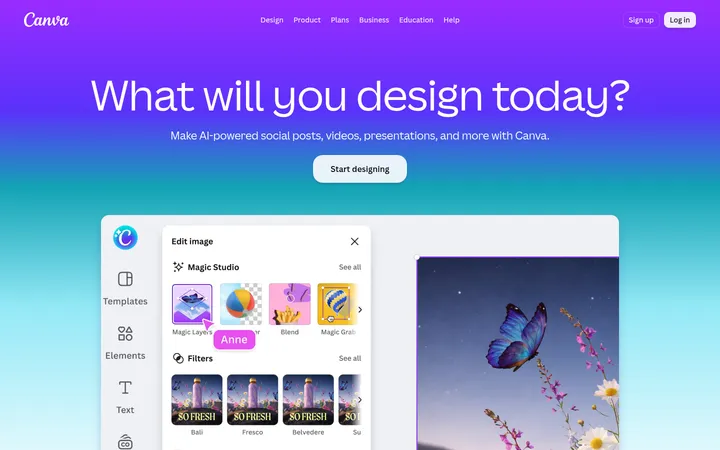
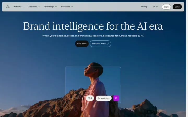
North star · Keep the interface restrained and dark so expressive serif typography, vivid creative work, and lime actions remain the focal points.
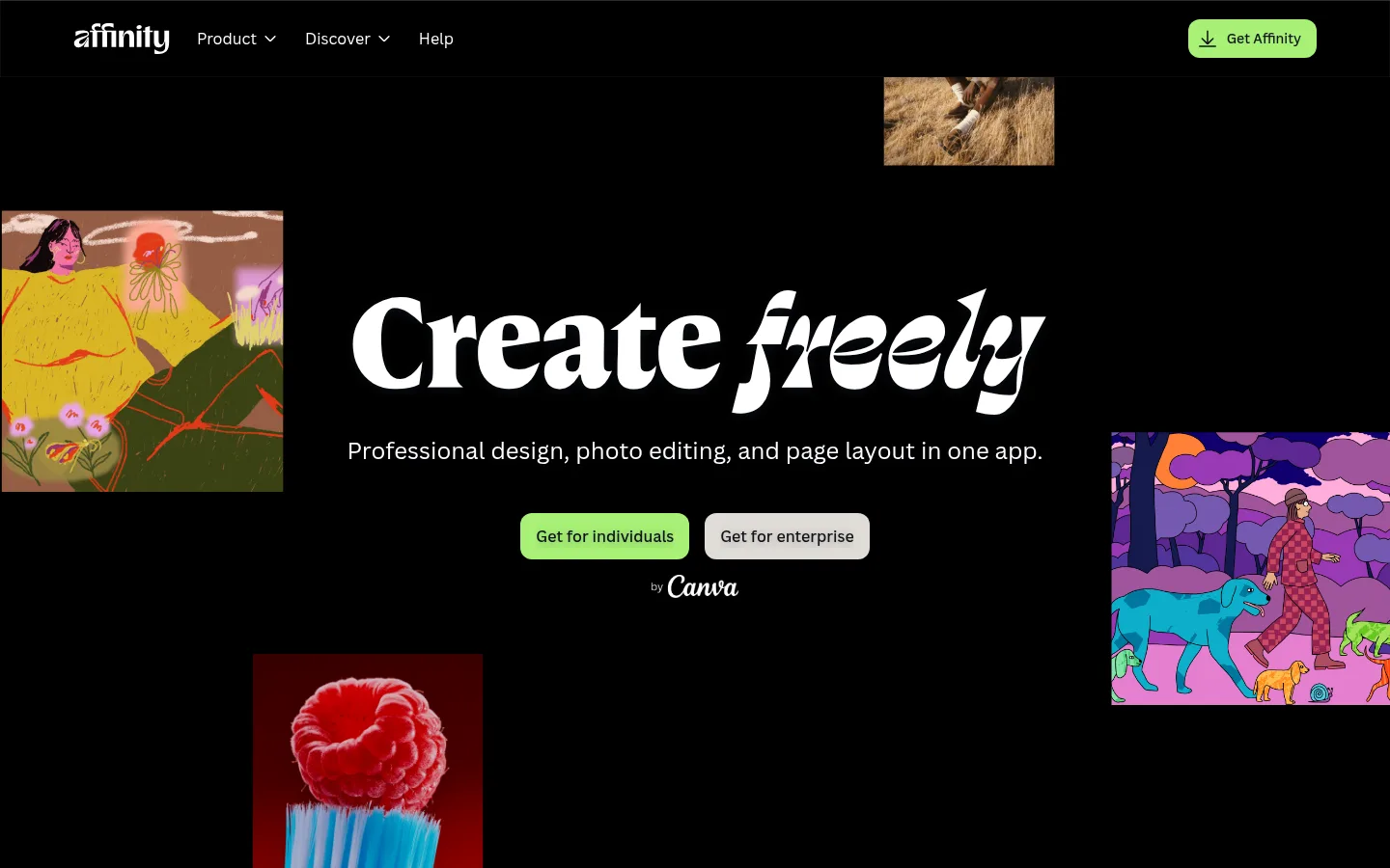
The visual identity is built around a near-black canvas (#000000), with warm charcoal (#211d1d) forming broad alternating section bands. White serif display headlines provide a strong editorial voice, while Canva Sans handles navigation, body copy, and controls with clear utility. Lime (#a7f175) is the signature interaction colour, used for download actions and selected links; pale neutral buttons provide a quieter enterprise path. The content moves between centered, high-impact statements and carefully arranged product stories, with generous breathing room between major sections. Creative imagery is deliberately varied—illustration, interface captures, motion work, and photography—so the artwork carries colour while the surrounding interface stays restrained. Rounded cards, thin muted borders, and subtle inset depth contain product examples without turning the page into a dense dashboard. A white editorial-content band near the lower page creates a deliberate contrast before the dark download area and oversized branded footer.
Navigation, body text, buttons, and supporting headings.
Aa 设计
Affinity Serif Variable
网络字体 · 字重 400 / 700 · 占比 17%
免费替代:DM Serif Display
Display and headline typography, especially the hero and editorial section titles.
Aa 设计
Times New Roman
系统字体 · 字重 400 · 占比 6%
免费替代:Libre Baskerville
Crawler-observed fallback text in a small number of card details.
角色
示例
字号
字重
行高
字距
特大标题
Oversized hero statement and major editorial moments.
Affinity
80px
700
0.98
0
一级标题
Primary page headline and major section title.
Affinity
56px
700
1
0
二级标题
Section-level statements and prominent content headlines.
Affinity
48px
400
1.1
0
三级标题
Feature headings and card titles.
Affinity
32px
400
1.25
0
四级标题
Supporting feature and content headings.
The quick brown fox 敏捷的狐狸
24px
401
1.4
0
正文
Explanatory copy, testimonials, and descriptive text.
The quick brown fox 敏捷的狐狸
16px
401
1.5
0
辅助文字
Attribution, metadata, and small supporting labels.
The quick brown fox 敏捷的狐狸
14px
400
1.57
0
导航
Header navigation and footer navigation links.
The quick brown fox 敏捷的狐狸
16px
401
1.5
0
链接
Prominent editorial and enterprise links.
The quick brown fox 敏捷的狐狸
24px
401
1.4
0
间距与布局
基准单位 4px · 密度:宽松
120px版块间距
16px元素间距
—卡片内边距
1288px内容最大宽度
1px
2px
4px
8px
12px
14px
16px
22px
24px
32px
40px
48px
80px
120px
Use a spacious page frame with a measured maximum content width of 1288px. The hero is centered within a full-bleed dark canvas and surrounded by loosely placed artwork. Subsequent sections alternate between full-width charcoal bands and black sections, with centered headings in feature areas and left-aligned editorial content where appropriate. Product examples use multi-column cards or split layouts; testimonials sit within broad open bands. Maintain the measured 120px section rhythm and 16px element rhythm as the underlying spacing references, avoiding cramped stacks.
圆角与层次
按钮 · 12px
卡片 · 20px
导航 · 10px
inset · other
inset · other
inset · nav
inset · button
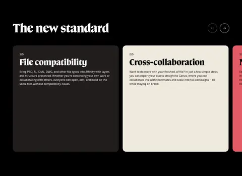
The page is predominantly flat, using solid black and warm-charcoal section bands rather than layered shadows. Cards are defined mainly by rounded corners and subdued graphite borders. Reserve subtle inset highlights and soft depth for controls or contained interface elements; do not add heavy, floating shadows to every section.
组件
下面的预览按实测的按钮、输入框、徽标、卡片样式重建(字体用替代字体)。
Primary download button
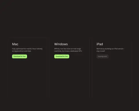
Lime fill (#a7f175), dark text (#0e1318), 12px radius, and measured padding of 8px 16px; used for prominent download actions.
Enterprise button
Light neutral fill with dark text and the same measured button radius and padding; provides a quieter alternative to the lime action.
Dark feature card
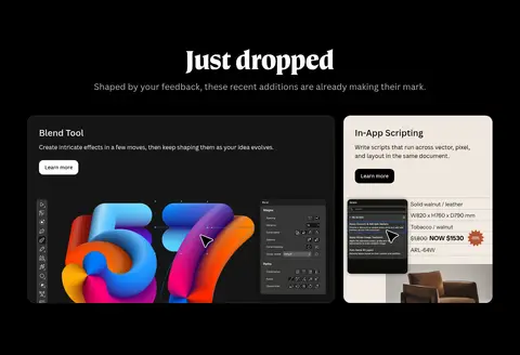
A product or capability card on black or warm charcoal, with a 20px radius and a thin muted outline where measured.
Editorial feature band
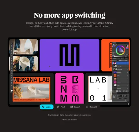
Full-width warm-charcoal section with a centered serif heading, supporting copy, and a large product visual.
Testimonial block
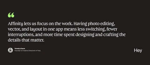
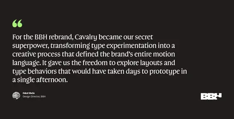
Large serif quote with a bright lime quotation mark, followed by compact attribution and a customer mark.
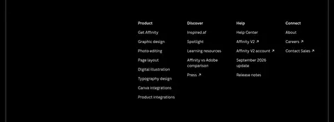
Footer navigation
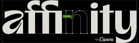
Dense multi-column link groups on black, ending in a large oversized Affinity wordmark treatment.
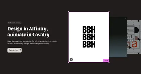
Imagery · Artwork is the main source of colour: the hero uses separately framed creative pieces around its centered statement, while later sections feature software interfaces, brand work, and product demonstrations. The page mixes illustration, photography, and video rather than applying one uniform treatment. Keep images crisp and contained in rounded cards or purposeful crops, and let saturated artwork contrast against the restrained dark surroundings.
Alternate broad charcoal bands with black sections.
Reserve lime for meaningful calls to action and emphasis.
Use expressive serif faces for large editorial statements.
Let product artwork supply most saturated colours.
Keep borders subtle and card corners rounded.
✕ 不该做
Do not turn every section into a card grid.
Do not use bright artwork colours as global UI accents.
Do not replace the dark canvas with a gradient-heavy background.
Do not use sans-serif styling for every large headline.
Do not add strong shadows to otherwise flat sections.
Do not crowd the page with tightly stacked content.
给 AI 的提示词
想快速出一个同风格的新页面,把这段话连同 DESIGN.md 一起发给 AI。
Build a new page in Affinity’s visual style with a near-black Canvas Black (#000000) foundation and broad Warm Charcoal (#211d1d) section bands. Use Studio White (#ffffff) for high-contrast text, Canva Sans-like sans-serif for navigation and body copy, and expressive serif headlines for major statements. Apply Creative Lime (#a7f175) selectively to primary actions and important links, with dark text on lime buttons. Keep the layout spacious, alternating centered feature moments with split product stories and editorial content. Use rounded, quietly outlined cards rather than heavy elevation. Make creative examples—illustration, interface imagery, or motion—the main source of vivid colour; Violet Signal (#a370fc), Electric Cyan (#2ec7ff), and Studio Magenta (#f075f1) should appear as artwork details, not site-wide controls. Finish with restrained multi-column navigation and an oversized brand mark.