North star · Use a dramatic dark opening, then let spacious white product sections and precise Inter typography carry the story.
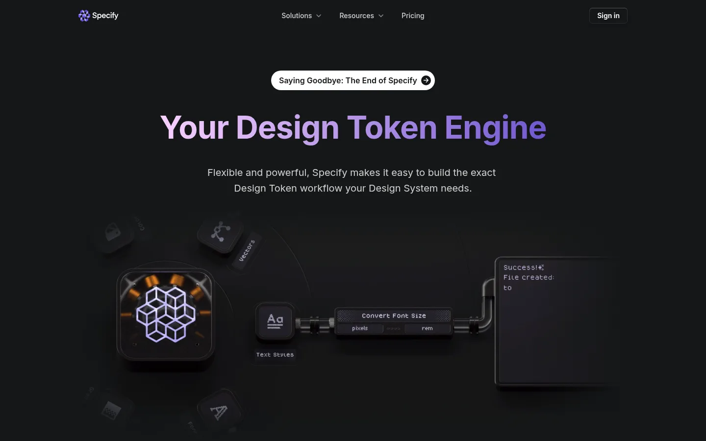
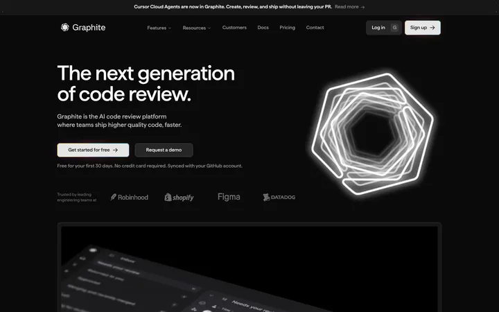
The page opens on a near-black hero, where white navigation and supporting copy frame a large headline filled with a purple-to-blue gradient. A softly vignetted, low-contrast 3D product illustration sits below the copy, reinforcing the technical subject without competing for attention. The hero gives way to broad white sections with centered dark headings, muted explanatory text, and generous whitespace. Inter is used throughout for a clean, contemporary interface voice; bold display headings use tight tracking, while body copy remains open and readable. Product screenshots, customer proof, and feature explanations are arranged as focused content groups rather than dense dashboards. Purple, blue, and green accents appear selectively in gradients, small icons, and product details. Cards use pale neutral fills and subtle shadows, while the overall page stays mostly flat and spacious.
Code-like product labels and technical output snippets
Aa 设计
Inter-Bold
系统字体 · 字重 700 · 占比 1%
免费替代:Inter
Hero heading and strongest display emphasis
角色
示例
字号
字重
行高
字距
一级标题
Hero title, large and bold with a purple gradient fill.
Specify
48px
700
1.17
-0.021em
二级标题
Centered section headings and prominent feature titles.
Specify
32px
600
1.25
-0.031em
正文
Hero supporting sentence and primary explanatory copy.
The quick brown fox 敏捷的狐狸
20px
400
1.6
0
辅助文字
Small supporting labels and compact feature descriptions.
The quick brown fox 敏捷的狐狸
16px
500
1.5
0
导航
Header navigation links and concise utility labels.
The quick brown fox 敏捷的狐狸
14px
500
1.71
0
代码
Technical snippets and code-oriented product output.
const style = 1;
14px
400
1.57
0
间距与布局
基准单位 8px · 密度:适中
80px版块间距
8px元素间距
16px卡片内边距
1120px内容最大宽度
4px
6px
8px
10px
16px
24px
40px
The measured content width is capped at 1120px, with the header and main content centered within it. The hero uses centered alignment and a single column; later white sections alternate centered headings with product imagery, customer proof, and feature content. Sections feel deliberately separated, with a measured section gap of 80px and comfortable overall density. The measured spacing scale is built around an 8px base unit. Preserve the long vertical rhythm and open whitespace rather than compressing content into a dashboard-like layout.
圆角与层次
按钮 · 50%
卡片 · 16px
图片 · 8px
导航 · 6px
链接 · 8px
md · link
md · card
inset · link, nav
sm · other
Most of the page stays flat, especially the white content bands. Cards have a measured 16px radius and a soft shadow; product media uses an 8px radius. Avoid prominent hairlines or heavy outlines, and reserve layered shadows for floating interface or showcase elements.
组件
下面的预览按实测的按钮、输入框、徽标、卡片样式重建(字体用替代字体)。
Header navigation
Compact links sit across the dark hero header, with the Specify mark at left and a discreet outlined sign-in control at right.
Hero announcement pill
A white, pill-shaped announcement link sits centered above the title, using dark text and a small circular arrow treatment.
Gradient hero title
A centered, bold Inter headline uses a violet-to-blue gradient against the near-black hero canvas.
Product showcase media
A dark, vignetted 3D illustration appears beneath the hero copy; later product screenshots are framed with soft corners.
Feature cards
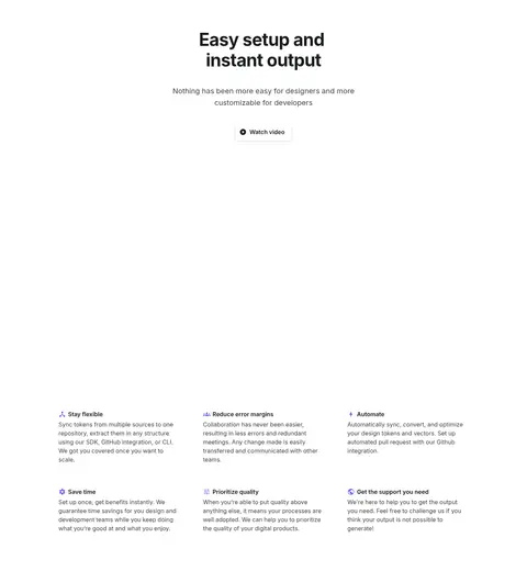
Feature and product cards use pale neutral surfaces, measured 16px card rounding, and subtle low-contrast shadows.
Customer proof
Customer logos and testimonial content provide social proof in light, spacious sections without heavy decoration.
Imagery · The hero uses dark, cinematic 3D product artwork with a soft vignette and dim highlights, leaving the headline dominant. Later sections use product-interface screenshots, customer logos, and testimonial cards as evidence of real workflows. Keep media contained within the content area, with restrained framing and rounded corners; avoid introducing generic lifestyle photography.
Center the hero announcement, title, and supporting copy.
Use the measured violet, blue, and green accents selectively.
Keep white content sections spacious and clearly separated.
Use Inter for interface and editorial text.
Frame product imagery as real technical evidence.
✕ 不该做
Do not turn the page into a dense dashboard.
Do not use bright accent colors as large section backgrounds.
Do not let product artwork overpower the hero title.
Do not add heavy borders or strong shadows to every card.
Do not introduce decorative typefaces or all-caps-heavy styling.
Do not fill the large whitespace between content groups.
给 AI 的提示词
想快速出一个同风格的新页面,把这段话连同 DESIGN.md 一起发给 AI。
Build a new SaaS page in Specify’s visual style. Use Night Canvas (#151718) for a cinematic opening and Gallery White (#ffffff) for broad, airy content sections. Set headings and interface copy in Inter, with a bold, tightly tracked hero title and a restrained gradient drawing on Specify Violet (#8d4af7) and Token Blue (#1d58c0); use Workflow Green (#009639) only as a small accent. Center key headings, keep supporting text muted, and organize content as focused feature, customer-proof, and product-showcase groups. Use Mist Surface (#f6f7f9) or Cloud Gray (#ebedef) for occasional cards, with softly rounded corners and subtle shadows. Keep the page within the measured 1120px content width, preserve generous vertical whitespace, and use dark technical product imagery rather than generic lifestyle photography.