North star · Keep the page nearly black and typographically quiet, letting cinematic imagery and real product UI provide the contrast and detail.
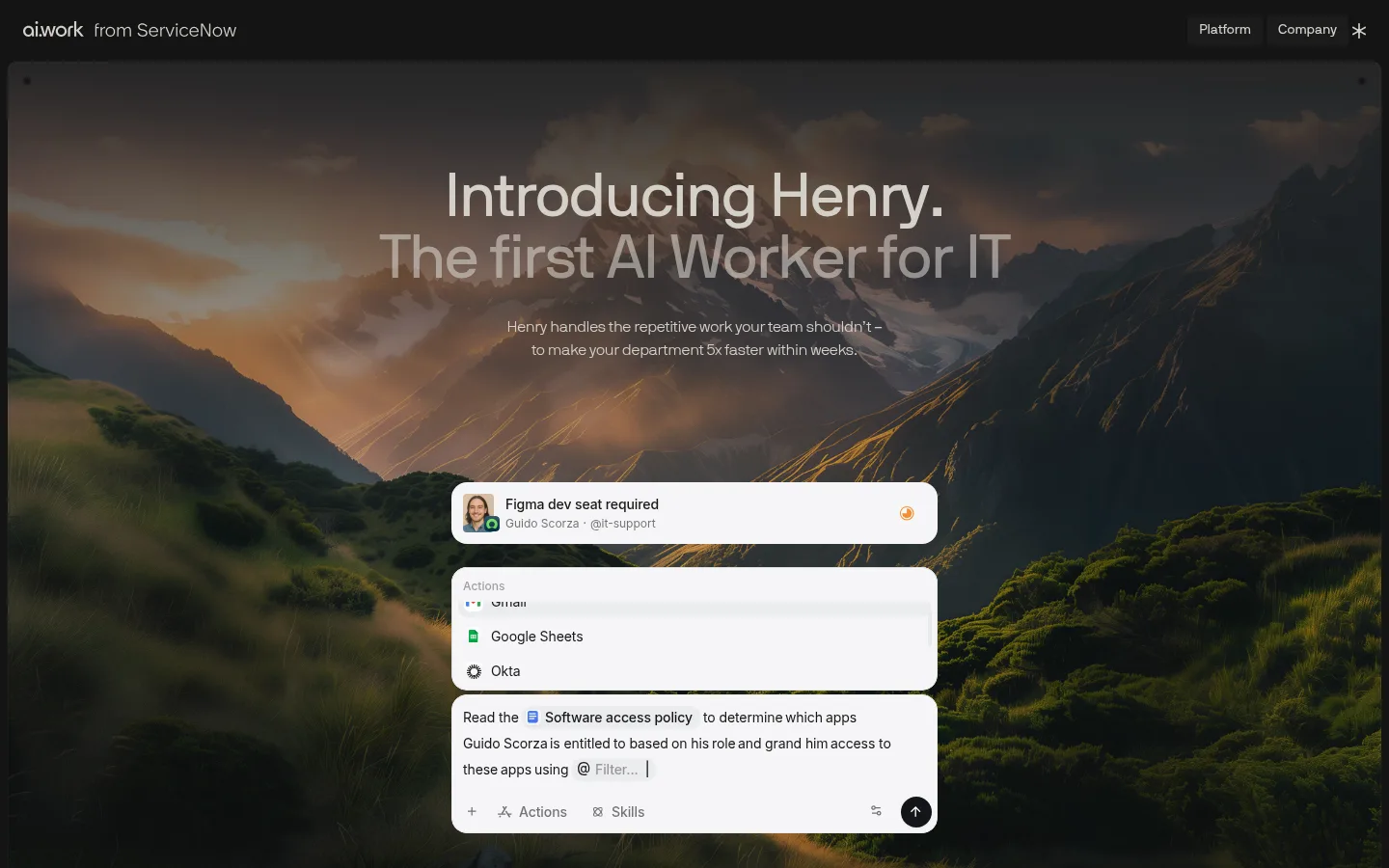
The visual system is anchored by a near-black canvas (#141414), with warm pale text (#d4d0c9) and quieter gray copy (#878581). Most sections remain flat and dark; subtle gradients soften the edges of the landscape hero and occasional product demonstrations rather than turning the page into a colorful gradient theme. White is reserved for strong text and bright embedded UI panels, while the warmer gray-brown (#2e2d2c) appears as a restrained card surface. NB International Pro provides the site’s light, contemporary voice: large centered headlines are compactly tracked, while body text stays airy and easy to scan. Inter supports interface-like text, with a mono face used for compact labels. The page alternates centered statements, wide product visuals, and restrained feature layouts, using long vertical intervals to make each narrative beat feel deliberate. Product screens and the mountain photograph supply most of the visual richness; the surrounding chrome stays quiet.
Light-weight body copy and captions across the page.
Aa 设计
Inter
网络字体 · 字重 400 / 500 / 600 · 占比 38%
免费替代:Inter
Product UI and interface-like supporting text.
Aa 设计
NB International Pro Regular
网络字体 · 字重 400 · 占比 17%
免费替代:Inter
Display headlines and section headings.
Aa 设计
NB International Pro Mono
网络字体 · 字重 400 · 占比 4%
免费替代:IBM Plex Mono
Small technical or category labels.
角色
示例
字号
字重
行高
字距
特大标题
Oversized hero headline and major editorial statements.
ai.work
64px
400
1
-0.02em
一级标题
Primary page heading and prominent section titles.
ai.work
32px
400
1.25
-0.02em
二级标题
Secondary section headings and feature-group titles.
The quick brown fox 敏捷的狐狸
24px
400
1.33
-0.02em
三级标题
Feature, capability, and card headings.
The quick brown fox 敏捷的狐狸
20px
400
1.2
-0.02em
正文
Descriptions, supporting explanations, and testimonial copy.
The quick brown fox 敏捷的狐狸
16px
300
1.5
-0.02em
辅助文字
Compact supporting labels and secondary interface text.
The quick brown fox 敏捷的狐狸
14px
300
1.71
-0.02em
代码
Small uppercase technical or category labels.
const style = 1;
10px
400
1.2
0
间距与布局
基准单位 4px · 密度:宽松
112px版块间距
10px元素间距
6px卡片内边距
—内容最大宽度
1px
2px
3px
4px
5px
6px
7px
8px
10px
12px
16px
23px
24px
48px
56px
The page uses a broad centered composition, with content and media held in generous margins rather than a dense dashboard grid. A slim top navigation sits above a large framed hero image; subsequent sections alternate centered headlines, horizontally arranged workflow cards, wide product demonstrations, and multi-column capability content. Vertical rhythm is notably spacious, with large gaps between narrative beats and compact groupings inside product UI. Keep alignment deliberate and let each section read as its own chapter; measurements do not establish a fixed maximum content width.
圆角与层次
卡片 · 10px
图片 · 4px
链接 · 4px
hairline · other
md · card
Most of the site is flat, with section changes conveyed by spacing and tonal shifts rather than visible borders. Cards and interface mock-ups sit slightly above the canvas through subtle dark shadows and rounded surfaces; bright embedded panels create the strongest depth contrast. Use gradients as image fades or overlays, not as a general page background.
组件
下面的预览按实测的按钮、输入框、徽标、卡片样式重建(字体用替代字体)。
Top navigation
A narrow dark header with the ai.work wordmark on the left and compact Platform, Company, and icon navigation on the right.
Cinematic hero
Dark-framed landscape backdrop, centered two-line headline, short supporting copy, and floating task/product UI.
Workflow cards
Dark task examples arranged in a horizontal showcase; card surfaces use #2e2d2c and rounded corners.
Editorial statement
A centered, large, lightly weighted headline separated from nearby content by substantial vertical space.
Product demonstration
Wide embedded interface or diagram on the dark canvas, using bright UI details as contrast rather than a new page palette.
Capability grid
Multi-column platform capabilities with concise headings, explanatory copy, and occasional workflow diagrams or UI panels.
Imagery · The opening uses a full-bleed mountain landscape at dusk, darkened so pale headline text remains legible. Product imagery consists of realistic interface mock-ups and workflow cards, shown against the dark canvas with crisp, bright panels. Later visuals include restrained diagrams and application marks. Keep photographic color concentrated in the hero; avoid introducing unrelated decorative illustration styles.
该做与不该做
✓ 该做
Use #141414 as the dominant canvas.
Set primary copy in warm pale neutrals.
Keep headlines light, centered, and tightly tracked.
Give major sections generous vertical separation.
Use realistic product UI as the main supporting visual.
Darken photography behind overlaid text.
Reserve bright white for text and interface panels.
✕ 不该做
Do not introduce a colorful section palette.
Do not make the page feel like a dense admin dashboard.
Do not use heavy bold display typography.
Do not add prominent borders to every card.
Do not stretch gradients across unrelated content.
Do not let hero imagery overpower headline legibility.
给 AI 的提示词
想快速出一个同风格的新页面,把这段话连同 DESIGN.md 一起发给 AI。
Build a new ai.work-style page with a near-black #141414 canvas and a quiet, cinematic mood. Use Warm Parchment (#d4d0c9) for primary soft text, Quiet Ash (#878581) for secondary copy, and Clean White (#ffffff) sparingly for high-contrast type or product UI. Use a light, tightly tracked sans-serif for body copy and regular-weight display headings; keep labels compact and technical. Organize content into spacious editorial sections: a restrained navigation, a media-led hero, centered statements, product demonstrations, and concise capability groupings. Use realistic software UI as the main detail, with Cinder Surface (#2e2d2c) cards and subtle shadows. Keep backgrounds flat, use gradients only to shade imagery, and make each section feel calm and deliberate.