North star · Keep the page grounded in black and white; use violet sparingly to mark the next action, not to decorate every section.
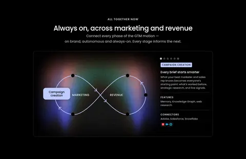
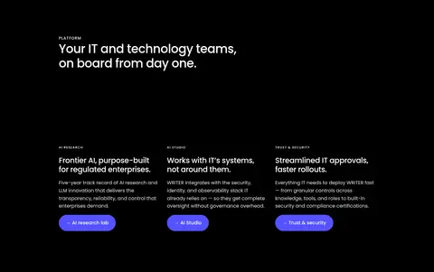
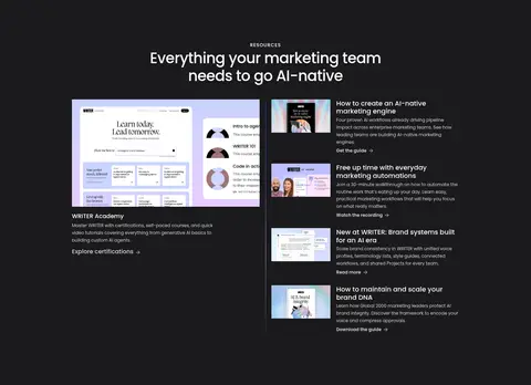
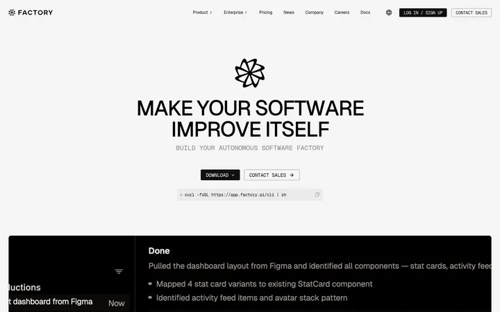
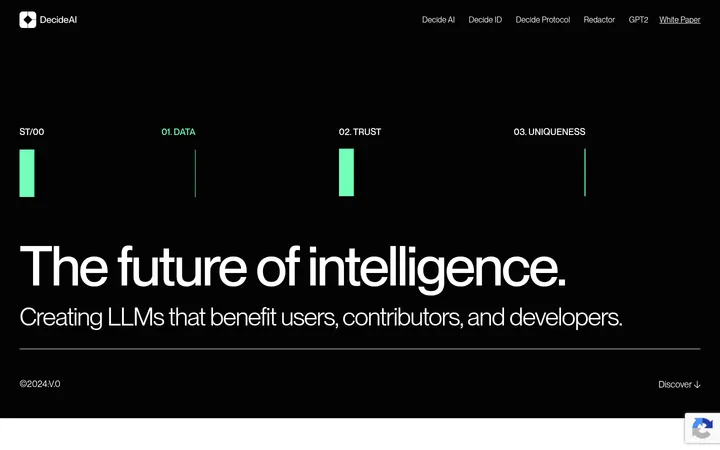
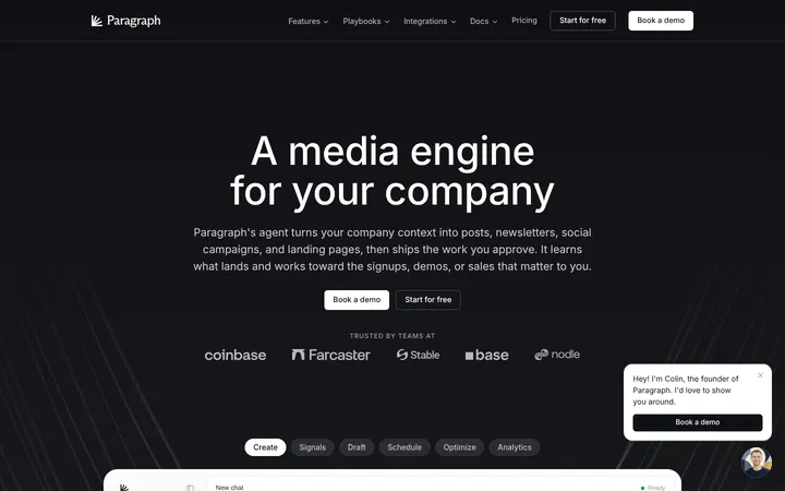
WRITER builds its visual identity around a near-black canvas, with white headlines and subdued gray supporting text doing most of the work. The vivid violet accent is reserved for primary actions and small interface highlights, keeping it distinct rather than turning the page into a field of color. Poppins is used throughout, with medium-weight, tightly tracked display and heading styles that give large centered statements a clean editorial presence. The hero combines a centered message and email form with overlapping product imagery; later sections alternate between centered feature introductions, broad image-led showcases, and left-aligned platform content. A charcoal resource band briefly changes the surface before the page returns to black. Product screens, people, and customer proof appear inside rounded panels, often with softly tinted or gradient imagery. Comfortable section spacing and thin gray borders give this dense, long homepage room to breathe without losing its enterprise focus.
All measured headings, body copy, navigation, buttons, and links.
角色
示例
字号
字重
行高
字距
特大标题
Oversized hero statement and major brand-level messaging.
WRITER
64px
500
1
-0.031em
一级标题
Primary page or section headline, especially hero messaging.
WRITER
44px
500
1.25
-0.02em
二级标题
Large section titles for feature and resource introductions.
WRITER
40px
500
1.2
-0.02em
三级标题
Card and subsection headings within showcases and content blocks.
The quick brown fox 敏捷的狐狸
25px
500
1.2
-0.02em
四级标题
Small supporting headings and resource titles.
The quick brown fox 敏捷的狐狸
20px
400
1.6
0
正文
Default explanatory copy, product descriptions, and card text.
The quick brown fox 敏捷的狐狸
15px
400
1.4
0
辅助文字
Small metadata, fine print, and compact supporting labels.
The quick brown fox 敏捷的狐狸
12px
400
1.66
0
按钮
Primary and secondary action labels.
The quick brown fox 敏捷的狐狸
16px
500
1.6
0
导航
Top navigation items and prominent menu labels.
The quick brown fox 敏捷的狐狸
14px
600
1.5
0
链接
Compact resource and case-study links.
The quick brown fox 敏捷的狐狸
12px
600
1.66
0
眉题
Uppercase section markers and category labels.
The quick brown fox 敏捷的狐狸
14px
500
1.2
0.077em
间距与布局
基准单位 2px · 密度:适中
60px版块间距
4px元素间距
—卡片内边距
1050px内容最大宽度
2px
3px
4px
5px
8px
9px
10px
12px
14px
15px
16px
18px
20px
24px
25px
28px
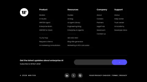
The measured content max width is 1050px, with a comfortable density and generous separation between major sections. The first viewport centers the hero headline and email form above layered imagery; subsequent blocks mix centered introductions, two-column showcases, a three-column platform row, and a four-column footer. Most sections remain black, while the resources area uses a charcoal band. Use the measured spacing scale and section rhythm rather than introducing arbitrary dimensions; align dense content to a clear grid and let image panels carry visual weight.
圆角与层次
按钮 · 50%
输入框 · 9999px
卡片 · 12px
图片 · 12px
lg · card
md · button
md · other
The page is mostly flat: black and charcoal surfaces, thin graphite card borders, and rounded media panels establish structure. Use layering where product cards overlap hero imagery, not as a general decoration. Measured card and button shadows are soft and dark, so keep them subtle against the black canvas.
组件
下面的预览按实测的按钮、输入框、徽标、卡片样式重建(字体用替代字体)。
Primary CTA
Use a pill-shaped Signal Violet (#5551ff) button with white Poppins text; the measured actions include Request a demo and Try for free.
Hero email form
A wide rounded email field sits directly beside a violet Request a demo action, centered below the headline.
Top navigation
Compact white Poppins menu labels align across the top, with the brand mark at left and a violet Try for free action at right.
Product showcase card
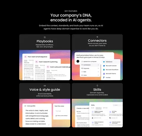
Combine a dark card, fine Graphite Rule (#393b40) border, rounded media, and embedded product UI or colorful imagery.
Section eyebrow
Small uppercase Poppins label with increased tracking precedes centered or left-aligned section headlines.
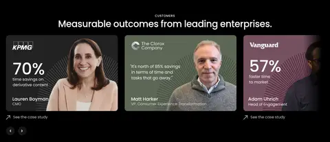
Customer proof card
Present a customer logo, outcome or statistic, portrait, and compact case-study link in a dense visual panel.
Resources band
Separate educational content with a Charcoal Band (#1a1a1c), then arrange a featured resource beside a compact feed.
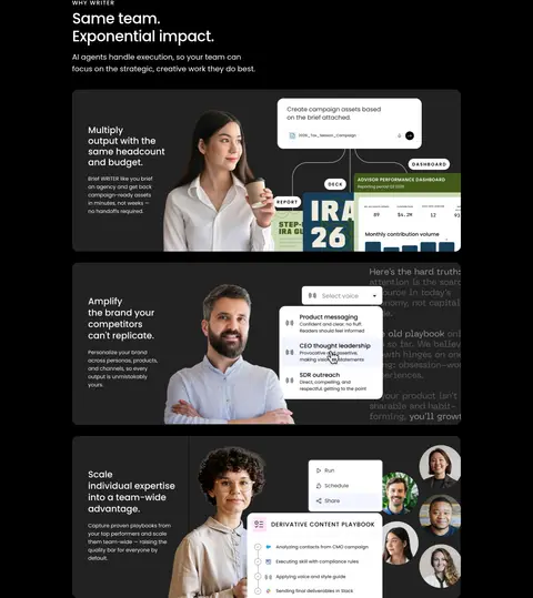
Imagery · Use polished product UI, customer portraits, and workplace photography as evidence of the platform in use. Hero media is layered with translucent interface cards, while feature showcases place screenshots and portraits inside broad rounded panels. Some product visuals carry colorful soft gradients, but these belong to the imagery rather than the brand canvas. Keep real people and UI legible, with dark surroundings and restrained crops.
Pair product UI with real customer or team imagery.
Use charcoal only to distinguish selected section bands.
Preserve generous space around major content groups.
✕ 不该做
Do not introduce unmeasured brand colors.
Do not make every section a different color.
Do not use violet as a large decorative background.
Do not flatten all product imagery into generic icon grids.
Do not crowd headings against card edges.
Do not make borders brighter than the content they contain.
Do not add strong shadows to every panel.
给 AI 的提示词
想快速出一个同风格的新页面,把这段话连同 DESIGN.md 一起发给 AI。
Build a new enterprise AI page in WRITER’s restrained dark visual system. Use Deep Canvas (#000000) for the main background, Bright Paper (#ffffff) for primary headings, and Soft Alloy (#d2d4d7) for supporting copy. Signal Violet (#5551ff) is for primary actions, not decorative fills; use Graphite Rule (#393b40) for quiet card outlines and Charcoal Band (#1a1a1c) for occasional section contrast. Set all text in Poppins or a close sans-serif substitute, with tight, medium-weight large headings and tracked uppercase eyebrows. Follow the measured 1050px content maximum and comfortable section rhythm. Combine centered introductions, clear grid-based content, polished product screenshots, and authentic people imagery. Keep panels rounded and mostly flat, with restrained shadows and layered media only where useful.