Hume AI 将语音评估呈现为以研究为基础、可量化的专业领域,用克制的黑白界面搭配鲜明的音频可视化。深色与浅色区块交替铺陈产品叙事,突出评测证据、基准数据与工具能力。
North star · Keep the interface monochrome and editorial; let precise data visualizations—not decorative UI—supply the color and complexity.
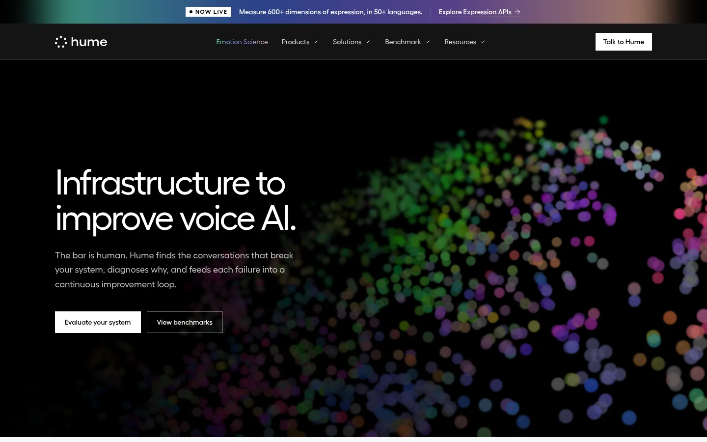
The page is built around a strong black-and-white contrast: expansive black sections frame the hero, benchmark story, closing CTA, and footer, while Gallery White and cool pale gray carry most informational content. Bright multicolour gradients are used sparingly in announcement and media artwork; colourful dots and diagrams belong to visualizations, not the base interface. Fellix gives headlines and body copy a clean, humanist sans-serif voice. PP Fraktion Mono marks eyebrows and selected section headings, lending research and measurement content a technical register. Large, left-aligned headlines sit above concise explanations, with crisp square buttons and cards. A spacious, centered content area supports alternating full-width bands, split layouts, and compact metric rows. Fine neutral borders define product panels without shadows, keeping the interface flat and analytical while allowing audio waveforms, score bars, and charts to provide visual texture.
配色
点色块复制色值。用途说明来自对页面的实测位置(背景、文字、描边、按钮)与截图判读。
品牌色
强调色
表层色
中性色
功能色
页面底色 · Gallery White表层 · Mist Gray表层 2 · Stage Black表层 3 · Cloud Line主文字 · Near Ink次要文字 · Slate Gray弱文字 · Soft Silver描边 · Cloud Line强调 · Signal Indigo强调 2 · Signal Mint强调 3 · Signal Violet
Display and body sans-serif for navigation, headlines, copy, buttons, and links.
Aa 设计
PP Fraktion Mono
网络字体 · 字重 400 / 500 · 占比 13%
免费替代:IBM Plex Mono
Monospaced eyebrow labels and technical or research-style section headings.
角色
示例
字号
字重
行高
字距
特大标题
Oversized hero and closing CTA headline.
Hume AI
72px
400
1
-0.05em
一级标题
Primary section and page headlines.
Hume AI
48px
400
1.25
-0.025em
二级标题
Technical section headings and research-led feature titles.
Hume AI
36px
400
1
-0.05em
正文
Explanatory paragraphs and product descriptions.
The quick brown fox 敏捷的狐狸
18px
400
1.63
0
辅助文字
Supporting notes, card copy, and small descriptions.
The quick brown fox 敏捷的狐狸
16px
400
1.63
0
按钮
Compact CTA labels.
The quick brown fox 敏捷的狐狸
14px
500
1.43
0
导航
Top navigation labels.
The quick brown fox 敏捷的狐狸
14px
400
1.43
0
链接
Text links and product exploration actions.
The quick brown fox 敏捷的狐狸
14px
500
1.43
0
眉题
Uppercase section and category labels.
The quick brown fox 敏捷的狐狸
12px
500
1.33
0.1em
代码
Compact technical labels and measurement-style annotations.
const style = 1;
12px
500
1.33
0.1em
间距与布局
基准单位 4px · 密度:宽松
144px版块间距
1px元素间距
20px卡片内边距
1216px内容最大宽度
1px
4px
6px
8px
10px
12px
16px
20px
24px
28px
32px
36px
40px
144px
Use a centered content frame with a measured maximum width of 1216px, while letting major color bands run full bleed. The homepage alternates black, pale gray, and white sections to establish a clear reading rhythm. Most content is left aligned, with feature areas arranged as split panels or multi-column cards and metrics distributed in a horizontal row. Keep density spacious: broad section breaks, compact controls, and generous breathing room around headlines. Maintain crisp alignment across headings, body copy, panels, and CTAs.
圆角与层次
徽标 · 9999px
没有测到阴影:页面是扁平的,层次靠底色和描边区分。
The interface is predominantly flat, with no measured shadow system. Use thin, neutral outlines to separate panels and card groups, and rely on alternating section backgrounds rather than floating layers. Square-corner buttons and cards reinforce the direct, research-oriented presentation; reserve rounded styling for compact pill-like badges.
组件
下面的预览按实测的按钮、输入框、徽标、卡片样式重建(字体用替代字体)。
Announcement strip
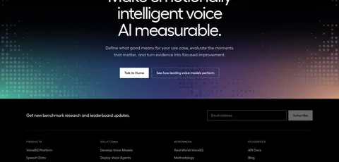
A narrow top message with a white NOW LIVE badge, concise update copy, and a linked action, backed by a multicolour gradient.
Primary CTA
Square-corner button with compact Fellix medium text; white with black text on dark sections, or near-black with white text on light sections.
Benchmark panel
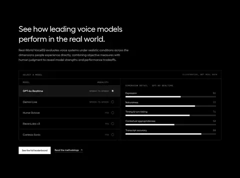
Dark bordered data table with model rows, evaluation dimensions, and horizontal score bars.
Feature card
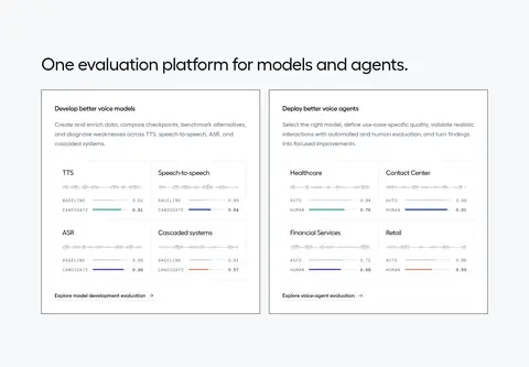
Flat white or pale-gray card with a thin #e6e8eb outline, concise title, explanatory copy, and a small interface visualization.
Metric row
Four aligned evidence metrics on white, each pairing a prominent figure with a short muted caption.
Technical badge
Uppercase PP Fraktion Mono label with expanded tracking, muted text, and a subtle outlined or pill-shaped treatment.
Footer columns
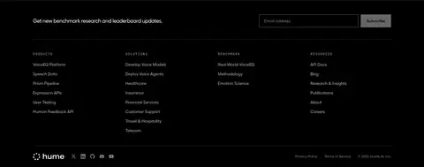
Black footer with a newsletter field, grouped link lists, subdued separators, and low-contrast utility links.
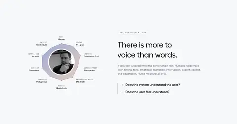
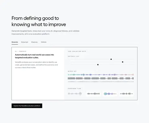
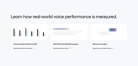
Imagery · The hero uses a dark, abstract field of glowing colored dots that suggests voice data rather than literal product photography. Across the page, product imagery is mostly interface diagrams: waveforms, score bars, sample cards, and benchmark tables. Keep these graphics clean and contained within panels; reserve vibrant gradients and colors for visualizations, avoiding unrelated stock photography.
Use Fellix for readable headlines, copy, and controls.
Reserve PP Fraktion Mono for technical labels and eyebrows.
Keep cards flat and outline them with measured neutral colors.
Use vivid gradients only in announcement or data artwork.
Show product capability through waveforms, tables, and score bars.
✕ 不该做
Do not add drop shadows or decorative elevation.
Do not turn the interface into a colorful dashboard.
Do not round standard buttons and feature cards.
Do not use gradients as broad section backgrounds.
Do not add stock photography or unrelated illustrations.
Do not crowd the spacious section rhythm with excess copy.
给 AI 的提示词
想快速出一个同风格的新页面,把这段话连同 DESIGN.md 一起发给 AI。
Build a new page in Hume AI’s measured visual style. Use Stage Black (#000000), Gallery White (#ffffff), and Mist Gray (#f7f8fa) as alternating full-width section surfaces; set primary text in Near Ink (#0a0a0a) or white according to contrast. Use Fellix or Inter for headlines, copy, and controls, with PP Fraktion Mono or IBM Plex Mono for uppercase technical eyebrows. Keep a centered content frame, spacious section rhythm, left-aligned editorial headings, and crisp square buttons. Outline product panels with Cloud Line (#e6e8eb) instead of shadows. Make the visual content feel voice-native through waveforms, evaluation tables, score bars, and compact metrics. Keep colorful accents—Signal Mint (#4ebc9c), Signal Indigo (#3452aa), and Signal Violet (#6e50aa)—inside data visuals or restrained gradient artwork, not as large interface fills.