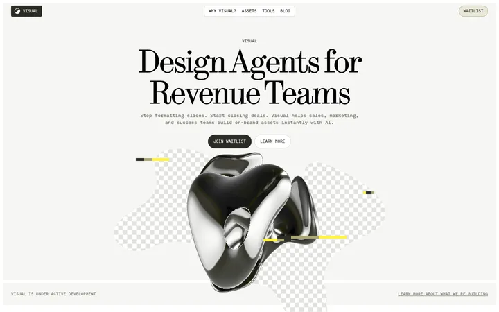
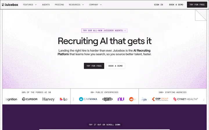
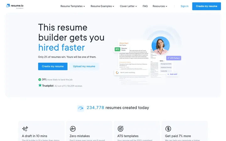
Metaview以明亮、偏编辑式的SaaS版式搭配近黑色导航和深绿色功能区。克制的字体与胶囊按钮营造沉稳感,醒目的影像则为招聘平台注入鲜明的人情味。
North star · Keep the interface quiet and spacious, then use deep-green contrast and one vivid, human image to give each key section a clear focal point.
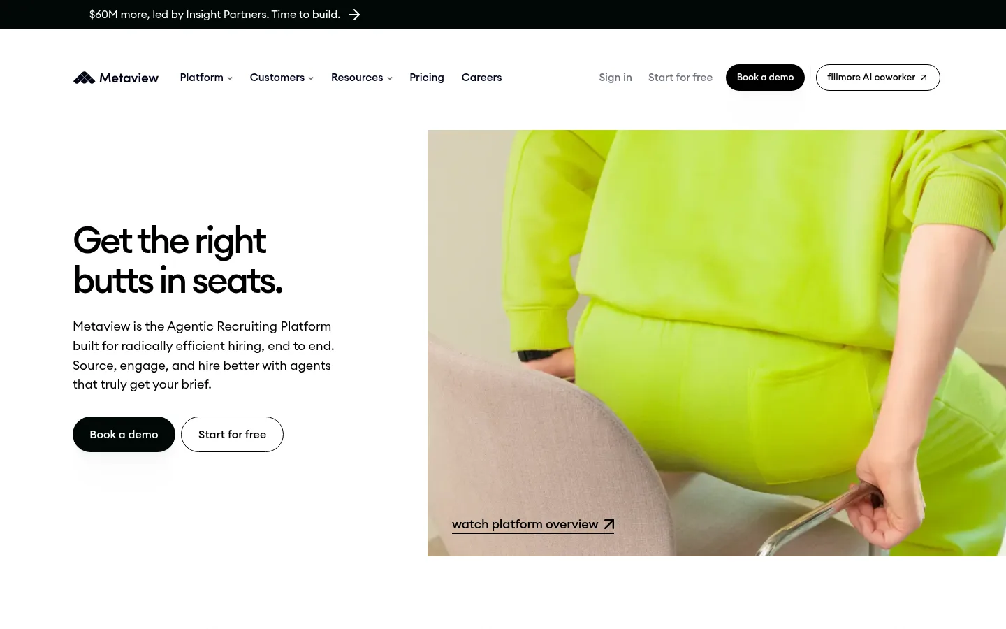
The page is built around a predominantly white canvas, with a narrow near-black announcement strip and occasional deep-green sections providing strong contrast. Warm off-white surfaces soften cards, while the measured mint, blue, and lilac accents belong mainly to gradient treatments rather than serving as everyday interface colours. Euclid Circular A gives headings and body copy a rounded, contemporary voice; headings are medium weight with tight tracking, and body text remains open and readable. The desktop hero uses a two-column composition: compact copy and pill actions sit beside a large, tightly cropped photograph. Sections below alternate spacious white fields, dark feature bands, product explanations, proof points, testimonials, and FAQ content. The layout uses generous vertical separation and restrained borders instead of dense decoration. Black capsule CTAs, outlined secondary actions, and rounded media frames provide the main interaction cues. The overall effect is calm and clear, punctuated by high-impact image colour.
配色 点色块复制色值。用途说明来自对页面的实测位置(背景、文字、描边、按钮)与截图判读。
品牌色
Forest Black
#000805
Announcement strip, dark section surfaces, and selected dark controls.
强调色
Mint Haze
#e3ffef
Light text accent associated with dark sections.
Fresh Mint
#5aecb8
Gradient accent within section effects; not a dominant control colour.
Periwinkle Beam
#88acfa
Cool gradient accent, used as a secondary atmospheric highlight.
Lilac Glow
#dbbef7
Soft gradient accent rather than a primary interface colour.
表层色
Gallery White
#ffffff
Primary page canvas, light section background, and reversed text on dark CTAs.
Warm Porcelain
#fbf8f4
Warm card and surface treatment against the white page canvas.
Deep Canopy
#0a2119
Large dark-green feature bands and inverted content areas.
Night Moss
#0b1b15
Dark cards, selected buttons, and inverse interactive surfaces.
中性色
True Ink
#000000
Primary headings, body copy, navigation text, and black pill CTAs.
功能色
Soft Pewter
#b8bab9
Muted copy and low-emphasis supporting text.
Quiet Rule
#d9d9d9
Fine borders around cards and navigation elements.
Pine Edge
#233830
Subtle outlines around dark cards, media controls, and links.
Stone Gray
#808483
Secondary text and understated interface details.
Sage Gray
#82938b
Muted footer copy and supporting text on dark surfaces.
Charcoal Moss
#29302d
Low-contrast outlines and card-detail borders in dark UI.
文字 背景 对比度 WCAG #000000 True Ink#ffffff Gallery White21:1 AAA #000000 True Ink#fbf8f4 Warm Porcelain19.84:1 AAA #000000 True Ink#000805 Forest Black1.04:1 不达标 #000000 True Ink#0a2119 Deep Canopy1.24:1 不达标 #b8bab9 Soft Pewter#ffffff Gallery White1.95:1 不达标 #b8bab9 Soft Pewter#fbf8f4 Warm Porcelain1.84:1 不达标
字体 字号阶梯:Major Third(比例约 1.26,正文 18px)。示例用免费替代字体渲染,数值为实测。
Aa 设计
Euclid Circular A 网络字体 · 字重 400 / 500 / 700 · 占比 98%
免费替代:Inter
Main interface font for headings, body copy, navigation, links, and buttons.
Aa 设计
Onsite Mono 网络字体 · 字重 400 / 500 · 占比 2%
免费替代:IBM Plex Mono
Small code-like or technical labels.
角色 示例 字号 字重 行高 字距 一级标题 Hero headline and primary page-level statement.
Metaview
36px 500 1.16 -0.03em 二级标题 Major section headings and prominent content titles.
Metaview
28px 500 1.16 -0.02em 三级标题 Feature, card, and subsection headings.
The quick brown fox 敏捷的狐狸
24px 500 1.28 -0.02em 正文 Introductory copy and primary explanatory text.
The quick brown fox 敏捷的狐狸
18px 400 1.48 0 辅助文字 Compact supporting copy and card details.
The quick brown fox 敏捷的狐狸
16px 400 1.48 0 按钮 CTA and action labels.
The quick brown fox 敏捷的狐狸
16px 500 1.6 0 导航 Header navigation labels.
The quick brown fox 敏捷的狐狸
15px 500 1.6 0 链接 Inline and standalone text links.
The quick brown fox 敏捷的狐狸
18px 400 1.48 0 代码 Occasional technical labels or code-like content.
const style = 1;
14.5px 500 1.48 0.01em
间距与布局 基准单位 8px · 密度:宽松
120px 版块间距
3px 元素间距
16px 卡片内边距
1158px 内容最大宽度
3px
4px
5px
6px
8px
10px
12px
16px
24px
40px
56px
104px
120px
Use a centered, spacious desktop composition with a measured maximum content width of 1158px. The hero is a two-column split, with left-aligned text and actions opposite wide, cropped media. Keep most content on white, punctuating the long page with full-bleed dark-green bands and centered feature sections. The measured section rhythm is generous, with a 120px section gap and an 8px base spacing unit. Lower sections use two- to four-column arrangements for benefits, proof, and resource content; FAQ and footer content become more compact while retaining clear alignment.
圆角与层次 xl · button
lg · card
lg · other
xl · card
The page is mostly flat: white fields and dark bands rely on contrast and spacing rather than decoration. Use fine measured borders for card edges, with rounded card corners. Reserve soft, restrained shadows for key buttons or highlighted cards; avoid adding a shadow to every surface. Layer gradients as subtle atmosphere within selected feature areas.
组件 下面的预览按实测的按钮、输入框、徽标、卡片样式重建(字体用替代字体)。
Announcement strip A narrow near-black band above the main header, carrying compact light copy and a directional arrow.
Navigation Logo and text links on white, with account actions and a black rounded “Book a demo” pill.
Hero split Left-aligned headline, concise explanatory copy, paired pill CTAs, and a large right-side lifestyle image with a text link overlay.
Dark feature band Full-width deep-green section used to create contrast around product and workflow storytelling.
Feature card Rounded product or testimonial panel; dark variants use #0b1b15 with #233830 borders.
Proof and metrics Logo marks, customer stories, and quantified outcomes arranged as sparse supporting evidence.
FAQ accordion A simple vertically stacked question list with clear text hierarchy and restrained separators.
Footer Multi-column link groups on a dark base, using muted sage text and compact social links.
Imagery · Use large, editorial lifestyle photography with unusual, close cropping; the hero image’s vivid lime clothing is image content, not a brand colour token. Pair photography with product UI and workflow visuals in feature sections. Maintain clean rectangular media framing and avoid heavy filters. Logos and testimonial media appear as supporting proof, while the primary visual emphasis comes from authentic human imagery and occasional interface demonstrations.
页面版块 共 13 个版块,按页面从上到下排列,每个都标了类型、布局和交互套路。
该做与不该做 ✓ 该做 Keep the main canvas white and uncluttered. Use #0a2119 or #000805 for deliberate dark section breaks. Set headings in Euclid Circular A with measured tight tracking. Use black pill-shaped primary CTAs with white labels. Pair concise copy with large, closely framed human photography. Give sections generous vertical breathing room. Use borders sparingly to define cards and controls. ✕ 不该做 Do not turn illustration-only accents into the page’s dominant UI palette. Do not crowd the hero with extra labels or decorative elements. Do not apply heavy shadows to every card. Do not make all sections dark or gradient-filled. Do not use sharp, square CTAs where the measured controls are pill-shaped. Do not treat the lime hero clothing as a reusable brand colour. Do not compress the long-page section rhythm. 给 AI 的提示词 想快速出一个同风格的新页面,把这段话连同 DESIGN.md 一起发给 AI。
复制 Build a new Metaview-style SaaS page with a predominantly #ffffff canvas, near-black #000805 announcement strip, and selective #0a2119 feature bands. Use Euclid Circular A or a close geometric sans substitute; keep headings medium-weight with tight tracking and body copy calm and readable. Compose the hero as a left-aligned text-and-CTA column beside a large, editorially cropped human photograph. Use black pill CTAs with white labels, restrained outlined secondary actions, warm #fbf8f4 cards, and fine #d9d9d9 rules. Treat #5aecb8, #88acfa, and #dbbef7 as occasional gradient atmosphere, not default button colours. Preserve generous whitespace, clear section breaks, and simple proof, feature, testimonial, FAQ, and footer modules. Keep decoration subordinate to content and imagery.
DESIGN.md Tailwind v4 CSS 变量 Design Tokens
---
title: "Metaview design system"
variant: extended
source: https://www.metaview.ai/
captured_at: 2026-10-12
theme: light
industry: ai
generator: Design DNA (https://four.wiralomi.com/style/metaview-ai)
ai_generated: true
ai_label: "本文件由 AI 辅助生成:数值取自公开网页的实测样式,命名、用途说明与建议为模型解读。商标归原所有者。 / AI-assisted content"
---
# Metaview · Design System
> Quiet editorial clarity with bold, unexpected imagery.
**Theme:** light · **Industry:** ai · **Source:** https://www.metaview.ai/ · **Captured:** 2026-10-12 (1440×900 desktop)
_AI-assisted content: values are measured from the public page at capture time; names, roles and guidance are model-written interpretations. Trademarks belong to their owners._
Metaview pairs a bright, editorial SaaS layout with near-black navigation and deep-green feature bands. Restrained typography and pill-shaped actions keep the experience calm, while vivid photography gives the recruiting platform a distinctive, human tone.
## North star
Keep the interface quiet and spacious, then use deep-green contrast and one vivid, human image to give each key section a clear focal point.
## Overview
The page is built around a predominantly white canvas, with a narrow near-black announcement strip and occasional deep-green sections providing strong contrast. Warm off-white surfaces soften cards, while the measured mint, blue, and lilac accents belong mainly to gradient treatments rather than serving as everyday interface colours. Euclid Circular A gives headings and body copy a rounded, contemporary voice; headings are medium weight with tight tracking, and body text remains open and readable. The desktop hero uses a two-column composition: compact copy and pill actions sit beside a large, tightly cropped photograph. Sections below alternate spacious white fields, dark feature bands, product explanations, proof points, testimonials, and FAQ content. The layout uses generous vertical separation and restrained borders instead of dense decoration. Black capsule CTAs, outlined secondary actions, and rounded media frames provide the main interaction cues. The overall effect is calm and clear, punctuated by high-impact image colour.
## Colors
| Name | Hex | Token | Group | Role |
|---|---|---|---|---|
| Gallery White | ` | `--color-gallery-white` | surface | Primary page canvas, light section background, and reversed text on dark CTAs. |
| Soft Pewter | ` | `--color-soft-pewter` | semantic | Muted copy and low-emphasis supporting text. |
| Warm Porcelain | ` | `--color-warm-porcelain` | surface | Warm card and surface treatment against the white page canvas. |
| Forest Black | ` | `--color-forest-black` | brand | Announcement strip, dark section surfaces, and selected dark controls. |
| True Ink | ` | `--color-true-ink` | neutral | Primary headings, body copy, navigation text, and black pill CTAs. |
| Quiet Rule | ` | `--color-quiet-rule` | semantic | Fine borders around cards and navigation elements. |
| Deep Canopy | ` | `--color-deep-canopy` | surface | Large dark-green feature bands and inverted content areas. |
| Mint Haze | ` | `--color-mint-haze` | accent | Light text accent associated with dark sections. |
| Fresh Mint | ` | `--color-fresh-mint` | accent | Gradient accent within section effects; not a dominant control colour. |
| Periwinkle Beam | ` | `--color-periwinkle-beam` | accent | Cool gradient accent, used as a secondary atmospheric highlight. |
| Lilac Glow | ` | `--color-lilac-glow` | accent | Soft gradient accent rather than a primary interface colour. |
| Pine Edge | ` | `--color-pine-edge` | semantic | Subtle outlines around dark cards, media controls, and links. |
| Stone Gray | ` | `--color-stone-gray` | semantic | Secondary text and understated interface details. |
| Sage Gray | ` | `--color-sage-gray` | semantic | Muted footer copy and supporting text on dark surfaces. |
| Night Moss | ` | `--color-night-moss` | surface | Dark cards, selected buttons, and inverse interactive surfaces. |
| Charcoal Moss | ` | `--color-charcoal-moss` | semantic | Low-contrast outlines and card-detail borders in dark UI. |
### Semantic aliases
`--color-canvas` → ` (Gallery White) · `--color-surface` → ` (Warm Porcelain) · `--color-surface-2` → ` (Forest Black) · `--color-surface-3` → ` (Deep Canopy) · `--color-surface-4` → ` (Night Moss) · `--color-text` → ` (True Ink) · `--color-text-muted` → ` (Soft Pewter) · `--color-text-subtle` → ` (Forest Black) · `--color-border` → ` (Quiet Rule) · `--color-accent` → ` (Fresh Mint) · `--color-accent-2` → ` (Periwinkle Beam) · `--color-accent-3` → ` (Lilac Glow)
### Contrast (WCAG 2.x)
| Text | Background | Ratio | Level |
|---|---|---|---|
| ` | ` | 21:1 | AAA |
| ` | ` | 19.84:1 | AAA |
| ` | ` | 1.04:1 | fail |
| ` | ` | 1.24:1 | fail |
| ` | ` | 1.95:1 | fail |
| ` | ` | 1.84:1 | fail |
| ` | ` | 10.38:1 | AAA |
| ` | ` | 8.65:1 | AAA |
| ` | ` | 20.25:1 | AAA |
| ` | ` | 19.13:1 | AAA |
### Gradients
- `radial-gradient(45% 62% at 18% 38%, rgba(29, 231, 159, 0.7), rgba(0, 0, 0, 0) 72%), radial-gradient(52% 68% at 82% 44%, rgba(62, 118, 255, 0.58), rgba(0, 0, 0, 0) 74%), radial-gradient(48% 56% at 52% 92%, rgba(196, 111, `
- `linear-gradient(100deg, rgba(255, 255, 255, 0), rgba(255, 255, 255, 0.86), rgba(154, 244, 226, 0.56), rgba(255, 255, 255, 0))`
- `radial-gradient(circle at 65% 32%, rgb(122, 250, 178) 0px, rgb(122, 250, 178) 15%, rgba(0, 0, 0, 0) 42%), radial-gradient(circle at 28% 70%, rgb(15, 152, 102) 0px, rgb(15, 152, 102) 18%, rgb(64, 218, 202) 46%, rgb(30, 76`
- `linear-gradient(90deg, rgba(255, 255, 255, 0.5), rgb(61, 212, 176), rgb(94, 198, 232))`
## Typography
| Family | Token | Source | Weights | Role | Free substitute |
|---|---|---|---|---|---|
| Euclid Circular A | `--font-body` | webfont | 400, 500, 700 | Main interface font for headings, body copy, navigation, links, and buttons. | Inter |
| Onsite Mono | `--font-mono` | webfont | 400, 500 | Small code-like or technical labels. | IBM Plex Mono |
- **Euclid Circular A:** Use measured 400, 500, and 700 weights; headings are medium with tight negative tracking, while interface text stays in sentence case.
- **Onsite Mono:** Use sparingly at medium weight, with slightly open tracking; it is a minor supporting face.
### Type scale — Major Third (ratio ≈ 1.26, base 18px)
| Role | Size | Weight | Line height | Letter spacing | Case | Family | Used for |
|---|---|---|---|---|---|---|---|
| h1 | 36px | 500 | 1.16 | -0.03em | — | Euclid Circular A | Hero headline and primary page-level statement. |
| h2 | 28px | 500 | 1.16 | -0.02em | — | Euclid Circular A | Major section headings and prominent content titles. |
| h3 | 24px | 500 | 1.28 | -0.02em | — | Euclid Circular A | Feature, card, and subsection headings. |
| body | 18px | 400 | 1.48 | 0 | — | Euclid Circular A | Introductory copy and primary explanatory text. |
| caption | 16px | 400 | 1.48 | 0 | — | Euclid Circular A | Compact supporting copy and card details. |
| button | 16px | 500 | 1.6 | 0 | — | Euclid Circular A | CTA and action labels. |
| nav | 15px | 500 | 1.6 | 0 | — | Euclid Circular A | Header navigation labels. |
| link | 18px | 400 | 1.48 | 0 | — | Euclid Circular A | Inline and standalone text links. |
| code | 14.5px | 500 | 1.48 | 0.01em | — | Onsite Mono | Occasional technical labels or code-like content. |
## Spacing & layout
- Base unit **8px**, density **spacious**.
- Scale (most used values): 3, 4, 5, 6, 8, 10, 12, 16, 24, 40, 56, 104, 120 px.
- Section rhythm 120px · element gap 3px · card padding 16px · max content width 1158px.
Use a centered, spacious desktop composition with a measured maximum content width of 1158px. The hero is a two-column split, with left-aligned text and actions opposite wide, cropped media. Keep most content on white, punctuating the long page with full-bleed dark-green bands and centered feature sections. The measured section rhythm is generous, with a 120px section gap and an 8px base spacing unit. Lower sections use two- to four-column arrangements for benefits, proof, and resource content; FAQ and footer content become more compact while retaining clear alignment.
## Shape & elevation
- Radius: button `9999px` · card `12px` · media `50%` · nav `9999px` · link `12px` · xs `4px` · sm `8px` · md `10px` · lg `12px` · xl `16px` · pill `9999px`
- Shadow `xl` (button): `rgba(0, 0, 0, 0.01) 0px 109px 106px 0px, rgba(0, 0, 0, 0.01) 0px 45.538px 44.284px 0px, rgba(0, 0, 0, 0.01) 0px 24.347px 23.676px 0px, rgba(0, 0, 0, 0.01) 0px 13.648px 13.273px 0px, rgba(0, 0, 0, 0.01`
- Shadow `lg` (card): `rgba(42, 207, 145, 0.18) 0px 12px 36px 0px`
- Shadow `lg-2` (other): `rgba(61, 212, 176, 0.592) 0px 0px 7.92207px 0px, rgba(61, 212, 176, 0.247) 0px 0px 19.6104px 0px`
- Shadow `xl-2` (card): `rgba(162, 229, 200, 0.1) 0px 0px 58.45px 0px`
- Shadow `inset` (link): `rgba(0, 0, 0, 0.3) 0px 0px 0px 2px inset`
- Motion: standard transition `0.15s ease` on interactive elements.
The page is mostly flat: white fields and dark bands rely on contrast and spacing rather than decoration. Use fine measured borders for card edges, with rounded card corners. Reserve soft, restrained shadows for key buttons or highlighted cards; avoid adding a shadow to every surface. Layer gradients as subtle atmosphere within selected feature areas.
## Imagery
Use large, editorial lifestyle photography with unusual, close cropping; the hero image’s vivid lime clothing is image content, not a brand colour token. Pair photography with product UI and workflow visuals in feature sections. Maintain clean rectangular media framing and avoid heavy filters. Logos and testimonial media appear as supporting proof, while the primary visual emphasis comes from authentic human imagery and occasional interface demonstrations.
## Components
### Announcement strip
A narrow near-black band above the main header, carrying compact light copy and a directional arrow.
### Navigation
Logo and text links on white, with account actions and a black rounded “Book a demo” pill.
### Hero split
Left-aligned headline, concise explanatory copy, paired pill CTAs, and a large right-side lifestyle image with a text link overlay.
### Dark feature band
Full-width deep-green section used to create contrast around product and workflow storytelling.
### Feature card
Rounded product or testimonial panel; dark variants use ### Proof and metrics
Logo marks, customer stories, and quantified outcomes arranged as sparse supporting evidence.
### FAQ accordion
A simple vertically stacked question list with clear text hierarchy and restrained separators.
### Footer
Multi-column link groups on a dark base, using muted sage text and compact social links.
### Measured component styles
- **Primary button** (“Watch”): background ## Do
- Keep the main canvas white and uncluttered.
- Use ## Don't
- Do not turn illustration-only accents into the page’s dominant UI palette.
- Do not crowd the hero with extra labels or decorative elements.
- Do not apply heavy shadows to every card.
- Do not make all sections dark or gradient-filled.
- Do not use sharp, square CTAs where the measured controls are pill-shaped.
- Do not treat the lime hero clothing as a reusable brand colour.
- Do not compress the long-page section rhythm.
## Agent prompt
Build a new Metaview-style SaaS page with a predominantly ## Page sections (top to bottom)
| # | Type | Layout | UX patterns | UI patterns |
|---|---|---|---|---|
| 1 | hero | Two columns: copy and actions at left, large image at right. | primary and secondary CTA, image-linked platform overview | large headline, pill buttons, cropped lifestyle image |
| 2 | logo-cloud | Single horizontal row of customer marks on white. | trust through customer logos | muted logo marks, wide horizontal alignment |
| 3 | how-it-works | Two-column product explanation with supporting visuals and action links. | workflow overview, task-specific actions | feature panels, product visuals, compact buttons |
| 4 | feature-split | Two-column feature block with product imagery and explanatory copy. | feature discovery, product trial link | large feature heading, paired text and media |
| 5 | product-showcase | Full-bleed, centered feature showcase. | ask-the-agent interaction concept | centered headline, immersive dark treatment |
| 6 | stats | Wide three-column results area with supporting visuals. | quantified outcomes, end-to-end value explanation | large metric headings, feature illustrations |
| 7 | feature-grid | Two-column section with multiple feature points and supporting artwork. | benefit scanning, platform capability exploration | stacked feature headings, small product visuals |
| 8 | feature-grid | Three-column security content with supporting icons or imagery. | guardrail explanation, control discovery | icon-led feature items, compact lists |
| 9 | testimonials | Multi-column case-study and testimonial cards with video content. | customer proof, video testimonials | rounded cards, quote-led content, media thumbnails |
| 10 | cta | Full-bleed centered CTA with supporting visual content. | book-a-demo conversion, free-start option | centered headline, paired action links |
| 11 | contact | Three-column resource and support content. | resource discovery, team support information | link groups, support feature blocks |
| 12 | faq | Single-column question list with expandable-answer patterns. | accordion questions, quick answer discovery | stacked rows, clear question hierarchy |
| 13 | footer | Four-column footer with grouped product and resource links. | category-based navigation, social destinations | compact link columns, muted footer text |
## Source CSS custom properties (selected)
```css
--mv-color-white: