North star · Keep the search and browsing structure exceptionally clear, using quiet neutrals and strong typographic hierarchy instead of decorative colour.
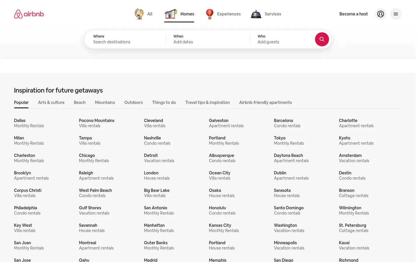
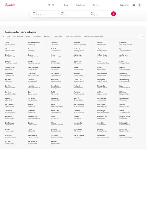
The page uses a near-white canvas and a slightly distinct pale-gray inspiration band to keep attention on navigation and destination names rather than decorative colour. Deep charcoal anchors headings and primary text; softer gray handles secondary labels and links, while thin gray rules divide search fields and category navigation. The visible brand mark and search action supply the strongest colour accents, but the measured page palette is otherwise neutral. Airbnb Cereal VF provides a friendly, rounded sans-serif voice, with bold headings and regular-weight directory text. The header is compact and centered around a pill-shaped search control; below it, a broad, left-aligned inspiration section lays out destination links in evenly spaced columns. Small destination labels form a dense but scannable directory. Images are not prominent in the captured viewport, so the visual identity depends on whitespace, typography, subtle surfaces, and consistent alignment.
Used throughout navigation, search fields, headings, destination listings, links, and buttons.
角色
示例
字号
字重
行高
字距
一级标题
Primary page heading, when present.
Airbnb
28px
700
1.43
0
二级标题
Inspiration section heading.
The quick brown fox 敏捷的狐狸
22px
500
1.18
-0.02em
三级标题
Subsection or grouped content heading.
The quick brown fox 敏捷的狐狸
21px
700
1.43
0
正文
Destination labels and supporting page text.
The quick brown fox 敏捷的狐狸
14px
400
1.29
0
辅助文字
Compact search labels and small supporting metadata.
The quick brown fox 敏捷的狐狸
12px
500
1.33
0
按钮
Search action and interactive controls.
The quick brown fox 敏捷的狐狸
14px
500
1.29
0
导航
Top navigation and category tabs.
The quick brown fox 敏捷的狐狸
14px
500
1.29
0
链接
Destination directory links and secondary navigation.
The quick brown fox 敏捷的狐狸
14px
400
1.43
0
间距与布局
基准单位 4px · 密度:适中
48px版块间距
16px元素间距
—卡片内边距
—内容最大宽度
2px
4px
5px
6px
8px
10px
11px
12px
15px
16px
18px
20px
24px
32px
35px
48px
Use a compact full-width header with the brand at left, category navigation centered, and account actions at right; center the search control beneath it. The inspiration band spans the available page width, with its heading and category tabs aligned to the left. Organize destination links into several evenly spaced columns, each with a city label above a muted rental-type label. Preserve comfortable gaps between section elements while keeping the directory itself information-dense. Do not invent a fixed maximum width; match the screenshot’s broad, fluid composition.
圆角与层次
按钮 · 8px
导航 · 32px
md · nav
Keep most surfaces visually flat, separated by white and pale-gray backgrounds or fine borders. The search bar is the main layered element, with a subtle shadow that lifts it from the header. Use restrained rounding on controls and avoid strong card shadows or stacked panels.
组件
下面的预览按实测的按钮、输入框、徽标、卡片样式重建(字体用替代字体)。
Top navigation
White header with brand mark at left, illustrated category icons and labels centered, and host/account/menu actions at right.
Pill search bar
Centered rounded search surface split into Where, When, and Who fields, with thin separators and a circular search action.
Inspiration section
Wide pale-gray band with a bold section heading, horizontal category tabs, and a fine rule under the tab row.
Category tabs
Compact text labels; the selected category uses darker text and a short underline, while inactive choices use muted gray.
Destination directory
Multiple aligned columns of city links, each pairing a darker destination name with a muted accommodation type.
Utility actions
Small host, profile, and menu controls sit apart from the main browsing navigation and remain visually quiet.
Imagery · Imagery is not a defining feature of the captured viewport: the inspiration directory is text-led, and destination links carry the content. Small illustrated category icons appear in the top navigation, while the brand mark and search icon provide compact visual signals. If adding imagery to a related page, keep it subordinate to browsing structure and avoid letting decorative visuals disrupt the calm, neutral composition.
Use white and pale gray to distinguish adjacent page regions.
Set primary text in #222222 and secondary labels in #6c6c6c.
Keep destination names and rental types on separate lines.
Align directory columns and category tabs consistently.
Make the search bar the header’s clearest interactive surface.
Use fine separators instead of heavy outlines.
✕ 不该做
Do not introduce unmeasured palette colours as broad page surfaces.
Do not turn the destination directory into image-heavy cards.
Avoid oversized display typography or decorative tracking.
Do not use high-contrast shadows across every component.
Do not crowd search fields together or remove their labels.
Avoid bright, filled backgrounds for inactive navigation.
给 AI 的提示词
想快速出一个同风格的新页面,把这段话连同 DESIGN.md 一起发给 AI。
Build a new travel browsing page in Airbnb’s calm, text-led visual style. Use #ffffff for the header and clean surfaces, #f7f7f7 for a softly differentiated content band, #222222 for headings and primary labels, and #6c6c6c for secondary text; reserve #dddddd and #ebebeb for subtle dividers. Set all text in a friendly sans-serif close to Airbnb Cereal VF, with clear regular, medium, and bold hierarchy. Create a compact top navigation and a centered, pill-shaped search control with labeled fields and separators. Below, use a broad left-aligned section heading, category tabs with a simple active underline, and an evenly aligned multi-column directory. Keep the page airy around section boundaries but dense and scannable within link lists. Use restrained borders, gentle rounding, and only subtle elevation on the search surface.