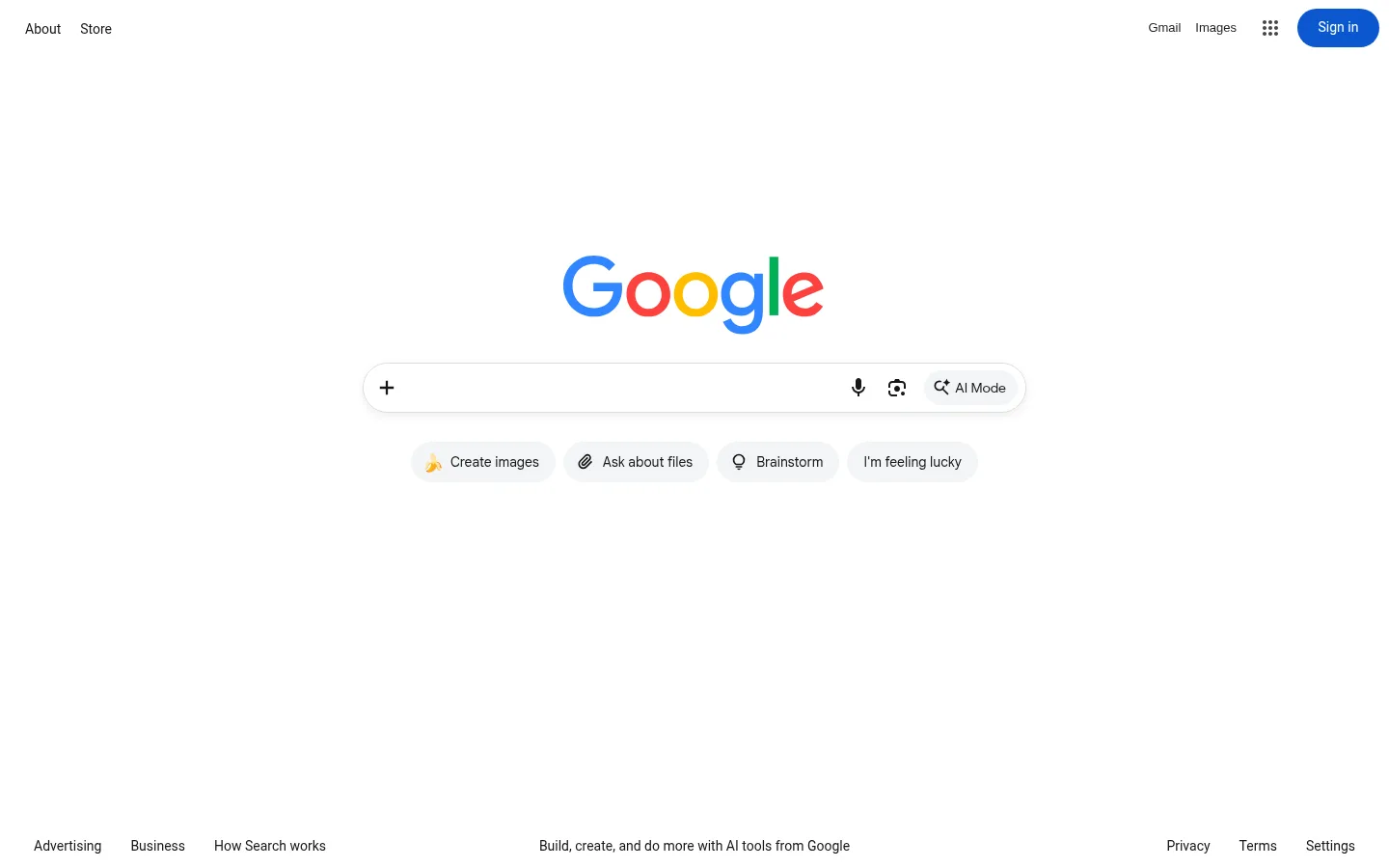
Google 首页以大面积白色留白突出居中的搜索体验。精简的导航和克制的控件为彩色标志留出空间,不喧宾夺主。
North star · Keep the white canvas quiet and spacious, concentrating visual attention on the centered search field and multicolor Google mark.
The page is defined by a nearly uninterrupted white canvas, with dark text and subtle gray controls providing structure rather than decoration. Google’s multicolor logo is the central visual signature; the measured palette also includes bright hues used in small interface accents and gradient or illustrated elements, not as broad section backgrounds. Roboto carries most navigation and body copy, while Google Sans shapes the search input and logo-adjacent interface. The top navigation stays close to the edges, and the main search area is centered with generous open space above and below. A long, rounded search field anchors the hero, followed by a compact row of soft-gray suggestion buttons. The footer sits at the bottom in small, unobtrusive text. Thin borders and a faint shadow separate the search field from the page without making the interface feel layered or card-heavy.
Main navigation, body copy, footer links, and suggestion labels
Aa 设计
Google Sans
网络字体 · 字重 400 · 占比 31%
免费替代:Inter
Search input text and Google-branded interface elements
Aa 设计
arial
系统字体 · 字重 400 · 占比 6%
免费替代:Arial
Small caption-style text
Aa 设计
Google Sans Text
系统字体 · 字重 500 · 占比 4%
免费替代:Roboto
Sign in button label
角色
示例
字号
字重
行高
字距
一级标题
Small regular-weight heading style; no visible page headline.
The quick brown fox 敏捷的狐狸
18px
400
normal
0
正文
Search suggestions and general interface copy.
The quick brown fox 敏捷的狐狸
14px
400
normal
0
辅助文字
Small footer or secondary informational text.
The quick brown fox 敏捷的狐狸
13px
400
1.85
0
导航
Header links such as About, Store, Gmail, and Images.
The quick brown fox 敏捷的狐狸
14px
400
normal
0
间距与布局
基准单位 2px · 密度:宽松
96px版块间距
8px元素间距
—卡片内边距
688px内容最大宽度
4px
5px
6px
8px
10px
12px
15px
16px
20px
96px
The page uses a spacious, single-column composition rather than a visible content grid. A compact header aligns links to the left and account controls to the right. The search-focused hero sits centered in the available viewport, with a measured page max width of 688px and generous section spacing. Its input and suggestion row form a tight cluster amid extensive white space. Footer links align along the bottom edge, with secondary informational text centered. Density remains deliberately low.
圆角与层次
按钮 · 9999px
md · other
The interface is mostly flat, with no prominent cards or stacked panels. A fine gray outline and faint shadow give the search field slight separation from the white canvas. Suggestion buttons use soft-gray fills and rounded pill silhouettes. Avoid adding strong shadows, heavy borders, or unnecessary layers.
组件
下面的预览按实测的按钮、输入框、徽标、卡片样式重建(字体用替代字体)。
Top navigation
Small dark links sit at opposite sides of the header; the right cluster includes Gmail, Images, an apps icon, and a blue Sign in pill.
Google wordmark
Centered multicolor logo is the dominant brand graphic above the search interface.
Search field
Wide rounded input with a thin gray border, subtle shadow, add control at left, and voice, visual search, and AI Mode actions at right.
Suggestion buttons
Compact pill-shaped actions use #f3f5f6 backgrounds and dark labels, arranged in a centered row beneath search.
Footer links
Small text links align to the bottom left and right, with a short AI tools message centered.
Imagery · The main graphic is the Google wordmark, centered above the search field and rendered in the familiar multicolor treatment. The measured page includes SVGs and small interface icons rather than photography, video, or large illustrations. Search controls use simple monochrome symbols, while a small emoji appears in one suggestion button. Keep imagery crisp, isolated, and secondary to the search interaction.
Keep the page background white and visually quiet.
Center the wordmark and search interface as the primary focal point.
Use Roboto for most compact interface labels and navigation.
Reserve solid blue for the Sign in action.
Style secondary search actions as soft-gray pills.
Keep footer content small and anchored near the bottom.
✕ 不该做
Do not fill the page with broad colored section bands.
Do not add prominent cards or heavy elevation.
Do not crowd the central search area with extra content.
Do not use gradient colors as large interface backgrounds.
Do not enlarge navigation until it competes with the search hero.
Do not add unmeasured spacing, sizes, or radii.
给 AI 的提示词
想快速出一个同风格的新页面,把这段话连同 DESIGN.md 一起发给 AI。
Build a new page in Google’s restrained search-homepage style. Use Canvas White (#ffffff) as the dominant surface, Interface Ink (#16171a) for compact copy, and Soft Divider (#dadce0) for delicate outlines. Keep the header sparse, with links at the left and utility/account actions at the right. Center a clear primary interaction in a narrow, calm composition, surrounded by generous whitespace. Use Roboto for navigation and most labels, with a clean Google Sans-like face for prominent input text. Reserve Action Blue (#0b57d0) for the primary account action; use Mist Gray (#f3f5f6) for secondary pill controls. Make borders and shadows subtle, avoid card-heavy layouts, and treat bright palette hues as small brand accents rather than large backgrounds.