North star · Keep the page calm and spacious, letting real human stories lead while magenta clearly signals donation actions.
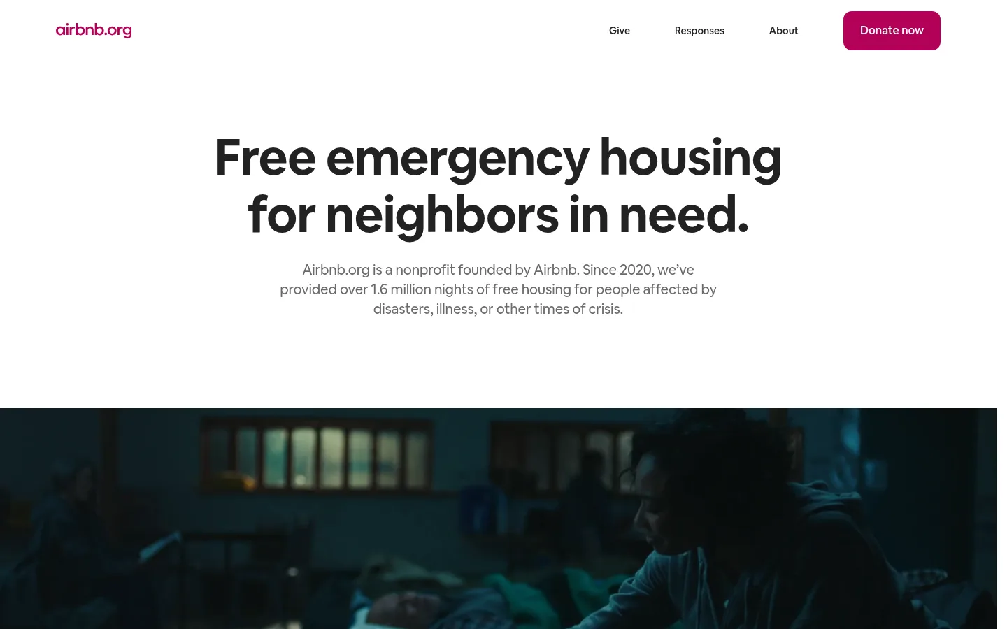
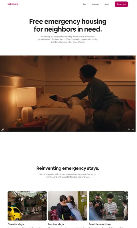
The visual strategy is led by a white canvas (#ffffff), near-black headings (#222222), and quiet gray supporting copy (#6a6a6a). Pale gray (#f7f7f7) distinguishes occasional section bands and the footer without disrupting the mostly white page. The concentrated magenta accent (#b30057) marks prominent donation actions and small brand details; it is not a general-purpose highlight color. Airbnb Cereal VF gives large, tightly tracked bold headlines a friendly editorial presence, balanced by readable, relaxed body copy. The page moves from a centered mission statement into full-width video, then alternating centered introductions, image-card grids, a pale promise panel, an impact map, and a final donation banner. Comfortable vertical breathing room lets each story stand apart. Rounded media and cards soften the otherwise clean geometry. Photography and video carry the emotional narrative; illustrations and map graphics support specific content rather than define the palette.
Major section headings such as stories and global impact.
Airbnb.org
40px
700
1.1
-0.03em
三级标题
Card titles and secondary feature headings.
The quick brown fox 敏捷的狐狸
26px
500
1.15
0
正文
Introductory paragraphs and explanatory section copy.
The quick brown fox 敏捷的狐狸
18px
400
1.56
0
辅助文字
Compact supporting copy and image-card descriptions.
The quick brown fox 敏捷的狐狸
14px
400
1.29
0
按钮
Donation and active-response action labels.
The quick brown fox 敏捷的狐狸
14px
500
1.29
0
导航
Header and footer navigation links.
The quick brown fox 敏捷的狐狸
14px
400
1.29
0
链接
Story names and inline calls to action.
The quick brown fox 敏捷的狐狸
18px
500
1.33
0
间距与布局
基准单位 8px · 密度:适中
80px版块间距
12px元素间距
—卡片内边距
—内容最大宽度
4px
7px
8px
12px
14px
15px
16px
24px
32px
40px
48px
64px
80px
96px
The page is a long, vertically paced homepage with a slim horizontal navigation and a centered hero. Content alternates between centered introductions, four-column card rows, split feature panels, and broad full-bleed media. Use a responsive grid: preserve generous side margins on desktop, then collapse cards into fewer columns on narrow screens. Section spacing feels comfortable rather than dense; align section headings consistently and let the video and impact map span wide. Exact maximum widths are not established by the measurements.
圆角与层次
按钮 · 12px
卡片 · 12px
图片 · 12px
链接 · 12px
没有测到阴影:页面是扁平的,层次靠底色和描边区分。
The interface is predominantly flat: no measured shadows define the page. Separate content through white space and occasional pale-gray bands rather than layered panels. Cards and media rely on rounded corners, while the active-responses control uses a thin dark outline; avoid adding decorative elevation.
组件
下面的预览按实测的按钮、输入框、徽标、卡片样式重建(字体用替代字体)。
Header navigation
Airbnb.org wordmark sits at the left, with Give, Responses, and About links aligned right before the prominent magenta Donate now button.
Mission hero
Centered bold headline and muted explanatory paragraph sit above wide video; preserve a large calm white field around the message.
Category cards
Three rounded image cards introduce disaster, medical, and resettlement stays, each followed by a compact title and explanatory copy.
Guest story cards
A four-card image row presents people helped; use photographic crops with legible white names and location details over darker image areas.
Promise feature
A pale-gray split panel pairs a concise 100% promise message and donation action with a rounded illustrative image.
Impact section
A two-column introduction pairs the global-impact heading with supporting statistics and an outlined View active responses button, followed by a wide map graphic.
Donation CTA and footer
A vivid magenta donation banner uses white copy and a white action button; the footer returns to pale gray with simple grouped text links.
Imagery · Documentary-style photography and video show guests, hosts, disasters, and emergency stays. The hero media runs nearly full width and uses a dark gradient overlay for legible controls or captions. Story and category cards use rounded image crops with restrained text overlays. A world map and pink-tinted feature illustrations explain impact and service qualities; treat their colors as content-specific artwork, not the core brand palette.
Use white space to give each mission story a clear pause.
Set primary headlines in bold, near-black Cereal-style sans serif.
Keep supporting copy muted and comfortably readable.
Reserve magenta for donation actions and carefully chosen brand details.
Use real human-centered photography and documentary video.
Round image cards and media consistently with the measured treatment.
✕ 不该做
Do not make magenta a large, repeated background color throughout the page.
Do not crowd sections together or compress the editorial rhythm.
Do not replace documentary imagery with glossy product renders.
Do not add shadows as a default card treatment.
Do not use bright colors from illustrations as global interface colors.
Do not make navigation or supporting copy compete with the mission headline.
给 AI 的提示词
想快速出一个同风格的新页面,把这段话连同 DESIGN.md 一起发给 AI。
Build a nonprofit page in the Airbnb.org visual style. Start with a clean Gallery White (#ffffff) canvas, Grounded Ink (#222222) headings and navigation, and Story Gray (#6a6a6a) supporting copy. Use Mission Magenta (#b30057) selectively for the main donation action; keep Quiet Mist (#f7f7f7) for subtle section or footer bands. Use a friendly sans-serif close to Airbnb Cereal VF, with bold, slightly tightly tracked headlines and regular, readable paragraph text. Structure the page as a spacious editorial sequence: centered mission hero, documentary media, image-led story or feature cards, impact content, clear donation banner, and grouped footer links. Keep media prominent, corners rounded, and surfaces mostly flat without decorative shadows. Adapt the grid responsively without losing generous breathing room.