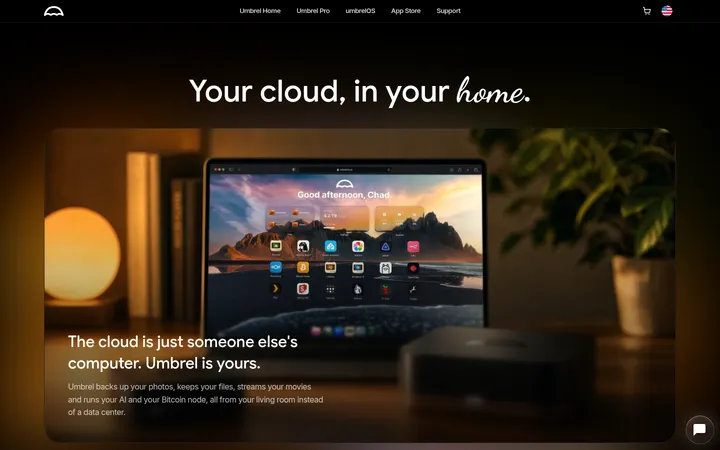
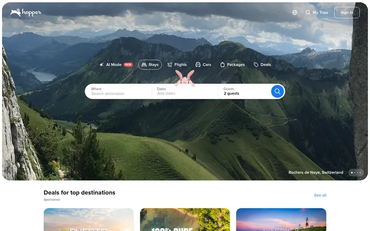
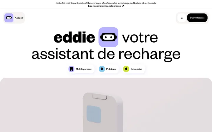
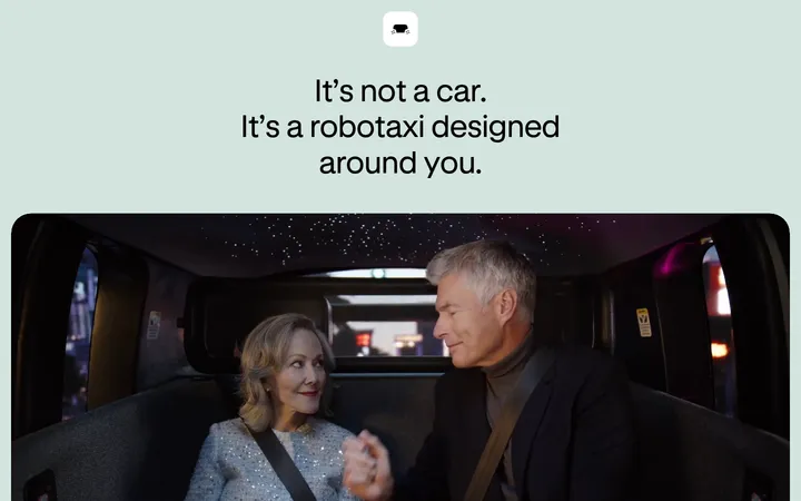
North star · Keep the interface stark and useful: let white-on-black typography and real service imagery carry the experience.
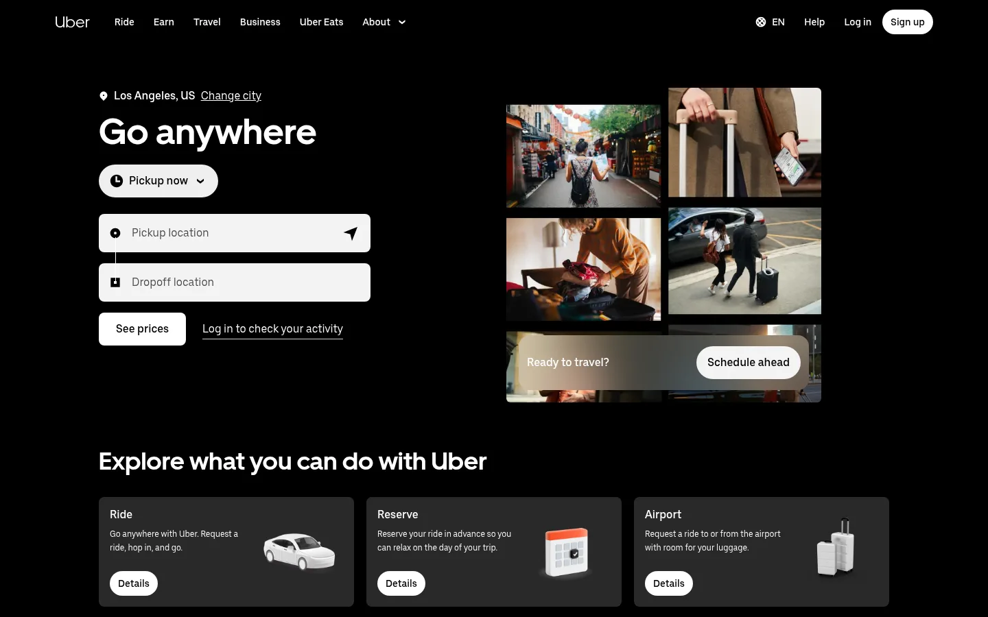
The page is anchored by a black canvas, with white text and controls creating a deliberately stark, high-contrast interface. The opening ride-booking area sets utility first: location and destination fields sit beside a collage of travel photography, with a prominent white action button. UberMove supplies bold display headings; UberMoveText carries navigation, body copy, and controls in a compact, legible sans-serif. Most service sections use a spacious, centered content area, with three-column cards or two-column image-and-copy splits. The rhythm alternates service cards, instructional steps, wide media, and calls to action, while section changes are mostly conveyed by content and imagery rather than decoration. Photography is the main source of color and texture. Some page bands invert to white for the Uber Eats content, where black text and buttons remain clear. Cards use restrained dark-gray surfaces and rounded corners; the overall treatment is flat, with little visible shadow.
配色
点色块复制色值。用途说明来自对页面的实测位置(背景、文字、描边、按钮)与截图判读。
品牌色
表层色
中性色
页面底色 · Night Canvas表层 · Signal White表层 2 · Charcoal Card主文字 · Signal White次要文字 · Night Canvas描边 · Signal White
Navigation, body copy, buttons, captions, and links
Aa 设计
UberMove
网络字体 · 字重 700 / 400 · 占比 9%
免费替代:Inter
Display headings and prominent section titles
角色
示例
字号
字重
行高
字距
一级标题
Primary hero headline, including “Go anywhere.”
Uber
52px
700
1.23
0
二级标题
Major service section headings.
Uber
36px
700
1.22
0
三级标题
Card titles and instructional step headings.
The quick brown fox 敏捷的狐狸
24px
700
1.33
0
正文
Service descriptions, explanations, and supporting copy.
The quick brown fox 敏捷的狐狸
16px
400
1.5
0
辅助文字
Compact secondary labels and supporting details.
The quick brown fox 敏捷的狐狸
12px
400
1.67
0
按钮
Booking, service, and account action labels.
The quick brown fox 敏捷的狐狸
16px
500
1.25
0
导航
Header navigation and compact menu labels.
The quick brown fox 敏捷的狐狸
14px
500
1.14
0
链接
Text links and secondary calls to action.
The quick brown fox 敏捷的狐狸
18px
500
1.33
0
间距与布局
基准单位 4px · 密度:宽松
64px版块间距
36px元素间距
—卡片内边距
1152px内容最大宽度
4px
6px
8px
10px
12px
14px
16px
18px
20px
24px
25px
36px
64px
The measured content max width is 1152px, with wide margins and a spacious overall density. The page begins with a two-column booking hero and continues through three-column service grids, instructional steps, and image-and-copy splits. Sections follow a measured 64px rhythm, with generous gaps between content groups. Headings align left, while media is often paired with adjacent copy rather than centered in isolation. A white Eats band interrupts the dark canvas before the page returns to black for earning, business, apps, and footer content.
圆角与层次
按钮 · 8px
卡片 · 8px
导航 · 9999px
没有测到阴影:页面是扁平的,层次靠底色和描边区分。
The interface is mostly flat: no measured shadows define the cards or sections. Contrast comes from black and white section bands, photography, and the charcoal service-card surface. Cards and controls use modest rounded corners, while borders are sparse; image outlines in the Eats and earning areas are visible accents from the content rather than a general elevation system.
组件
下面的预览按实测的按钮、输入框、徽标、卡片样式重建(字体用替代字体)。
Ride booking form
Hero form pairs a white pickup selector and stacked light location fields with a white “See prices” button and a text link on black.
Service cards
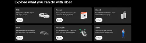
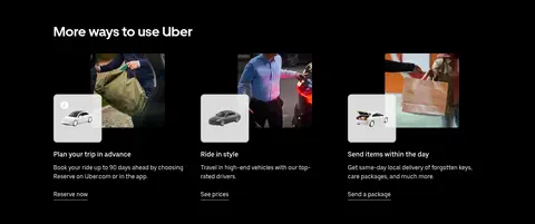
The opening six-card grid uses #292929 surfaces, white titles and copy, concise details links, and small service imagery.
Instruction steps
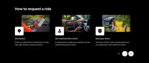
A three-step ride-request sequence combines a thumbnail image, an icon tile, a short heading, and compact explanatory text.
Media feature split
Wide photo or video media is paired with left-aligned copy and a direct action, keeping the content legible against the section canvas.
Food service band
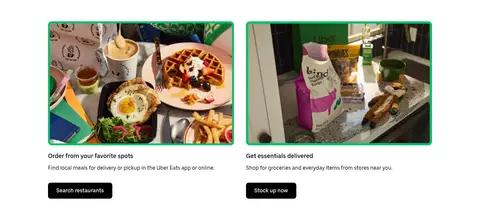
A white section contrasts with the dark page, using black text and buttons beside food and grocery photography.
App download panels
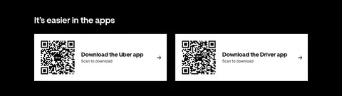
Two white QR download panels sit side by side with a code, app label, scan instruction, and directional icon.
Footer navigation
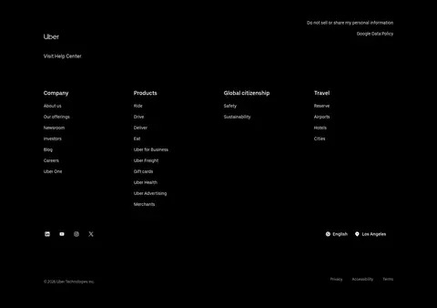
A black footer organizes numerous utility and company links into columns, with muted legal details and compact location controls.
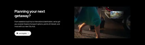
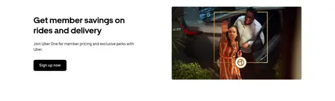
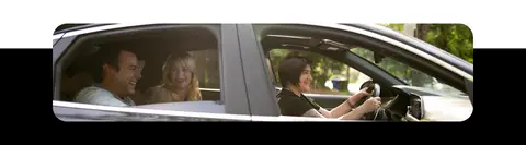
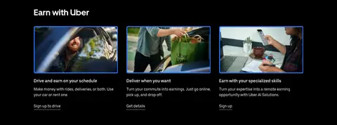
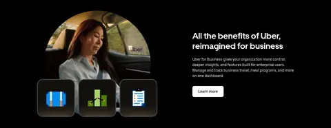
Imagery · Photographic lifestyle imagery dominates: travel scenes, drivers, meals, delivery, and people using services. The hero assembles several images into a collage, while later sections use wide banners, card thumbnails, and paired feature images. Media is generally rectangular with modest rounded corners; small service illustrations appear within cards. A video provides motion in the getaway section. Image colors are allowed to supply contrast against the otherwise restrained black-and-white palette.
Use a black canvas for the primary page and footer.
Use white text and controls to establish clear contrast.
Keep headings bold, left-aligned, and sentence case.
Group related services into compact, consistent card grids.
Use real service photography as the main visual texture.
Make key actions visually distinct with simple solid buttons.
✕ 不该做
Don’t introduce unmeasured brand colors into the interface.
Don’t decorate flat sections with heavy shadows.
Don’t crowd copy or controls around the hero booking form.
Don’t use gradients as a dominant page treatment.
Don’t replace practical labels with vague promotional copy.
Don’t make card styling more prominent than its content.
给 AI 的提示词
想快速出一个同风格的新页面,把这段话连同 DESIGN.md 一起发给 AI。
Build a new Uber-style page with a near-black #000000 canvas and crisp #ffffff typography and controls. Use #292929 sparingly for dark service cards; reserve #cbcbcb for subtle hairline treatment and #afafaf for secondary footer details. Set bold UberMove-like display headings against readable UberMoveText-like body copy, navigation, and buttons. Structure content within a spacious centered area, alternating practical feature grids, instructional steps, and image-and-copy splits. Use real lifestyle photography in rectangular frames with modest rounding; let imagery provide color rather than adding decorative gradients. Keep surfaces mostly flat and shadows absent. Where a light content band is needed, use a white background with black copy and actions. Make interactions direct, labels concise, and primary actions easy to identify.