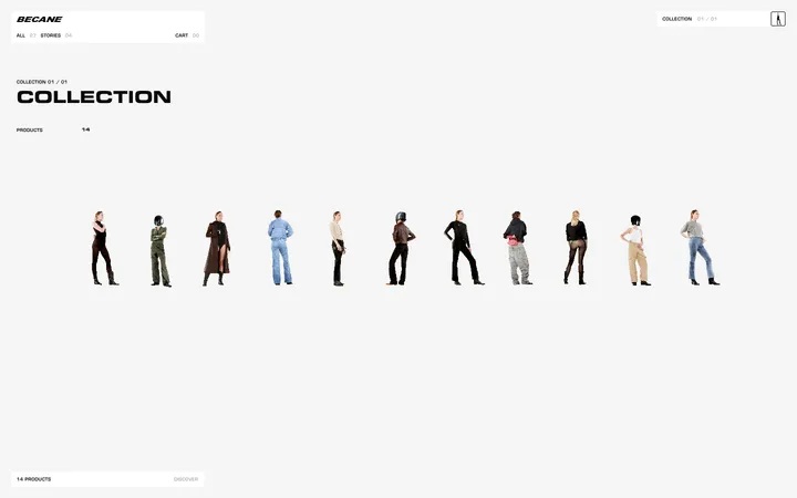
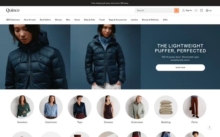
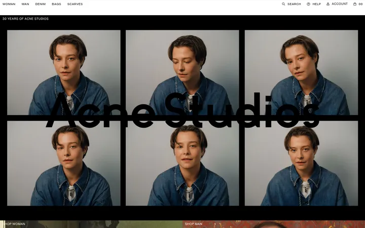
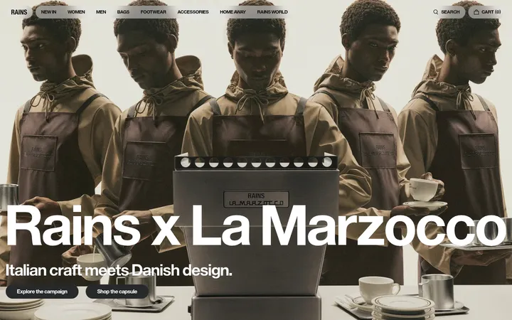
North star · Let editorial fashion photography lead, and keep the shopping interface quiet, sharply typed, and easy to scan.
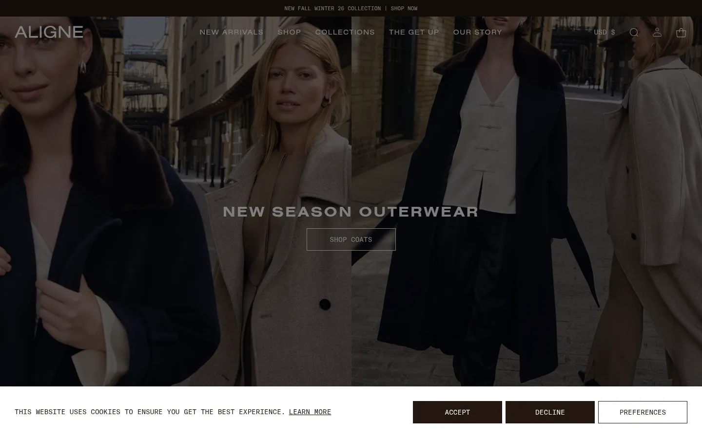
The visual strategy is led by contrast: clean white canvases and deep brown-black text keep the shopping interface quiet, while full-bleed campaign photography supplies the mood and colour. A muted beige section gives the editorial feed a distinct, warmer pause. Headings use Nimbus Sans Extended in uppercase with conspicuous tracking; GT America Mono carries navigation, utility copy, prices, and buttons, lending the page a precise, catalog-like voice. Large image panels alternate with four-column product rows and smaller editorial grids, so the page feels like a fashion magazine that remains easy to shop. Images are the dominant colour source, often darkened behind white campaign copy. Buttons are square-cornered and outlined rather than rounded or heavily filled. Hairlines and restrained spacing organize the merchandise without adding visual weight; the experience relies on image scale, typography, and section rhythm rather than decoration.
Campaign and section headings, uppercase navigation, and editorial/category links.
Aa 设计
GT America Mono
网络字体 · 字重 400 / 700 · 占比 45%
免费替代:Space Mono
Body copy, utility navigation, product details, prices, buttons, captions, and cookie controls.
角色
示例
字号
字重
行高
字距
一级标题
Primary campaign headline over the full-bleed hero.
ALIGNE
30px
700
1
0.333em
二级标题
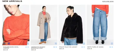
Section titles such as New Arrivals and The Icons.
The quick brown fox 敏捷的狐狸
25px
700
1.15
0.1em
三级标题
Editorial card and feature headings.
The quick brown fox 敏捷的狐狸
24px
600
1.15
0
四级标题
Small emphatic section or campaign headings.
The quick brown fox 敏捷的狐狸
22px
700
1
0.455em
正文
Editorial descriptions and supporting shopping copy.
The quick brown fox 敏捷的狐狸
13px
400
1.4
0
辅助文字
Compact product labels, prices, and image captions.
The quick brown fox 敏捷的狐狸
11px
400
1
0
按钮
Uppercase calls to action and outlined shopping controls.
The quick brown fox 敏捷的狐狸
14px
400
1
0
导航
Uppercase primary navigation and utility links.
The quick brown fox 敏捷的狐狸
14px
400
1
0.714em
链接
Collection, editorial, and product navigation links.
The quick brown fox 敏捷的狐狸
14px
400
1
0.714em
眉题
Short uppercase labels introducing editorial content.
The quick brown fox 敏捷的狐狸
14px
400
1
0.714em
代码
Monospaced utility text and compact informational details.
const style = 1;
13px
400
1.4
0
间距与布局
基准单位 2px · 密度:适中
60px版块间距
10px元素间距
—卡片内边距
1400px内容最大宽度
3px
5px
10px
12px
14px
15px
16px
20px
30px
40px
50px
60px
80px
The page uses a wide, image-led canvas, with content capped around the measured 1400px maximum width where applicable. Full-bleed campaign panels bookend product and editorial sections; the product showcases use four columns, while category panels split into two and story cards into three or four. Headings tend to align left above shopping grids, but campaign copy is centered over imagery. Generous section breaks create a comfortable rhythm, while product labels and controls remain compact. The overall density is comfortable, not sparse.
圆角与层次
inset · other
md · other
The interface is predominantly flat: white and beige section fields, square-cornered outlines, and fine separators establish structure. Product panels do not rely on visible card shadows. Layered campaign text sits directly over darkened photography, while the cookie banner is a distinct white strip with dark action buttons. Keep depth subtle and functional.
组件
下面的预览按实测的按钮、输入框、徽标、卡片样式重建(字体用替代字体)。
Campaign hero
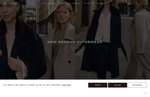
Full-bleed seasonal fashion image with centered uppercase heading and a square-cornered, white-outlined shopping CTA over a darkened photo.
Product carousel
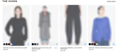
Four-column merchandise row on white, led by a left-aligned uppercase title; images dominate, with compact monospaced names and prices below.
Category panels
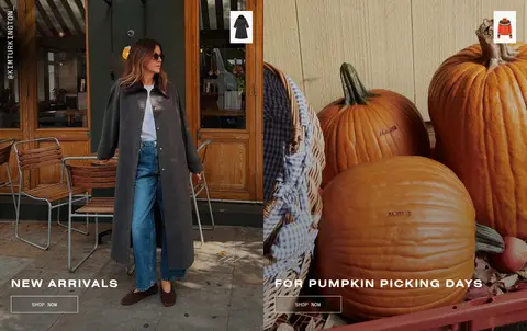
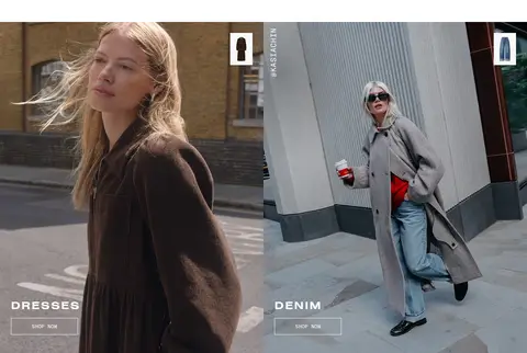
Two side-by-side lifestyle image panels with uppercase white category titles and small outlined SHOP NOW buttons near the bottom.
Editorial feature cards
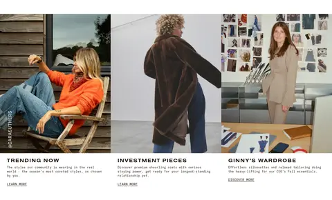
Three-image story grid with image-led cards, uppercase titles, short monospaced descriptions, and lightweight learn-more links.
Get Up editorial band
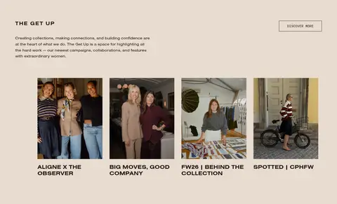
Warm #e7dcd1 section with introductory copy, a discovery link, and a row of compact campaign-story thumbnails.
Cookie consent bar
White horizontal strip with monospaced notice text and separate dark ACCEPT and DECLINE buttons plus a light outlined PREFERENCES control.
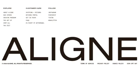
Multi-column footer
White footer with compact uppercase column labels, small monospaced links, newsletter controls, and an oversized ALIGNE wordmark.
Imagery · Use real fashion and lifestyle photography as the primary visual material: street-style portraits, seasonal campaigns, product-on-model imagery, and behind-the-scenes brand stories. Hero and category images are broad, edge-to-edge panels, often with a dark overlay to preserve white text contrast. Product photography sits in orderly white-backed grids with consistent framing. Avoid decorative illustration or 3D styling.
Use photography as the strongest visual statement.
Keep the main shopping canvas white and uncluttered.
Set display headings in tracked uppercase.
Use monospaced type for utility copy and product details.
Keep CTA corners square and outlines fine.
Give editorial content a warm beige band.
Use blue only for sparse interactive accents.
✕ 不该做
Do not add gradients or decorative colour fields.
Do not turn product items into elevated shadow cards.
Do not round buttons or image panels.
Do not let interface colour compete with campaign imagery.
Do not use loose, oversized body typography.
Do not apply the blue accent as a large background.
给 AI 的提示词
想快速出一个同风格的新页面,把这段话连同 DESIGN.md 一起发给 AI。
Build a new fashion storefront page in ALIGNE’s editorial style. Use Gallery White (#ffffff) as the main canvas and Roasted Ink (#24170f) for text, utility bands, and key controls. Reserve Oat Linen (#e7dcd1) for a distinct editorial/story section; use Signal Blue (#0073ff) only for a small interactive accent. Pair extended uppercase sans headings with monospaced body, navigation, prices, and buttons. Structure the page with a cinematic full-bleed image, clean multi-column product grids, and image-led category or story panels. Overlay campaign copy on subtly darkened photography. Use square-cornered outlined CTAs, restrained hairlines, and minimal elevation. Keep spacing comfortable, text compact, and product information easy to scan. Let the imagery provide seasonal colour rather than introducing extra interface colours.