North star · Let bold technical typography and carefully placed fashion imagery stand out against expansive off-white space.
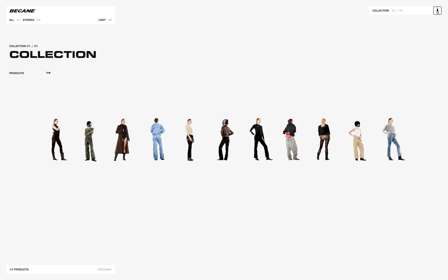
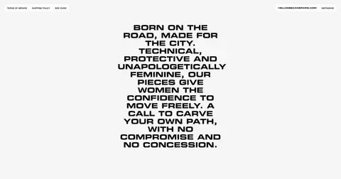
The page is built on a near-white #f6f6f6 canvas, with near-black #0a0a0a doing almost all of the typographic work. Thin #e6e6e6 dividers and restrained white interface panels create small points of structure without introducing heavy card framing. Red is present in the measured palette but is not a defining interface colour in the screenshots; treat it as an occasional detail within imagery rather than a default CTA colour. Eurostile Becane supplies a distinctive, technical voice: tiny uppercase navigation and labels contrast with large, heavy uppercase display statements. The opening catalogue uses a broad horizontal field, sparse labels and a lineup of cutout model imagery that leaves generous empty space around the figures. Below, the brand manifesto becomes a narrow, centered block of emphatic type. The result is deliberately flat, airy and editorial, with hierarchy made through scale, alignment and negative space rather than colour or decoration.
配色
点色块复制色值。用途说明来自对页面的实测位置(背景、文字、描边、按钮)与截图判读。
品牌色
强调色
表层色
中性色
页面底色 · Gallery Fog表层 · Paper White主文字 · Carbon Ink次要文字 · Muted Alloy描边 · Quiet Divider强调 · Signal Red
All measured roles: body display, navigation and eyebrow labels.
角色
示例
字号
字重
行高
字距
正文
Large uppercase brand manifesto and prominent collection display text.
Bécane
30px
700
1.1
0
导航
Compact uppercase primary navigation, counts and utility links.
The quick brown fox 敏捷的狐狸
8px
400
1.1
0.04em
眉题
Small uppercase section labels and collection metadata.
The quick brown fox 敏捷的狐狸
8px
400
1.1
0.04em
间距与布局
基准单位 2px · 密度:适中
86px版块间距
8px元素间距
—卡片内边距
1400px内容最大宽度
2px
7px
8px
9px
10px
20px
40px
86px
100px
The measured maximum page width is 1400px, with a comfortable, low-density composition. The opening viewport places a compact navigation panel at the upper left and collection metadata below it, while a small collection indicator sits opposite at the upper right. A broad product lineup spans the middle of the page with ample surrounding canvas. The discovery control anchors the lower left. The next section shifts to a centered, narrow manifesto, creating a clear change of alignment without adding a strong background band.
圆角与层次
按钮 · 1px
图片 · 1px
导航 · 3px
没有测到阴影:页面是扁平的,层次靠底色和描边区分。
The design is essentially flat: measured shadows and gradients are absent. Small white panels distinguish navigation and catalogue controls from the off-white canvas, while fine gray dividers provide restrained structure. Keep layering minimal and avoid card-like framing around the fashion imagery.
组件
下面的预览按实测的按钮、输入框、徽标、卡片样式重建(字体用替代字体)。
Compact navigation panel
A small white upper-left panel holds the Bécane wordmark, uppercase collection/story links and cart count; use black text and subtle separators.
Collection indicator
A compact white control near the upper-right edge pairs the collection label with a muted index and a small outlined icon control.
Collection heading
Place a small uppercase collection eyebrow above a large, heavy uppercase title, followed by a compact product count.
Fashion lineup
Show full-body model cutouts in a horizontal sequence across the open canvas, without individual card backgrounds.
Product discovery control
Use a white horizontal control near the lower-left area, with the product count in black and the discovery link muted.
Brand manifesto
Set the uppercase brand statement in heavy Eurostile Becane, centered as a narrow multiline block with generous surrounding whitespace.
Imagery · The catalogue presents a horizontal lineup of full-body fashion figures, isolated against the pale canvas rather than enclosed in product cards. Figures are small relative to the page and separated by generous open space, allowing silhouettes and contrasting garments to read as a collective collection view. Their varied clothing colours belong to the product imagery, not the core interface palette.
Use #0a0a0a for primary text and display headings.
Set navigation and labels in compact uppercase type.
Give product imagery generous open space.
Use white panels sparingly for small controls.
Make the manifesto a strong, centered typographic block.
✕ 不该做
Do not turn the interface into a dense product grid.
Do not use red as a default CTA fill.
Do not add prominent shadows or gradients.
Do not frame every model in a card.
Do not let secondary labels compete with the headline.
Do not replace the sparse layout with decorative clutter.
给 AI 的提示词
想快速出一个同风格的新页面,把这段话连同 DESIGN.md 一起发给 AI。
Build a new Bécane-style fashion page with an airy editorial catalogue feel. Use Gallery Fog (#f6f6f6) as the continuous canvas and Carbon Ink (#0a0a0a) for the logo, headings and primary labels. Reserve Paper White (#ffffff) for compact controls, Quiet Divider (#e6e6e6) for understated rules and Muted Alloy (#b2b2b2) for secondary counts. Signal Red (#ff0000) is not a default interface accent; avoid prominent red buttons. Use a technical geometric sans, preferably Eurostile Becane or a close substitute, with uppercase navigation and bold, emphatic display copy. Keep the header compact, the product imagery arranged as a spacious horizontal lineup, and the manifesto centered in a narrow block. Favor flat surfaces, precise alignment and generous negative space over cards, shadows or decoration.