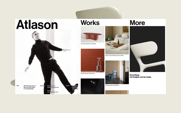
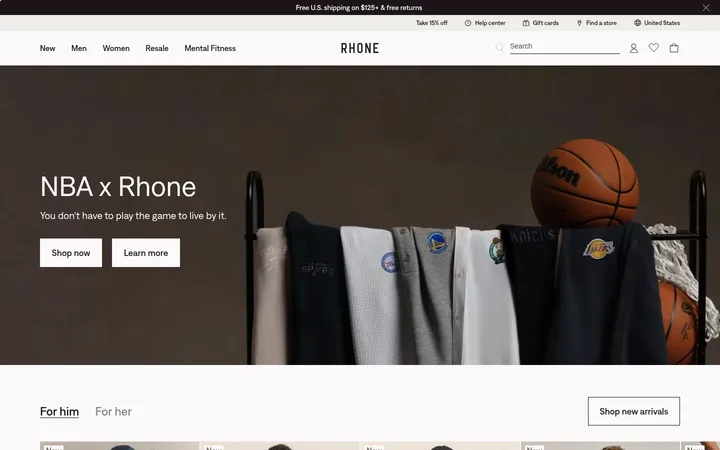
Alison Roman 首页以奶油色与深墨色搭建克制的编辑式框架,穿插沉浸式烹饪视频、食谱照片和醒目的文学感标题。橄榄绿分类区块与深色页脚形成鲜明色彩停顿,同时保持内容主导的舒缓节奏。
North star · Let warm editorial typography and tactile food imagery lead, keeping interface decoration quiet and the cream canvas continuous.
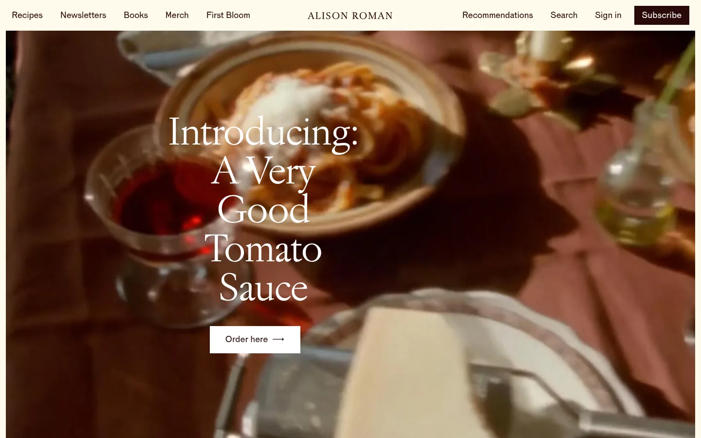
The visual identity is built around a warm cream canvas (#fffaec), dark brown-black text (#290a08), and real food imagery rather than decorative interface effects. A slim, restrained navigation sits above a full-bleed video hero, where a large, light serif headline overlays the cooking footage and a simple contrasting CTA. Below, generous cream space gives recipe cards, product recommendations, and newsletter content room to breathe; thin warm-gray hairlines quietly separate editorial groupings. The full-width olive category section creates a deliberate pause, using oversized cream serif links as a typographic directory. Photography stays natural and tactile, with food, cookware, and candid lifestyle scenes carrying most of the color. Two newsletter/video moments and a quote feature add variety while preserving a clear vertical reading flow. The overall effect is personal, literary, and approachable: typography and imagery lead, while UI chrome remains minimal.
Navigation, body copy, buttons, captions, and many recipe links and headings.
Aa 设计
Jannon Neo
网络字体 · 字重 400 / 300 · 占比 28%
免费替代:Cormorant Garamond
Display headlines, editorial headings, and prominent recipe links.
角色
示例
字号
字重
行高
字距
特大标题
Oversized hero or category display headlines.
Alison Roman
120px
300
1
-0.03em
一级标题
Primary hero and major editorial headlines.
Alison Roman
80px
300
1
-0.03em
二级标题
Section headings such as recipe and newsletter titles.
Alison Roman
48px
300
1
-0.03em
三级标题
Recipe names and prominent editorial card titles.
Alison Roman
32px
400
1.1
-0.02em
四级标题
Supporting feature and content headings.
The quick brown fox 敏捷的狐狸
25.5px
400
1.5
0
正文
Introductory copy, descriptions, and editorial text.
The quick brown fox 敏捷的狐狸
18px
400
1.2
-0.01em
辅助文字
Dates, short image captions, and fine supporting notes.
The quick brown fox 敏捷的狐狸
14px
400
1.3
0
按钮
Compact navigation and action labels.
The quick brown fox 敏捷的狐狸
18px
500
1.5
0
导航
Header and footer navigation links.
The quick brown fox 敏捷的狐狸
18px
400
1.2
-0.01em
链接
Large linked recipe or category titles.
Alison Roman
32px
400
1.1
-0.02em
眉题
Small uppercase labels above section content.
The quick brown fox 敏捷的狐狸
20px
400
1.4
0.24em
间距与布局
基准单位 8px · 密度:适中
32px版块间距
24px元素间距
—卡片内边距
1200px内容最大宽度
2px
4px
6px
8px
10px
12px
16px
20px
24px
32px
36px
80px
160px
A comfortable, vertically flowing editorial page uses a measured maximum content width of 1200px, with full-bleed media and selected full-width color bands breaking out of the contained sections. Navigation distributes links around a centered wordmark. Recipe and newsletter feeds use four-column card layouts, while feature sections center their headings and media. The category directory is a single centered column of oversized links. Thin rules mark transitions, and broad intervals between major blocks keep the long page from feeling crowded.
圆角与层次
按钮 · 50%
卡片 · 5px
hairline · card
The interface is predominantly flat, with no meaningful shadow language. Warm hairlines separate editorial groups, and image or video panels provide their own depth through photography rather than card elevation. Cards remain mostly open and unboxed; only a slight measured card radius appears on selected product content, while buttons look visually square in the screenshot.
组件
下面的预览按实测的按钮、输入框、徽标、卡片样式重建(字体用替代字体)。
Split-link navigation
A slim cream header places small dark links on both sides of a centered Alison Roman wordmark, with Subscribe as a dark button.
Video hero
Full-bleed cooking footage carries a large light serif headline and a compact white Order here CTA.
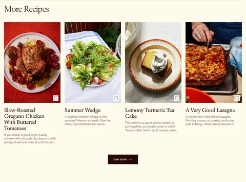
Recipe card feed
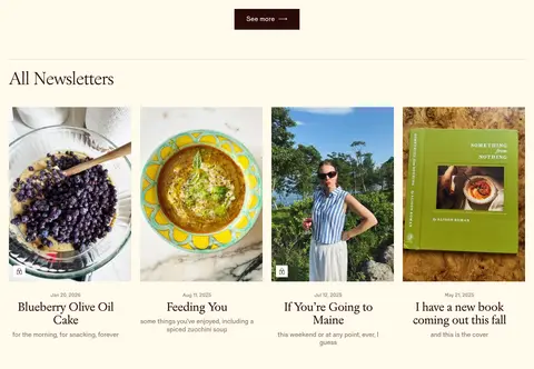
A four-column image-led row pairs food photography with serif recipe titles, quiet descriptions, and a centered dark See more button.
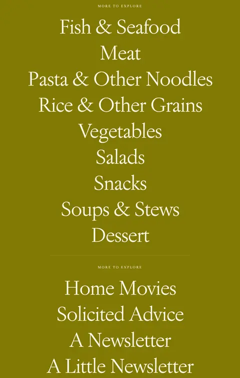
Olive category directory
A full-width #827a04 panel stacks oversized cream serif category links in one centered column, divided into two groups.
Newsletter feature
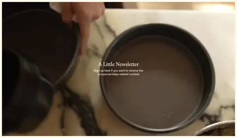
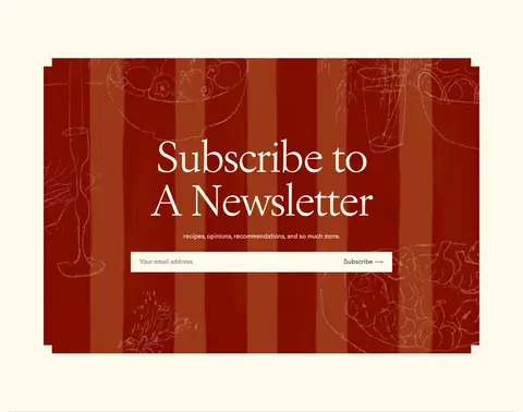
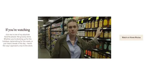
A centered video callout and a separate red illustrated subscription panel provide distinct editorial and signup moments.
Quote feature
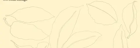
A #fff3cc band presents a prominent recipe quotation with attribution and faint botanical line art.
Multi-column footer
A #290a08 footer combines the handwritten-style AR mark with grouped cream navigation links.
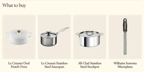
Imagery · Food photography and cooking video are the main visual content, presented as large, natural-looking images with little interface framing. The hero and newsletter feature use full-width video with overlaid text; recipe and product feeds use neatly aligned image cards. Lifestyle and cookware imagery adds variety. The quote panel includes delicate botanical line art, while the newsletter graphic uses a distinct red illustrated pattern.
Keep the warm cream canvas continuous across most sections.
Use Jannon Neo-style serif typography for large editorial statements.
Let food photography and cooking footage dominate feature areas.
Reserve olive green for a clear, full-width category interlude.
Use dark brown-black for primary copy and prominent CTA fills.
Separate content groups with fine, warm hairlines.
Keep card treatments open, with generous surrounding space.
✕ 不该做
Do not introduce gradients or decorative interface shadows.
Do not turn every section into a boxed card grid.
Do not use bright red as a page-wide brand color.
Do not replace the large serif headlines with heavy geometric display type.
Do not crowd the long-scroll layout with dense UI controls.
Do not add extra colored bands that compete with the olive section.
Do not treat colors seen only in food photos as interface tokens.
给 AI 的提示词
想快速出一个同风格的新页面,把这段话连同 DESIGN.md 一起发给 AI。
Build a new food-editorial page in Alison Roman’s visual language. Use Kitchen Cream (#fffaec) as the dominant canvas, Roasted Ink (#290a08) for text and dark actions, and Cocoa Taupe (#826e65) for secondary copy. Use Olive Grove (#827a04) sparingly for one strong full-width category band; keep Tomato Red (#810c00) confined to an illustrated promotional asset. Pair light, literary serif display headlines with restrained sans-serif navigation and body copy. Organize the page as a calm vertical story: slim split navigation, immersive food media, image-led editorial cards, a category directory, newsletter content, and a quiet footer. Prefer natural food photography, thin warm dividers, open card layouts, and ample breathing room. Avoid gradients, heavy shadows, and unnecessary ornamental UI.