North star · Pair restrained cream-and-brown typography with generous space and tactile, full-bleed food imagery.
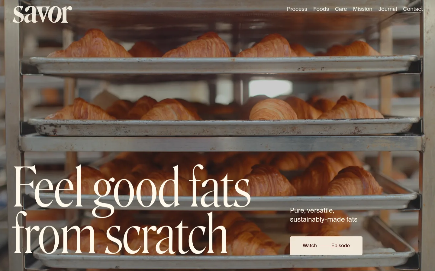
The visual identity balances a warm, restrained palette with richly textured food photography. The measured canvas is warm cream (#fff9eb), used across navigation and the long content area; deep brown (#370808) provides the primary text and link colour. Black (#000000) is measured on an inverse section, while the opening viewport itself is dominated by full-bleed bakery photography with a dark overlay that keeps cream navigation and headline lettering legible. Suisse Intl is the measured sans-serif for navigation and body copy, but the hero uses a much more expressive, high-contrast serif display face visible in the screenshot; preserve that editorial contrast rather than forcing all text into one style. The composition is spacious and image-led: a large headline anchors the lower left, with supporting copy and a pale button offset to the right. Below, the cream field and broad open areas let small blocks of copy and food imagery breathe. Keep surfaces mostly flat and let photography supply texture, warmth and depth.
Measured navigation, body copy, and interface text
角色
示例
字号
字重
行高
字距
一级标题
Oversized editorial hero headline, visually serif in the screenshot.
Savor
40px
400
1.25
0
二级标题
Section-level editorial headings on the cream canvas.
The quick brown fox 敏捷的狐狸
22px
400
1.35
-0.01em
三级标题
Bold subheadings within supporting content.
The quick brown fox 敏捷的狐狸
21px
700
1.24
-0.009em
正文
Supporting copy alongside photography and in content sections.
The quick brown fox 敏捷的狐狸
16px
400
1.45
0
导航
Header navigation over the hero and site links.
The quick brown fox 敏捷的狐狸
18px
400
1.45
-0.01em
间距与布局
基准单位 4px · 密度:适中
36px版块间距
20px元素间距
—卡片内边距
1360px内容最大宽度
6px
11px
15px
16px
18px
20px
22px
35px
36px
39px
40px
42px
52px
64px
143px
200px
The measured maximum page width is 1360px, with a comfortable density and a 12-column grid indicated by the sampled CSS. The hero spans the viewport and overlays navigation, headline, supporting copy, and CTA on photography. Headline and supporting copy sit in separate left and right zones near the bottom of the frame. The following cream section is broad and notably open, with content aligned toward the left rather than arranged as dense cards. Maintain generous section breathing room and a clear shift from immersive imagery to quiet canvas.
圆角与层次
按钮 · 5px
没有测到阴影:页面是扁平的,层次靠底色和描边区分。
The page is largely flat, with no measured shadows or border system. The hero gains depth from the full-bleed photograph and its dark treatment, not from cards or floating panels. The CTA is a simple pale button with a measured 5px radius; keep other surfaces open and avoid adding decorative borders.
组件
下面的预览按实测的按钮、输入框、徽标、卡片样式重建(字体用替代字体)。
Overlay navigation
Place the Savor wordmark at upper left and compact Suisse Intl navigation links at upper right, using cream text over the hero image.
Editorial hero
Use full-bleed bakery photography, a large serif headline aligned lower left, and a short supporting message offset to the right.
Watch Episode button
Pale #f0e7d7 button with Cocoa Ink (#370808) text, 5px radius, and measured padding of 20px 42px.
Cream content section
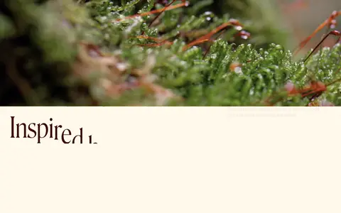
Transition from the dark photographic opening to a spacious #fff9eb canvas with Cocoa Ink text and restrained content density.
Food imagery strip
Use narrow, vertically stacked close-up video or image crops of ingredients and cooking to add tactile detail within generous surrounding space.
Imagery · Use tactile, cinematic food photography rather than illustration or 3D. The opening image shows trays of croissants in a bakery oven, framed full-bleed and darkened enough for cream text to read. Later imagery includes close botanical detail and vertically presented food-preparation clips. Keep crops immersive and sensory; measured screenshot colours from the photographs are not additional brand palette colours.
Pair restrained sans-serif UI with expressive display headlines.
Preserve broad areas of open space.
✕ 不该做
Do not introduce unmeasured brand colours.
Do not crowd the cream content sections.
Do not use cards and shadows as the main visual structure.
Do not flatten the hero into a plain colour block.
Do not set every text element in the same display style.
Do not treat photograph-derived colours as brand tokens.
给 AI 的提示词
想快速出一个同风格的新页面,把这段话连同 DESIGN.md 一起发给 AI。
Build a new Savor-style page with a restrained, warm editorial identity. Use Butter Cream (#fff9eb) for the main canvas and navigation text over imagery, and Cocoa Ink (#370808) for body copy and links. A dark inverse section is measured as Deep Black (#000000), but let authentic food photography carry most of the hero atmosphere. Create an immersive full-bleed opening image with a dark legibility treatment, compact overlay navigation, a large expressive serif headline, and offset supporting copy with a pale, simply rounded CTA. Use Suisse Intl or a close sans-serif substitute for navigation and body text. Keep the rest of the page spacious and flat, with selective food close-ups and generous open areas. Avoid invented palette tokens, heavy card systems, decorative borders, or unnecessary shadows.