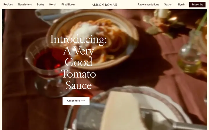
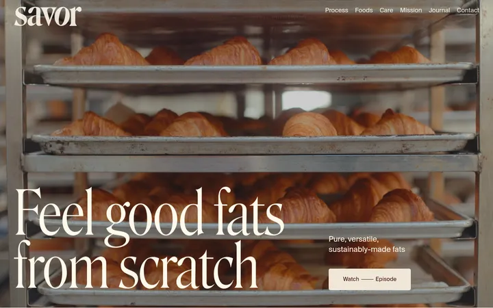
North star · Let appetizing food photography lead, while a calm ivory-and-green editorial system keeps navigation and information clear.
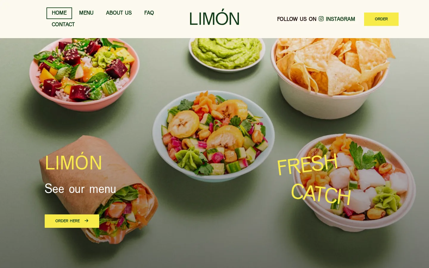
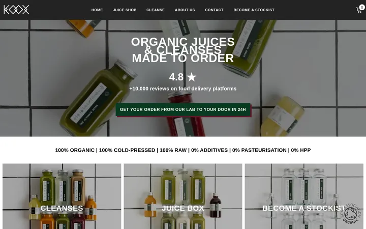
The visual identity balances an ivory canvas (#fcf9f0) and deep forest green (#103b15) with a dark burgundy-brown (#1d0b0d) and a muted sage section band (#dbe2dc). Lemon yellow (#f7ea48) is reserved for high-visibility moments: hero lettering, order buttons, and small social accents. VenusCom carries the whole page, with uppercase display headings and navigation contrasted against lighter-weight sentence-case copy. The first screen is led by full-width food photography, while subsequent areas use calm two-column editorial splits and a three-card menu feature row. Content stays left aligned and spacious, with broad section transitions rather than decorative containers. Food images bring the strongest colour and texture; their photographic tones should not be mistaken for the brand palette. Buttons and cards remain visually flat, with crisp edges and minimal framing.
All page typography, including hero and section headings, navigation, copy, labels, and buttons.
角色
示例
字号
字重
行高
字距
特大标题
Oversized uppercase hero wordmark and promotional display text.
Limón
75px
400
1.25
0
一级标题
Primary page or hero heading, set in uppercase.
Limón
68px
400
1.2
0.03em
二级标题
Major section headings such as the healthy fast food introduction.
Limón
54px
400
1
0
三级标题
Menu category titles and supporting section headings.
Limón
46px
300
1.15
0
四级标题
Strong uppercase subheadings and location or information labels.
Limón
36px
700
1.2
0
正文
Lightweight descriptive paragraphs and practical restaurant information.
The quick brown fox 敏捷的狐狸
20px
300
1.45
0
辅助文字
Small uppercase eyebrow labels and compact supporting metadata.
The quick brown fox 敏捷的狐狸
16px
400
1.2
0.06em
按钮
Bold uppercase ordering and action labels.
The quick brown fox 敏捷的狐狸
19px
700
1.01
0.02em
导航
Bold uppercase primary navigation links.
The quick brown fox 敏捷的狐狸
19px
700
1.01
0.03em
眉题
Spaced uppercase introductory labels and short section identifiers.
The quick brown fox 敏捷的狐狸
16px
400
1.2
0.06em
间距与布局
基准单位 1px · 密度:宽松
120px版块间距
—元素间距
15px卡片内边距
1170px内容最大宽度
4px
5px
8px
10px
12px
15px
16px
20px
30px
34px
120px
Use a centered content area capped at the measured 1170px maximum, with wide outer breathing room and predominantly left-aligned text. The page alternates full-width colour bands with contained editorial layouts: a hero image, a two-column introduction, a three-column menu row, then practical information and social content. Section spacing is spacious, with a measured 120px section gap. Keep the information density low and let each section read as a distinct horizontal chapter.
圆角与层次
按钮 · 1px
没有测到阴影:页面是扁平的,层次靠底色和描边区分。
The interface is predominantly flat: no measured shadows or gradients. Use large uninterrupted colour bands and crisp image edges instead of raised cards. Buttons have a nearly square measured 1px radius; menu cards remain visually open, with minimal border framing. Keep layering limited to text and CTAs positioned over hero photography.
组件
下面的预览按实测的按钮、输入框、徽标、卡片样式重建(字体用替代字体)。
Primary navigation
Cream header with compact uppercase VenusCom links, centered wordmark, social prompt, and a yellow ORDER action; the active link is outlined in forest green.
Hero
Full-width food photograph with sparse yellow display text, a short white supporting line, and a yellow order button.
Order button
Citrus Flash (#f7ea48) fill, Forest Herb (#103b15) uppercase label, measured 1px radius, and crisp rectangular silhouette.
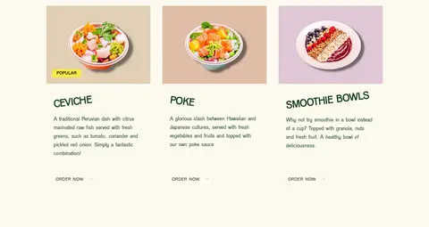
Menu category cards
Three side-by-side food categories, each with a photograph, uppercase title, short description, and understated order link; use yellow for a small popularity marker.
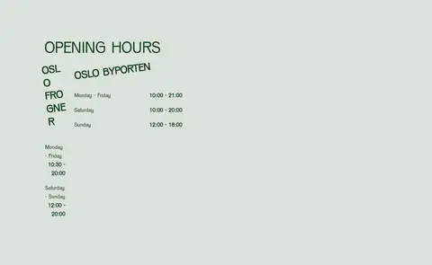
Opening hours
A Sage Mist (#dbe2dc) section with an uppercase heading and a two-location schedule arranged in columns.
Footer
Dark measured canvas treatment with wordmark, social links, location names, addresses, phone numbers, and email links in a compact multi-column layout.
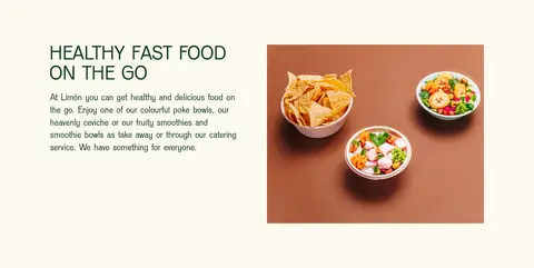
Imagery · Use appetizing, natural-light food photography as the primary visual asset. The hero image spans the page and is overlaid with sparse yellow promotional lettering and an order action. Supporting images appear as individual food or bowl photographs within the intro and three menu cards. Preserve the photography's warm, varied colours; they are image content, not additional interface palette colours.
Let food photography dominate the hero and menu areas.
Keep section content left aligned and editorial.
Use VenusCom with uppercase display and navigation text.
Reserve Citrus Flash for actions and brief highlights.
Keep buttons crisp and nearly square.
Separate content with broad, calm colour bands.
✕ 不该做
Do not introduce unmeasured brand colours.
Do not mistake food-photo colours for interface colours.
Do not add gradients or decorative shadows.
Do not turn every section into a bordered card.
Do not overcrowd the page with dense copy.
Do not use rounded, pill-shaped buttons.
Do not center all text or disrupt the left-aligned rhythm.
给 AI 的提示词
想快速出一个同风格的新页面,把这段话连同 DESIGN.md 一起发给 AI。
Build a new Limón-style food homepage using a centered content area capped at 1170px and spacious editorial section breaks. Use Cream Canvas (#fcf9f0) for the main light sections, Forest Herb (#103b15) for text and navigation, and Sage Mist (#dbe2dc) for a practical-information band. Reserve Citrus Flash (#f7ea48) for order actions and small highlights; use Cocoa Ink (#1d0b0d) only for measured dark treatments. Set all type in VenusCom or a close sans-serif substitute, with uppercase headings, navigation, and buttons, and light sentence-case body copy. Lead with full-width appetizing food photography and sparse text overlay. Follow with a two-column introduction, a three-item menu feature row, and useful location or social details. Keep surfaces flat, edges crisp, and decoration minimal.