North star · Keep the interface quiet and spacious so the animated work, not the chrome, carries the visual energy.
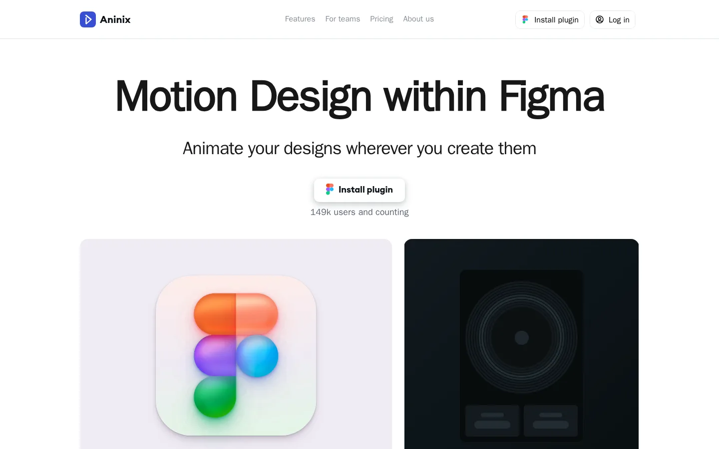
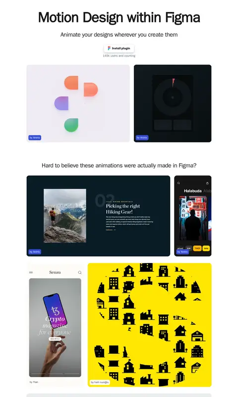
The page uses a white canvas as a quiet frame for its product story, with pale gray cards separating the interface from the motion examples. Near-black headings create strong contrast, while muted gray supports navigation, captions, and supporting copy. Blue appears sparingly in the brand mark and small creator labels; brighter blues and other vivid hues mostly belong to the showcased animation artwork, not the core interface. Large, centered system-sans headlines establish a direct hierarchy, balanced by a distinctive Mackinac body face for softer editorial character. The layout stays within a measured 1120px content width: a compact header leads to a spacious centered hero, followed by a varied gallery of large video samples and a contributor testimonial wall. Rounded media cards and subtle CTA shadows add polish without heavy borders or decoration. Generous vertical intervals keep the long page airy, while the sample work supplies visual density and contrast.
Supporting product explanation and contributor testimonial copy.
The quick brown fox 敏捷的狐狸
20px
400
1.4
0
辅助文字
Small counts, creator credits, and supporting labels.
The quick brown fox 敏捷的狐狸
16px
400
1.44
0
链接
Navigation and text links in the header and footer.
The quick brown fox 敏捷的狐狸
18px
400
1.44
0
间距与布局
基准单位 4px · 密度:适中
80px版块间距
10px元素间距
—卡片内边距
1120px内容最大宽度
4px
8px
10px
12px
16px
24px
28px
40px
48px
80px
120px
The measured content maximum is 1120px, with a centered desktop composition and a compact horizontal header. The hero stacks its headline, supporting line, plugin CTA, and user count along the center axis. Below, a flexible gallery mixes side-by-side media, wide samples, and narrower mobile-format previews rather than repeating identical tiles. Sections breathe with a measured 80px rhythm and comfortable density; the contributor wall and footer continue the long-form vertical flow.
圆角与层次
按钮 · 8px
卡片 · 16px
链接 · 16px
hairline · link
md · link
The interface is mostly flat, with no prominent border system. Rounded cards define the media gallery, while the plugin CTA uses a soft, layered shadow to lift it from the white canvas. Keep surrounding content clean; let card surfaces and embedded artwork supply depth rather than adding heavy outlines or broad shadows.
组件
下面的预览按实测的按钮、输入框、徽标、卡片样式重建(字体用替代字体)。
Header navigation
A compact white top bar with the Aninix mark, muted text links, and right-aligned plugin and login actions, separated from the page by a faint hairline.
Hero heading
Large, centered system-sans headline above a supporting sentence, with generous clear space before the media gallery.
Plugin CTA
White, softly shadowed install control with a small Figma mark and concise label; the measured small brand button treatment uses #374fd5 with #000000 text.
Animation gallery
A varied video-led collection of broad and narrow samples in rounded frames, including light, dark, and colorful works.
Creator label
Small attribution tags tucked onto showcased media; blue labels use #374fd5 and remain secondary to the artwork.
Contributor wall
A pale blue-tinted feature area with multiple white testimonial cards, compact copy, and a clear section heading.
Footer links
Minimal, low-contrast utility links and social icons arranged below a thin divider.
Imagery · The page is driven by video and animation previews rather than conventional product photography. Samples sit in large rounded rectangular frames, mixing light and dark backdrops, mobile mockups, interface compositions, and vivid graphic artwork. Their colours are intentionally varied and should be treated as content inside the gallery, not as a signal to recolour the surrounding interface. Small creator labels sit close to the media.
Use large animation samples as the primary visual feature.
Reserve #374fd5 for small brand cues and creator tags.
Use #f0f0f0 as a restrained card surface.
Leave generous vertical space between major page blocks.
✕ 不该做
Do not turn the page into a dark interface.
Do not use gallery artwork colours as global brand colours.
Do not crowd the hero with extra interface elements.
Do not add heavy borders around cards.
Do not repeat a rigid, identical gallery tile layout.
Do not make muted navigation compete with the headline.
给 AI 的提示词
想快速出一个同风格的新页面,把这段话连同 DESIGN.md 一起发给 AI。
Build a new Aninix-style page with a calm white canvas (#ffffff), Ink Black (#171717) headings, and Quiet Slate (#89909a) for secondary navigation and labels. Use a compact top navigation, then a centered hero with a large system-sans headline, a short supporting line, and a softly elevated plugin CTA. Keep the main content within the measured 1120px maximum width and preserve generous vertical breathing room. Showcase the product through a varied gallery of rounded video or animation frames, mixing wide and narrow compositions rather than repeating a uniform grid. Treat vivid artwork as embedded content, not interface palette. Use Mist Surface (#f0f0f0) sparingly behind selected cards and Plugin Indigo (#374fd5) only for small brand marks or creator tags. Finish with a testimonial wall and quiet utility footer.