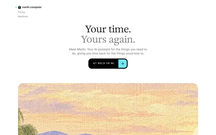
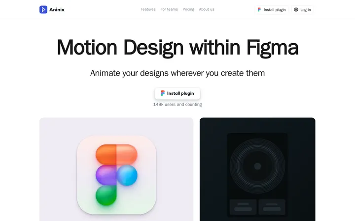
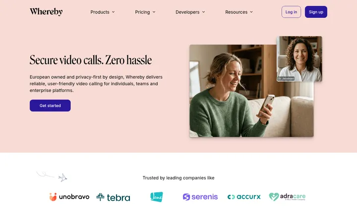
North star · Keep the interface monochrome and spacious so real product screens provide the page’s visual color and detail.
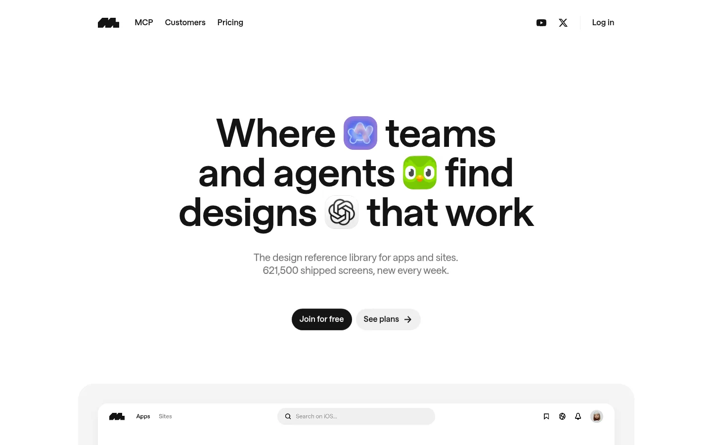
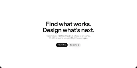
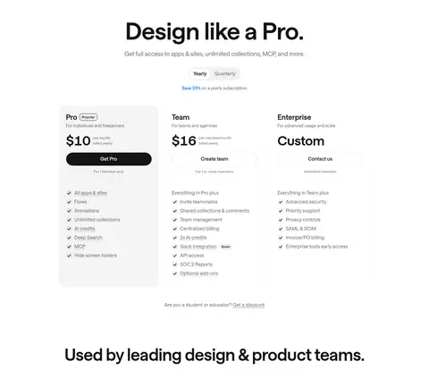
The page uses a near-monochrome foundation: white is the primary canvas, #141414 carries headlines, navigation and the strongest calls to action, and #f4f4f4 marks soft surfaces and the customer-story band. Muted grays are reserved for supporting copy and subtle treatments rather than competing with the product. Saans gives the identity its rounded, contemporary character; oversized, tightly tracked headlines create a strong editorial entry point, while smaller, lightly tracked text keeps utility content calm. The hero is centered and spacious, with compact pill actions beneath the headline and a large interface preview below. Further down, app-screen imagery supplies color and detail, while cards and feature groups sit within generous whitespace. A full-width pale-gray storytelling section provides a clear rhythm change before the white closing CTA. Rounded cards and soft shadows add separation without heavy outlines.
Display and interface typography throughout the page.
角色
示例
字号
字重
行高
字距
特大标题
Oversized hero and campaign display headlines.
Mobbin
80px
652
1
-0.007em
一级标题
Primary hero headline.
Mobbin
64px
652
1
-0.009em
二级标题
Major section headings and closing CTA.
Mobbin
44px
652
1.09
-0.009em
三级标题
Feature, story, and content card headings.
The quick brown fox 敏捷的狐狸
24px
652
1.25
0
四级标题
Secondary titles and supporting subheads.
The quick brown fox 敏捷的狐狸
20px
440
1.3
0
正文
Descriptions and explanatory copy.
The quick brown fox 敏捷的狐狸
16px
456
1.38
0.013em
辅助文字
Fine print, metadata, and small supporting labels.
The quick brown fox 敏捷的狐狸
14px
456
1.43
0.014em
导航
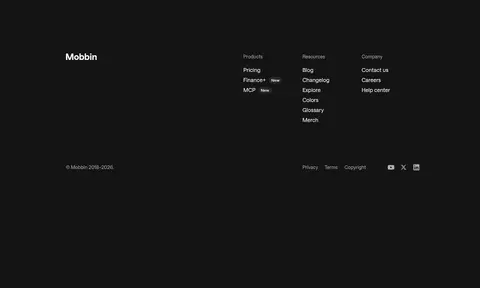
Header and footer navigation labels.
The quick brown fox 敏捷的狐狸
16px
600
1.38
0.013em
链接
Text links and secondary pill actions.
The quick brown fox 敏捷的狐狸
16px
600
1.38
0.013em
间距与布局
基准单位 8px · 密度:适中
80px版块间距
8px元素间距
—卡片内边距
1045px内容最大宽度
2px
4px
8px
12px
16px
20px
24px
32px
40px
64px
80px
160px
200px
Use a centered content frame with a measured maximum width of 1045px, but let section backgrounds span the viewport. The hero aligns centrally, while later feature areas alternate between centered grids and left-aligned split layouts. Keep the rhythm open: section gaps measure 80px, with smaller 8px element gaps for compact groups. Content density stays comfortable; large media previews and visible whitespace balance the page. The customer-story area forms a distinct full-width gray band.
圆角与层次
按钮 · 14px
卡片 · 20px
图片 · 19px
链接 · 9999px
md · media, card, other
inset · other
Most sections remain flat against white or pale gray rather than relying on borders. Product media and occasional cards use a soft measured shadow of rgba(0, 0, 0, 0.04) 0px 8px 24px 0px. Rounded containers and light surface contrast establish layering; avoid strong outlines or dramatic depth.
组件
下面的预览按实测的按钮、输入框、徽标、卡片样式重建(字体用替代字体)。
Header navigation
Compact brand mark at left, followed by MCP, Customers, and Pricing links; social icons and Log in sit on the right.
Hero CTA pair
Centered pill actions: dark #141414 Join for free and light See plans, with measured button radius 14px.
Library preview
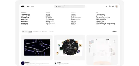
Large product interface preview placed in a pale rounded media frame, with a soft shadow and curated app-screen content.
Screen gallery
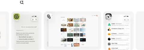
Horizontal showcase of many app screenshots, using rounded media cards to make the library itself the visual proof.
Category collection
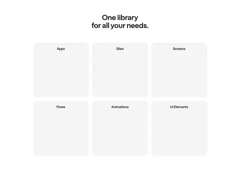
Three-column grid presenting Apps, Sites, Screens, Flows, Animations, and UI Elements as separate library categories.
Customer story cards
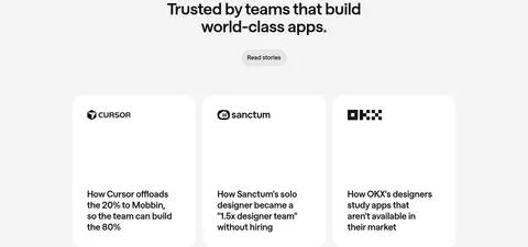
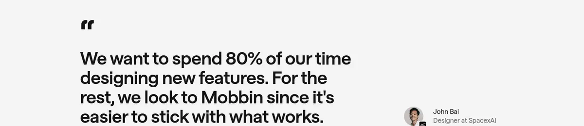
Three white story cards arranged in a grid within the #f4f4f4 section band; logos and compact editorial copy lead each card.
Closing CTA
Centered headline and short supporting copy on white, followed by the same dark primary and light secondary pill actions.
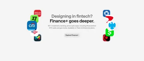
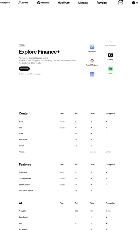
Imagery · Product UI is the primary imagery: browser-like library previews, rows of app screens, and interface collections. Keep previews large enough to read as curated product evidence, set them in pale rounded containers, and let their native interface colors provide contrast. Customer logos, AI tool marks, and finance app icons appear as supporting assets; they are not the brand palette. The hero preview includes video.
Reserve #f4f4f4 for quiet bands and soft surfaces.
Let product screenshots supply most vivid color.
Center the hero and give it generous whitespace.
Use Saans-style rounded typography with tight display tracking.
✕ 不该做
Don't introduce unmeasured accent colors into the interface.
Don't crowd the hero with extra navigation or controls.
Don't turn every section into a card grid.
Don't use heavy borders or high-contrast shadows.
Don't let gray supporting copy compete with headlines.
Don't apply product-art colors as brand colors.
给 AI 的提示词
想快速出一个同风格的新页面,把这段话连同 DESIGN.md 一起发给 AI。
Build a new Mobbin-style page with a white Gallery White (#ffffff) canvas, Soft Ink (#141414) headlines and primary actions, and Cloud Gray (#f4f4f4) for restrained surface contrast. Use Saans or a close Inter substitute, with large tightly tracked display headlines and calm, slightly tracked supporting text. Keep the header compact, center the hero, and pair it with a large rounded product-interface preview. Organize the rest into generous sections with alternating centered grids and split layouts; use real product-screen imagery as the main source of color. A pale gray customer-story band can establish a rhythm change. Favor rounded media and cards with only soft shadows, not heavy borders. Finish with a clear centered CTA and paired pill actions. Preserve substantial whitespace and avoid adding unmeasured brand colors.