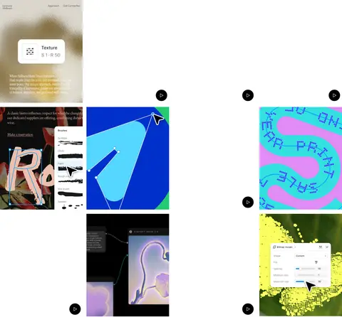
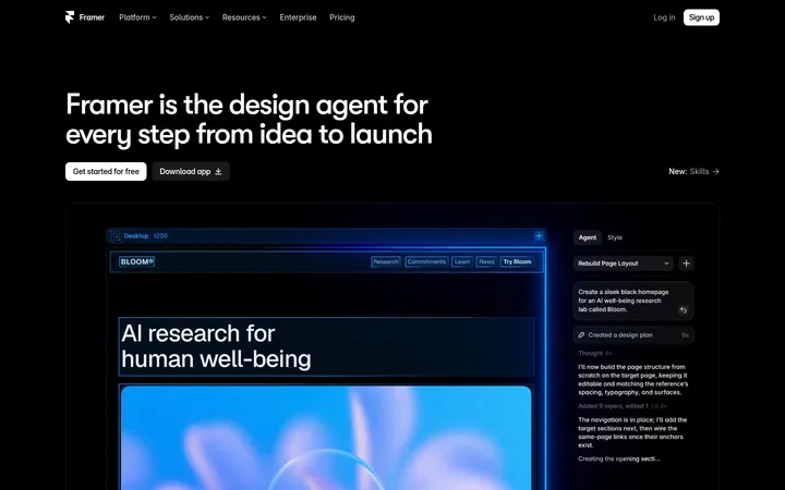
North star · Keep the interface monochrome and spacious, letting real product and community visuals provide the color and depth.
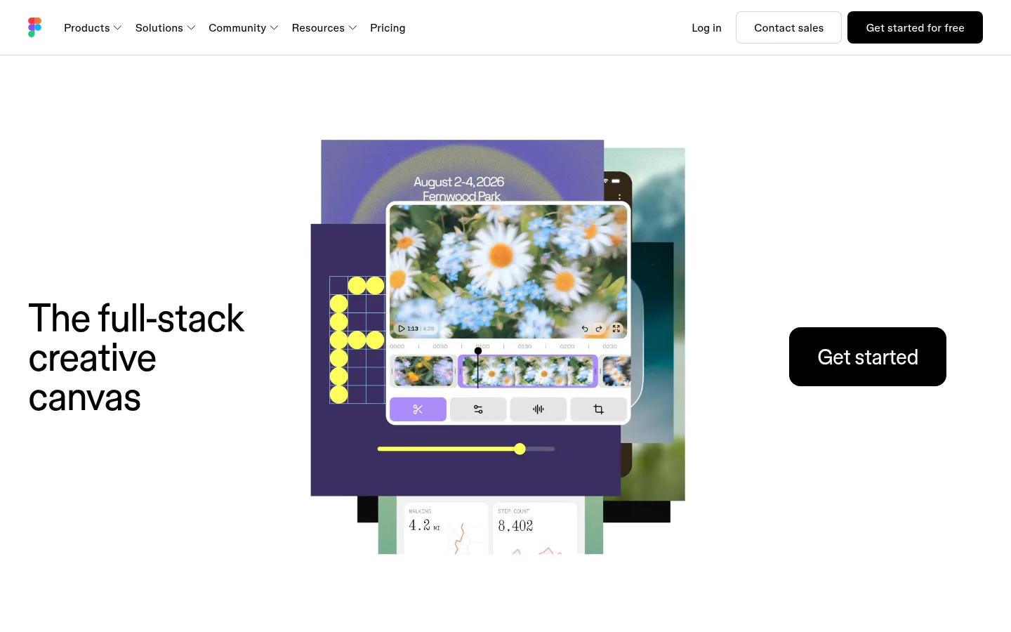
The page uses Gallery White (#ffffff) as an almost uninterrupted canvas, with Ink (#000000) reserved for headings, navigation, controls, the large closing CTA, and the full-width footer. Supporting copy is softened with muted gray; fine gray rules separate navigation and other subtle boundaries. Bright color is mostly carried by product examples, community templates, and the Figma mark rather than broad brand-color panels. Figma Sans gives the page a clean, contemporary voice: oversized regular-weight headlines sit beside small, understated descriptions and simple text links. The hero is deliberately asymmetric, balancing a left-aligned headline, a layered product montage, and a standalone black CTA. Below, spacious editorial sections alternate between text-led statements, media, feature links, customer proof, and a horizontal template gallery. The page stays visually flat; imagery supplies depth through overlap and varied color, while restrained borders and minimal shadowing keep the interface light.
Display and headings, body copy, navigation, buttons, captions, and links.
Aa 设计
figmaMono
网络字体 · 字重 400 · 占比 2%
免费替代:Space Mono
Uppercase eyebrow labels and code-like labels.
角色
示例
字号
字重
行高
字距
特大标题
Oversized hero or campaign display headlines.
Figma
88px
400
1
-0.014em
一级标题
Primary page and section headline emphasis.
Figma
56px
400
1
-0.022em
二级标题
Major section titles and narrative statements.
Figma
44px
400
1.1
-0.015em
三级标题
Feature titles and smaller content headings.
Figma
30px
400
1.2
-0.022em
正文
Supporting product explanations and descriptive copy.
The quick brown fox 敏捷的狐狸
16px
320
1.45
-0.007em
辅助文字
Small notes, customer details, and secondary labels.
The quick brown fox 敏捷的狐狸
14px
400
1.45
0
按钮
CTA and action control labels.
The quick brown fox 敏捷的狐狸
16px
400
1.45
0
导航
Top-level navigation and utility links.
The quick brown fox 敏捷的狐狸
16px
400
1.45
0
眉题
Uppercase mono section or category labels.
The quick brown fox 敏捷的狐狸
16px
400
1.3
0.03em
代码
Occasional uppercase, code-like interface labels.
const style = 1;
16px
400
1.3
0.03em
间距与布局
基准单位 4px · 密度:适中
80px版块间距
2px元素间距
—卡片内边距
1360px内容最大宽度
2px
4px
5px
6px
8px
12px
16px
20px
24px
30px
32px
40px
70px
80px
The measured content max width is 1360px, with a comfortable density and a measured 80px section gap. The opening viewport spreads a left-aligned headline, central product montage, and right-side CTA across a wide canvas. Further down, the page alternates single-column statements with two-column feature areas and broad media moments. A customer-proof block and template gallery provide denser content before the full-width black footer. Preserve generous whitespace and varied alignment rather than forcing every section into identical cards.
圆角与层次
按钮 · 50%
图片 · 50%
导航 · 8px
链接 · 2px
inset · button, nav
hairline · nav
The interface is predominantly flat, with no prominent card-shadow system. A thin measured gray border and subtle navigation hairline provide the main separation. Use overlap and layered media artwork for depth in showcases; keep controls clean and reserve strong contrast for black buttons and the footer.
组件
下面的预览按实测的按钮、输入框、徽标、卡片样式重建(字体用替代字体)。
Top navigation
White horizontal bar with the Figma mark, compact product and resource links, utility actions, and a black rounded primary button; a fine hairline separates it from the page.
Hero composition
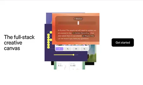
Wide asymmetric arrangement: large black headline at left, layered creative product imagery in the center, and a standalone black Get started CTA at right.
Feature narrative
Spacious text-led statements with muted supporting copy, occasional two-column placement, and understated text links for product exploration.
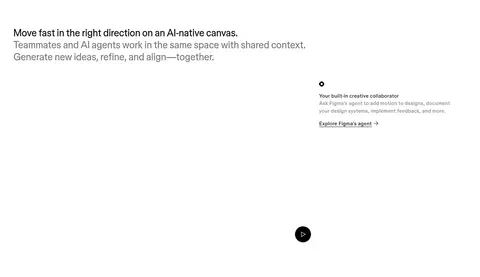
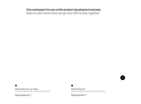
Media showcase
Product and creative examples presented as large image panels, with simple circular play controls and minimal surrounding interface.
Customer proof
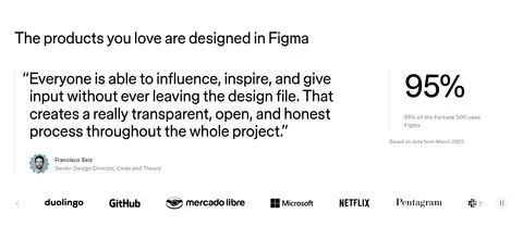
Testimonial quote paired with a prominent 95% statistic and a horizontal row of recognizable customer logos.
Template gallery
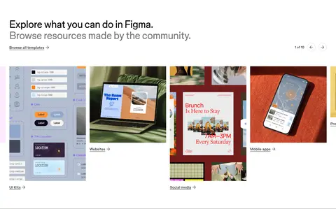
Horizontal strip of colorful community template previews with small category links and compact carousel controls.
Dark footer
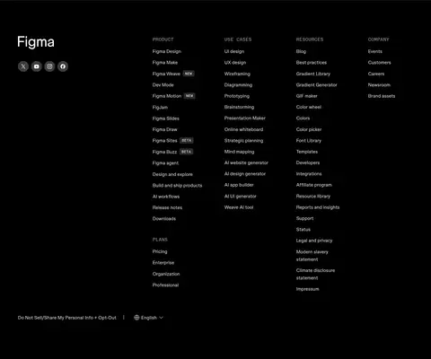
Full-width black closing area with white Figma branding, social icons, and several tightly organized columns of small navigation links.
Imagery · Product UI, templates, and community examples appear as colorful media within otherwise white sections. The hero uses overlapping rectangular creative panels, while lower sections include video-like previews, customer logos, and a horizontally browsable template gallery. Keep imagery vivid and closely cropped to the work itself; avoid adding decorative background color blocks that compete with the examples.
Use large, regular-weight headlines with tight tracking.
Let colorful product examples supply most visual variety.
Preserve generous whitespace between major sections.
✕ 不该做
Do not add broad colored section backgrounds.
Do not turn every feature into a bordered card.
Do not make secondary copy as dark or prominent as headlines.
Do not center every section into the same template.
Do not add heavy shadows to ordinary interface elements.
Do not let decoration overwhelm product imagery.
给 AI 的提示词
想快速出一个同风格的新页面,把这段话连同 DESIGN.md 一起发给 AI。
Build a new Figma-style page on a Gallery White (#ffffff) canvas with Ink (#000000) typography and CTA fills. Use Figma Sans or a close sans-serif substitute, with oversized regular headlines, tight tracking, and smaller muted supporting copy in Soft Graphite (#757575). Keep the layout wide and editorial: asymmetric hero, generous open space, varied single- and two-column sections, and a clear closing footer band. Use colorful product or community imagery as the main source of visual richness; do not spread Canvas Blue (#00b6ff) across large surfaces. Keep borders subtle in Rule Gray (#d6d6d6), interfaces mostly flat, and buttons simply rounded. Build clear navigation, concise feature narratives, media showcases, and a compact proof or gallery section without imposing a repetitive card grid.