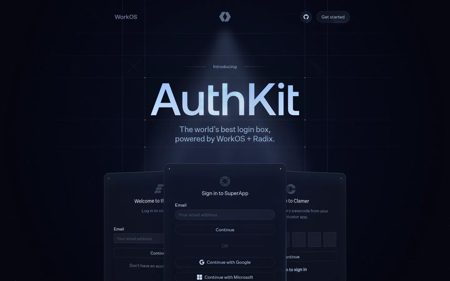
North star · Keep the page nearly black and spacious, then make product interfaces feel luminous through cool type, fine borders, and restrained layered glow.
The visual system is anchored by a near-black navy canvas (#05060f), used consistently across the long page rather than alternating coloured bands. Dark raised surfaces and fine blue-black borders frame interface previews, while cool pale blue text establishes the luminous, technical mood. Muted slate tones keep supporting copy secondary. Purple, coral, and blue are restrained accents, most legible inside the authentication UI and not a reason to recolour the surrounding page. Large, medium-weight Aeonik Pro headings contrast with compact Untitled Sans navigation, body text, and controls. A centered hero pairs oversized product naming with a short description and overlapping login-card mockups. Further sections use centered headlines and broad product illustrations, with a two-column closing area. Generous vertical breathing room, hairline grid details, soft glows, and inset highlights create depth without bright section backgrounds or heavy shadows.
配色
点色块复制色值。用途说明来自对页面的实测位置(背景、文字、描边、按钮)与截图判读。
品牌色
强调色
表层色
中性色
功能色
页面底色 · Midnight Canvas表层 · Raised Slate主文字 · Ice Light次要文字 · Muted Steel弱文字 · Quiet Slate描边 · Night Border强调 · Signal Violet强调 2 · Warm Coral强调 3 · Electric Azure
Navigation, body copy, captions, links, and buttons
Aa 设计
aeonikPro
网络字体 · 字重 500 / 400 · 占比 11%
免费替代:Manrope
Large hero and section headings
角色
示例
字号
字重
行高
字距
一级标题
Hero product name, set as the prominent display headline.
AuthKit by WorkOS
48px
500
1.17
0
二级标题
Centered major feature-section headlines.
AuthKit by WorkOS
44px
500
1.16
0
三级标题
Supporting feature and product-preview headings.
The quick brown fox 敏捷的狐狸
24px
400
1.33
-0.01em
正文
Descriptive copy beneath headings and within page content.
The quick brown fox 敏捷的狐狸
16px
400
1.5
0
辅助文字
Small labels and secondary product-interface annotations.
The quick brown fox 敏捷的狐狸
14px
400
1.43
0
按钮
Authentication actions and compact calls to action.
The quick brown fox 敏捷的狐狸
14px
500
2.29
0
导航
Header navigation and utility links.
The quick brown fox 敏捷的狐狸
14px
400
2.57
0
链接
Emphasized inline links, including sign-up actions.
The quick brown fox 敏捷的狐狸
14px
600
1.43
0
间距与布局
基准单位 4px · 密度:宽松
100px版块间距
8px元素间距
—卡片内边距
1177px内容最大宽度
1px
4px
5px
6px
8px
10px
12px
14px
16px
20px
24px
32px
36px
40px
42px
120px
A centered, single-column marketing flow sits within a measured maximum width of 1177px, with a spacious density and a section gap around 100px. The hero aligns its headline and copy centrally above overlapping interface cards. Feature sections retain the same dark canvas and alternate centered copy with broad illustrations; the measured closing section uses two columns. Fine grid lines and carefully framed mockups provide structure without boxed content bands.
圆角与层次
按钮 · 2px
输入框 · 2px
卡片 · 16px
图片 · 50%
导航 · 50%
链接 · 9999px
md · other
sm · other
inset · nav, card, other
inset · other
Depth comes from layered interface cards, thin dark borders, inset highlights, and soft blue-tinted glows rather than hard drop shadows. Keep the overall canvas flat and uninterrupted; give product mockups the strongest separation, with delicate outlines and restrained luminous edges.
组件
下面的预览按实测的按钮、输入框、徽标、卡片样式重建(字体用替代字体)。
Header navigation
Minimal top row with WorkOS branding, centered mark, utility icon, and a dark pill-shaped Get started control.
Hero headline
Large centered Aeonik Pro product name with a short cool-toned supporting statement beneath.
Authentication preview
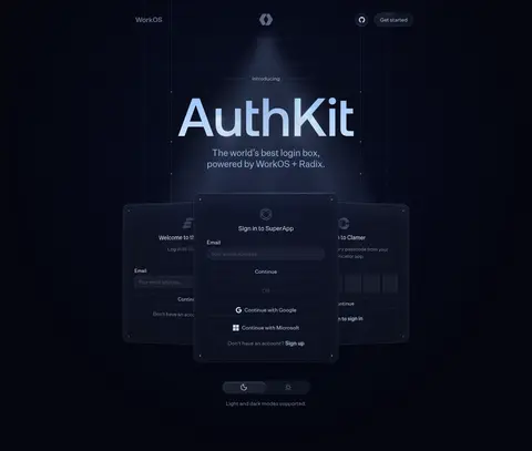
Overlapping dark login panels; the central card is foregrounded with outlined fields, compact provider actions, and a violet primary button.
Outlined utility button
Compact dark control with pale text, a fine border or inset highlight, and a pill-like silhouette where shown.
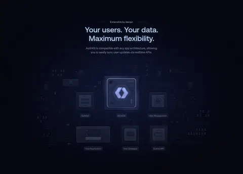
Feature illustration
Broad, dark technical product diagram or editor preview, framed by subtle lines and luminous UI details.
Inline sign-up link
Small semibold pale-blue text link integrated into interface or supporting content.
Imagery · The page relies on product UI mockups and technical diagrams rather than photography. The hero stacks multiple sign-in experiences, with the central card in front; later illustrations map product flexibility and show a customization workspace. Keep mockups crisp but subdued, using dark panels, cool edge light, small interface details, and selective violet, coral, blue, and green accents.
Keep headings and hero content centered and cool-toned.
Use #10131d and fine borders to distinguish interface surfaces.
Layer product previews with restrained blue glow and inset highlights.
Reserve #663af3 for prominent actions inside product UI.
Leave generous vertical breathing room between content blocks.
✕ 不该做
Do not introduce bright alternating section backgrounds.
Do not turn illustration accent colours into dominant page colours.
Do not use heavy shadows or thick outlines.
Do not crowd the hero with extra marketing copy.
Do not use decorative display type for body copy or controls.
Do not make every panel equally bright or visually prominent.
给 AI 的提示词
想快速出一个同风格的新页面,把这段话连同 DESIGN.md 一起发给 AI。
Build a new page in AuthKit’s dark, technical visual style. Use Midnight Canvas (#05060f) as an uninterrupted background, Raised Slate (#10131d) for interface surfaces, and Night Border (#1b1f2b) for delicate outlines. Set large, centered headlines in a medium-weight geometric sans close to Aeonik Pro; use a clean sans like Inter for navigation, copy, and controls. Keep the layout spacious, with a focused hero and broad, carefully composed product previews. Make UI layers feel dimensional with thin borders, pale Glacier Glow (#bad7f7) highlights, and restrained soft light. Use Ice Light (#d8ecf8) for key text and reserve Signal Violet (#663af3) for a primary product action. Avoid bright section bands, heavy shadows, clutter, and oversized decorative colour. Treat accent colours as details inside the product interface.