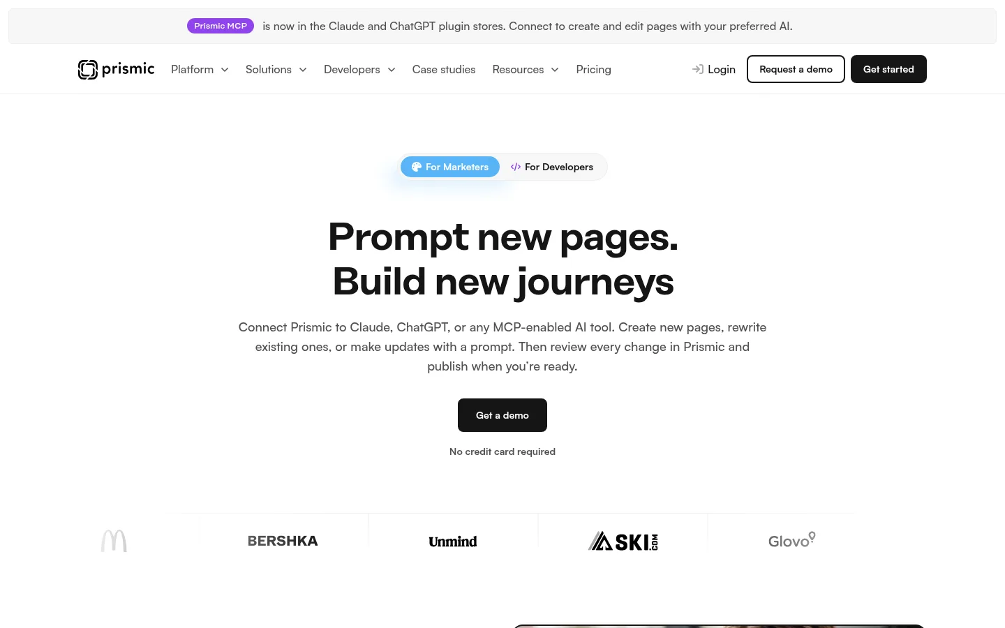
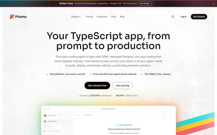
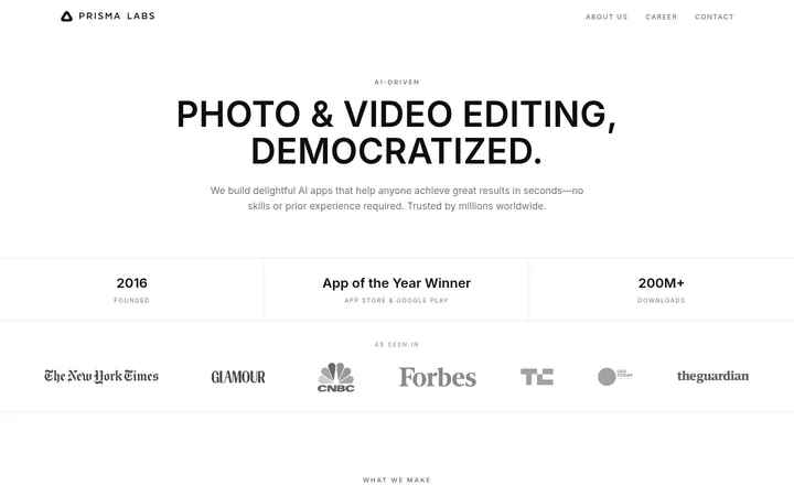
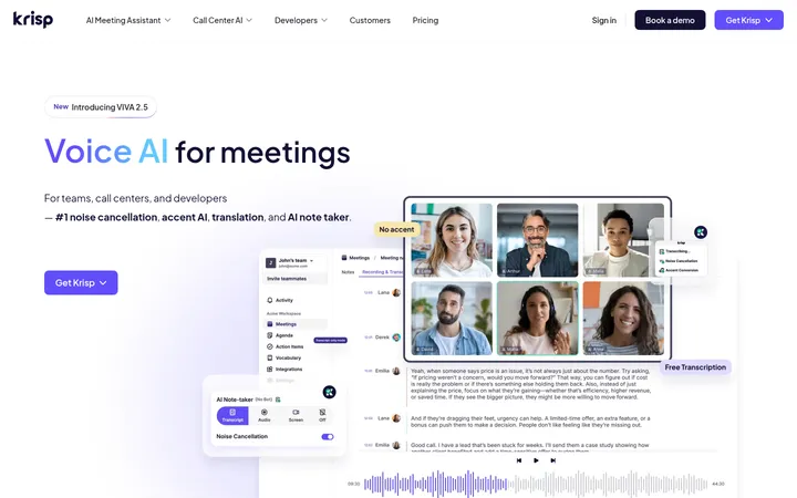
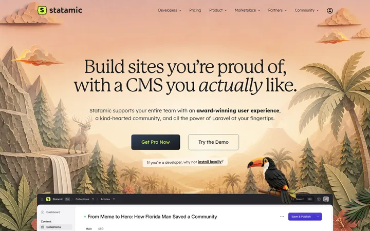
Prismic 以宽阔的白色画布和醒目的黑色字体为主,蓝紫色只作少量强调。产品截图、浅灰卡片与深色区块共同组织长页面,层次清楚而不显沉重。
North star · Keep the page calm and legible: let whitespace and black typography lead, and use color only to clarify product details.
The page is built on a predominantly white canvas, with near-black text and controls creating crisp contrast rather than relying on decorative color. Pale gray fills distinguish feature cards, while thin gray rules separate testimonial content; a deep charcoal band gives the workflow section and footer visual weight. Blue appears as a small interface accent, and purple is confined to the MCP announcement badge, so neither competes with the content. Headings use a bold, tightly tracked display face, balanced by compact, readable sans-serif body copy. The layout alternates between centered hero content and left-aligned, multi-column sections, with generous whitespace between major blocks. Product UI images and a human-centered video still provide evidence of use, while repeated rounded cards make the feature areas easy to scan. CTAs stay simple and high-contrast.
配色 点色块复制色值。用途说明来自对页面的实测位置(背景、文字、描边、按钮)与截图判读。
品牌色
Prismic Ink
#151515
Primary text, headings, dark CTA buttons, the workflow band, and footer.
强调色
MCP Violet
#8e44ec
Small Prismic MCP announcement badge, not a broad page background.
Signal Blue
#59b5f8
Sparse interface or text emphasis; avoid treating it as a dominant page color.
表层色
Canvas White
#ffffff
Main page canvas, light button fills, and contrast text on dark surfaces.
Cloud Panel
#f7f7f7
Soft-filled feature cards and understated content surfaces.
Charcoal Panel
#1f1f1f
Occasional dark card surface within the otherwise light product presentation.
中性色
Soft Rule
#eeeeee
Card outlines, fine separators, and subdued interface boundaries.
Slate Copy
#505050
Navigation labels and secondary body copy on white.
功能色
Muted Gray
#a4a4a4
Low-emphasis text detected in measured styles; use sparingly for tertiary copy.
文字 背景 对比度 WCAG #151515 Prismic Ink#ffffff Canvas White18.26:1 AAA #151515 Prismic Ink#f7f7f7 Cloud Panel17.05:1 AAA #151515 Prismic Ink#1f1f1f Charcoal Panel1.11:1 不达标 #505050 Slate Copy#ffffff Canvas White8.06:1 AAA #505050 Slate Copy#151515 Prismic Ink2.26:1 不达标 #505050 Slate Copy#f7f7f7 Cloud Panel7.53:1 AAA
字体 字号阶梯:Perfect Fourth(比例约 1.368,正文 16px)。示例用免费替代字体渲染,数值为实测。
Aa 设计
copyFont 网络字体 · 字重 500 / 700 · 占比 86%
免费替代:Inter
Body copy, navigation, captions, and most compact links and buttons.
Aa 设计
headingsFont 网络字体 · 字重 500 / 700 · 占比 14%
免费替代:Plus Jakarta Sans
Display and section headings, plus the measured button type role.
角色 示例 字号 字重 行高 字距 特大标题 Large hero headline and other high-priority page statements.
Prismic
56px 700 1.14 -0.025em 一级标题 Primary section headings and prominent content titles.
Prismic
40px 700 1.1 -0.025em 二级标题 Secondary section headings and feature-group titles.
Prismic
32px 500 1.13 -0.025em 三级标题 Card titles and smaller subsection headings.
The quick brown fox 敏捷的狐狸
22px 500 1.27 -0.025em 正文 Standard paragraphs, feature descriptions, and supporting copy.
The quick brown fox 敏捷的狐狸
16px 500 1.5 0 辅助文字 Compact labels, metadata, and supporting card text.
The quick brown fox 敏捷的狐狸
14px 700 1.43 0 按钮 Prominent button label styling where the display face is used.
The quick brown fox 敏捷的狐狸
22px 500 1.27 -0.025em 导航 Header navigation labels and menu items.
The quick brown fox 敏捷的狐狸
16px 500 1.5 0 链接 Bold inline actions, story links, and compact text CTAs.
The quick brown fox 敏捷的狐狸
14px 700 1.43 0
间距与布局 基准单位 8px · 密度:适中
80px 版块间距
16px 元素间距
48px 卡片内边距
1216px 内容最大宽度
1px
4px
8px
10px
12px
16px
24px
32px
40px
48px
56px
80px
Use a centered page frame capped at the measured 1216px max width, with comfortable density and clear section breaks. The hero is centered, while most content sections use left-aligned headings and split or three-column layouts. Preserve the measured 80px section rhythm and 16px element rhythm where applicable. Alternate text with product media, then use repeated cards to organize feature explanations. Keep testimonial and FAQ content aligned to the same frame; let the footer expand into multiple link columns.
圆角与层次 没有测到阴影:页面是扁平的,层次靠底色和描边区分。
The design is mostly flat: measured data reports no shadows. Use subtle borders in #eeeeee for outlined cards and separators, and #f7f7f7 fills for soft card surfaces. Rounded corners distinguish cards and buttons without making them look raised. Reserve dark panels for deliberate section contrast, not floating overlays.
组件 下面的预览按实测的按钮、输入框、徽标、卡片样式重建(字体用替代字体)。
Announcement strip A restrained top banner with a compact purple Prismic MCP badge, short announcement copy, and a pale neutral background.
Header navigation Logo and horizontal navigation use #505050 labels, with simple menu affordances and contrasting outlined or dark CTA buttons.
Hero Centered, bold two-line headline, muted explanatory copy, dark demo CTA, and a low-key customer logo row.
Feature cards Use #f7f7f7 rounded surfaces or #eeeeee outlines to separate concise feature copy without shadows.
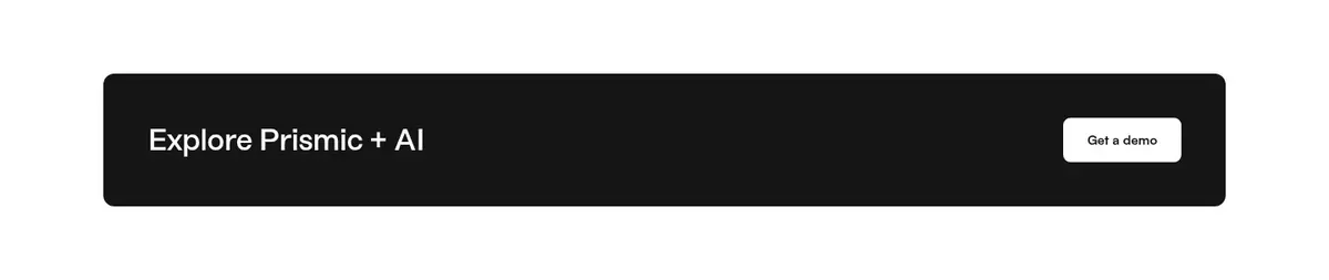
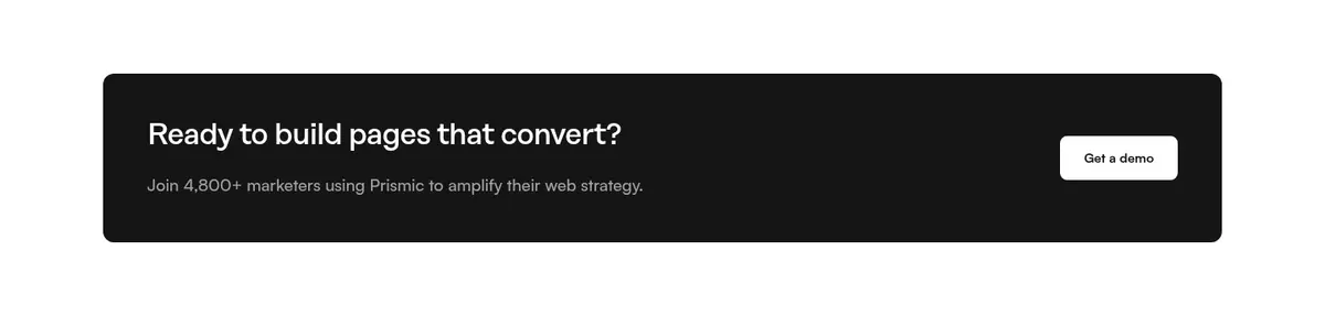
Dark CTA band A wide #151515 panel pairs a short prompt with a white button for clear, high-contrast action.
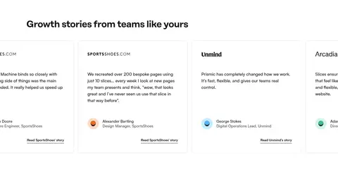
Testimonial cards Bordered story cards combine short customer quotes, attribution, and a compact bold text link.
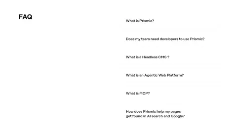
FAQ accordion A two-column FAQ layout balances a section heading against a vertical list of concise questions and controls.
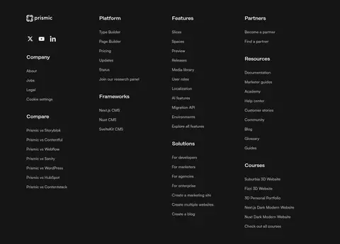
Footer A deep #151515 footer uses multiple link columns, restrained light text, and compact social icons.
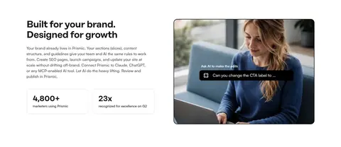
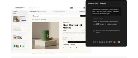
Imagery · Use product-interface screenshots as the main proof of capability, framed cleanly within the content grid and often paired with explanatory cards. Include occasional human-centered photography or video stills, cropped to feel like part of the product story rather than decorative stock imagery. Small interface accents may appear inside screenshots; keep the surrounding page neutral and avoid adding unmeasured brand colors.
页面版块 共 12 个版块,按页面从上到下排列,每个都标了类型、布局和交互套路。
首页
首屏 首页主视觉
Centered hero beneath announcement and navigation; headline, short copy, CTA, and customer logos.
图文交替 品牌与增长
Two-column section with copy and stats opposite a product-related image.
其他 团队应用
Single-column section heading and brief explanatory paragraph.
产品展示 产品演示
A prominent product image occupies a focused single-column media area.
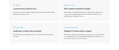
功能网格 AI工作场景
Two-column grid of repeated soft-gray feature cards with short descriptions.
行动号召 探索行动
Wide dark horizontal panel with a text prompt and button.
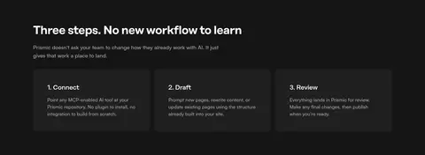
使用步骤 三步上手
Dark section with introduction and three horizontally arranged step cards.
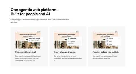
功能网格 平台能力
Three-column feature cards, each combining product image, heading, and copy.
行动号召 转化邀请
Wide, dark CTA panel with a short heading, proof copy, and demo action.
用户评价 客户故事
Horizontal row of bordered testimonial cards with customer attribution and links.
常见问题 常见问题
Two-column FAQ area with section label beside a vertical question list.
页脚 页脚导航
Full-width dark footer with logo, social links, and four dense navigation columns.
该做与不该做 ✓ 该做 Keep the main canvas white and uncluttered. Use #151515 for primary text and key actions. Apply #f7f7f7 to soft feature surfaces. Use #eeeeee for quiet borders and separators. Give headlines tight tracking and clear weight contrast. Pair product imagery with nearby explanatory copy. ✕ 不该做 Do not turn the page into a colorful gradient system. Do not use purple or blue as broad section backgrounds. Do not add shadows when the measured design is flat. Do not center every section; retain left-aligned content blocks. Do not crowd cards with dense copy or competing decoration. Do not use unmeasured radii or spacing values. 给 AI 的提示词 想快速出一个同风格的新页面,把这段话连同 DESIGN.md 一起发给 AI。
复制 Create a new Prismic-style SaaS page with a calm, product-led visual system. Use Canvas White (#ffffff) as the main canvas, Prismic Ink (#151515) for headings and primary actions, Slate Copy (#505050) for secondary text, Cloud Panel (#f7f7f7) for soft cards, and Soft Rule (#eeeeee) for borders. Keep MCP Violet (#8e44ec) and Signal Blue (#59b5f8) sparse and contextual. Use bold, tightly tracked headings with clean, readable sans-serif body text. Build a centered frame with generous measured section rhythm, alternating split content and card grids. Show authentic product UI imagery beside concise copy. Favor flat surfaces, rounded cards, high-contrast buttons, and a dark footer; avoid gradients, shadows, and decorative clutter.
DESIGN.md Tailwind v4 CSS 变量 Design Tokens
---
title: "Prismic design system"
variant: extended
source: https://prismic.io/
captured_at: 2026-10-12
theme: light
industry: saas
generator: Design DNA (https://four.wiralomi.com/style/prismic-io)
ai_generated: true
ai_label: "本文件由 AI 辅助生成:数值取自公开网页的实测样式,命名、用途说明与建议为模型解读。商标归原所有者。 / AI-assisted content"
---
# Prismic · Design System
> Quiet monochrome layouts, with product clarity at the center.
**Theme:** light · **Industry:** saas · **Source:** https://prismic.io/ · **Captured:** 2026-10-12 (1440×900 desktop)
_AI-assisted content: values are measured from the public page at capture time; names, roles and guidance are model-written interpretations. Trademarks belong to their owners._
Prismic pairs a spacious white canvas and assertive black typography with restrained blue and purple accents. Product screenshots, soft-gray cards, and a single dark footer make the long homepage feel structured without becoming visually heavy.
## North star
Keep the page calm and legible: let whitespace and black typography lead, and use color only to clarify product details.
## Overview
The page is built on a predominantly white canvas, with near-black text and controls creating crisp contrast rather than relying on decorative color. Pale gray fills distinguish feature cards, while thin gray rules separate testimonial content; a deep charcoal band gives the workflow section and footer visual weight. Blue appears as a small interface accent, and purple is confined to the MCP announcement badge, so neither competes with the content. Headings use a bold, tightly tracked display face, balanced by compact, readable sans-serif body copy. The layout alternates between centered hero content and left-aligned, multi-column sections, with generous whitespace between major blocks. Product UI images and a human-centered video still provide evidence of use, while repeated rounded cards make the feature areas easy to scan. CTAs stay simple and high-contrast.
## Colors
| Name | Hex | Token | Group | Role |
|---|---|---|---|---|
| Prismic Ink | ` | `--color-prismic-ink` | brand | Primary text, headings, dark CTA buttons, the workflow band, and footer. |
| Canvas White | ` | `--color-canvas-white` | surface | Main page canvas, light button fills, and contrast text on dark surfaces. |
| Soft Rule | ` | `--color-soft-rule` | neutral | Card outlines, fine separators, and subdued interface boundaries. |
| Slate Copy | ` | `--color-slate-copy` | neutral | Navigation labels and secondary body copy on white. |
| Cloud Panel | ` | `--color-cloud-panel` | surface | Soft-filled feature cards and understated content surfaces. |
| Muted Gray | ` | `--color-muted-gray` | semantic | Low-emphasis text detected in measured styles; use sparingly for tertiary copy. |
| MCP Violet | ` | `--color-mcp-violet` | accent | Small Prismic MCP announcement badge, not a broad page background. |
| Charcoal Panel | ` | `--color-charcoal-panel` | surface | Occasional dark card surface within the otherwise light product presentation. |
| Signal Blue | ` | `--color-signal-blue` | accent | Sparse interface or text emphasis; avoid treating it as a dominant page color. |
### Semantic aliases
`--color-canvas` → ` (Canvas White) · `--color-surface` → ` (Prismic Ink) · `--color-surface-2` → ` (Cloud Panel) · `--color-surface-3` → ` (Charcoal Panel) · `--color-text` → ` (Prismic Ink) · `--color-text-muted` → ` (Slate Copy) · `--color-text-subtle` → ` (Soft Rule) · `--color-border` → ` (Soft Rule) · `--color-accent` → ` (Signal Blue)
### Contrast (WCAG 2.x)
| Text | Background | Ratio | Level |
|---|---|---|---|
| ` | ` | 18.26:1 | AAA |
| ` | ` | 17.05:1 | AAA |
| ` | ` | 1.11:1 | fail |
| ` | ` | 8.06:1 | AAA |
| ` | ` | 2.26:1 | fail |
| ` | ` | 7.53:1 | AAA |
| ` | ` | 2.04:1 | fail |
| ` | ` | 1.16:1 | fail |
| ` | ` | 15.74:1 | AAA |
| ` | ` | 1.08:1 | fail |
## Typography
| Family | Token | Source | Weights | Role | Free substitute |
|---|---|---|---|---|---|
| copyFont | `--font-body` | webfont | 500, 700 | Body copy, navigation, captions, and most compact links and buttons. | Inter |
| headingsFont | `--font-display` | webfont | 500, 700 | Display and section headings, plus the measured button type role. | Plus Jakarta Sans |
- **copyFont:** Measured weights 500 and 700; keep copy clean and compact, with no tracking or uppercase styling.
- **headingsFont:** Measured weights 500 and 700; headings use tight negative tracking, with sentence-case wording.
### Type scale — Perfect Fourth (ratio ≈ 1.368, base 16px)
| Role | Size | Weight | Line height | Letter spacing | Case | Family | Used for |
|---|---|---|---|---|---|---|---|
| display | 56px | 700 | 1.14 | -0.025em | — | headingsFont | Large hero headline and other high-priority page statements. |
| h1 | 40px | 700 | 1.1 | -0.025em | — | headingsFont | Primary section headings and prominent content titles. |
| h2 | 32px | 500 | 1.13 | -0.025em | — | headingsFont | Secondary section headings and feature-group titles. |
| h3 | 22px | 500 | 1.27 | -0.025em | — | headingsFont | Card titles and smaller subsection headings. |
| body | 16px | 500 | 1.5 | 0 | — | copyFont | Standard paragraphs, feature descriptions, and supporting copy. |
| caption | 14px | 700 | 1.43 | 0 | — | copyFont | Compact labels, metadata, and supporting card text. |
| button | 22px | 500 | 1.27 | -0.025em | — | headingsFont | Prominent button label styling where the display face is used. |
| nav | 16px | 500 | 1.5 | 0 | — | copyFont | Header navigation labels and menu items. |
| link | 14px | 700 | 1.43 | 0 | — | copyFont | Bold inline actions, story links, and compact text CTAs. |
## Spacing & layout
- Base unit **8px**, density **comfortable**.
- Scale (most used values): 1, 4, 8, 10, 12, 16, 24, 32, 40, 48, 56, 80 px.
- Section rhythm 80px · element gap 16px · card padding 48px · max content width 1216px.
Use a centered page frame capped at the measured 1216px max width, with comfortable density and clear section breaks. The hero is centered, while most content sections use left-aligned headings and split or three-column layouts. Preserve the measured 80px section rhythm and 16px element rhythm where applicable. Alternate text with product media, then use repeated cards to organize feature explanations. Keep testimonial and FAQ content aligned to the same frame; let the footer expand into multiple link columns.
## Shape & elevation
- Radius: button `8px` · card `12px` · media `50%` · badge `9999px` · nav `8px` · link `8px` · xs `2px` · sm `6px` · md `8px` · lg `12px` · xl `16px` · pill `9999px`
- No box shadows measured: the page is flat.
- Motion: standard transition `0.15s cubic-bezier(0.4, 0, 0.2, 1)` on interactive elements.
The design is mostly flat: measured data reports no shadows. Use subtle borders in ## Imagery
Use product-interface screenshots as the main proof of capability, framed cleanly within the content grid and often paired with explanatory cards. Include occasional human-centered photography or video stills, cropped to feel like part of the product story rather than decorative stock imagery. Small interface accents may appear inside screenshots; keep the surrounding page neutral and avoid adding unmeasured brand colors.
## Components
### Announcement strip
A restrained top banner with a compact purple Prismic MCP badge, short announcement copy, and a pale neutral background.
### Header navigation
Logo and horizontal navigation use ### Hero
Centered, bold two-line headline, muted explanatory copy, dark demo CTA, and a low-key customer logo row.
### Feature cards
Use ### Dark CTA band
A wide ### Testimonial cards
Bordered story cards combine short customer quotes, attribution, and a compact bold text link.
### FAQ accordion
A two-column FAQ layout balances a section heading against a vertical list of concise questions and controls.
### Footer
A deep ### Measured component styles
- **Primary button** (“Get a demo”): background ## Do
- Keep the main canvas white and uncluttered.
- Use ## Don't
- Do not turn the page into a colorful gradient system.
- Do not use purple or blue as broad section backgrounds.
- Do not add shadows when the measured design is flat.
- Do not center every section; retain left-aligned content blocks.
- Do not crowd cards with dense copy or competing decoration.
- Do not use unmeasured radii or spacing values.
## Agent prompt
Create a new Prismic-style SaaS page with a calm, product-led visual system. Use Canvas White (## Page sections (top to bottom)
| # | Type | Layout | UX patterns | UI patterns |
|---|---|---|---|---|
| 1 | hero | Centered hero beneath announcement and navigation; headline, short copy, CTA, and customer logos. | primary demo action, customer social proof | centered headline, dark CTA, logo row |
| 2 | feature-split | Two-column section with copy and stats opposite a product-related image. | benefit explanation, proof-point stats | split layout, image panel, stat tiles |
| 3 | other | Single-column section heading and brief explanatory paragraph. | context setting | left-aligned heading, short intro |
| 4 | product-showcase | A prominent product image occupies a focused single-column media area. | workflow demonstration | product UI screenshot, overlay panel |
| 5 | feature-grid | Two-column grid of repeated soft-gray feature cards with short descriptions. | scan feature benefits, compare use cases | rounded cards, blue micro-labels |
| 6 | cta | Wide dark horizontal panel with a text prompt and button. | secondary conversion | dark band, light button |
| 7 | how-it-works | Dark section with introduction and three horizontally arranged step cards. | step-by-step guidance | numbered cards, dark-on-dark surfaces |
| 8 | feature-grid | Three-column feature cards, each combining product image, heading, and copy. | capability scanning | three-card row, embedded product previews |
| 9 | cta | Wide, dark CTA panel with a short heading, proof copy, and demo action. | conversion prompt, social proof | dark rounded panel, contrasting button |
| 10 | testimonials | Horizontal row of bordered testimonial cards with customer attribution and links. | customer validation, story discovery | outlined cards, quote text, text links |
| 11 | faq | Two-column FAQ area with section label beside a vertical question list. | answer discovery, progressive disclosure | question rows, expand controls |
| 12 | footer | Full-width dark footer with logo, social links, and four dense navigation columns. | site-wide navigation, social discovery | dark surface, multi-column links, social icons |
## Source CSS custom properties (selected)
```css
--tw-text-opacity: 1;
--shiki-color-text: