North star · Let refined serif typography and a cool, quiet canvas carry the page, reserving saturated colour for focused product moments.
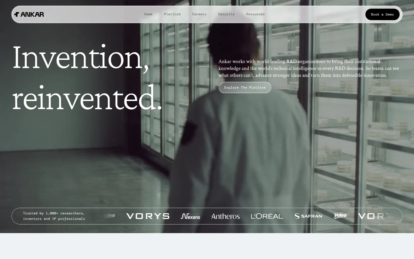
The visual strategy combines an almost-white blue-gray canvas with near-black text and expansive serif typography. The opening screen places a large, elegant headline over darkened laboratory footage, while concise supporting copy and small monospace controls keep the message precise. Further down, generous pale sections create a quiet reading surface for editorial headings, compact explanatory copy, and fine dividing rules. Red and deep blue appear as concentrated accent colours, notably in a vivid abstract platform panel; treat them as selective feature colour rather than page-wide decoration. Rounded pill navigation and CTAs provide a softer counterpoint to the formal type. Images feel cinematic and observational—research environments, people, and product interface views—often cropped into wide bands or prominent media panels. Preserve the contrast between calm, spacious content sections and immersive, darkened photographic moments.
配色
点色块复制色值。用途说明来自对页面的实测位置(背景、文字、描边、按钮)与截图判读。
强调色
表层色
中性色
页面底色 · Mist Canvas表层 · Deep Ink主文字 · Deep Ink次要文字 · Paper White弱文字 · Frost White强调 · Signal Crimson强调 2 · Research Indigo
Navigation, button labels, captions, and small utility text.
角色
示例
字号
字重
行高
字距
特大标题
Oversized hero-scale editorial statements.
Ankar
130px
400
1.1
-0.031em
一级标题
Primary hero headline and major page statements.
Ankar
80px
400
1.1
-0.025em
二级标题
Large section headlines introducing key themes.
Ankar
52px
400
1
-0.019em
三级标题
Secondary feature and content-section headings.
Ankar
45px
400
1.1
-0.022em
四级标题
Smaller card or sub-section headings.
Ankar
36px
400
1.1
-0.028em
正文
Paragraphs and explanatory editorial copy.
The quick brown fox 敏捷的狐狸
18px
400
1.33
0
辅助文字
Small labels, captions, and supporting metadata.
The quick brown fox 敏捷的狐狸
12px
400
1.6
0
按钮
Compact monospace navigation and CTA labels.
The quick brown fox 敏捷的狐狸
12px
400
1.17
0
代码
Utility-style or technical supporting text.
const style = 1;
12px
400
1.6
0
间距与布局
基准单位 2px · 密度:紧凑
40px版块间距
10px元素间距
—卡片内边距
1280px内容最大宽度
1px
3px
10px
20px
40px
A wide desktop composition uses a measured maximum content width of 1280px. The first viewport is a full-bleed photographic hero with a floating pill-shaped navigation bar, a left-aligned headline, and supporting copy set to the right. Below, pale editorial sections alternate between split text layouts, broad media bands, and feature panels. Fine horizontal rules and compact supporting details organise content without dense card grids. Spacing follows a compact measured rhythm, but large headline and media areas preserve a spacious overall impression.
圆角与层次
按钮 · 9999px
卡片 · 20px
图片 · 40px
链接 · 20px
inset · button
The page is largely flat: pale sections rely on canvas contrast and fine hairlines instead of heavy card shadows. The navigation and CTAs use rounded pill silhouettes. The measured button treatment includes a subtle white inset highlight; image overlays add depth to photographic areas without introducing a broad shadow system.
组件
下面的预览按实测的按钮、输入框、徽标、卡片样式重建(字体用替代字体)。
Floating navigation
A translucent, pale pill bar overlays the hero, with a bold Ankar mark, compact DM Mono links, and a black Book a Demo pill.
Cinematic hero
Full-bleed workplace video or photography, darkened for contrast, with a large white Crimson Pro headline and concise supporting copy.
Primary CTA
Use compact 12px DM Mono labels in rounded pill buttons; the measured Book a Demo variant is black with white text.
Editorial section header
Large regular-weight serif heading paired with concise body copy, often arranged in opposite columns on the pale canvas.
Feature artwork panel
A broad, rounded visual panel may use the measured crimson and indigo accents; keep saturated colour contained within the artwork.
Media strip
A wide, low-height crop of video or photography separates editorial sections and adds cinematic pacing.
Trust indicators
Compact monospace labels and restrained badges communicate enterprise trust without competing with the main serif hierarchy.
Imagery · Use cinematic workplace and research footage as the primary visual anchor, with people and laboratory environments framed in broad, immersive crops. Dark overlays improve white headline legibility over the hero. Supporting media includes panoramic video strips and product-interface imagery. Abstract red-and-blue graphics belong to focused feature artwork, not the site-wide background.
Use the pale blue-gray canvas for broad content sections.
Set major statements in regular-weight editorial serif.
Keep utility labels and buttons in compact monospace.
Use cinematic media as a deliberate focal point.
Reserve crimson and indigo for focused artwork.
Keep rules and card treatments visually restrained.
✕ 不该做
Do not make vivid accent colours the dominant page background.
Do not replace the editorial serif hierarchy with generic heavy sans headings.
Do not crowd the page with dense cards or decoration.
Do not place white copy on imagery without a darkening treatment.
Do not add heavy shadows to otherwise flat sections.
Do not turn navigation labels into oversized controls.
给 AI 的提示词
想快速出一个同风格的新页面,把这段话连同 DESIGN.md 一起发给 AI。
Build a new Ankar page with a calm, enterprise editorial character. Use Mist Canvas (#eef2f6) for broad content areas and Deep Ink (#000000) for primary text and key dark CTAs. Set major headlines in a regular, tightly tracked Crimson Pro-style serif; use Crimson Text-style serif for readable paragraphs and DM Mono-style text for compact navigation, captions, and buttons. Compose content in a wide layout with generous breathing room, split editorial sections, fine dividers, and rounded pill controls. Use cinematic research or workplace imagery for focal sections, darkening it where white text overlays. Keep Paper White (#ffffff) and Frost White (#f8fafb) for restrained contrast. Limit Signal Crimson (#ba484f) and Research Indigo (#2f3d86) to focused feature artwork rather than broad page surfaces. Maintain a flat, clean elevation system.