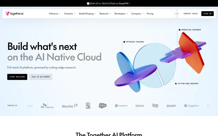
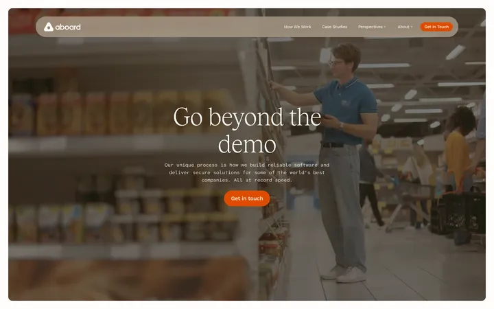
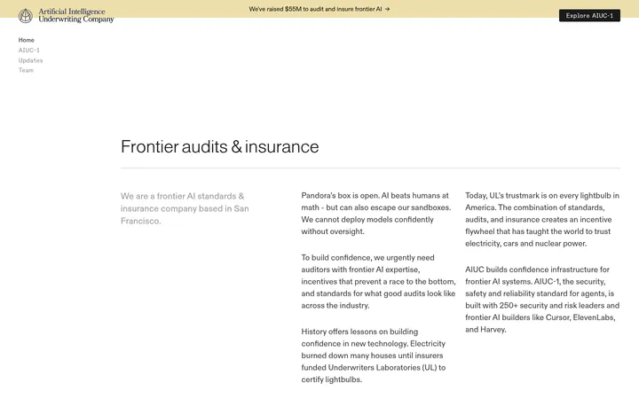
North star · Let expansive illustrated scenes create the emotion, then return to quiet white space and precise editorial typography.
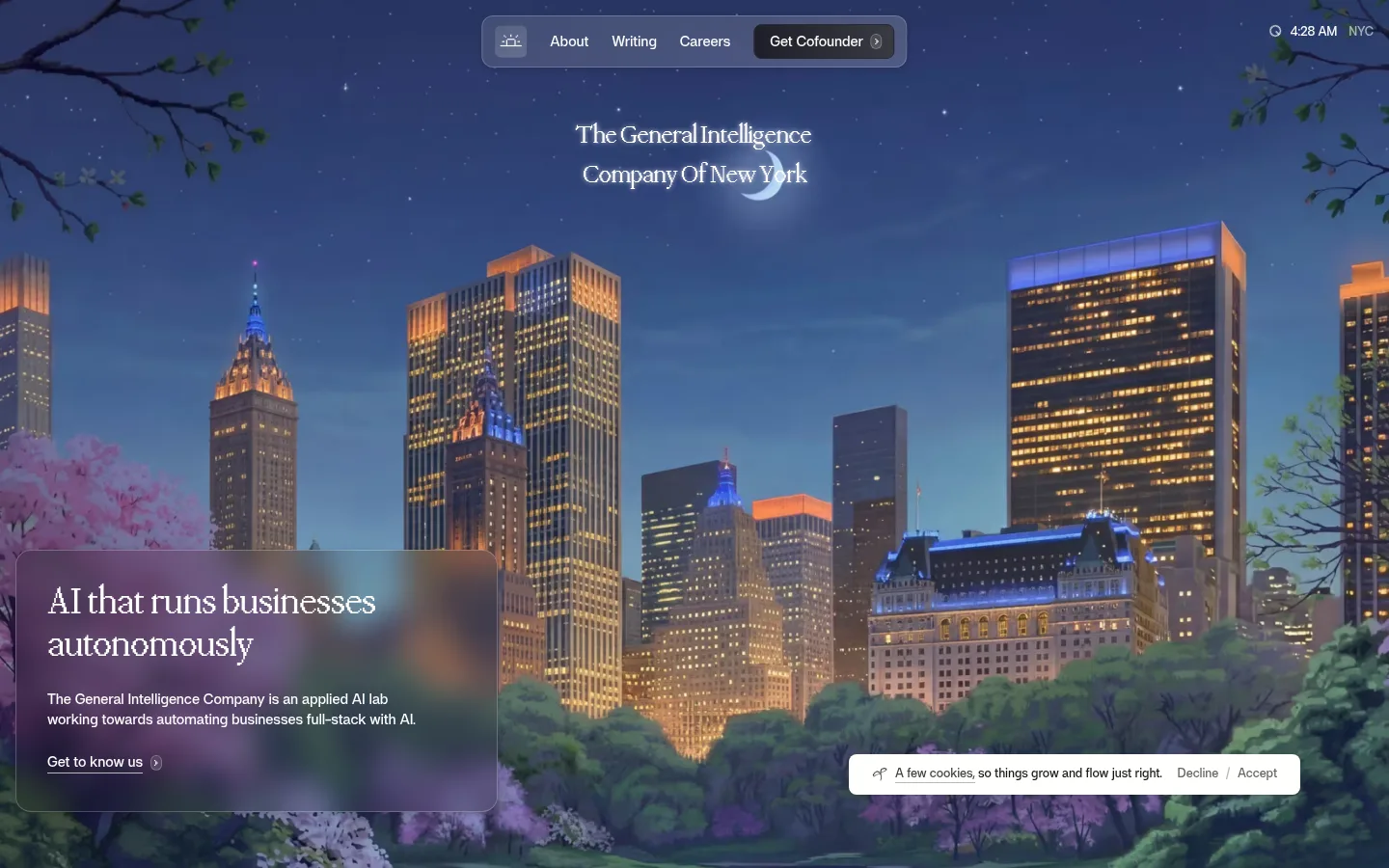
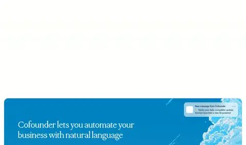
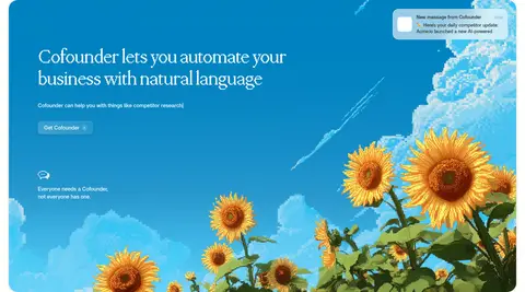
The visual strategy contrasts a quiet editorial canvas with immersive, story-like imagery. White and near-white sections let the content breathe, while a full-bleed illustrated New York nightscape makes the opening feel cinematic; later, a saturated blue product panel with sunflowers creates a distinct focal point. Dark charcoal carries headlines and primary reading text, muted gray supports secondary copy, and fine pale borders separate cards without making the page feel boxed in. Display headings use the distinctive ppMondwest serif, with tight tracking and restrained weights; af sans-serif keeps navigation, body copy, and controls practical and legible. Layouts are mostly single-column and centered or left-aligned, with generous vertical pauses between narrative moments. The product feature and article cards introduce contained, rounded surfaces, but the overall impression remains open and image-led rather than dashboard-like.
Navigation, body copy, captions, buttons, and practical interface text.
Aa 设计
ppmondwest
网络字体 · 字重 500 / 400 · 占比 23%
免费替代:Instrument Serif
Editorial display headings and prominent narrative statements.
角色
示例
字号
字重
行高
字距
一级标题
Centered brand statement over the illustrated opening scene.
General Intelligence Company
54px
400
1.1
-0.02em
二级标题
Major editorial headlines and the product-feature title.
General Intelligence Company
48px
500
1.1
-0.02em
三级标题
Article-card and secondary feature headings.
General Intelligence Company
40px
500
1.1
-0.02em
四级标题
Supporting narrative statements within content sections.
The quick brown fox 敏捷的狐狸
27px
400
1.5
-0.04em
正文
Explanatory paragraphs and section copy.
The quick brown fox 敏捷的狐狸
15px
500
1.4
-0.01em
辅助文字
Small labels, metadata, and supporting notes.
The quick brown fox 敏捷的狐狸
13px
500
1.3
-0.01em
按钮
Compact CTA and cookie-control labels.
The quick brown fox 敏捷的狐狸
13px
500
1.4
-0.01em
导航
Header and footer navigation links.
The quick brown fox 敏捷的狐狸
15px
500
1.4
-0.01em
间距与布局
基准单位 8px · 密度:适中
80px版块间距
8px元素间距
12px卡片内边距
1248px内容最大宽度
2px
3px
4px
5px
8px
12px
16px
20px
24px
32px
40px
48px
64px
80px
200px
The page uses a measured 1248px maximum content width and a comfortable density, with long single-column storytelling sections and occasional multi-column content such as the three-card article feed. The hero is full-bleed and centered around its landscape image, with an inset copy panel anchored low on the left. Subsequent sections alternate between centered or split editorial compositions and a contained product feature. Section transitions are marked by ample vertical breathing room rather than heavy dividers; the measured section gap is 80px, with an 8px base spacing rhythm.
圆角与层次
按钮 · 4px
卡片 · 16px
导航 · 9999px
hairline · other, footer, nav
sm · nav, card, button
sm · card, other
hairline · footer
Most sections remain flat against white, with fine #dee2de hairlines used for card and footer definition. Rounded cards and the floating nav use restrained soft shadows rather than pronounced depth. The hero and product illustrations carry their own visual layering through translucent overlays and image contrast; avoid adding heavy card shadows to the editorial content.
组件
下面的预览按实测的按钮、输入框、徽标、卡片样式重建(字体用替代字体)。
Floating navigation
A compact translucent rounded pill sits near the top center over the hero artwork, combining navigation links with a dark Get Cofounder CTA.
Hero copy panel
A translucent, softly bordered panel sits over the lower-left landscape, pairing a large serif heading, short sans-serif paragraph, and understated text link.
Narrative feature
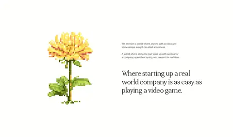
Open white editorial sections pair explanatory copy and serif statements with small botanical or diagram illustrations.
Cofounder feature
A rounded, inset #0081c0 product showcase combines a left-aligned serif headline and CTA with vivid sunflower artwork and a message preview.
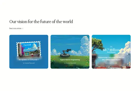
Article cards
Three image-led cards form a row beneath a left-aligned serif section heading, with compact overlaid titles and subtle rounded edges.
Closing footer
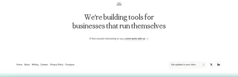
A centered serif recruitment statement and simple link groups close the page, with a compact email-update field and understated social links.
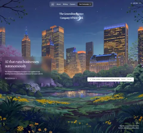
Imagery · Large, painterly illustrated landscapes define the experience: a New York night scene opens the page, followed by botanical imagery and a bright sunflower product vignette. The articles use image-led cards with rounded corners and text layered over their artwork. Small illustrations and diagrams appear in the white narrative sections. Treat these as intentional branded art, not photography or generic SaaS mockups; preserve their broad framing and saturated color contrasts.
Use the illustrated hero as the page’s primary visual anchor.
Keep most storytelling sections white or near-white and generously spaced.
Set display headlines in an editorial serif with tight tracking.
Use af-style sans-serif for navigation, body copy, and controls.
Reserve #0081c0 for a distinct product feature band.
Keep borders and shadows fine, pale, and restrained.
✕ 不该做
Do not turn the page into a dense dashboard layout.
Do not use saturated blue as a general background across every section.
Do not replace the bespoke landscape art with generic stock photography.
Do not add heavy shadows or thick borders to editorial cards.
Do not use all-caps headings or oversized interface labels.
Do not collapse the generous pauses between story sections.
给 AI 的提示词
想快速出一个同风格的新页面,把这段话连同 DESIGN.md 一起发给 AI。
Build a new page in this visual style as an image-led editorial experience, not a dashboard. Start with a full-bleed, cinematic illustrated scene and a compact floating navigation pill; use Gallery White (#ffffff) for the spacious story sections and Editorial Charcoal (#2c2c2c) for primary reading text. Set display headlines in a refined, tightly tracked serif similar to ppMondwest, and use a clean sans-serif like Inter for navigation, body copy, and controls. Keep layouts mostly single-column, with occasional split features or a three-card image feed. Use Cofounder Blue (#0081c0) sparingly for one distinct product showcase. Keep borders pale Mist Border (#dee2de), corners soft, and shadows subtle. Preserve generous vertical breathing room, painterly illustrative imagery, concise text, and understated CTAs.