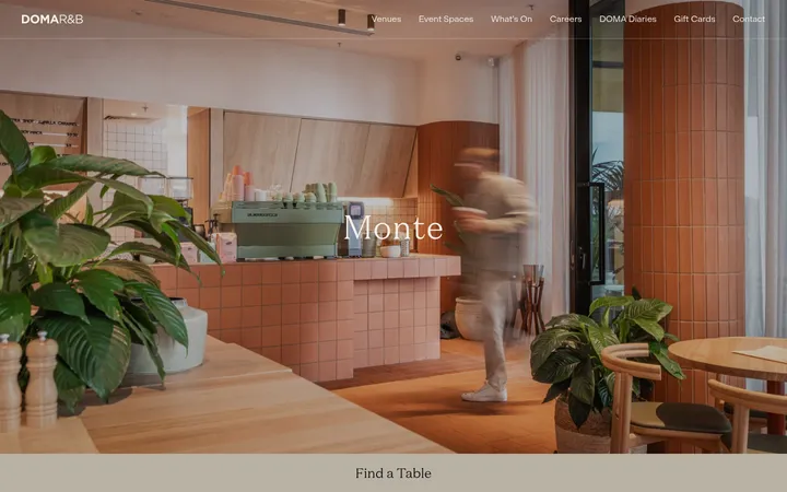
这是 Anna Jóna 的长篇致意页面,将闭店公告、私人信件与餐厅空间影像串联起来。柔粉底色、玫瑰红文字和温暖的室内摄影,共同营造亲密而有编辑感的叙事氛围。
North star · Let a restrained blush-and-rose palette and expressive Sansita typography frame spacious, image-led storytelling.
The page is built around a measured rose-red and blush pairing: #db404f carries nearly all visible type and also appears as a bold full-width section band, while #fce1e3 is the recurring canvas. The first viewport uses a paler blush image field, then hands attention to full-bleed restaurant video and photography. Sansita Bold gives even long personal copy a distinctive, dense display character; oversized headlines and smaller passages retain the same expressive voice rather than switching to a neutral interface font. The layout is a single-column, long-scroll story, punctuated by wide media, an intimate text letter, a room image, a red design statement, image collages, and a testimonial. Rounded image corners soften the architectural photography, while broad blush margins let each composition breathe. White is a sparse type colour on red, not a general canvas. Keep the experience flat and editorial: the visual hierarchy comes from colour fields, scale, imagery, and generous intervals rather than borders or shadows.
配色
点色块复制色值。用途说明来自对页面的实测位置(背景、文字、描边、按钮)与截图判读。
品牌色
表层色
中性色
页面底色 · Blush Canvas主文字 · Rose Signal次要文字 · Soft White强调 · Rose Signal
All measured display, heading, body, caption, and link text.
角色
示例
字号
字重
行高
字距
特大标题
Large statement headings, including the closure announcement.
Anna Jóna
70px
700
1.06
-0.02em
一级标题
Primary section headings and prominent story titles.
Anna Jóna
49px
700
1.11
-0.02em
正文
Personal letter and supporting editorial copy.
Anna Jóna
38.5px
700
1.14
-0.02em
辅助文字
Small labels, attributions, and supporting image text.
Anna Jóna
28.5px
700
1.17
-0.02em
间距与布局
基准单位 1px · 密度:适中
48px版块间距
11px元素间距
—卡片内边距
—内容最大宽度
11px
36px
48px
95px
115px
144px
173px
A single-column, long-scroll composition with no measured page maximum width. The opening announcement aligns a large headline to the left and a short supporting paragraph alongside it; later story copy sits in a narrower reading measure. Full-bleed video and large restaurant images interrupt the text, followed by a red statement band, image collages, and testimonial. The measured spacing rhythm ranges from compact element gaps to broad section intervals, creating a comfortable rather than crowded density.
圆角与层次
没有测到阴影:页面是扁平的,层次靠底色和描边区分。
The interface is predominantly flat, with no measured shadows or gradients and no visible card-border system. Separation comes from large background colour bands, open spacing, and image placement. Rounded media edges create the main sense of softness and layering; avoid adding decorative elevation that competes with the photography.
组件
下面的预览按实测的按钮、输入框、徽标、卡片样式重建(字体用替代字体)。
Closure announcement
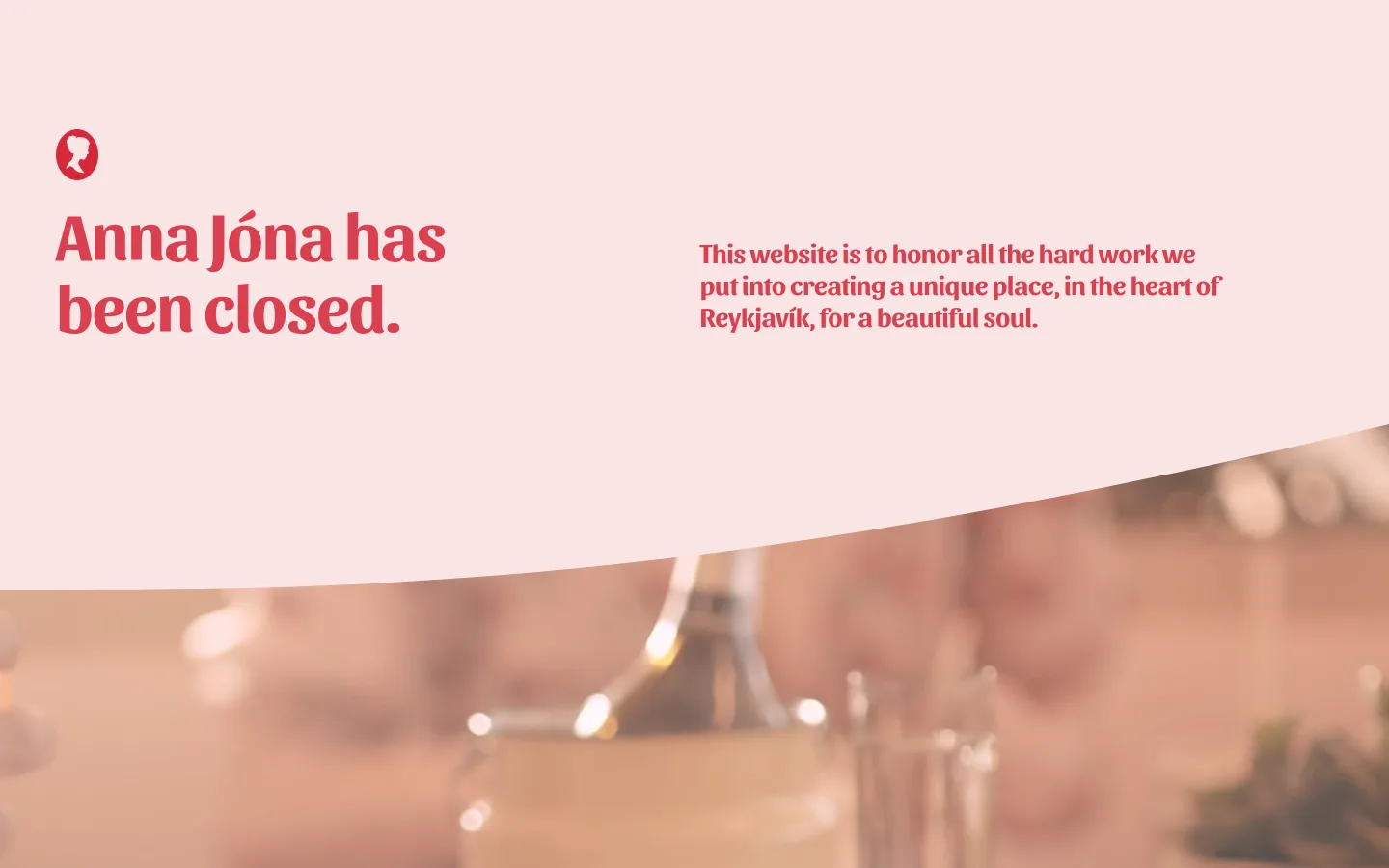
Blush opening field with a prominent rose-red closure headline, short supporting tribute, and small brand mark.
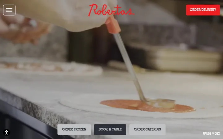
Full-bleed video
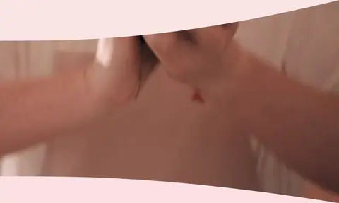
Wide restaurant footage breaks through the opening field and leads into the personal story.
Personal letter
Narrow, single-column editorial copy on blush, set in the same bold Sansita voice as the headings.
Design statement band
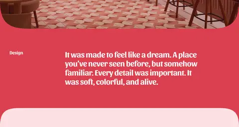
Rose-red section pairs a small label with a concise white statement about the restaurant's design.
Interior gallery
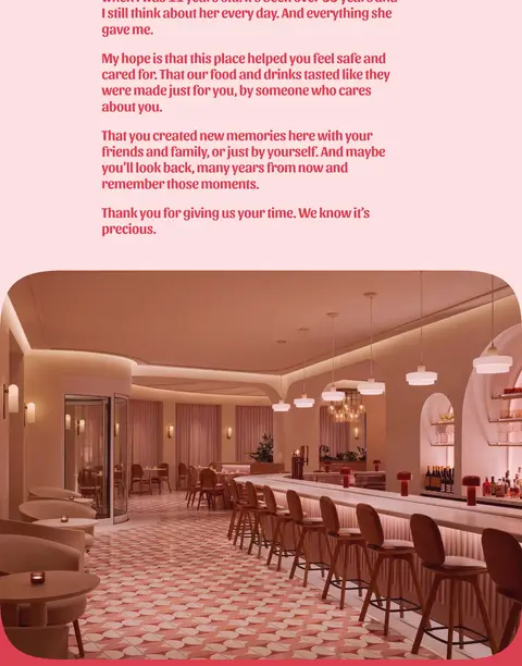
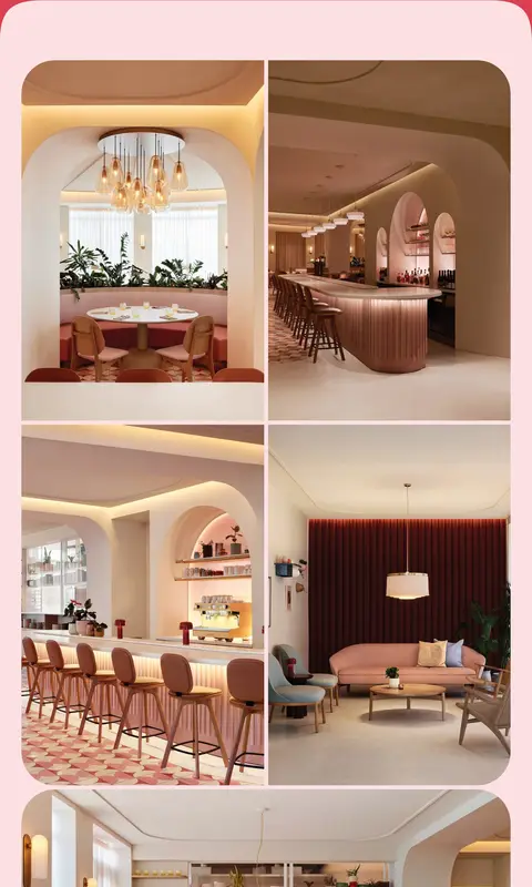
Large rounded restaurant images and multi-image collages presented directly against the blush canvas.
Guest testimonial
Centered, rose-red quotation on a spacious blush field with a smaller attribution beneath.
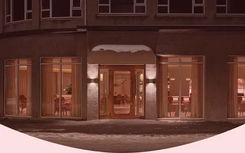
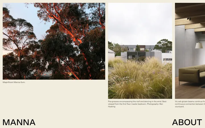
Imagery · Restaurant interiors are the central visual material: warm, softly lit architectural scenes, bar details, seating areas, and exterior views. A full-bleed video introduces the story; subsequent wide photographs and multi-image collages provide a visual tour. Images retain their natural warm wood and muted pink tones, framed by blush backgrounds and softened with large rounded corners. The photograph's brown and peach hues belong to the pictured restaurant, not the interface palette.
Use Sansita Bold for expressive display and reading text.
Alternate long-form copy with full-bleed or wide restaurant imagery.
Keep image framing soft with large rounded corners.
Reserve #ffffff for text placed over rose-red fields.
✕ 不该做
Do not introduce unmeasured interface colours.
Do not use shadows or borders to manufacture hierarchy.
Do not crowd the long-form story with dense card layouts.
Do not replace the expressive type voice with generic sans-serif styling.
Do not treat photographic browns and pinks as interface tokens.
Do not make every section a saturated red band.
给 AI 的提示词
想快速出一个同风格的新页面,把这段话连同 DESIGN.md 一起发给 AI。
Build a new long-scroll editorial page in the Anna Jóna visual style. Use Blush Canvas (#fce1e3) for the dominant page surface and Rose Signal (#db404f) for expressive text and occasional full-width statement bands; reserve Soft White (#ffffff) for text on those red bands. Use bold Sansita, or a close free substitute, with tight tracking across headings and editorial copy. Structure the page as a single-column story: a clear opening statement, short supporting copy, spacious reading passages, and large restaurant or venue imagery between sections. Let media span broadly, use softly rounded image corners, and keep surrounding space generous. Create hierarchy through scale, colour fields, and image placement rather than shadows, borders, or cards. Keep photography warm and natural, but do not turn its image colours into interface tokens.