North star · Make every section feel like a playful neighborhood restaurant poster: bold red and expressive type against spacious white or charcoal, supported by real food imagery.
The page balances a clean white canvas with deep charcoal sections and unmistakable red bands, buttons, and illustrated accents. The measured palette is deliberately tight: #ffffff carries most editorial content, #2b2f36 anchors navigation and dark section panels, and #ed2023 marks high-priority actions and energetic transitions. Oversized Borensa display lettering gives major headings a retro, hand-painted character, while Offset TM handles the readable copy and larger link labels. The opening is a full-screen, muted kitchen video with a centered red wordmark and a compact delivery CTA; later sections alternate generous white layouts, dark textured panels, and saturated red shop/social areas. Food photography is cropped boldly, sometimes bleeding to the edges, while small illustrated pizza motifs add playful punctuation. Checkerboard dividers, decorative stars, and irregular section edges make the spacious scroll feel handcrafted. Keep surfaces mostly flat and let image contrast, color blocks, and typography create hierarchy.
Body copy, section headings, and larger content links
Aa 设计
Borensa
网络字体 · 字重 400 · 占比 21%
免费替代:Rye
Display headlines, CTA labels, navigation labels, and captions
角色
示例
字号
字重
行高
字距
特大标题
Oversized decorative titles for major promotional sections.
Roberta's Pizza
120px
400
0.88
0
一级标题
Large uppercase headline treatment for primary page statements.
Roberta's Pizza
80px
400
0.88
0
二级标题
Section titles such as events, shop, and newsletter.
Roberta's Pizza
54px
400
1.11
0
三级标题
Subsection headings and feature titles.
The quick brown fox 敏捷的狐狸
24px
400
1.25
0
正文
Restaurant descriptions and supporting copy, often uppercase.
The quick brown fox 敏捷的狐狸
20px
400
1.5
0
辅助文字
Compact uppercase labels and image-related details.
The quick brown fox 敏捷的狐狸
14px
400
2.14
-0.02em
导航
Short uppercase navigation and utility labels.
The quick brown fox 敏捷的狐狸
14px
400
2.14
-0.02em
链接
Prominent content links and image-card labels.
The quick brown fox 敏捷的狐狸
24px
400
1.25
0
间距与布局
基准单位 4px · 密度:宽松
128px版块间距
40px元素间距
—卡片内边距
1400px内容最大宽度
12px
16px
18px
20px
24px
25px
30px
32px
40px
64px
96px
128px
A long, spacious homepage uses a measured max-width of 1400px, with full-bleed video, image, and color-band sections breaking up white content areas. Layouts shift between centered single-column copy, two-column editorial and card compositions, and image-led grids. Section rhythm is generous, with a measured 128px section gap and 40px element gap; preserve the distinct transitions rather than compressing the page into a dense feed. Center major titles and keep supporting content easy to scan.
圆角与层次
按钮 · 7px
导航 · 50%
链接 · 7px
sm · link
The visual language is mostly flat: strong color panels and imagery establish depth instead of stacked cards. Use thin, square-edged outlines around selected image cards and checkerboard dividers between major sections. Measured link shadow is subtle; reserve it for a small interactive detail rather than applying a general shadow system.
组件
下面的预览按实测的按钮、输入框、徽标、卡片样式重建(字体用替代字体)。
Primary CTA
Sauce Red (#ed2023) fill, white uppercase Borensa label, and a measured rounded radius of about 7px. Use for delivery, catering, and about actions.
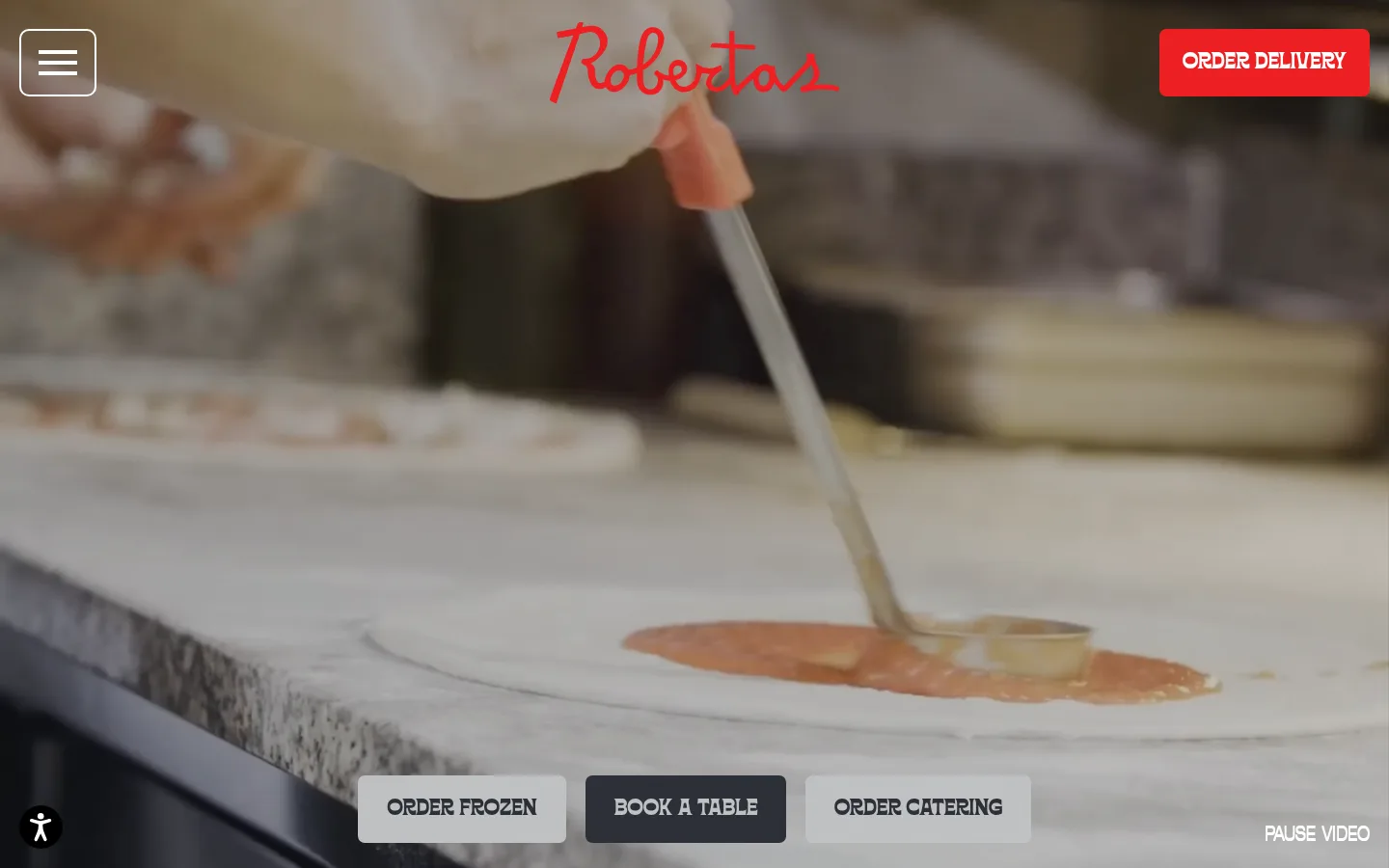
Hero video header
Full-bleed kitchen footage with centered red wordmark, a compact menu control, a red delivery CTA, and a bottom row of secondary actions.
Dark content band
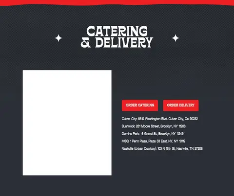
Oven Charcoal (#2b2f36) section surface with high-contrast light headings, restrained decorative stars, and aligned content.
Image card
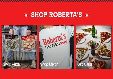
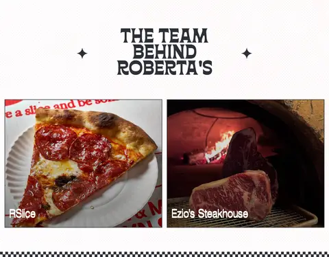
Photographic card with a square-edged dark outline and a large Offset TM link label positioned over the image.
Checkerboard divider
A narrow black-and-white checker pattern marking transitions between distinct full-width sections.
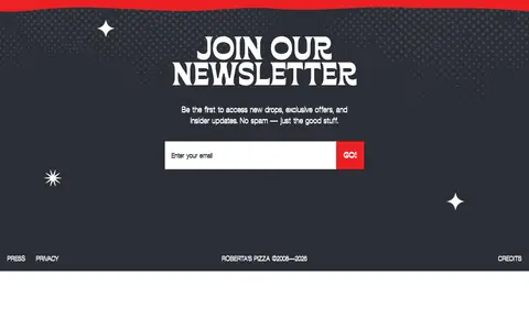
Newsletter form
Centered heading and brief copy above a horizontal email input and Sauce Red submit action on a dark textured panel.
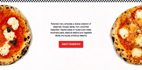
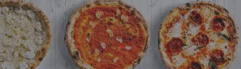
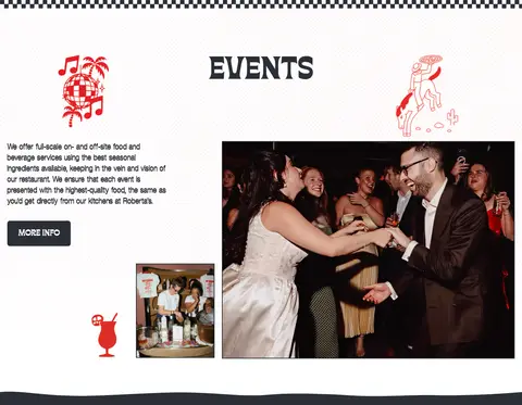
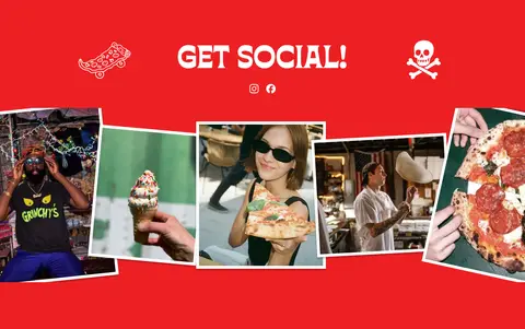
Imagery · Lead with full-bleed, softly darkened kitchen video, then use vivid photographs of pizza, restaurant events, products, and social moments. Crop food and people close, with some images extending to the viewport edges or serving as card backgrounds. Hand-drawn pizza characters, stars, and other small decorative illustrations appear as accents, not substitutes for photography.
Use the measured palette only for brand UI colors.
Give primary actions the Sauce Red fill and white label.
Pair expressive Borensa headings with readable Offset TM copy.
Alternate spacious white sections with bold charcoal or red bands.
Use real food and restaurant photography as a central visual element.
Keep major image and color sections full-bleed where appropriate.
✕ 不该做
Do not add unmeasured brand colors to UI surfaces.
Do not make the layout uniformly card-based or compact.
Do not use heavy shadows across the page.
Do not replace the decorative display type with generic bold sans-serif.
Do not treat illustration-only colors as part of the core palette.
Do not crowd the generous section spacing with extra interface elements.
给 AI 的提示词
想快速出一个同风格的新页面,把这段话连同 DESIGN.md 一起发给 AI。
Build a new restaurant page in Roberta’s Pizza’s expressive editorial style. Use Gallery White (#ffffff) as the main canvas, Oven Charcoal (#2b2f36) for dark bands and text, and Sauce Red (#ed2023) for primary actions and energetic section accents. Keep Deep Black (#000000) limited to image fades and overlay details. Use a decorative display face similar to Borensa for uppercase titles and CTA labels, paired with an Offset TM-like condensed sans for copy and links. Create generous section spacing, a few full-bleed food photographs, centered headline moments, and varied one- or two-column content blocks. Add restrained checkerboard separators and small hand-drawn food motifs. Favor flat surfaces, square image framing, and clear high-contrast actions; avoid dense dashboards, gradients as decoration, and generic card grids.