North star · Keep the trading action unmistakable on a white, spacious canvas, and reserve saturated color for interaction and illustrative accents.
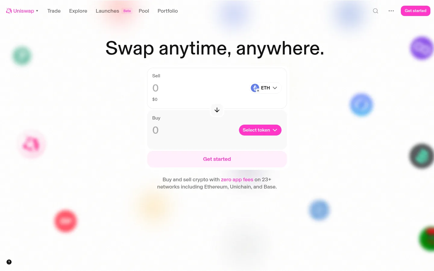
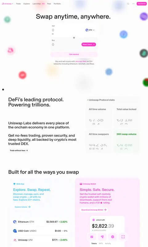
The page uses white as a dominant canvas, keeping the swap experience legible and making the high-chroma pink CTA and wordmark immediately recognizable. Near-black text provides strong contrast; muted gray supports supporting copy, while pale gray and lightly tinted surfaces separate interface fields, cards, and product stories without heavy framing. Basel Grotesk supplies a contemporary, rounded sans-serif voice, with large centered hero typography and compact navigation and utility text. The top viewport is deliberately sparse: a slim navigation row sits above a centered headline and exchange form, while soft, blurred token illustrations float around the edges. Lower sections shift into editorial splits and a colorful feature-card grid, using pastel pink, lilac, blue, orange, and mint chiefly as contextual product illustration colors. Rounded cards, subtle hairlines, and generous whitespace keep these varied blocks cohesive.
Brand-wide sans-serif for navigation, hero and section headings, interface labels, and body copy.
角色
示例
字号
字重
行高
字距
特大标题
Large hero headline, centered above the swap interface.
Uniswap
64px
485
1.19
0
一级标题
Primary hero or major section heading.
Uniswap
52px
500
1
0
二级标题
Prominent section headings, including the lower protocol introduction.
Uniswap
36px
485
1.11
0
三级标题
Feature-card titles and subordinate content headings.
The quick brown fox 敏捷的狐狸
24px
485
1.17
0
正文
Main descriptive copy and explanatory text.
The quick brown fox 敏捷的狐狸
18px
535
1.15
0
辅助文字
Compact helper text, labels, and card details.
The quick brown fox 敏捷的狐狸
16px
485
1.38
0
导航
Top-level navigation items and site links.
The quick brown fox 敏捷的狐狸
18px
485
1.33
0
链接
Prominent resource links and linked feature titles.
The quick brown fox 敏捷的狐狸
24px
485
1.17
0
间距与布局
基准单位 8px · 密度:紧凑
40px版块间距
8px元素间距
18px卡片内边距
741px内容最大宽度
2px
4px
5px
6px
8px
12px
16px
20px
24px
32px
40px
48px
Use a compact top navigation, then a centered hero with a narrow exchange form and ample open space around it. The measured content max width is 741px; preserve a readable central column rather than stretching content across the viewport. Lower content alternates editorial split sections, statistic cards, and a multi-column feature-card grid, followed by resource rows and a compact footer. Align the hero centrally and lower editorial copy to the left. Maintain the measured 8px spacing base and 40px section gap as a consistent rhythm, with a compact overall density.
圆角与层次
按钮 · 50%
卡片 · 20px
图片 · 50%
导航 · 50%
链接 · 32px
md · button
hairline · other
The design is mostly flat: white cards and pale surfaces rely on contrast and fine borders rather than strong shadows. Use rounded card shapes and thin light-gray hairlines to define groups. Reserve very subtle elevation for interactive controls, and let the hero's blurred token artwork create depth without adding heavy interface shadows.
组件
下面的预览按实测的按钮、输入框、徽标、卡片样式重建(字体用替代字体)。
Top navigation
A compact horizontal row with the pink Uniswap mark, text links, small utility icons, and a bright pink rounded Get started CTA.
Swap form
Centered, stacked sell and buy areas with large amount inputs, token selection, a direction switch, and a full-width CTA.
Token selector
A pill-shaped Select token control using #ff37c7 with dark text and a small dropdown indicator.
Market cards
White rounded cards for token and price details; use restrained separation and pink emphasis for linked or highlighted values.
Protocol statistics
A grouped light-gray statistic panel with compact labels and clear separation between metrics.
Feature cards
Rounded product panels with pastel-tinted surfaces, concise copy, a link, and a contained product illustration.
Resource rows
Simple help, blog, docs, and social links set in clear horizontal rows with subtle divider lines and directional icons.
Imagery · No photographic or video-led treatment defines the page. The hero is surrounded by softly blurred, floating token marks, while lower feature panels use colorful product illustrations and interface mockups. Keep these visuals contained within their respective cards or around the hero edges; their vivid colors belong to illustration and ecosystem identity, not to the neutral page canvas.
Use Uniswap Pink #ff37c7 to emphasize primary actions and brand links.
Center the hero headline and swap form as one focal group.
Separate content with pale surfaces and delicate hairlines.
Use pastel accent colors mainly within token art and feature illustrations.
Use rounded cards and controls consistent with the measured component radii.
✕ 不该做
Do not flood the page with saturated accent backgrounds.
Do not introduce heavy shadows or thick borders.
Do not stretch the swap interface across the full viewport.
Do not use token illustration colors as the main text palette.
Do not crowd the hero with extra copy or decorative controls.
Do not force uppercase styling or exaggerated letter spacing.
给 AI 的提示词
想快速出一个同风格的新页面,把这段话连同 DESIGN.md 一起发给 AI。
Build a new page in Uniswap's visual style using a white canvas (#ffffff), Soft Ink (#131313) typography, and delicate Quiet Line (#ececec) dividers. Use Uniswap Pink (#ff37c7) sparingly for primary actions, links, and brand cues; pale surfaces such as Cloud Surface (#f9f9f9) and Pink Veil (#ffeeff) should distinguish controls and cards. Set all text in Basel or a close sans-serif substitute, with neutral tracking and natural case. Keep the header compact and the main action centered in a narrow column, surrounded by generous whitespace. For supporting content, use editorial text-and-stat splits and rounded feature cards with contained illustrations. Keep blue, mint, violet, and orange accents inside visual assets rather than broad page fills. Favor flat surfaces, subtle borders, and quick, understated interaction feedback.