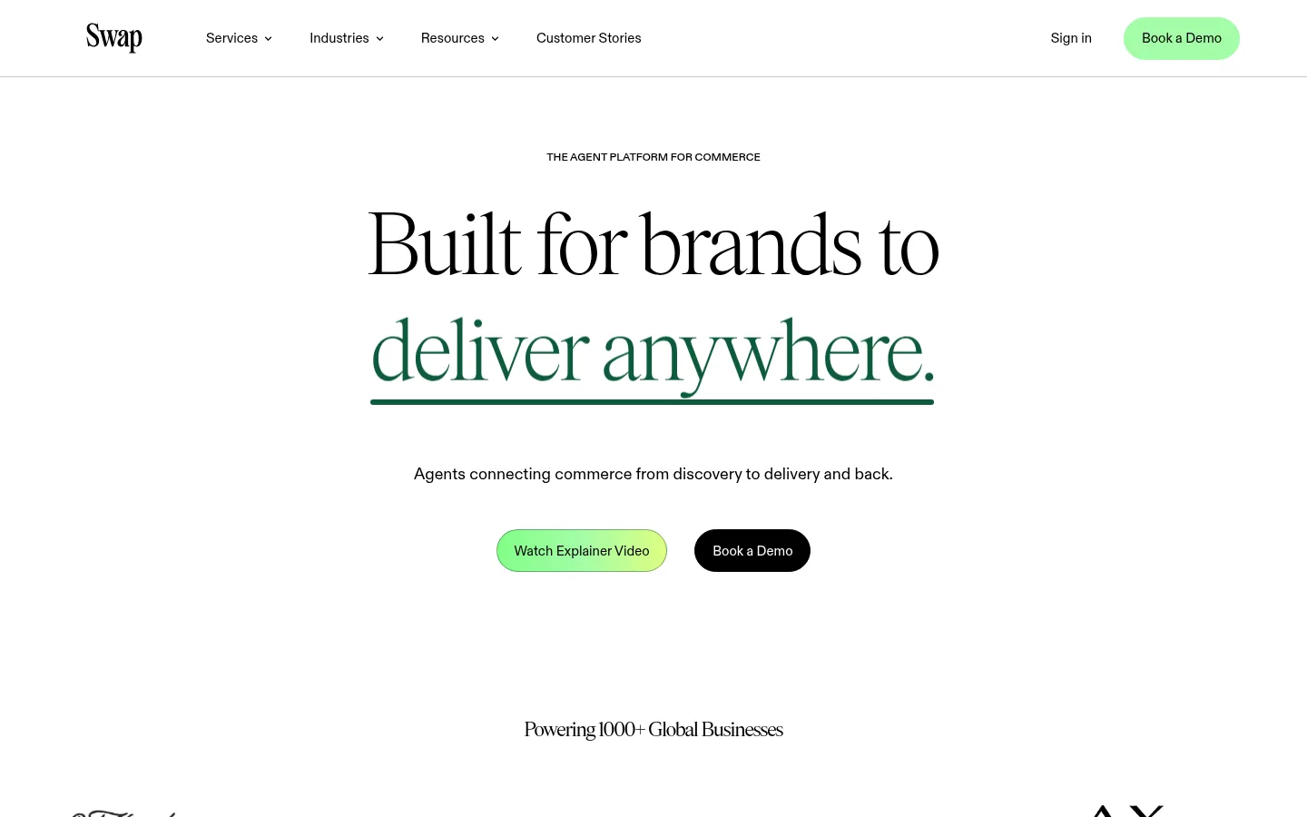
North star · Let editorial serif headlines and generous white space lead, using pale green bands and compact rounded controls to organize commerce details.
The page uses a bright white canvas as its main visual field, with black text providing crisp contrast and pale green reserved for product-feature bands and the demo section. A vivid green CTA gradient adds a focal point without overwhelming the restrained palette. Large, lightweight serif headlines create an editorial voice; a clean sans-serif handles navigation, body copy, buttons, and form labels. The centered hero leads into a customer-logo strip, then a green-tinted product feature area with three compact cards. Later sections return to white for results, security, and the blog, before a pale green contact band anchors the demo form. Content stays airy and carefully aligned, with rounded pills and cards softening the otherwise clean geometry. Product interfaces and editorial photography support the message, while the illustrated footer adds a distinct hand-drawn finish.
Sans-serif for navigation, body copy, buttons, captions, form controls, and compact labels.
Aa 设计
secondaryFont
网络字体 · 字重 300 / 400 / 100 · 占比 13%
免费替代:Cormorant Garamond
Serif display face for the hero and major section headlines, results figures, and editorial titles.
角色
示例
字号
字重
行高
字距
特大标题
Oversized editorial display headlines where the layout calls for a dramatic statement.
Swap
120px
100
0.95
-0.01em
一级标题
Main hero headline and the largest page-level title.
Swap
100px
300
0.95
-0.01em
二级标题
Major section headlines such as product platform and blog introductions.
Swap
80px
300
0.95
-0.01em
三级标题
Feature or section subheads, including security and results messaging.
Swap
72px
300
1
-0.017em
四级标题
Smaller card and subsection headings where present.
Swap
60px
300
0.95
-0.01em
正文
Supporting descriptions, card copy, and general page text.
The quick brown fox 敏捷的狐狸
15px
400
1.2
0
辅助文字
Compact article metadata, tags, and secondary labels.
The quick brown fox 敏捷的狐狸
12px
400
1.2
0
按钮
Small button labels and compact interface actions.
The quick brown fox 敏捷的狐狸
12px
400
1.2
0
导航
Header navigation links and menu items.
The quick brown fox 敏捷的狐狸
15px
400
1.2
0
间距与布局
基准单位 2px · 密度:适中
80px版块间距
12px元素间距
20px卡片内边距
1040px内容最大宽度
2px
3px
4px
6px
7px
8px
10px
11px
12px
14px
15px
19px
20px
30px
40px
80px
The header and content sit within a centered, measured page width, while most sections retain broad white margins. A centered hero gives way to a horizontal logo cloud, then a three-column feature-card grid. Results and security sections use simpler centered or split alignments, followed by a multi-card editorial feed. The demo area switches to a two-column layout with copy beside a dark form. Section spacing is generous and consistent, while cards and labels remain compact enough to keep the long page scannable.
圆角与层次
按钮 · 9999px
输入框 · 9999px
卡片 · 24px
图片 · 10px
徽标 · 9999px
导航 · 10px
链接 · 10px
lg · card
Most surfaces are flat against white, with separation created by background bands, spacing, and fine outlines rather than prominent shadows. Feature cards have rounded corners and subtle depth around their product media. The demo form is a dark rounded panel on the pale green band; avoid adding strong shadows or layered effects elsewhere.
组件
下面的预览按实测的按钮、输入框、徽标、卡片样式重建(字体用替代字体)。
Pill navigation and CTA
Use black navigation text on white with a fine header divider. The primary Book a Demo action is a mint pill with black text; a solid black pill provides a secondary contrast in the hero.
Editorial hero
Center a lightweight serif headline, small uppercase sans-serif eyebrow, short supporting copy, and a paired gradient and black pill CTA treatment.
Commerce feature cards
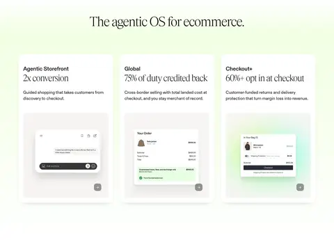
Arrange three rounded cards in a row with compact sans-serif labels, serif result figures, concise copy, and framed product-interface imagery.
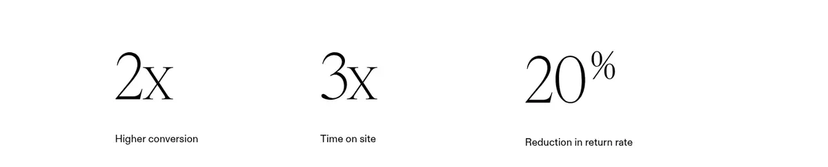
Result metrics
Present large light serif figures in an open three-column row, with brief sans-serif explanations underneath.
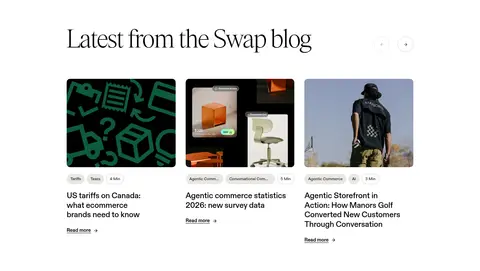
Article cards
Use rounded editorial thumbnails, small outlined or warm neutral topic badges, compact metadata, serif or restrained headings, and bold black Read more links.
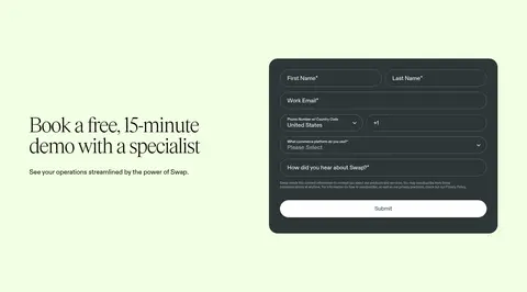
Demo form
Place a rounded Deep Moss panel on the pale green contact band, with light text, rounded outlined fields, and a white full-width submit control.
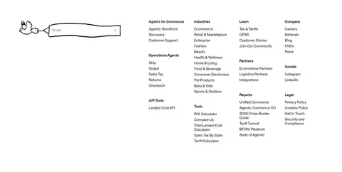
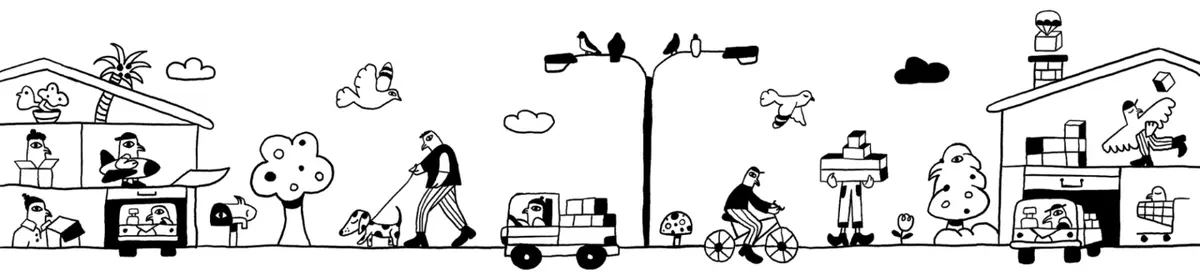
Hand-drawn footer art
Finish with a wide black line-art commerce scene on the white canvas, beneath a dense but orderly multi-column link directory.
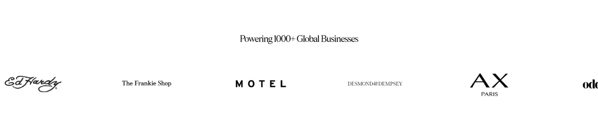
Imagery · Brand logos appear in a restrained horizontal strip. Product feature cards include small commerce-interface screenshots framed within soft, pale media areas; blog cards use varied editorial images with rounded corners. Certification logos provide credibility without dominating the security section. The final footer illustration is black line art on white, offering a hand-drawn contrast to the otherwise polished product UI. Keep image treatments clean and avoid heavy overlays.
Reserve pale green bands for feature and contact sections.
Pair large lightweight serif headlines with clean sans-serif interface text.
Keep primary actions rounded and visually distinct.
Give major sections generous breathing room.
Use product imagery to clarify platform features.
✕ 不该做
Do not make the page feel dark or densely filled.
Do not use green as the default text color.
Do not replace editorial serif headlines with heavy bold sans-serif.
Do not add conspicuous shadows to every card.
Do not let product screenshots overpower their cards.
Do not crowd the hero with extra copy or controls.
给 AI 的提示词
想快速出一个同风格的新页面,把这段话连同 DESIGN.md 一起发给 AI。
Build a new page in Swap’s visual style: a clean white canvas with Ink (#000000) text and Gallery White (#ffffff) space. Use lightweight editorial serif headlines, paired with a restrained sans-serif for navigation, body copy, controls, and labels. Keep the header simple and the hero centered, with a small uppercase eyebrow, a concise message, and rounded CTAs. Use Fresh Mint (#a3fda7) for the main action; a subtle gradient can move from Lime Spark (#82ff87) to Citrus Glow (#deff82). Organize content into spacious sections, using Lime Wash (#f2ffe3) for a feature or contact band. Show product details in compact rounded cards, and reserve Deep Moss (#2d3637) for inverse panels. Favor thin outlines over heavy shadows, and use authentic product imagery or restrained editorial visuals.